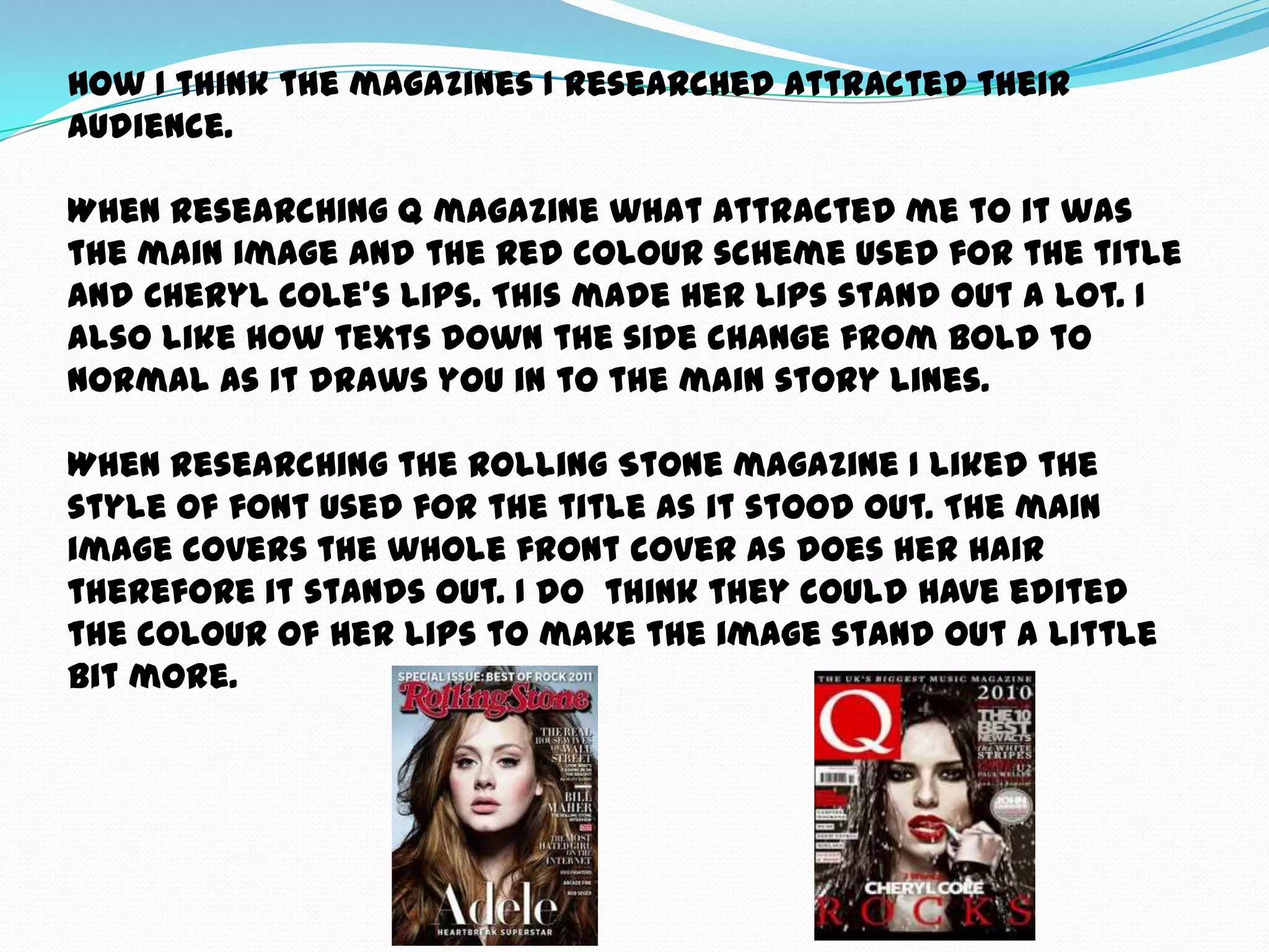
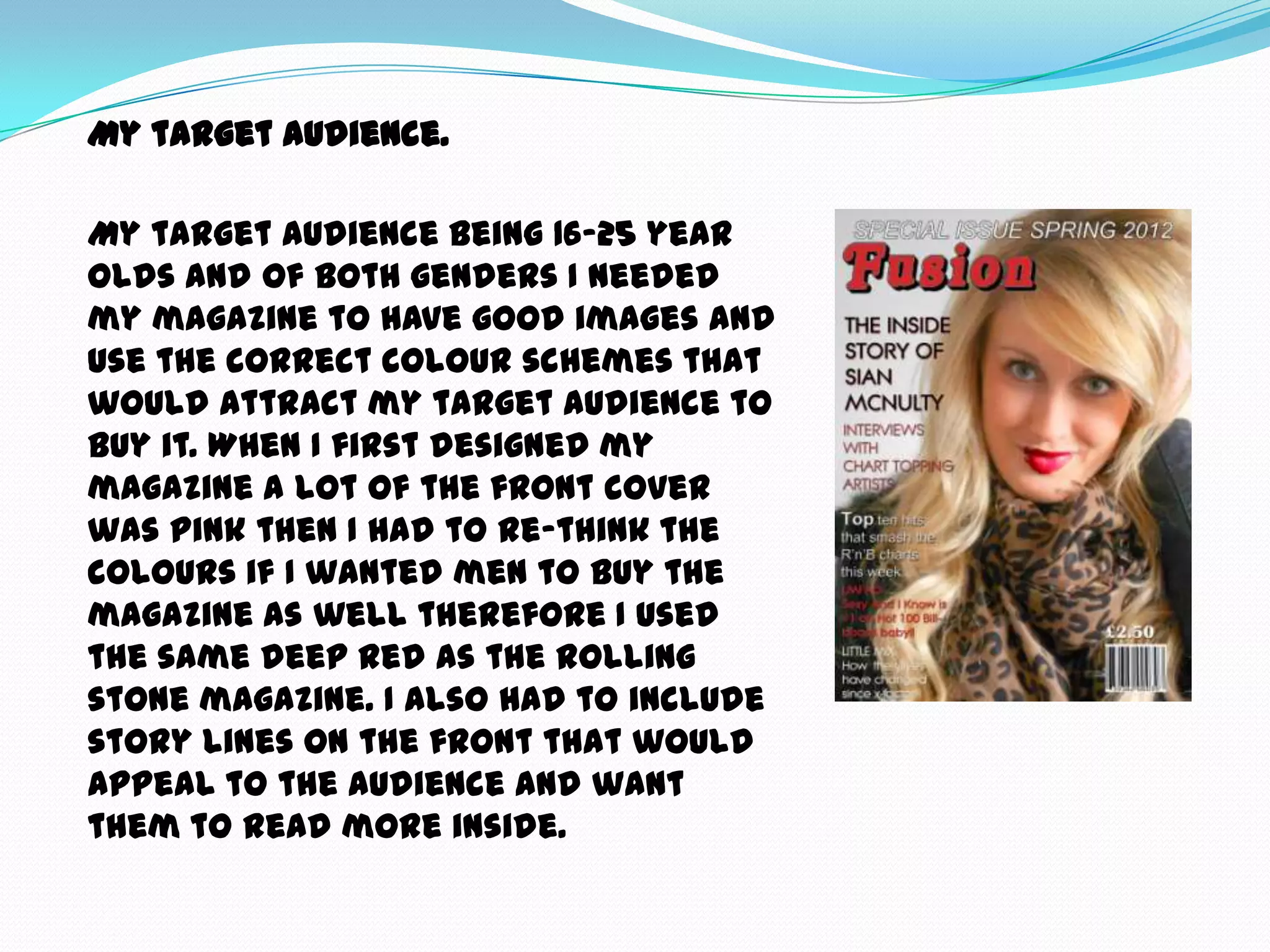
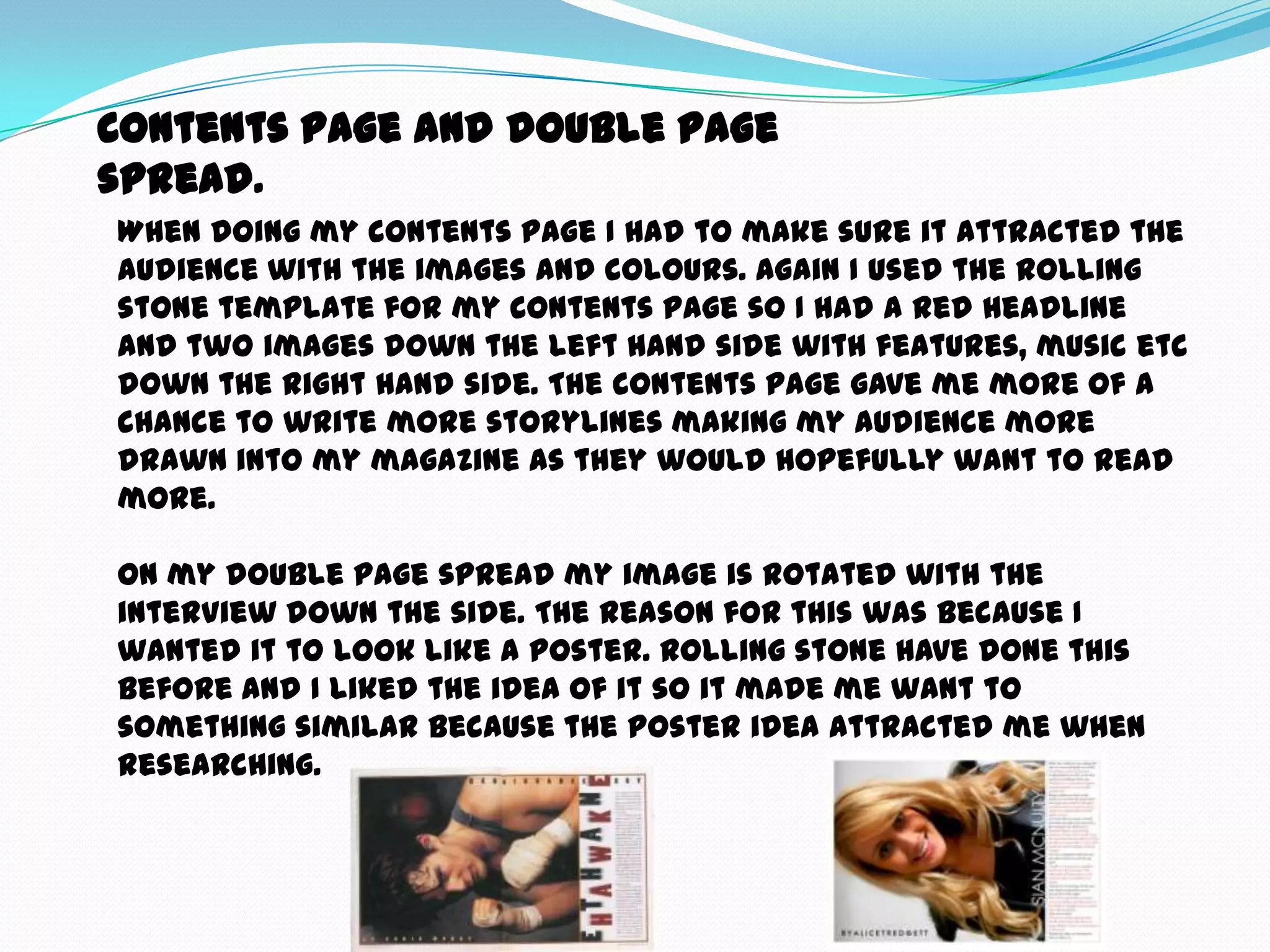
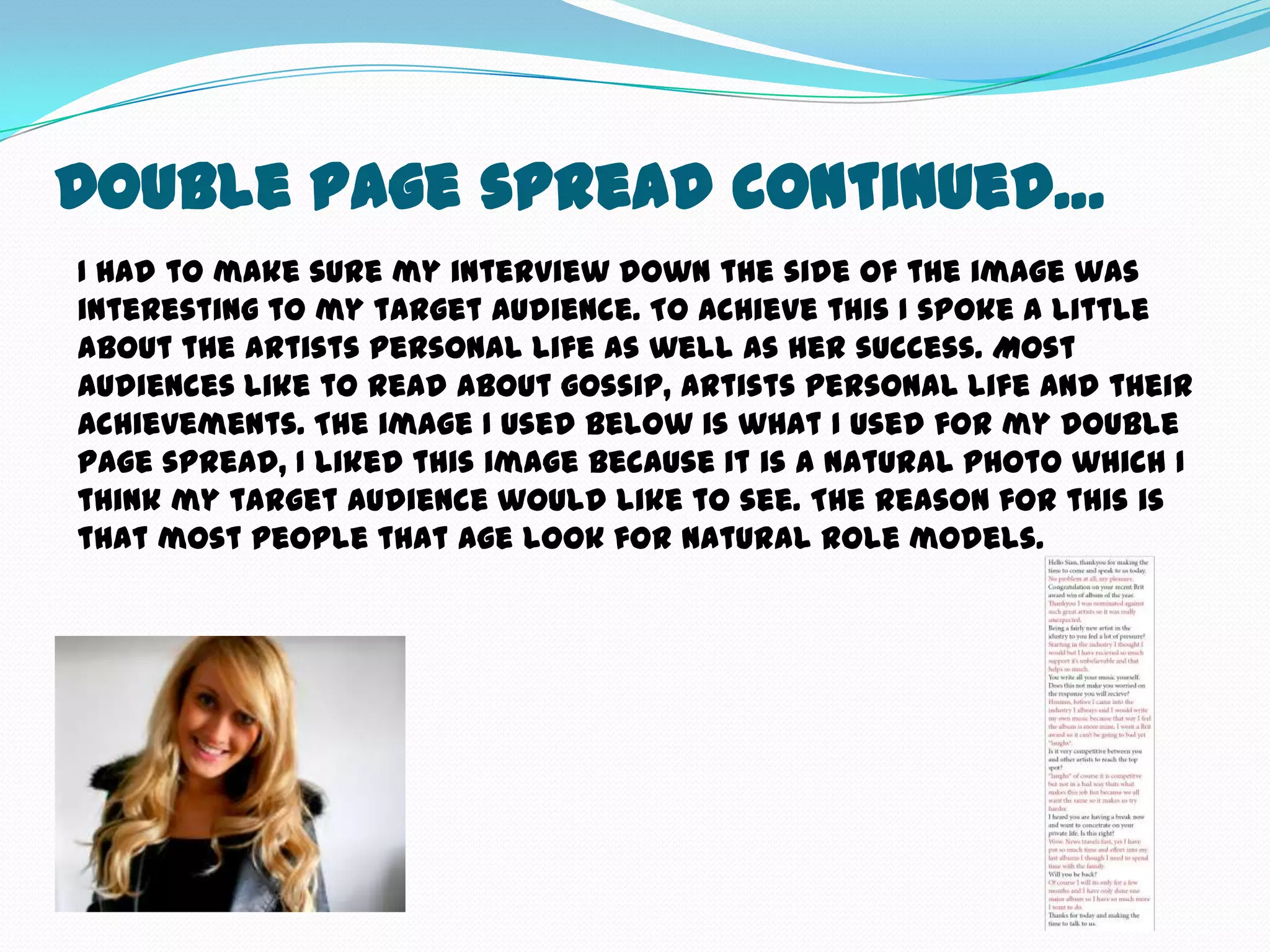
How did you
attract/address your
audience?
How I think the magazines I researched attracted their
audience.

When researching Q magazine what attracted me to it was
the main image and the red colour scheme used for the title
and Cheryl Cole’s lips. This made her lips stand out a lot. I
also like how texts down the side change from bold to
normal as it draws you in to the main story lines.

When researching the Rolling Stone magazine I liked the
style of font used for the title as it stood out. The main
image covers the whole front cover as does her hair
therefore it stands out. I do think they could have edited
the colour of her lips to make the image stand out a little
bit more.
My target audience.

My target audience being 16-25 year
olds and of both genders I needed
my magazine to have good images and
use the correct colour schemes that
would attract my target audience to
buy it. When I first designed my
magazine a lot of the front cover
was pink then I had to re-think the
colours if I wanted men to buy the
magazine as well therefore I used
the same deep red as the rolling
stone magazine. I also had to include
story lines on the front that would
appeal to the audience and want
them to read more inside.
Contents page and double page
spread.
When doing my contents page I had to make sure it attracted the
audience with the images and colours. Again I used the rolling
stone template for my contents page so I had a red headline
and two images down the left hand side with features, music etc
down the right hand side. The contents page gave me more of a
chance to write more storylines making my audience more
drawn into my magazine as they would hopefully want to read
more.

On my double page spread my image is rotated with the
interview down the side. The reason for this was because I
wanted it to look like a poster. Rolling stone have done this
before and I liked the idea of it so it made me want to
something similar because the poster idea attracted me when
researching.
Double Page spread continued…
I had to make sure my interview down the side of the image was
interesting to my target audience. To achieve this I spoke a little
about the artists personal life as well as her success. Most
audiences like to read about gossip, artists personal life and their
achievements. The image I used below is what I used for my double
page spread, I liked this image because it is a natural photo which I
think my target audience would like to see. The reason for this is
that most people that age look for natural role models.

Question 555

  • 1.
  • 2.
    How I thinkthe magazines I researched attracted their audience. When researching Q magazine what attracted me to it was the main image and the red colour scheme used for the title and Cheryl Cole’s lips. This made her lips stand out a lot. I also like how texts down the side change from bold to normal as it draws you in to the main story lines. When researching the Rolling Stone magazine I liked the style of font used for the title as it stood out. The main image covers the whole front cover as does her hair therefore it stands out. I do think they could have edited the colour of her lips to make the image stand out a little bit more.
  • 3.
    My target audience. Mytarget audience being 16-25 year olds and of both genders I needed my magazine to have good images and use the correct colour schemes that would attract my target audience to buy it. When I first designed my magazine a lot of the front cover was pink then I had to re-think the colours if I wanted men to buy the magazine as well therefore I used the same deep red as the rolling stone magazine. I also had to include story lines on the front that would appeal to the audience and want them to read more inside.
  • 4.
    Contents page anddouble page spread. When doing my contents page I had to make sure it attracted the audience with the images and colours. Again I used the rolling stone template for my contents page so I had a red headline and two images down the left hand side with features, music etc down the right hand side. The contents page gave me more of a chance to write more storylines making my audience more drawn into my magazine as they would hopefully want to read more. On my double page spread my image is rotated with the interview down the side. The reason for this was because I wanted it to look like a poster. Rolling stone have done this before and I liked the idea of it so it made me want to something similar because the poster idea attracted me when researching.
  • 5.
    Double Page spreadcontinued… I had to make sure my interview down the side of the image was interesting to my target audience. To achieve this I spoke a little about the artists personal life as well as her success. Most audiences like to read about gossip, artists personal life and their achievements. The image I used below is what I used for my double page spread, I liked this image because it is a natural photo which I think my target audience would like to see. The reason for this is that most people that age look for natural role models.