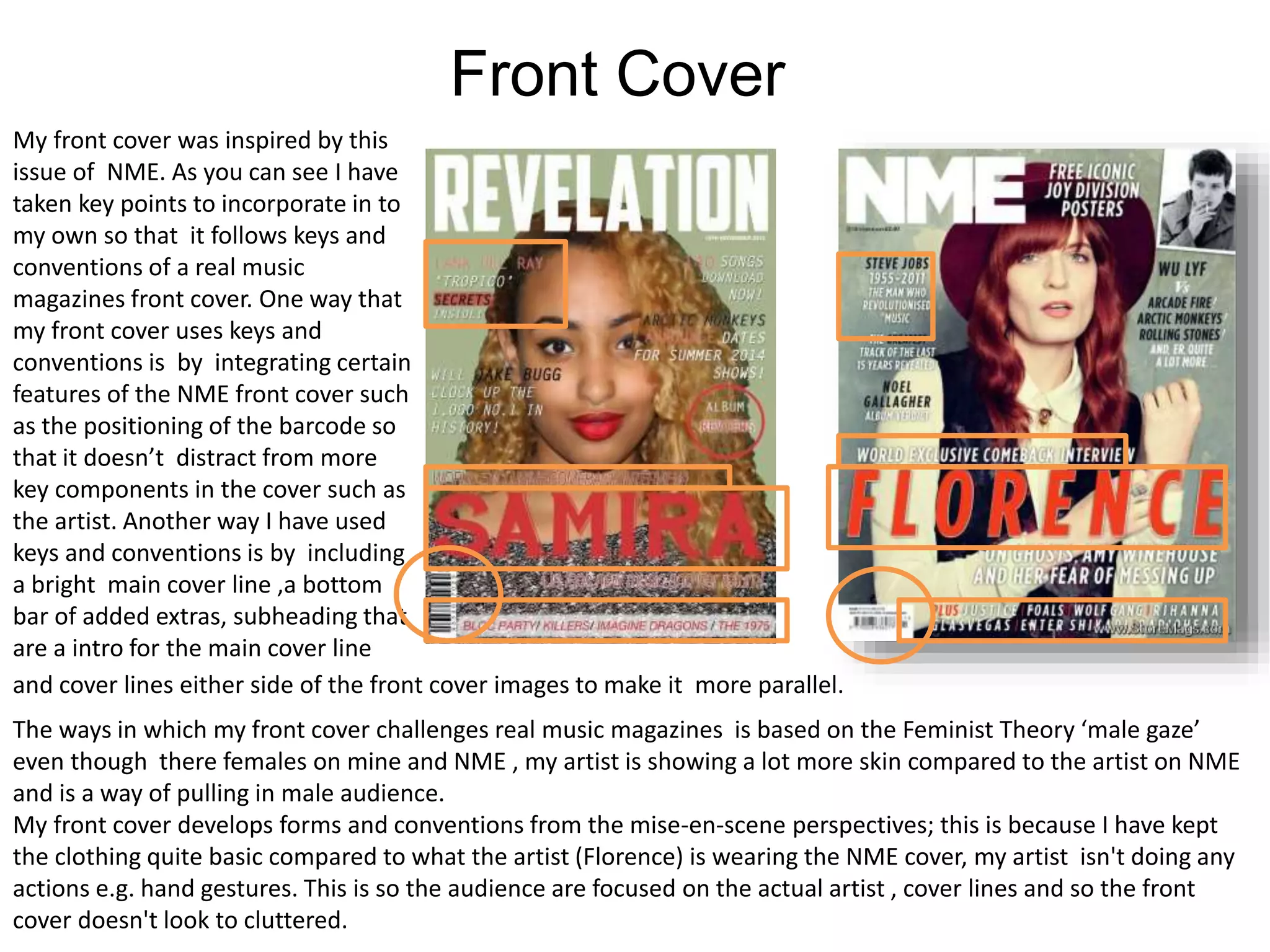
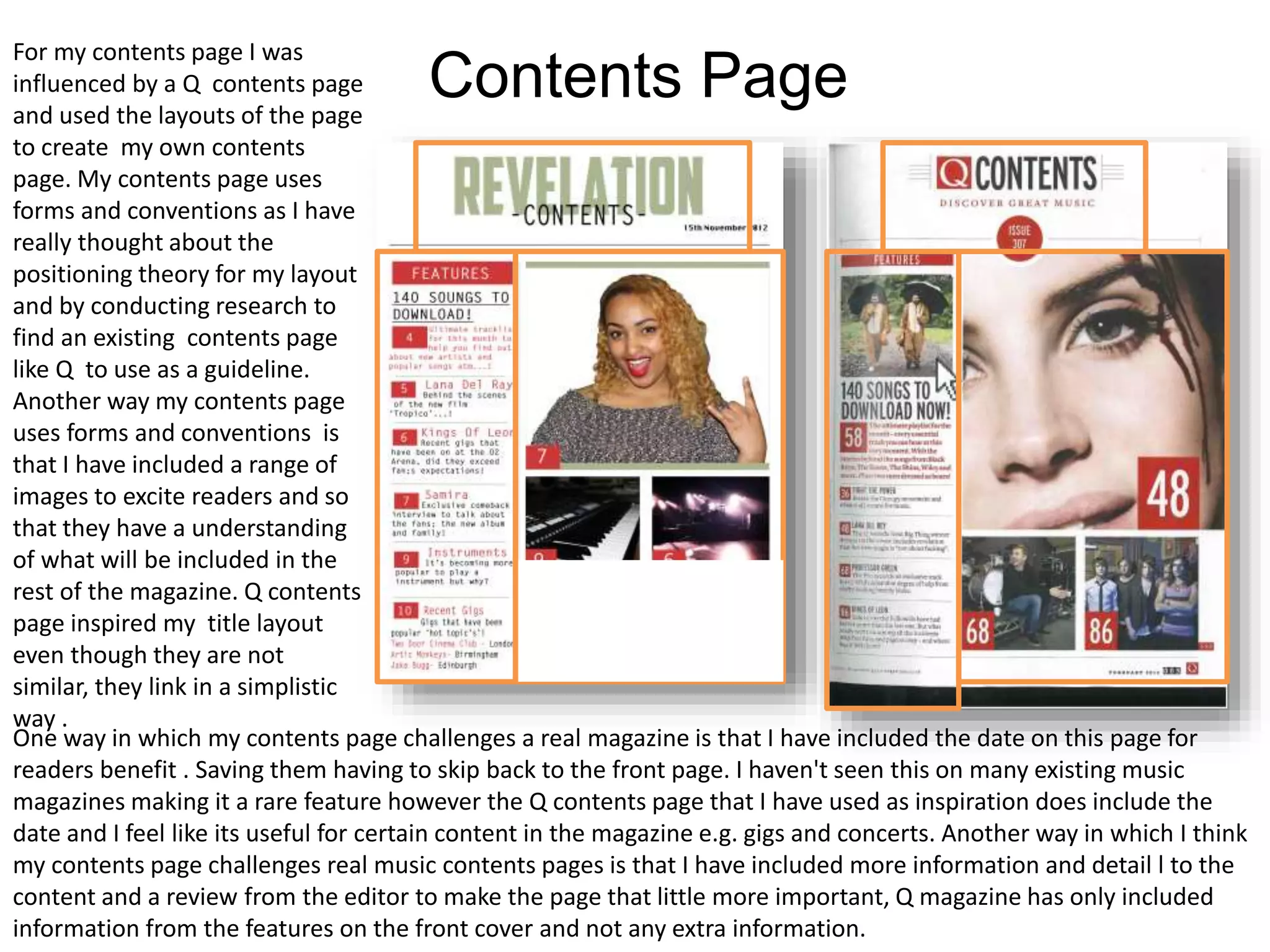
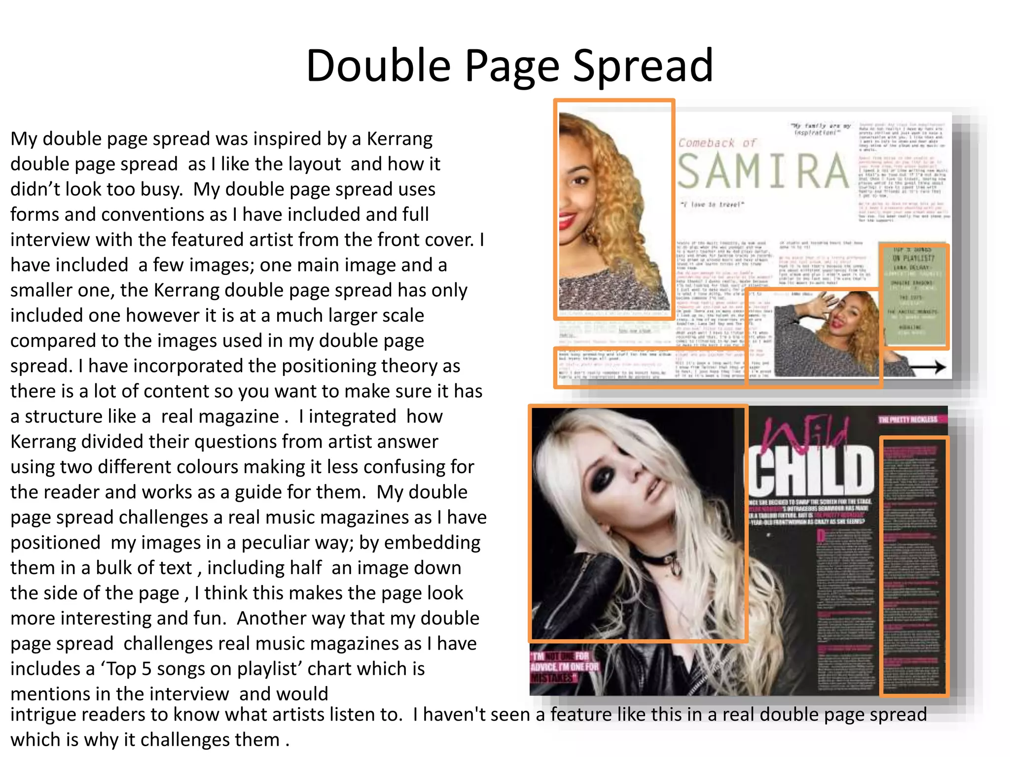
The document discusses the design choices made for different sections of a student-created music magazine, including the front cover, contents page, and double page spread. For the front cover, the student incorporated conventions from an NME cover such as barcode placement. The contents page was influenced by the layout of a Q magazine contents page. The double page spread took inspiration from a Kerrang spread in its interview format and use of images but also includes unconventional elements like a half image and embedded full images. Across the sections, the student considers positioning theory, challenges conventions, and strives to engage and guide readers like a real magazine.