Mood boards
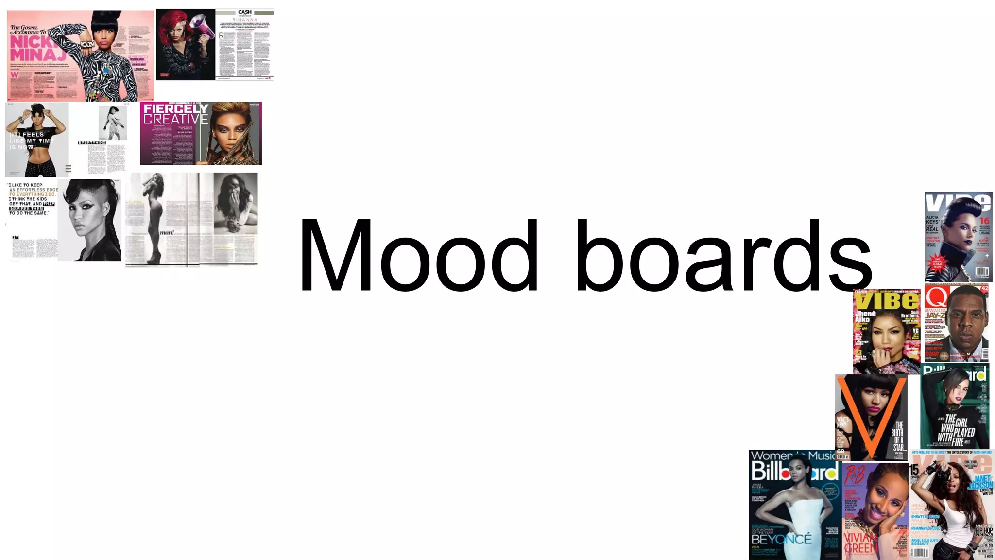
I created a mood board of these double page articles because they all reflect R&B and there
is something I could take and use in my double page article in each article. All the articles
use a variety of bright colours connotes the artist because they are bold and striking
.Although the articles use bright colours all the colours suit each other and are similar, this
has been done so that the colour scheme doesn’t overpower the article. One thing all the
articles have in common is that they all have a large image of who the article is about either
on one page or next to the writing. This is something I would like to incorporate in my double
page article because it shows who the article is about and it is a way of grabbing the
reader’s attention by making the image powerful and dominant for example the image of
Beyoncé will immediately catch the readers eye because of the use of direct mode of
address and the close up on her face. In each of the large images the use of direct mode of
address is repeated this entices the reader to buy the magazine because the artist is look
directly at the reader therefore it encourages them to buy the magazine. Pull quotes are
used in each of the articles so that the readers can see a glimpse of what is in the article
this will make them want to find where the pull quote is and read the whole article. The pull
quotes are usually controversial or shocking to grip the reader. In the first two articles of
Nicki Minaj and Rihanna drop caps are used at the start of a sentence, this is an effective
way of grabbing reader’s attention because they add personality. In the article about
Rihanna stand first is used to introduce the artist, some readers may not know who the
artist is just from looking at the large image, therefore introducing them would save readers
from not knowing who they’re reading about.
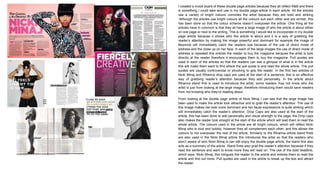
From looking at the double page article of Nicki Minaj I can see that the large image has
been used to make the article look attractive and to grab the reader’s attention. The use of
this image makes her look more dominant and her facial expressions is quite striking which
will immediately catch the reader’s attention. Drop Caps are also used at the start of the
article, this has been done to add personality and visual strength to the page, the Drop caps
also makes the reader look straight at the start of the article which will lead them to read the
whole article. The colours used in the article are all bright colours, which will reflect Nicki
Minaj who is loud and bubbly, however they all complement each other, and this allows the
colours to not overpower the rest of the article. Similarly to the Rihanna article stand firsts
are also used in the Nicki Minaj article this introduces the artist so that the readers who
aren’t aware of who Nicki Minaj is can still enjoy the double page article, the stand first also
acts as a summary of the article. Stand firsts also grad the reader’s attention because if they
read the sentence and want to know more they will read on. The use of the bold headline,
which says ‘Nicki Minaj, this intrigues the reader to the article and entices them to read the
article and find out more. Pull quotes are used in the article to break up the text and attract
the reader.
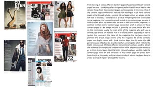
From looking at various different Content pages I have chosen these 8 content
pages because I think they reflect my genre perfectly and I would like to take
certain things from these content pages and incorporate it into mine. One of
the content page conventions I noticed from looking at all of these content
pages is that they all include a content list and page number are always on the
left next to the text, a content lists is a list of everything that will be included
in the magazine, this is something I will include in my content page because It
clearly shows what my readers will be able to see in my music magazine. In
addition to that another content page convention which is shown in these
content pages is a key image and this is generally the same person who was
on the front cover, usually the main artist of the magazine who will have a
double page article. I’ve noticed that in all of the content page they all have a
symbol that represents the name of the magazine, this has been done to
promote the brands image and to unify the magazine. All of the contents
pages uses bright colours and I think this has been done to evoke the R&B
genre because it R&B can be described as fun and energetic which reflects the
bright colours used. All these different conventions have been used to attract
the audience for example the content list has made it easier for the reader to
go to their desired pages. Also the bright colours have been used to make the
content page more fun and attractive. In this content page the artists don’t
look directly at the reader and the indirect mode of address has been done to
create a sense of mystery amongst the readers.
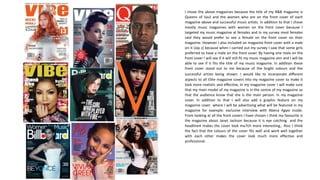
I chose the above magazines because the title of my R&B magazine is
Queens of Soul and the women who are on the front cover of each
magazine above and successful music artists. In addition to that I chose
mostly music magazines with women on the front cover because I
targeted my music magazine at females and in my survey most females
said they would prefer to see a female on the front cover on their
magazine. However I also included on magazine front cover with a male
on it (Jay z) because when I carried out my survey I saw that some girls
preferred to have a male on the front cover. By having one male on the
front cover I will see if it will still fit my music magazine aim and I will be
able to see if it fits the title of my music magazine. In addition these
front cover stand out to me because of the bright colours and the
successful artists being shown. I would like to incorporate different
aspects to all t5he magazine covers into my magazine cover to make it
look more realistic and effective, In my magazine cover I will make sure
that my main model of my magazine is in the centre of my magazine so
that the audience know that she is the main person. In my magazine
cover. In addition to that I will also add a graphic feature on my
magazine cover where I will be advertising what will be featured in my
magazine for example: exclusive interview with Abena Agyei inside.
From looking at all the front covers I have chosen I think my favourite is
the magazine about Janet Jackson because it is eye catching and the
headline4 makes the cover look mu7ch more interesting,. Also I think
the fact that the colours of the cover fits well and work well together
with each other makes the cover look much more effective and
professional.

Mood boards

  • 1.
  • 2.
    I created amood board of these double page articles because they all reflect R&B and there is something I could take and use in my double page article in each article. All the articles use a variety of bright colours connotes the artist because they are bold and striking .Although the articles use bright colours all the colours suit each other and are similar, this has been done so that the colour scheme doesn’t overpower the article. One thing all the articles have in common is that they all have a large image of who the article is about either on one page or next to the writing. This is something I would like to incorporate in my double page article because it shows who the article is about and it is a way of grabbing the reader’s attention by making the image powerful and dominant for example the image of Beyoncé will immediately catch the readers eye because of the use of direct mode of address and the close up on her face. In each of the large images the use of direct mode of address is repeated this entices the reader to buy the magazine because the artist is look directly at the reader therefore it encourages them to buy the magazine. Pull quotes are used in each of the articles so that the readers can see a glimpse of what is in the article this will make them want to find where the pull quote is and read the whole article. The pull quotes are usually controversial or shocking to grip the reader. In the first two articles of Nicki Minaj and Rihanna drop caps are used at the start of a sentence, this is an effective way of grabbing reader’s attention because they add personality. In the article about Rihanna stand first is used to introduce the artist, some readers may not know who the artist is just from looking at the large image, therefore introducing them would save readers from not knowing who they’re reading about. From looking at the double page article of Nicki Minaj I can see that the large image has been used to make the article look attractive and to grab the reader’s attention. The use of this image makes her look more dominant and her facial expressions is quite striking which will immediately catch the reader’s attention. Drop Caps are also used at the start of the article, this has been done to add personality and visual strength to the page, the Drop caps also makes the reader look straight at the start of the article which will lead them to read the whole article. The colours used in the article are all bright colours, which will reflect Nicki Minaj who is loud and bubbly, however they all complement each other, and this allows the colours to not overpower the rest of the article. Similarly to the Rihanna article stand firsts are also used in the Nicki Minaj article this introduces the artist so that the readers who aren’t aware of who Nicki Minaj is can still enjoy the double page article, the stand first also acts as a summary of the article. Stand firsts also grad the reader’s attention because if they read the sentence and want to know more they will read on. The use of the bold headline, which says ‘Nicki Minaj, this intrigues the reader to the article and entices them to read the article and find out more. Pull quotes are used in the article to break up the text and attract the reader.
  • 3.
    From looking atvarious different Content pages I have chosen these 8 content pages because I think they reflect my genre perfectly and I would like to take certain things from these content pages and incorporate it into mine. One of the content page conventions I noticed from looking at all of these content pages is that they all include a content list and page number are always on the left next to the text, a content lists is a list of everything that will be included in the magazine, this is something I will include in my content page because It clearly shows what my readers will be able to see in my music magazine. In addition to that another content page convention which is shown in these content pages is a key image and this is generally the same person who was on the front cover, usually the main artist of the magazine who will have a double page article. I’ve noticed that in all of the content page they all have a symbol that represents the name of the magazine, this has been done to promote the brands image and to unify the magazine. All of the contents pages uses bright colours and I think this has been done to evoke the R&B genre because it R&B can be described as fun and energetic which reflects the bright colours used. All these different conventions have been used to attract the audience for example the content list has made it easier for the reader to go to their desired pages. Also the bright colours have been used to make the content page more fun and attractive. In this content page the artists don’t look directly at the reader and the indirect mode of address has been done to create a sense of mystery amongst the readers.
  • 4.
    I chose theabove magazines because the title of my R&B magazine is Queens of Soul and the women who are on the front cover of each magazine above and successful music artists. In addition to that I chose mostly music magazines with women on the front cover because I targeted my music magazine at females and in my survey most females said they would prefer to see a female on the front cover on their magazine. However I also included on magazine front cover with a male on it (Jay z) because when I carried out my survey I saw that some girls preferred to have a male on the front cover. By having one male on the front cover I will see if it will still fit my music magazine aim and I will be able to see if it fits the title of my music magazine. In addition these front cover stand out to me because of the bright colours and the successful artists being shown. I would like to incorporate different aspects to all t5he magazine covers into my magazine cover to make it look more realistic and effective, In my magazine cover I will make sure that my main model of my magazine is in the centre of my magazine so that the audience know that she is the main person. In my magazine cover. In addition to that I will also add a graphic feature on my magazine cover where I will be advertising what will be featured in my magazine for example: exclusive interview with Abena Agyei inside. From looking at all the front covers I have chosen I think my favourite is the magazine about Janet Jackson because it is eye catching and the headline4 makes the cover look mu7ch more interesting,. Also I think the fact that the colours of the cover fits well and work well together with each other makes the cover look much more effective and professional.