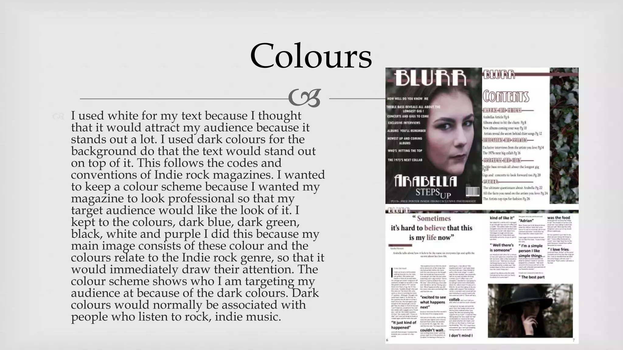
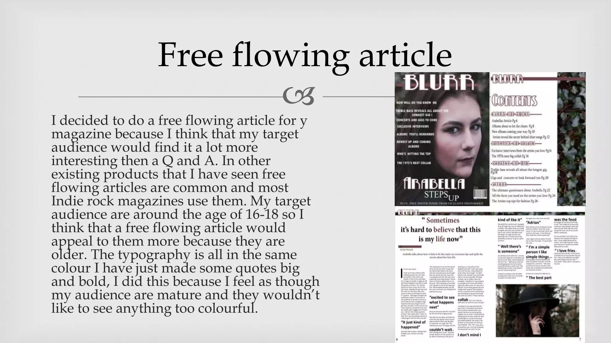
How did you attract your audience ?
 I used white for my text because I thought
that it would attract my audience because it
stands out a lot. I used dark colours for the
background do that the text would stand out
on top of it. This follows the codes and
conventions of Indie rock magazines. I wanted
to keep a colour scheme because I wanted my
magazine to look professional so that my
target audience would like the look of it. I
kept to the colours, dark blue, dark green,
black, white and purple I did this because my
main image consists of these colour and the
colours relate to the Indie rock genre, so that it
would immediately draw their attention. The
colour scheme shows who I am targeting my
audience at because of the dark colours. Dark
colours would normally be associated with
people who listen to rock, indie music.
Colours

I had my front cover give direct address
because I wanted to create intimacy. I
chose to make the image dark and dull
looking because that’s what is
associated with my genre and I thought
that it would grab the attention of my
target audience. My images were taken
outside in the woods were there are lots
of trees, I did this because nature and
the outside is commonly seen in an
Indie genre. I did this because my target
audience would be attracted to the look
of the image as it outside it from of trees
and bushes.
Images

 I added a strap line to the
bottom of my page because I
thought that it would grab the
attention of my audience and
make the magazine look more
interesting. From looking at
previous magazines that are the
same genre as mine there were
no straplines but I decided to
add one because I wanted my
magazine to grab attention.
Strap line

I decided to do a free flowing article for y
magazine because I think that my target
audience would find it a lot more
interesting then a Q and A. In other
existing products that I have seen free
flowing articles are common and most
Indie rock magazines use them. My target
audience are around the age of 16-18 so I
think that a free flowing article would
appeal to them more because they are
older. The typography is all in the same
colour I have just made some quotes big
and bold, I did this because I feel as though
my audience are mature and they wouldn’t
like to see anything too colourful.
Free flowing article

 I added a pull quote because
I felt that it would grab the
attention of my audience.
From my research I have
noticed that most magazines
contain pull quotes.
Pull quote

Evaluation question 5

  • 1.
    How did youattract your audience ?
  • 2.
     I usedwhite for my text because I thought that it would attract my audience because it stands out a lot. I used dark colours for the background do that the text would stand out on top of it. This follows the codes and conventions of Indie rock magazines. I wanted to keep a colour scheme because I wanted my magazine to look professional so that my target audience would like the look of it. I kept to the colours, dark blue, dark green, black, white and purple I did this because my main image consists of these colour and the colours relate to the Indie rock genre, so that it would immediately draw their attention. The colour scheme shows who I am targeting my audience at because of the dark colours. Dark colours would normally be associated with people who listen to rock, indie music. Colours
  • 3.
     I had myfront cover give direct address because I wanted to create intimacy. I chose to make the image dark and dull looking because that’s what is associated with my genre and I thought that it would grab the attention of my target audience. My images were taken outside in the woods were there are lots of trees, I did this because nature and the outside is commonly seen in an Indie genre. I did this because my target audience would be attracted to the look of the image as it outside it from of trees and bushes. Images
  • 4.
      I addeda strap line to the bottom of my page because I thought that it would grab the attention of my audience and make the magazine look more interesting. From looking at previous magazines that are the same genre as mine there were no straplines but I decided to add one because I wanted my magazine to grab attention. Strap line
  • 5.
     I decided todo a free flowing article for y magazine because I think that my target audience would find it a lot more interesting then a Q and A. In other existing products that I have seen free flowing articles are common and most Indie rock magazines use them. My target audience are around the age of 16-18 so I think that a free flowing article would appeal to them more because they are older. The typography is all in the same colour I have just made some quotes big and bold, I did this because I feel as though my audience are mature and they wouldn’t like to see anything too colourful. Free flowing article
  • 6.
      I addeda pull quote because I felt that it would grab the attention of my audience. From my research I have noticed that most magazines contain pull quotes. Pull quote