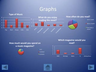
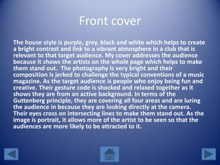
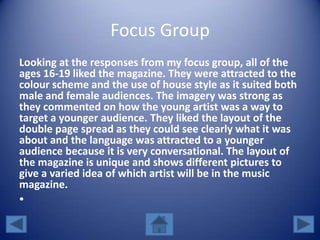
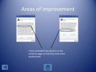
Question 7
How did you attract/address your
audience?
By Alix Kelly
CONTENTS
• Target audience
• Graphs
• Front cover
• Proof
• Contents and Double Page
• Proof
• Focus Group
• Screenshots
Who are my target audience?
From looking at my market research, my target
audience was people aged 16-19. It was aimed at
people wanting to buy a pop/dance magazine for a low
price and was interested in plenty of images and artist
reviews and interviews. In terms of the content, it
includes articles about clubbing and dancing as well as
interviews of popular dance/pop artists of that genre.
Graphs
0
2
4
6
8
Pop Rock House Indie RnB
Type of Music
0
5
10
What do you enjoy
reading the most?
How often do you read?
Once a week
Once a month
Few times a
month
How much would you spend on
a music magazine?
0-£1
£1.50-£2
£2.50-£5 0
2
4
6
8
NME Kerrang! Nylon Q Rolling Stone
Which magazine would you
read?
Front cover
The house style is purple, grey, black and white which helps to create
a bright contrast and link to a vibrant atmosphere in a club that is
relevant to that target audience. My cover addresses the audience
because it shows the artists on the whole page which helps to make
them stand out. The photography is very bright and their
composition is jerked to challenge the typical conventions of a music
magazine. As the target audience is people who enjoy being fun and
creative. Their gesture code is shocked and relaxed together as it
shows they are from an active background. In terms of the
Guttenberg principle, they are covering all four areas and are luring
the audience in because they are looking directly at the camera.
Their eyes cross on intersecting lines to make them stand out. As the
image is portrait, it allows more of the artist to be seen so that the
audiences are more likely to be attracted to it.
PROOF
Contents and Double Page
In the contents, there are more photos used. As the target
audiences are interested in seeing photos, I have tried to fit in
as many photos as I can to help fit the needs of my target
audience. As the content on the double page spread discusses
clubbing in the summer this will attract people to look at places
to go clubbing if they are interested in seeing their favorite
bands or artists performing at festivals or gigs in their area. A
lot of people will be going to festivals such as cream fields and
Leeds so this magazine will focus on articles on those
occasions.
PROOF
Focus Group
Looking at the responses from my focus group, all of the
ages 16-19 liked the magazine. They were attracted to the
colour scheme and the use of house style as it suited both
male and female audiences. The imagery was strong as
they commented on how the young artist was a way to
target a younger audience. They liked the layout of the
double page spread as they could see clearly what it was
about and the language was attracted to a younger
audience because it is very conversational. The layout of
the magazine is unique and shows different pictures to
give a varied idea of which artist will be in the music
magazine.
•
Areas of improvement
I have amended that photos on the
contents page so that they look more
professional.

Question 5 fin

  • 1.
    Question 7 How didyou attract/address your audience? By Alix Kelly
  • 2.
    CONTENTS • Target audience •Graphs • Front cover • Proof • Contents and Double Page • Proof • Focus Group • Screenshots
  • 3.
    Who are mytarget audience? From looking at my market research, my target audience was people aged 16-19. It was aimed at people wanting to buy a pop/dance magazine for a low price and was interested in plenty of images and artist reviews and interviews. In terms of the content, it includes articles about clubbing and dancing as well as interviews of popular dance/pop artists of that genre.
  • 4.
    Graphs 0 2 4 6 8 Pop Rock HouseIndie RnB Type of Music 0 5 10 What do you enjoy reading the most? How often do you read? Once a week Once a month Few times a month How much would you spend on a music magazine? 0-£1 £1.50-£2 £2.50-£5 0 2 4 6 8 NME Kerrang! Nylon Q Rolling Stone Which magazine would you read?
  • 5.
    Front cover The housestyle is purple, grey, black and white which helps to create a bright contrast and link to a vibrant atmosphere in a club that is relevant to that target audience. My cover addresses the audience because it shows the artists on the whole page which helps to make them stand out. The photography is very bright and their composition is jerked to challenge the typical conventions of a music magazine. As the target audience is people who enjoy being fun and creative. Their gesture code is shocked and relaxed together as it shows they are from an active background. In terms of the Guttenberg principle, they are covering all four areas and are luring the audience in because they are looking directly at the camera. Their eyes cross on intersecting lines to make them stand out. As the image is portrait, it allows more of the artist to be seen so that the audiences are more likely to be attracted to it.
  • 6.
  • 7.
    Contents and DoublePage In the contents, there are more photos used. As the target audiences are interested in seeing photos, I have tried to fit in as many photos as I can to help fit the needs of my target audience. As the content on the double page spread discusses clubbing in the summer this will attract people to look at places to go clubbing if they are interested in seeing their favorite bands or artists performing at festivals or gigs in their area. A lot of people will be going to festivals such as cream fields and Leeds so this magazine will focus on articles on those occasions.
  • 8.
  • 9.
    Focus Group Looking atthe responses from my focus group, all of the ages 16-19 liked the magazine. They were attracted to the colour scheme and the use of house style as it suited both male and female audiences. The imagery was strong as they commented on how the young artist was a way to target a younger audience. They liked the layout of the double page spread as they could see clearly what it was about and the language was attracted to a younger audience because it is very conversational. The layout of the magazine is unique and shows different pictures to give a varied idea of which artist will be in the music magazine. •
  • 10.
    Areas of improvement Ihave amended that photos on the contents page so that they look more professional.