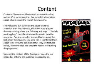
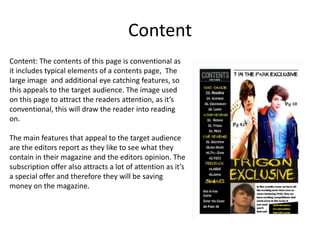
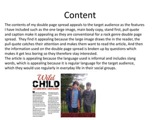
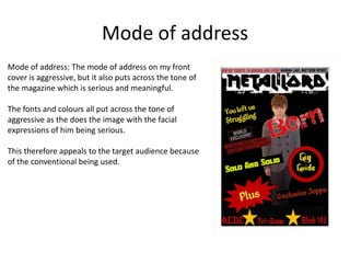
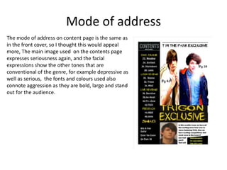
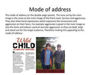
The document discusses how the magazine appeals to its target audience through its use of fonts, content, and mode of address. Sans serif fonts are used throughout to appeal to the younger target audience and convey a rock genre feel. The content on the cover, contents page, and double page spread uses conventional elements like images, pull quotes, and featured bands to attract readers. The mode of address is aggressive on the cover and contents page through serious images and bold design choices, appealing to the target audience.