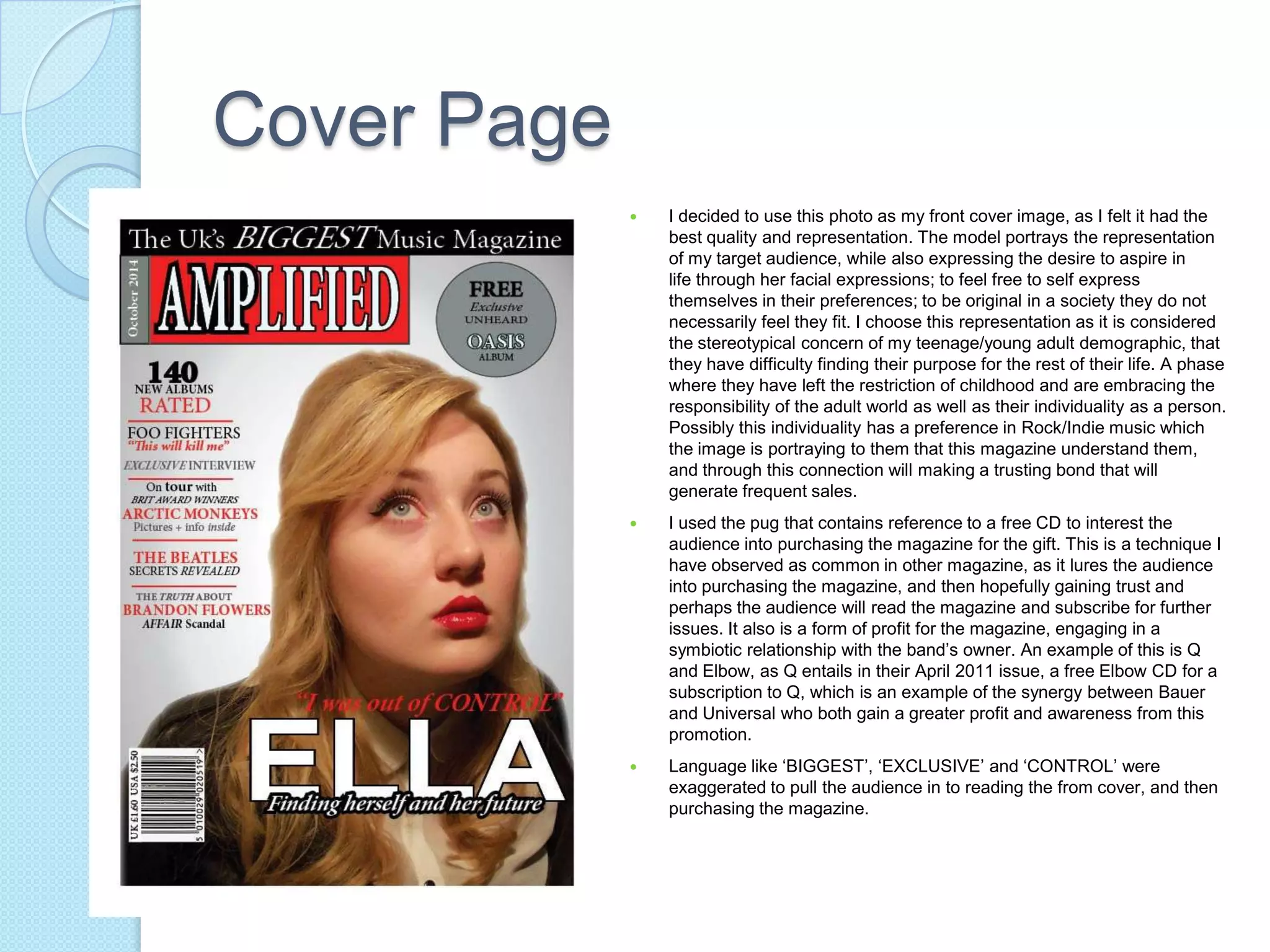
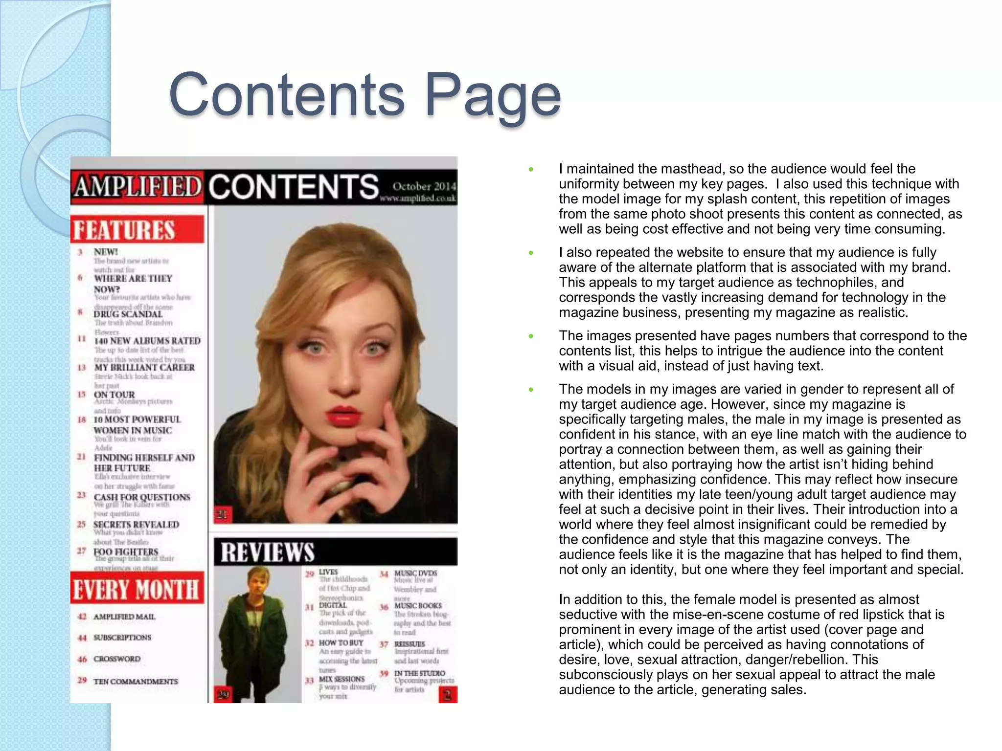
5. How did you attract/address
your audience?
When constructing my magazine, I chose to use Q Magazine, as
it’s genre of rock/indie is similar to mine. This would help me in it’s
layout and how it attracts it’s audience, as we both share a target
audience of that style.
My target audience is defined as 16 to 25 years old to help me
refine my content to what my target audience really likes, and
prevent myself from being to general in construction; helping me to
create the best music magazine I can produce to my ability.
 However, I decided to use a more defined and younger
target audience than Q, of male16 to 25 years in age. I
chose modify to this, as my research shows that the
audiences are becoming more technophiles, and the
younger generation are the best example of this.
Therefore, by using the internet as a platform to
advertise the magazine, I can maintain my audience’s
interest and gain a wider demographic from it reaching
a larger amount of people. This could be through the
magazine’s site, forums or social media sites.
 The magazine could also appeal to their target audience by
portraying artists that dress like them, articles that relate to
their lives or lives they desire, language that is easy and
contains a small amount of their idiolect, a layout that is fun
with a colour scheme that reflects their style
(red,black,white,grey), free gifts and advertisements that
appeal to their interests. This also benefits the magazine, as
well as the advertiser, as it creates a symbiotic relationship.
Having the advertisements in the magazine attracts
consumers for the advertiser’s product and widens their
consumer group. The advertisers pay to have their
advertisements in the magazine, which is profit for the
magazine, as well as creating trust with their audience as the
audience now perceives the magazine as understanding their
preferences, leading to future buys.
Cover Page
 I decided to use this photo as my front cover image, as I felt it had the
best quality and representation. The model portrays the representation
of my target audience, while also expressing the desire to aspire in
life through her facial expressions; to feel free to self express
themselves in their preferences; to be original in a society they do not
necessarily feel they fit. I choose this representation as it is considered
the stereotypical concern of my teenage/young adult demographic, that
they have difficulty finding their purpose for the rest of their life. A phase
where they have left the restriction of childhood and are embracing the
responsibility of the adult world as well as their individuality as a person.
Possibly this individuality has a preference in Rock/Indie music which
the image is portraying to them that this magazine understand them,
and through this connection will making a trusting bond that will
generate frequent sales.
 I used the pug that contains reference to a free CD to interest the
audience into purchasing the magazine for the gift. This is a technique I
have observed as common in other magazine, as it lures the audience
into purchasing the magazine, and then hopefully gaining trust and
perhaps the audience will read the magazine and subscribe for further
issues. It also is a form of profit for the magazine, engaging in a
symbiotic relationship with the band’s owner. An example of this is Q
and Elbow, as Q entails in their April 2011 issue, a free Elbow CD for a
subscription to Q, which is an example of the synergy between Bauer
and Universal who both gain a greater profit and awareness from this
promotion.
 Language like ‘BIGGEST’, ‘EXCLUSIVE’ and ‘CONTROL’ were
exaggerated to pull the audience in to reading the from cover, and then
purchasing the magazine.
Contents Page
 I maintained the masthead, so the audience would feel the
uniformity between my key pages. I also used this technique with
the model image for my splash content, this repetition of images
from the same photo shoot presents this content as connected, as
well as being cost effective and not being very time consuming.
 I also repeated the website to ensure that my audience is fully
aware of the alternate platform that is associated with my brand.
This appeals to my target audience as technophiles, and
corresponds the vastly increasing demand for technology in the
magazine business, presenting my magazine as realistic.
 The images presented have pages numbers that correspond to the
contents list, this helps to intrigue the audience into the content
with a visual aid, instead of just having text.
 The models in my images are varied in gender to represent all of
my target audience age. However, since my magazine is
specifically targeting males, the male in my image is presented as
confident in his stance, with an eye line match with the audience to
portray a connection between them, as well as gaining their
attention, but also portraying how the artist isn’t hiding behind
anything, emphasizing confidence. This may reflect how insecure
with their identities my late teen/young adult target audience may
feel at such a decisive point in their lives. Their introduction into a
world where they feel almost insignificant could be remedied by
the confidence and style that this magazine conveys. The
audience feels like it is the magazine that has helped to find them,
not only an identity, but one where they feel important and special.
In addition to this, the female model is presented as almost
seductive with the mise-en-scene costume of red lipstick that is
prominent in every image of the artist used (cover page and
article), which could be perceived as having connotations of
desire, love, sexual attraction, danger/rebellion. This
subconsciously plays on her sexual appeal to attract the male
audience to the article, generating sales.
Double-Page Article
 The conversational language of the interview
creates a relaxed atmosphere for the audience
whilst reading the article. It also humanises the
artist, helping the audience to relate to her and
trust her on a more personal level, as opposed
to a distant celebrity on a higher level. This is
again reflected in the image of the artist, which
portrays the vulnerability of ‘Ella’ and perhaps
relating to how the audience feels vulnerable
and isolated in their beginning steps, as late
teens to early adults, into the big world that is
adult life.
 This could b reinforced through the pull quote
‘..it’s so much harder alone” which adds the
isolated and vulnerable portrayal of the artist.
This is contrasted with ‘I will still probably drink,
I’m not going to lie... because we all no I will’
which’s controversial contents portrays the
stereotypical attitude of an ‘I don’t care’ teen and
the overwhelming introduction to the wild
influence of alcohol. However, the blunt honesty
conveyed also portrays the artist as truthful,
which may appeal the audience as they feel they
can trust the artist, and by extension, the
magazine. This is one of the key approaches a
magazine uses to relate to their audience, in
order to gain further sales.

Question 5

  • 1.
    5. How didyou attract/address your audience? When constructing my magazine, I chose to use Q Magazine, as it’s genre of rock/indie is similar to mine. This would help me in it’s layout and how it attracts it’s audience, as we both share a target audience of that style. My target audience is defined as 16 to 25 years old to help me refine my content to what my target audience really likes, and prevent myself from being to general in construction; helping me to create the best music magazine I can produce to my ability.
  • 2.
     However, Idecided to use a more defined and younger target audience than Q, of male16 to 25 years in age. I chose modify to this, as my research shows that the audiences are becoming more technophiles, and the younger generation are the best example of this. Therefore, by using the internet as a platform to advertise the magazine, I can maintain my audience’s interest and gain a wider demographic from it reaching a larger amount of people. This could be through the magazine’s site, forums or social media sites.
  • 3.
     The magazinecould also appeal to their target audience by portraying artists that dress like them, articles that relate to their lives or lives they desire, language that is easy and contains a small amount of their idiolect, a layout that is fun with a colour scheme that reflects their style (red,black,white,grey), free gifts and advertisements that appeal to their interests. This also benefits the magazine, as well as the advertiser, as it creates a symbiotic relationship. Having the advertisements in the magazine attracts consumers for the advertiser’s product and widens their consumer group. The advertisers pay to have their advertisements in the magazine, which is profit for the magazine, as well as creating trust with their audience as the audience now perceives the magazine as understanding their preferences, leading to future buys.
  • 4.
    Cover Page  Idecided to use this photo as my front cover image, as I felt it had the best quality and representation. The model portrays the representation of my target audience, while also expressing the desire to aspire in life through her facial expressions; to feel free to self express themselves in their preferences; to be original in a society they do not necessarily feel they fit. I choose this representation as it is considered the stereotypical concern of my teenage/young adult demographic, that they have difficulty finding their purpose for the rest of their life. A phase where they have left the restriction of childhood and are embracing the responsibility of the adult world as well as their individuality as a person. Possibly this individuality has a preference in Rock/Indie music which the image is portraying to them that this magazine understand them, and through this connection will making a trusting bond that will generate frequent sales.  I used the pug that contains reference to a free CD to interest the audience into purchasing the magazine for the gift. This is a technique I have observed as common in other magazine, as it lures the audience into purchasing the magazine, and then hopefully gaining trust and perhaps the audience will read the magazine and subscribe for further issues. It also is a form of profit for the magazine, engaging in a symbiotic relationship with the band’s owner. An example of this is Q and Elbow, as Q entails in their April 2011 issue, a free Elbow CD for a subscription to Q, which is an example of the synergy between Bauer and Universal who both gain a greater profit and awareness from this promotion.  Language like ‘BIGGEST’, ‘EXCLUSIVE’ and ‘CONTROL’ were exaggerated to pull the audience in to reading the from cover, and then purchasing the magazine.
  • 5.
    Contents Page  Imaintained the masthead, so the audience would feel the uniformity between my key pages. I also used this technique with the model image for my splash content, this repetition of images from the same photo shoot presents this content as connected, as well as being cost effective and not being very time consuming.  I also repeated the website to ensure that my audience is fully aware of the alternate platform that is associated with my brand. This appeals to my target audience as technophiles, and corresponds the vastly increasing demand for technology in the magazine business, presenting my magazine as realistic.  The images presented have pages numbers that correspond to the contents list, this helps to intrigue the audience into the content with a visual aid, instead of just having text.  The models in my images are varied in gender to represent all of my target audience age. However, since my magazine is specifically targeting males, the male in my image is presented as confident in his stance, with an eye line match with the audience to portray a connection between them, as well as gaining their attention, but also portraying how the artist isn’t hiding behind anything, emphasizing confidence. This may reflect how insecure with their identities my late teen/young adult target audience may feel at such a decisive point in their lives. Their introduction into a world where they feel almost insignificant could be remedied by the confidence and style that this magazine conveys. The audience feels like it is the magazine that has helped to find them, not only an identity, but one where they feel important and special. In addition to this, the female model is presented as almost seductive with the mise-en-scene costume of red lipstick that is prominent in every image of the artist used (cover page and article), which could be perceived as having connotations of desire, love, sexual attraction, danger/rebellion. This subconsciously plays on her sexual appeal to attract the male audience to the article, generating sales.
  • 6.
    Double-Page Article  Theconversational language of the interview creates a relaxed atmosphere for the audience whilst reading the article. It also humanises the artist, helping the audience to relate to her and trust her on a more personal level, as opposed to a distant celebrity on a higher level. This is again reflected in the image of the artist, which portrays the vulnerability of ‘Ella’ and perhaps relating to how the audience feels vulnerable and isolated in their beginning steps, as late teens to early adults, into the big world that is adult life.  This could b reinforced through the pull quote ‘..it’s so much harder alone” which adds the isolated and vulnerable portrayal of the artist. This is contrasted with ‘I will still probably drink, I’m not going to lie... because we all no I will’ which’s controversial contents portrays the stereotypical attitude of an ‘I don’t care’ teen and the overwhelming introduction to the wild influence of alcohol. However, the blunt honesty conveyed also portrays the artist as truthful, which may appeal the audience as they feel they can trust the artist, and by extension, the magazine. This is one of the key approaches a magazine uses to relate to their audience, in order to gain further sales.