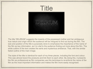
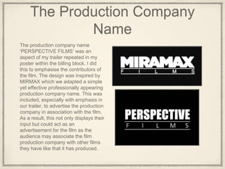
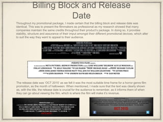
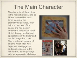
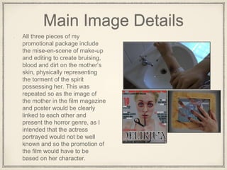
How effective is the combination of
your main product and ancillary
texts?
When moving on to our ancillary tasks (film poster
and film magazine cover), we had to ensure there
were clear links to our trailer as it would portray a
more professional promotional package.
Title
The title 'DELIRIUM' suggests the insanity of the possessed mother and her ambiguous
true nature and origin which the audience will be intrigued to find out during the film. The
size and position of the title is purposely done to emphasize the importance of the name of
the film as key information, as it is vital to the audience finding out more about the film. The
white outline of the text creates the eerie and mysterious ambience. That, with the similar
faded outline of the main image.
The style of the title is identical for each of my three pieces, including the font and colour.
This was almost brand the products and link them to each other. By doing this, it presents
the film as professional as film companies use this technique to re-enforce the name of the
film as the most important information and makes the film more easily recognised.
The Production Company
Name
The production company name
‘PERSPECTIVE FILMS’ was an
aspect of my trailer repeated in my
poster within the billing block. I did
this to emphasise the contributors of
the film. The design was inspired by
MIRMAX which we adapted a simple
yet effective professionally appearing
production company name. This was
included, especially with emphasis in
our trailer, to advertise the production
company in association with the film.
As a result, this not only displays their
input but could act as an
advertisement for the film as the
audience may associate the film
production company with other films
they have like that it has produced.
Billing Block and Release
Date
Throughout my promotional package, I made certain that the billing block and release date was
identical. This was to present the filmmakers as professional as my research showed that many
companies maintain the same credits throughout their product’s package. In doing so, it provides
stability, structure and assurance of their imput amongst their different promotional devices. which alter
to suit the way they want to appeal to their audience.
The release date was ‘OCT 2015’ as we felt it was the most suitable time frame for a horror genre film
promotion, as the month of halloween. When mentioned, I made sure that the text was clearly shown
as, with the title, the release date is crucial for the audience to remember, as it informs them of when
they can go about viewing the film, which is where the film will make it’s revenue.
Conventional Details
As modern society is rapidly growing more technophilic with the introduction of
further advancements in technology, I felt it necessary to incorporate this into
the promotional package. This is evident through the representation of
conventional details such as web addresses and social media links. This allows
the audience to connect with the product through different platforms and the
production to relay information to them in an immediate way. This also acts as
a extremely effective advertisement, as aspects of the websites, like
‘@DELIRIUM’ can be spread through the audience’s use, encouraging
communication about the film. As a result, creating a widely spread promotion
of the film, ranging possibly international with relatively no cost.
The Main Character
The character of the mother
is the main character, and so
I have involved her in all
three pieces of the
promotional package, even
twice in the case of the
poster and her identity
behind the mysterious hand,
hinted through her bruised
appearance in the trailer and
the film magazine cover.
This creates an element of
enigma which I felt was
important to engage the
audience’s interest in the
film further, as the package
acts as a promotional device
Main Image Details
All three pieces of my
promotional package include
the mise-en-scene of make-up
and editing to create bruising,
blood and dirt on the mother’s
skin, physically representing
the torment of the spirit
possessing her. This was
repeated so as the image of
the mother in the film magazine
and poster would be clearly
linked to each other and
present the horror genre, as I
intended that the actress
portrayed would not be well
known and so the promotion of
the film would have to be
based on her character.
Conclusion
I feel I have created a realistic appearing
promotional package that portrays many
details that link the three pieces to each
other and reference the film trailer greatly. I
aimed to incorporate as many aspects of
the plot as possible, while still generating
an element of enigma about the film, which
I felt would act well to engage the
audience’s interest in the film plot and
characters further.

Question 2 (3)

  • 1.
    How effective isthe combination of your main product and ancillary texts? When moving on to our ancillary tasks (film poster and film magazine cover), we had to ensure there were clear links to our trailer as it would portray a more professional promotional package.
  • 2.
    Title The title 'DELIRIUM'suggests the insanity of the possessed mother and her ambiguous true nature and origin which the audience will be intrigued to find out during the film. The size and position of the title is purposely done to emphasize the importance of the name of the film as key information, as it is vital to the audience finding out more about the film. The white outline of the text creates the eerie and mysterious ambience. That, with the similar faded outline of the main image. The style of the title is identical for each of my three pieces, including the font and colour. This was almost brand the products and link them to each other. By doing this, it presents the film as professional as film companies use this technique to re-enforce the name of the film as the most important information and makes the film more easily recognised.
  • 3.
    The Production Company Name Theproduction company name ‘PERSPECTIVE FILMS’ was an aspect of my trailer repeated in my poster within the billing block. I did this to emphasise the contributors of the film. The design was inspired by MIRMAX which we adapted a simple yet effective professionally appearing production company name. This was included, especially with emphasis in our trailer, to advertise the production company in association with the film. As a result, this not only displays their input but could act as an advertisement for the film as the audience may associate the film production company with other films they have like that it has produced.
  • 4.
    Billing Block andRelease Date Throughout my promotional package, I made certain that the billing block and release date was identical. This was to present the filmmakers as professional as my research showed that many companies maintain the same credits throughout their product’s package. In doing so, it provides stability, structure and assurance of their imput amongst their different promotional devices. which alter to suit the way they want to appeal to their audience. The release date was ‘OCT 2015’ as we felt it was the most suitable time frame for a horror genre film promotion, as the month of halloween. When mentioned, I made sure that the text was clearly shown as, with the title, the release date is crucial for the audience to remember, as it informs them of when they can go about viewing the film, which is where the film will make it’s revenue.
  • 5.
    Conventional Details As modernsociety is rapidly growing more technophilic with the introduction of further advancements in technology, I felt it necessary to incorporate this into the promotional package. This is evident through the representation of conventional details such as web addresses and social media links. This allows the audience to connect with the product through different platforms and the production to relay information to them in an immediate way. This also acts as a extremely effective advertisement, as aspects of the websites, like ‘@DELIRIUM’ can be spread through the audience’s use, encouraging communication about the film. As a result, creating a widely spread promotion of the film, ranging possibly international with relatively no cost.
  • 6.
    The Main Character Thecharacter of the mother is the main character, and so I have involved her in all three pieces of the promotional package, even twice in the case of the poster and her identity behind the mysterious hand, hinted through her bruised appearance in the trailer and the film magazine cover. This creates an element of enigma which I felt was important to engage the audience’s interest in the film further, as the package acts as a promotional device
  • 7.
    Main Image Details Allthree pieces of my promotional package include the mise-en-scene of make-up and editing to create bruising, blood and dirt on the mother’s skin, physically representing the torment of the spirit possessing her. This was repeated so as the image of the mother in the film magazine and poster would be clearly linked to each other and present the horror genre, as I intended that the actress portrayed would not be well known and so the promotion of the film would have to be based on her character.
  • 8.
    Conclusion I feel Ihave created a realistic appearing promotional package that portrays many details that link the three pieces to each other and reference the film trailer greatly. I aimed to incorporate as many aspects of the plot as possible, while still generating an element of enigma about the film, which I felt would act well to engage the audience’s interest in the film plot and characters further.