Download to read offline
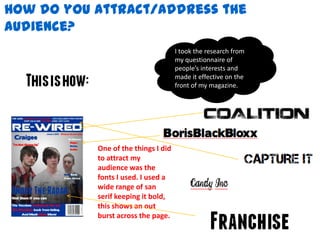
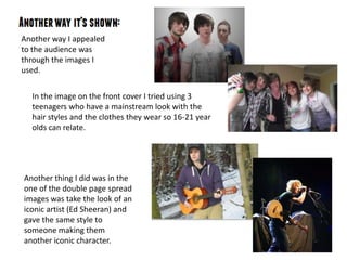
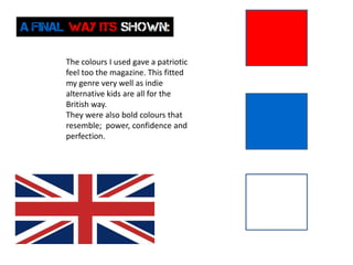

The document discusses strategies for attracting a target audience to a magazine. It used bold sans-serif fonts and large images on the cover to stand out visually. The cover image featured mainstream-looking teenagers to appeal to 16-21 year olds. An inside spread featured an iconic artist's style given to another person to create a new iconic character. Bold, patriotic colors were used that conveyed power, confidence and perfection to match the indie, alternative genre.


