How did you attract
•Download as PPTX, PDF•
0 likes•107 views

The document discusses how the author addressed their audience in designing an alternative hip hop magazine. They used bright colors and clear taglines to attract attention and convey the magazine's focus. Articles on popular artists and exclusive stories were included to interest and inform readers. The language and format of interviews aimed to be relatable while maintaining a formal tone. Layout and stylistic elements mimicked a successful magazine to appear professional and appeal to the target audience of students.

Recommended
More Related Content
What's hot
What's hot (19)
Similar to How did you attract
Similar to How did you attract (20)
How did you attract
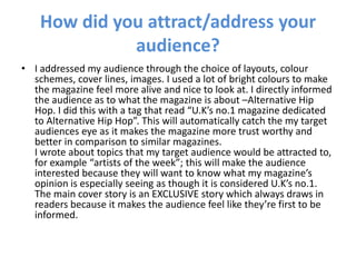
- 1. How did you attract/address your audience? I addressed my audience through the choice of layouts, colour schemes, cover lines, images. I used a lot of bright colours to make the magazine feel more alive and nice to look at. I directly informed the audience as to what the magazine is about –Alternative Hip Hop. I did this with a tag that read “U.K’s no.1 magazine dedicated to Alternative Hip Hop”. This will automatically catch the my target audiences eye as it makes the magazine more trust worthy and better in comparison to similar magazines.I wrote about topics that my target audience would be attracted to, for example “artists of the week”; this will make the audience interested because they will want to know what my magazine’s opinion is especially seeing as though it is considered U.K’s no.1. The main cover story is an EXCLUSIVE story which always draws in readers because it makes the audience feel like they’re first to be informed.
- 2. How did you attract/address your audience? I decided to write an article in an interview form, I did this because most articles in Magazines that I researched (Vibe) are in interview form and this institution is really successful and I wanted my magazine to be as successful too. The language Iused was formal to an extent but I made the content flow a bit better and have a more chatty tone which would appeal to my target audience as they would be able to relate to what the artist is saying.
- 3. How did you attract/address your audience? I followed the layout and style of a Vibe magazine. I decided to follow it’s house style because I wanted my magazine to look realistic and effective. For example I looked at the positioning of the cover picture and meanings of cover lines and images and followed them when I created my magazine to produce a similar, professional end result. As my target audience would probably be students I made my magazine at a low price of £2.25. The price is affordable in disposable income. I put the issue number as a high number, so it shows the audience that the magazine is successful and has a good circulation.