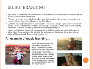
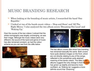
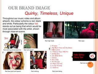
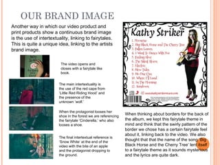
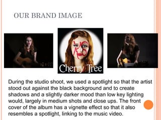
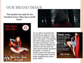
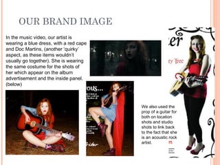
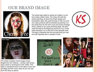
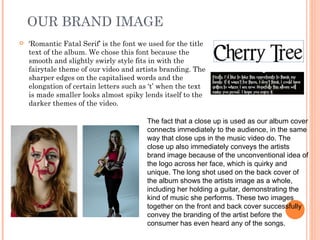
The document discusses branding in the music industry and provides an example of how One Republic has maintained a consistent brand image across their music videos and album covers. It then provides a hypothetical example of how a fictional artist's brand image is conveyed through elements like color scheme, references to fairytales in the visuals, lighting, locations, and costumes of the artist. The brand image is described as "Quirky, Timeless, Unique." Examples are given of how these elements spread the brand image across a music video and album packaging like the artwork, advertisements, and thank you pages.
The document discusses how to effectively create and maintain a brand identity for a new artist entering the music industry. It emphasizes using consistent themes, styles, colors and imagery across all media texts, such as the music video, album covers, and magazine advertisements, to build recognition of the artist's brand among the target audience. Benchmarking against a similar existing successful brand helped inform the desired brand identity. The chosen brand identity for this artist portrayed her as quirky, colorful, and confident to appeal to the target demographic of 16-25 year old females.
The document discusses branding in advertising and music. It provides examples of how Cadbury and Coca-Cola use branding in their advertisements to convey emotional connections to their brands rather than directly promoting their products. Music branding is also examined, with One Republic used as an example of maintaining a consistent brand image across their music videos and album covers through elements like color schemes, imagery and themes. The document then proposes a brand image of "Quirky, Timeless, Unique" for a fictional music artist and analyzes how this brand would be conveyed through elements in a music video, album artwork and promotional materials.
Question Two: How effective is the combination of your main product and ancil...Betty10
The document discusses how an artist's brand identity was created to help her break into the competitive music industry.
1) Consistency was key - the same themes, colors, fonts, and imagery were used across the music video, album covers, and magazine advert to create recognizability.
2) Bright colors, quirky styles, and themes of individuality and confidence were used to appeal to the target audience of 16-25 year old females.
3) An existing successful brand was benchmarked to help decide how to position this artist's brand to stand out among competitors while still conforming to audience expectations.
The document discusses branding in the music industry and provides examples of how branding was used to create a memorable image for a fictional band. It explains that the band's branding portrays a fun, quirky, retro, down-to-earth image through consistent use of bright colors, casual costumes, a recurring fox motif, and a vintage-inspired logo and font across all products including a music video, album cover, poster, and digital packaging. The branding aims to position the band as approachable while still adhering to indie-pop genres and fulfilling audience needs through social identification.
The document discusses how effective the combination of a main product and ancillary texts can be through establishing a clear product identity. It analyzes examples from artists like Amy Winehouse, Adele, and Duffy to see how their music videos, CD covers, and magazine ads work cohesively through consistent branding elements like simplicity, similar imagery and colors. The document also evaluates how the combination of products created for this evaluation project establish relationships with the music video through narrative and performance imagery, color schemes, and clear connections to the song's message and themes.
The document provides an evaluation of a media studies project. It summarizes how the media product uses forms and conventions of real media, including using silhouettes to create a visual identity for the band like real artists. It challenges conventions by creating an intimate connection between viewer and artist rather than togetherness. Feedback showed the storyline could be clearer. The student learned audience feedback is important to understand who characters are. Media technologies like Photoshop, Premiere and blogging were used effectively in the research, planning, construction and evaluation stages.
This document discusses conventions used in drum & bass music videos and promotional materials for albums. It identifies several conventions including: high tempo with quick cuts and camera shots; matching images to the beat; including narratives and urban themes in videos. For promotional materials, conventions discussed are using the artist's name, album title, images, release date, record label, and reviews. The document compares examples from Pendulum and Chase & Status to analyze how their promotional materials follow conventions and how the student's materials align with conventions as well.
The digipak meets many conventions of real music products through consistent fonts, colors, and emphasis on the artist's name and album title. It challenges conventions by cutting off parts of images and including the artist's social media instead of producer details. While mostly conventional, elements like a handwritten font and messages from the artist aim to feel authentic yet distinctive. Overall, the design draws from typical digipak styles but incorporates some original elements.
The document contains examples of advertisements for music albums and singles. Most ads follow similar conventions, including displaying the band name, album name and artwork, and release date. Some ads provide more information like the record label, available formats, and unique selling points to draw in audiences. A few ads take a more minimal approach, leaving out details to encourage further research from interested viewers.
This promotional poster uses size, font styles, and imagery to emphasize important information and create an appealing design. The artist's name is the largest text to highlight their importance. The main image takes up most of the space to promote the album. Inclusion of the record label and websites provide legitimacy. Overall, the poster utilizes visual elements effectively to catch the audience's attention and promote the product.
The document provides initial ideas and planning for two potential student projects: a music video and a horror film teaser trailer. For the music video, the student analyzed reference music videos and selected "Fix You" by Secondhand Serenade, with a narrative of a struggling relationship. For the teaser trailer, the genre of horror was chosen, and the story would involve a woman discovering paranormal activity after moving into a new house. Both projects emphasize using mise-en-scene, color schemes, and editing techniques to effectively set the tone and convey the narrative in a short format.
The combination of the artist's music video, CD covers, and advert is effective because it creates consistency across the products. Flowers and fonts are used prominently and consistently to convey specific themes and ideas. Flowers represent hope, life, and recovery at first but then shift to represent anguish and pain. Bright colors are used initially but then give way to darker tones to reflect the emerging despair. Graffiti fonts are used to portray the artist's unconventional nature and authenticity, while handwritten fonts suggest vulnerability. Together, these visual elements effectively combine to support the narrative and message of the music video and album.
The document discusses the evaluation of a music video project. It summarizes how the music video challenges conventions by using a nonlinear dream sequence narrative format. It also discusses how the cinematography, editing, and sound design follow technical conventions. Audience feedback indicated some confusion with the dream sequence but appreciation for the humor. The document also describes the use of new media technologies in researching, planning, constructing, and evaluating the project.
Mima Productions chose their company name based on the founder's name to be short, simple and personal. Logos help develop familiarity with a studio and build reputation by allowing audiences to associate the logo with the genre a company produces. Logos are also accompanied by music and color schemes that further suggest the genre through being melodic or certain tones for a peaceful or dramatic feel. Mima Productions' initial logo design evolved into their final logo to represent these goals.
The document discusses conventions of pop music videos, such as bright colors and provocative artist attire. It then summarizes how the group's music video challenges some conventions by not using very bright colors or showing much skin. The actress is covered up. The document also discusses how the group's CD cover challenges conventions by not using many primary colors and instead focusing on neutral tones with some color on clothes to draw attention to the artist.
The campaign to promote Matrix's album and single release consisted of a CD digipack, website, and music video. The website uses dark backgrounds and contrasting colors to create an unconventional brand image representing the alternative techno genre. It promotes Matrix as a mysterious DJ through images that reference artists like the Joker to appeal to fans of this niche music. The campaign effectively uses these products together across different platforms to market Matrix and the label to techno audiences online and in magazines.
The combination of the artist's print production work and music video was mostly effective but could have been improved. The print production used consistent colors, fonts, and imagery to be recognizable as a package. However, the lighting and colors were not fully consistent between the polished print materials and homemade-looking video. Improvements could have included more consistent lighting in the video and filming some scenes in a studio to better match the print package.
The document discusses how the media product uses conventions of real rap music genres. It analyzes characteristics like urban locations, flashy displays of wealth, close-ups of the artist, and fast-paced montages. The product aims to match conventions through the artist's clothing, locations, and poses that emphasize confidence and expensive tastes. It also strives to relate visuals to lyrics through fonts, basketball scenes, and synchronized dancing. Overall, the product works to develop relationships between music and visuals to engage audiences through a consistent visual style and brand identity.
The document provides information and inspiration for designing a digipak advert. It analyzes existing digipak advert designs from various artists such as Janet, Beyonce, Katy Perry, Avril Lavigne, and Taylor Swift. Key elements that are commonly included and should be considered for the new design are:
1) A strong image of the artist to draw attention.
2) Details on the album release date.
3) An image of the album design to promote recognition.
4) Bold text listing the artist name and album title.
5) An eye-catching layout that follows design principles.
6) Cohesive branding through colors and fonts that match the album style
Billboard magazine analyzes Beyoncé's latest album and concert. The front cover features a close-up photo of Beyoncé looking at the camera to grab readers' attention. Inside, a double-page spread contains black and white photos of Beyoncé in different poses and outfits with a quote from her interview. The target audience is teens aged 16 to young adults aged 26 interested in various music genres, as the magazine provides chart updates across rock, pop, R&B and more in a mature layout.
The document discusses how branding and consistency across products is important for establishing an artist's image and brand within the R&B music genre. It analyzes Chris Brown's brand image of being young, energetic, and appealing to female audiences. To brand their own artist, the document's creator followed Chris Brown's style cues and conventions of the R&B genre in their music video, album cover, and magazine advert through elements like clothing, jewelry, and background colors and themes. They aimed to clearly link their artist to Chris Brown's brand and the R&B genre overall through a consistent presentation across ancillary materials.
Ninthuja Saseetharan evaluated their media product which was a music video for the song "Move it 2 the drum" by DJ Chuckie featuring Hardwell. Some key points:
- The music video uses a non-linear dream sequence format which challenges conventions of typical music videos.
- Technical elements like camera work, editing and sound techniques follow conventions to maintain quality.
- The video drew inspiration from other music videos with similar club scene themes.
- Feedback was generally positive about the humorous elements and club atmosphere, but some found the dream sequence confusing.
- New media technologies like YouTube, Photoshop and social media were used in the research, planning, construction
The document describes the student's media product, which is a magazine focused on the genres of rap and R&B. The target audience is both male and female aged 16-25. Through research, the student found these genres appeal to both genders in this age range. The magazine was designed using conventions from real music magazines like layout, imagery positioning, and color schemes.
Our music video production used, developed, and challenged conventions of the indie genre in several ways:
1) The costumes and props were generally conventional for the genre to communicate the romance subplot, while the main characters' clothing challenged norms.
2) The camerawork during memories was stable to contrast with handheld shots during the emotional breakdown, conforming to genre conventions.
3) Editing followed beats but also used color grading and pacing to highlight the indie aesthetic and narrative.
4) The main challenge was portraying the main characters as a homosexual couple to increase LGBTQ representation, challenging typical music industry representations.
GovDelivery at the City of Raleigh by Beth StagnerGranicus
Beth Stagner, IT Manager for the City of Raleigh, discussed how the city implemented GovDelivery to improve citizen communications. Prior to GovDelivery, the city used multiple isolated systems. GovDelivery provided a single platform to reach citizens across departments. After testing in 2011, the city launched GovDelivery city-wide in 2012. Since launching, the city has seen subscriber growth, high engagement rates, and cost savings from reducing printed newsletters. Popular topics include parks, arts, and planning information. GovDelivery has helped standardize branding and reach more citizens through centralized communications.
Collin the caterpillar and his friends decide to play a game of hide and seek. Ladybird closes her eyes to count while the others hide. When it's time to look, Ladybird finds the snail, butterfly, and bee but can't find where Collin is hiding. Collin shouts that he's here but now Annie is missing.
Scott Burns, CEO & co-Founder, GovDelivery "The State of Digital Communications" presentation at GovDelivery's 2013 Digital Communications Tour: Minnesota stop on February 5, 2013.
This document provides an equity research report on China from J.P. Morgan. It recommends buying shares of Chinese banks, as they have potential for upside in net interest margins and asset quality. While macroeconomic data appears encouraging, details show discretionary spending weakening and lack of pricing power, suggesting earnings estimates for 2013 may be too high. Banks offer the possibility of growth given expectations for better net interest margin outcomes in the third quarter and improved asset quality in 2013.
Jeff Freeland Nelson, Founder & CEO, Play from ScratchGranicus
Jeff Freeland Nelson, Founder & CEO, Play from Scratch keynote presentation from GovDelivery's 2013 Digital Communication Tour: Minnesota Stop - February 5, 2013.
The document summarizes research on factors that influence college students' spending habits and credit card debt. It finds that easy access to credit, lack of financial education, social influences, poor academic performance, insufficient financial aid, and low family income can all contribute to students taking on unhealthy debt levels. Students who are female, minorities, older, or come from families with less income or financial support tend to be more at risk of accumulating credit card debt during college. While some research is still needed, social and economic factors clearly impact students' financial choices and well-being.
The document outlines the Greeks Stay Strong teaching model, which was designed to educate Greek students on safer partying practices. The model consists of 3 phases - Join Strong, Learn Strong, and Stay Strong. Join Strong involves students pledging to party safely. Learn Strong includes an interactive session with a relatable speaker addressing safe partying. Stay Strong provides optional crisis management training. The model was piloted successfully at Michigan State University and is now available for any college to adopt to address alcohol and drug risks in Greek communities.
Best Practices in making Learning Social & FunTeamie
The document discusses best practices for building social learning networks. It outlines 5 key practices: 1) Build learning communities for ongoing learning discussions, 2) Create shared and collaborative multimedia content, 3) Share and build experiences through peer learning, 4) Reward participation through gamification, and 5) Facilitate collaborative learning rather than solely teaching. The key is that social and collaborative learning drives engagement better than formal education alone. Technology can enable the delivery of social learning experiences.
The document discusses how parents use information and communication technologies (ICT). It finds that parents use a wide range of devices for activities like communication, information seeking, social connection, and self-expression. Parents' technology use is individualized based on factors like income, education, and skills. It is also complementary, as parents get information from both online and offline sources. Parenting educators should capitalize on parents' digital connections by using technology to deliver education and complement informal learning. Educators also need competency in technology integration according to standards for effective practice.
El documento describe la evolución del conocimiento científico desde la antigua Grecia hasta la época moderna. Comienza con Sócrates, Platón y Aristóteles que sentaron las bases de la filosofía y el razonamiento lógico. Luego, durante la Edad Media el conocimiento se centró en la teología. El Renacimiento trajo el enfoque en el ser humano y el método científico experimental. Figuras como Copérnico, Galileo y Descartes further desarrollaron el razonamiento deductivo e inductivo. La Ilustración popular
The document provides an overview of the Bible, including:
- It is divided into the Old Testament and New Testament
- The Old Testament contains the Pentateuch, Historical Books, Wisdom Books, and Prophetic Books
- The New Testament contains the Gospels, Acts of the Apostles, Pauline Letters, General Epistles, and Revelation
- There are differences in the contents of the Catholic and Protestant Bibles, with the Catholic version containing additional books.
Social media role in cost effective communications (CAPIO)Granicus
Scott Burns presenting on social media's role in cost effective digital communications at the 2012 Annual Conference for the California Association of Public Information Officers (CAPIO).
Bibliografía:
B-Learning utilizando software libre,
una alternativa viable en Educación Superior
Julio César GONZÁLEZ MARIÑO
Universidad Autónoma de Tamaulipas. Mexico
LMS 2.0 - Tools for the Next Gen of LearnersTeamie
The document discusses the evolution of learning management systems (LMS) from LMS 1.0 to LMS 2.0. LMS 1.0 tools had low usage and usability, expensive customizations, and a non-intuitive user interface. However, the changing landscape with social media, mobile devices, and learning/workplace trends requires LMS 2.0 to be more social, collaborative, engage users with open/user-generated content, and facilitate learning anywhere on any device through the cloud. Key characteristics of LMS 2.0 include social communities, discovery/subscriptions, personalized learning, gamification, and cloud/mobile delivery to drive a more engaged and effective learning experience.
The document summarizes a student's advanced portfolio coursework project creating a music video with an indie/rock theme. The student worked with a friend to film and write up the project, contributing equally. Their target audience was defined using demographic profiling as mainly white, aged 16-24, from socio-economic class C1. The music video fulfills conventions of the genre through visuals relating to lyrics and music. Album covers were also created to appeal to the target indie audience and maintain the edgy brand image established.
The document summarizes feedback received on a student group's music video and ancillary materials for a dancehall song. The group's video took a unconventional approach for the genre by not including large dance scenes or overly sexualizing the female dancer. Audience feedback was that the video was confusing but enjoyable. The group learned to plan shoots better and use proper equipment. Feedback on their print materials was positive, though different fonts were used. The group learned to work together more cohesively. New media technologies helped at all stages of production from research to planning to evaluation.
The student created a music video for the song "Rum and Redbull" in the dancehall genre. Their video challenged some conventions of typical dancehall videos by separating the male and female scenes and focusing more on the concept than large dance scenes. They received positive feedback on their video and print materials from audiences. The bright colors and Jamaican flag theme in the prints were well-received. The student learned they should have planned shoots better and had more faith in their team members. New media technologies like digital cameras and editing software helped at all stages of production but issues like broken equipment caused some difficulties.
Our music video for the song "Bunker Hill" by Red Hot Chili Peppers challenges conventions of real music videos in several ways. We show rebellion in a modern context through elements like modern clothing, graffiti, and isolated settings. The mask worn by our main character both promotes our fictional band "Tooz" and alludes to the film V for Vendetta. Across our music video and additional products like a magazine ad and album digipak, we maintain elements like the mask and flames to maintain continuity while conveying the theme of rebellion.
The student created a music video for the song "Rum and Redbull" in the dancehall genre. Their video challenged dancehall conventions by separating the male and female scenes rather than having them dance together. It also focused more on the concept than large dance scenes. They received positive feedback on the video and print materials, though some noted it was confusing. The student learned they should plan shoots better, have more faith in their team, and coordinate print design elements. New media technologies helped at all stages, from research to filming with a digital camera to editing with Final Cut Pro and designing print materials in Photoshop.
A digi-pak is a form of CD packaging that protects the disk. It can hold one or two disks and includes pictures on the inside and outside, usually promoting the artist. Album covers normally display the artist's name so audiences know who it is, as well as the album name so consumers know what they are buying. Covers also commonly feature pictures of the artist to create iconography that allows audiences to identify them. Continuity is important, so elements like color schemes, text styles, and images are often repeated across the front and back covers.
The document discusses how the creator effectively combined the main music video product with ancillary texts (album digipak and magazine advert) to promote the fictional artist Darcy Jones. Specifically, it maintained Darcy's character traits of being strong and independent across all products by having her look directly at the camera. It also showed her softer side by having her look away, and portrayed happy memories in black and white. Unifying stylistic elements like a vintage effect and similar location in the video and photos helped combine the pieces into a cohesive promotion of Darcy Jones' image.
This document summarizes the effectiveness of combining the main music product with ancillary texts such as the music video, website, and album cover. While subtle connections were made between the products through consistent use of imagery like crosses and baths, and fonts, the bold colors of the ancillary texts did not translate well to the music video locations. Overall, more direct references could have been made between the character and stylistic elements of the ancillary texts to better tie the music products together as a cohesive package.
The three products - a music video, magazine advertisement, and album digipak - were connected through their shared theme of a strong, independent female protagonist. The music video stood out from typical romantic R&B videos by portraying the protagonist happily moving on from a breakup rather than pining for her ex. Stills from the video informed the images chosen for the digipak and magazine ad to maintain consistency across products while symbolizing different aspects of the relationship. However, the products each had distinct identities and increasing their synergy could have been achieved through using the same image across all pieces.
The document discusses how the media product uses and develops conventions of real media products. It summarizes how the music video represents the artist through live performance clips, links the visuals and music through meaningful scenes, uses typical busker settings and costumes to portray the musical genre. The digipak and magazine ad also aim to represent the artist and suggest the indie genre through the use of black and white images of the band, typical fonts and layouts, and written content like magazine reviews. Special effects like de-saturating the images create a cohesive black and white theme throughout the promotional package.
The student created a brand image for their fictional band using various elements in their music video and ancillary products. They aimed to portray the band as fun, quirky, and different from other indie-pop bands. Key elements of the brand image included the use of a fox costume, consistent colors, fonts, and repetition of visuals across products. Audience feedback indicated that the brand image successfully conveyed the desired qualities and was unique, especially the fox costume. Minor improvements such as using real musicians were suggested, but overall the branding was deemed effective.
The document discusses how a band created a brand image for themselves to stand out in the music industry. They aimed for an image that was fun, quirky, and carefree while still fitting in the indie-pop genre. To create this image, they used consistent elements like costumes, colors, and a fox mascot across their music video and album packaging. Specifically, they dressed in casual clothing like cardigans and t-shirts in various indie-inspired colors. They also incorporated a mix of bright and dull colors to represent different aspects of indie-pop. Repeating these visual elements helped make the band and their products instantly recognizable and memorable.
The group created a promotional package for the band Arctic Monkeys that included a magazine advertisement, music video, and digipack. The music video focuses more on the girl in the song "Arabella" than the lead singer, challenging conventions. Shots of the band are in black and white to match the original video. Lighting, costumes, and camerawork were chosen to fit indie music video conventions. The advertisement and digipack use dark colors and simple designs that represent the indie rock genre. Some inconsistencies exist, like high key lighting in the digipack, but overall the package uses synergy across products to represent the band and genre.
The document discusses how new media technologies were used at various stages of creating a music video project. In the research stage, search engines and social media were used to find information and contact interview subjects. During filming, a camera, microphone, lights, and editing suite were utilized. Editing was done using Final Cut Pro software. A poster was designed using Microsoft Publisher and Photoshop. Technologies like blogs and file sharing sites were employed to deliver the final work. Overall, new media technologies supported and enhanced the project from initial research through final evaluation and presentation.
This document summarizes the key ways in which the media product uses and develops conventions of real music videos and media products. It discusses conventions of music videos such as demonstrating genre characteristics and relationships between lyrics, music, and visuals. It then describes how the media product incorporates these conventions, such as through shots that reference other music videos and the use of close-ups, angles, and imagery that establish the indie/rock genre. Overall, the document conveys how the media product was influenced by real examples but adapted them in an original way.
The document discusses the effectiveness of combining a music artist's main product with ancillary texts like a magazine ad and CD cover.
The student created a magazine ad and CD cover for their music artist Leyton Benta by researching styles used by artists like Chris Brown, Justin Bieber, and Michael Jackson. They challenged conventions by using vibrant colors and lighting to make Leyton stand out.
Testing found 89% of people found the magazine ad and CD covers appealing due to their vibrant colors. There is synergy between the music video, CD, and magazine ad as they all feature Leyton dressed the same to promote the products together. In the end, the group selected the student's CD cover and magazine ad as their favorites
How effective is the combination of your main product and ancillary tasks?Alex Reid
This document discusses how brands can effectively combine their main products and ancillary tasks. It provides examples of how music bands have developed strong brand identities through consistent imagery, symbols and styles that are carried across their music, merchandise and media. Maintaining consistency in areas like logo, color scheme, imagery and target audience allows the brand to be easily recognizable and helps boost sales and promotion. The document argues that combining products in a way that clearly communicates the brand's identity makes for an effective overall brand strategy.
A brand is more than just a product - it is the particular make or form of a product that distinguishes it from competitors. Effective branding creates a unique personality or identity for a product to stand out.
The document discusses the branding of heavy metal musician Rob Zombie and his record label Roadrunner Records. It analyzes how Zombie's brand image is created through dark album covers, costumes, music style and font to appeal to fans.
The author then discusses their own heavy metal band brand called "Patchwork Undead" created for Roadrunner Records. Similar elements like dark color schemes, Gothic clothing, sinister lyrics and narrative were used to establish a heavy metal brand identity comparable to Rob Zombie's. Audience
How to Manage Your Lost Opportunities in Odoo 17 CRMCeline George
Odoo 17 CRM allows us to track why we lose sales opportunities with "Lost Reasons." This helps analyze our sales process and identify areas for improvement. Here's how to configure lost reasons in Odoo 17 CRM
ISO/IEC 27001, ISO/IEC 42001, and GDPR: Best Practices for Implementation and...PECB
Denis is a dynamic and results-driven Chief Information Officer (CIO) with a distinguished career spanning information systems analysis and technical project management. With a proven track record of spearheading the design and delivery of cutting-edge Information Management solutions, he has consistently elevated business operations, streamlined reporting functions, and maximized process efficiency.
Certified as an ISO/IEC 27001: Information Security Management Systems (ISMS) Lead Implementer, Data Protection Officer, and Cyber Risks Analyst, Denis brings a heightened focus on data security, privacy, and cyber resilience to every endeavor.
His expertise extends across a diverse spectrum of reporting, database, and web development applications, underpinned by an exceptional grasp of data storage and virtualization technologies. His proficiency in application testing, database administration, and data cleansing ensures seamless execution of complex projects.
What sets Denis apart is his comprehensive understanding of Business and Systems Analysis technologies, honed through involvement in all phases of the Software Development Lifecycle (SDLC). From meticulous requirements gathering to precise analysis, innovative design, rigorous development, thorough testing, and successful implementation, he has consistently delivered exceptional results.
Throughout his career, he has taken on multifaceted roles, from leading technical project management teams to owning solutions that drive operational excellence. His conscientious and proactive approach is unwavering, whether he is working independently or collaboratively within a team. His ability to connect with colleagues on a personal level underscores his commitment to fostering a harmonious and productive workplace environment.
Date: May 29, 2024
Tags: Information Security, ISO/IEC 27001, ISO/IEC 42001, Artificial Intelligence, GDPR
-------------------------------------------------------------------------------
Find out more about ISO training and certification services
Training: ISO/IEC 27001 Information Security Management System - EN | PECB
ISO/IEC 42001 Artificial Intelligence Management System - EN | PECB
General Data Protection Regulation (GDPR) - Training Courses - EN | PECB
Webinars: https://pecb.com/webinars
Article: https://pecb.com/article
-------------------------------------------------------------------------------
For more information about PECB:
Website: https://pecb.com/
LinkedIn: https://www.linkedin.com/company/pecb/
Facebook: https://www.facebook.com/PECBInternational/
Slideshare: http://www.slideshare.net/PECBCERTIFICATION
This presentation includes basic of PCOS their pathology and treatment and also Ayurveda correlation of PCOS and Ayurvedic line of treatment mentioned in classics.
A review of the growth of the Israel Genealogy Research Association Database Collection for the last 12 months. Our collection is now passed the 3 million mark and still growing. See which archives have contributed the most. See the different types of records we have, and which years have had records added. You can also see what we have for the future.
Walmart Business+ and Spark Good for Nonprofits.pdfTechSoup
"Learn about all the ways Walmart supports nonprofit organizations.
You will hear from Liz Willett, the Head of Nonprofits, and hear about what Walmart is doing to help nonprofits, including Walmart Business and Spark Good. Walmart Business+ is a new offer for nonprofits that offers discounts and also streamlines nonprofits order and expense tracking, saving time and money.
The webinar may also give some examples on how nonprofits can best leverage Walmart Business+.
The event will cover the following::
Walmart Business + (https://business.walmart.com/plus) is a new shopping experience for nonprofits, schools, and local business customers that connects an exclusive online shopping experience to stores. Benefits include free delivery and shipping, a 'Spend Analytics” feature, special discounts, deals and tax-exempt shopping.
Special TechSoup offer for a free 180 days membership, and up to $150 in discounts on eligible orders.
Spark Good (walmart.com/sparkgood) is a charitable platform that enables nonprofits to receive donations directly from customers and associates.
Answers about how you can do more with Walmart!"
The simplified electron and muon model, Oscillating Spacetime: The Foundation...RitikBhardwaj56
Discover the Simplified Electron and Muon Model: A New Wave-Based Approach to Understanding Particles delves into a groundbreaking theory that presents electrons and muons as rotating soliton waves within oscillating spacetime. Geared towards students, researchers, and science buffs, this book breaks down complex ideas into simple explanations. It covers topics such as electron waves, temporal dynamics, and the implications of this model on particle physics. With clear illustrations and easy-to-follow explanations, readers will gain a new outlook on the universe's fundamental nature.
Executive Directors Chat Leveraging AI for Diversity, Equity, and InclusionTechSoup
Let’s explore the intersection of technology and equity in the final session of our DEI series. Discover how AI tools, like ChatGPT, can be used to support and enhance your nonprofit's DEI initiatives. Participants will gain insights into practical AI applications and get tips for leveraging technology to advance their DEI goals.
বাংলাদেশের অর্থনৈতিক সমীক্ষা ২০২৪ [Bangladesh Economic Review 2024 Bangla.pdf] কম্পিউটার , ট্যাব ও স্মার্ট ফোন ভার্সন সহ সম্পূর্ণ বাংলা ই-বুক বা pdf বই " সুচিপত্র ...বুকমার্ক মেনু 🔖 ও হাইপার লিংক মেনু 📝👆 যুক্ত ..
আমাদের সবার জন্য খুব খুব গুরুত্বপূর্ণ একটি বই ..বিসিএস, ব্যাংক, ইউনিভার্সিটি ভর্তি ও যে কোন প্রতিযোগিতা মূলক পরীক্ষার জন্য এর খুব ইম্পরট্যান্ট একটি বিষয় ...তাছাড়া বাংলাদেশের সাম্প্রতিক যে কোন ডাটা বা তথ্য এই বইতে পাবেন ...
তাই একজন নাগরিক হিসাবে এই তথ্য গুলো আপনার জানা প্রয়োজন ...।
বিসিএস ও ব্যাংক এর লিখিত পরীক্ষা ...+এছাড়া মাধ্যমিক ও উচ্চমাধ্যমিকের স্টুডেন্টদের জন্য অনেক কাজে আসবে ...
বাংলাদেশ অর্থনৈতিক সমীক্ষা (Economic Review) ২০২৪ UJS App.pdf
Question 2 updated
1. HOW EFFECTIVE IS THE
COMBINATION OF YOUR
MAIN PRODUCT AND
ANCILLARY TASKS?
Jayne Summers
2. WHAT IS BRANDING?
A brand is a particular make of a product.
Branding is the result of mass production. With more and more
makes available to consumers, products had to be given a certain
‘personality’ to encourage buyers.
Branding is about creating an image that people will link to a
particular type of product.
“Competitive branding became a necessity of the machine
age - within a context of manufactured sameness, image
-based difference had to be manufactured along with the
product.” - Naomi Klein, ‘No Logo.’
3. The following two advertisements are examples
of branding which I will discuss on the next
slide…
4. EXAMPLES OF
BRANDING
“Advertising today is not merely about selling products; it is
about selling a brand, a dream, a message.” - Katharine
Viner.
Coke Cola also
Cadburys
continue their
continue their
brand image
brand image
through their
with the colour
logo (company
purple for their
name) and
products and
colour scheme,
their logo, which
particularly
is ‘Cadbury’ in
reds.
the familiar
white swirl.
Although the Cadburys advert has minimal The brand image for Coca Cola is youth, fun and
relevance to the actual product, it still conveys friendship. Again, the advert doesn’t seem
the brand image. Because Cadburys is such an particularly related to the product, (though more
established company, they can produce so than Cadburys), However, Coca Cola also
adverts which do not contain the actual product humanise their product and allow people to relate
but still trigger the emotional response the to it in a more personal way, which encourages
audience link to the product, making them more their target audience to buy the drink – in this
likely to buy it. For Cadburys this is a brand case young people, who, as you can see, the
image of joy and fun – “a glass and a half full of advertisement targets.
joy.”
5. MUSIC BRANDING
Branding in the music industry is used to differentiate between similar music styles, by
looking to the artist themselves.
The way an artist is branded can affect how their audience feels about them, and is a
way to attract a certain audience in the first place.
A brand for an artist is created through their consistent image, style, mise-en-scene of
music videos and artwork and their personality. This brand image may change slightly
over time to reflect changes of the artist eg: them growing up.
A successful brand image will be apparent in all of the artists work and will create a
clear idea of that artist in the mind of the audience, so if they see the artists album,
they will immediately know who it belongs to.
An example of music branding…
This is the album cover for the
Marina And The Diamonds
album ‘Radioactive’ and two
stills from the video of the same
name. As you can see, the
branding of the artist is obvious
through both products – through
location, artists style/costume
and colour scheme. If you looked
at one product without the other,
you would still be able to tell that
the two go together.
6. MUSIC BRANDING RESEARCH
When looking at the branding of music artists, I researched the band ‘One
Republic.’
I looked at two of the bands music videos – ‘Stop and Stare’ and ‘All The
Right Moves.’ I also analysed the two album covers ‘Dreaming Out Loud’ and
‘Waking Up.’
Over the course of the two videos I noticed that the
artists iconography was largely unchanging, as was
their image. Although the music videos were very
different, the sound of the band and genre of music
has also remained constant, as had the colour
scheme as you can see from the stills below.
The two album covers also show how branding
has remained basically the same. Both covers
have quite abstract images on the front, which
are not directly relating to any of the songs,
reflected in the sometimes quite abstract
meaning of the bands videos. The titles of the
albums suggest the only change is that the band
has grown up slightly and become more
confident, as ‘Waking Up’ suggests a more
definite sound that ‘Dreaming.’
7. OUR BRAND IMAGE
Quirky, Timeless, Unique
Throughout our music video and album
artwork, the colour scheme is red, black
and white. Particularly the colour red
stands out as being that which would be
most associated with the artist, shown
through mise-en-scene.
Red high heels Red cape
Red clothing and accessories Red nail varnish
Red text and logo
Red face paint and lipstick Red clothing Red track listing
8. OUR BRAND IMAGE
Another way in which our video product and
print products show a continuous brand image
is the use of intertextuality, linking to fairytales.
This is quite a unique idea, linking to the artists
brand image.
The video opens and
closes with a fairytale like
book.
The main intertextuality is
the use of the red cape from
‘Little Red Riding Hood’ and
the presence of the
unknown ‘wolf.’
When the protagonist looses her
shoe in the forest we are referencing
When thinking about borders for the back of
the fairytale ‘Cinderella,’ who also the album, we kept this fairytale theme in
looses a shoe. mind and think that the swirly pattern of the
border we chose has a certain fairytale feel
about it, linking back to the video. We also
The final intertextual reference is
‘Snow White’ at the end of the
thought that that the name of the song ‘Big
video with the bite of an apple Black Horse and the Cherry Tree’ lent itself
and the protagonist dropping to to a fairytale theme as it sounds mysterious
the ground. and the lyrics are quite dark.
9. OUR BRAND IMAGE
During the studio shoot, we used a spotlight so that the artist
stood out against the black background and to create
shadows and a slightly darker mood than low key lighting
would, largely in medium shots and close ups. The front
cover of the album has a vignette effect so that it also
resembles a spotlight, linking to the music video.
10. OUR BRAND IMAGE
The location we used for the
narrative of our video was a small
forest.
For our album advertisement
and thank you page we used
shots taken on-location, rather
than in the studio. This spreads
the brand image across both
the video and artwork, as the
setting is directly relatable and
someone who has seen the
video would instantly recognise
the poster. A number of
location shots were also used
in our montage panel, with the
poses suggesting the artists
quirky nature.
11. OUR BRAND IMAGE
In the music video, our artist is
wearing a blue dress, with a red cape
and Doc Martins, (another ‘quirky’
aspect, as these items wouldn’t
usually go together). She is wearing
the same costume for the shots of
her which appear on the album
advertisement and the inside panel.
(below)
We also used the
prop of a guitar for
both on location
shots and studio
shots to link back
to the fact that she
is an acoustic rock
artist.
12. OUR BRAND IMAGE
The artists logo (right) is simply her initials in a red
font inside a black circle. The colour fits with the
artists branding, as does the simple design and
handwritten style. We used the logo in both our print
and video products (left and below) by painting it on
the artists face for the front cover and some montage
shots, adding to her quirky branding style. We also
used the logo at the beginning and end of our music
video because it is on the front of the fairytale book.
The logo is therefore the first and last thing you see
and will hopefully stick in peoples minds.
The artists ‘timeless’ brand image comes
largely from her makeup – red lips, with smoky
eyes; which is reminiscent of the 1930s. This
style is maintained both on the album cover and
montage and the music video as you can see
from the close up above.
13. OUR BRAND IMAGE
'Romantic Fatal Serif’ is the font we used for the title
text of the album. We chose this font because the
smooth and slightly swirly style fits in with the
fairytale theme of our video and artists branding. The
sharper edges on the capitalised words and the
elongation of certain letters such as ‘t’ when the text
is made smaller looks almost spiky lends itself to the
darker themes of the video.
The fact that a close up is used as our album cover
connects immediately to the audience, in the same
way that close ups in the music video do. The
close up also immediately conveys the artists
brand image because of the unconventional idea of
the logo across her face, which is quirky and
unique. The long shot used on the back cover of
the album shows the artists image as a whole,
including her holding a guitar, demonstrating the
kind of music she performs. These two images
together on the front and back cover successfully
convey the branding of the artist before the
consumer has even heard any of the songs.