
Recommended
More Related Content
What's hot
What's hot (20)
Similar to Magazine 4th draft & reflection
Similar to Magazine 4th draft & reflection (20)
Recently uploaded
Recently uploaded (20)
Magazine 4th draft & reflection
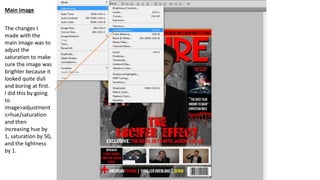
- 1. The changes I made with the main image was to adjust the saturation to make sure the image was brighter because it looked quite dull and boring at first. I did this by going to image>adjustment s>hue/saturation and then increasing hue by 1, saturation by 50, and the lightness by 1. Main image
- 2. I decided to make this change and thought it looked better for my magazine because it would help me appeal to my younger target audience, and it also suits the house style of Empire magazine since they like to use lots of colour in their main images connoting their films are modern.
- 3. I used the text tool to change the wording of the skyline to ‘My Friend Dahmer: First look at the scene’s thriller epic’ to try and suit the conventions of Empire magazine skylines. My Friend Dahmer is a 2017 thriller film. Empire magazine skylines tend to feature exclusive content only in particular films within the similar genre to the main film featured on the cover. This is what I’ve seen in most of their magazines from my research. SKYLINE
- 4. From my previous draft, the font used was different and I realised Empire use serif fonts for their date and price. I applied this to my product by by using Da Fonts to install the Sans Serif font and made my date and price ‘October 2018 £3.99’ whereas the real media text above is charged at £4.99. I set this price at £3.99 to attract a larger audience segment i.e. those on lower incomes such as younger teenagers so they too can purchase the magazine too because I intend to target a young audience. I’ve also set the prices in dollars too just like the real media text above which is what Empire usually do in order to widen their product to a global audience.
- 5. I noticed that with most Empire magazine cover lines they contain these boxes surrounding them. They usually do this to section out or categorise the different story types by colour coding them. I applied this in my product by using the shape tool on Photoshop to create white boxes outside the specified movie articles such as Gone Girl and Shutter Island to let the audience know it's about the film itself. I then developed this convention by using blending options to add a shiny effect to the large film names to catch the audience's attention. 'Gone Girl – Did Nick Dunne kill Amy Dunne' - this raises enigmas for the audience because they are more likely to read inside the magazine to unfold the truth.
- 6. With the inception example, I used this story as a replacement for American Psycho because my younger target audience would be less likely to be interested in older films from over a decade ago such as American Psycho and Seven. Whereas, Inception is a 2010 film which isn't too old for my audience.
- 7. STICKER I made changes to the wording, and the style of the sticker. In my previous draft, it was 'Jason Napper, from cry baby to murder' and I didn't like it too much because it's not what Empire magazines tend to do in their stickers. Instead, typical Empire magazines promote other films, use exclusive stories, and use other promotional materials. I then use the text tool to create VUE cinema tickets on offer. I did this to encourage my audience to go and watch all these films in the cinema. I then used the colour tool to change VUE to orange to represent the unique logo of VUE cinema and their house style as orange associates with warmth and haziness. I then made the cinema font again to draw the viewer's attention. I added an exclamation mark on the end to connote to the audience that this opportunity is emerging in terms of trends in audience behaviour as more of them are purchasing tickets to watch the film in cinema. I feel this benefits the final film because this is where the promotional materials come in to encourage box office revenue to increase, therefore the film is likely to be a success. Lastly, I changed the colour of the actual sticker to red to suit the colour schemes of the title, boxes, and masthead whereas before it was gold which didn't really work with the orange VUE font.
- 8. Banner With this, I tilted the banner to fit Empire conventions as I was inspired by this example, and I changed the first image to the psychologist scene because the one from the previous draft realistically won't be featured in our film. Click to add text