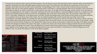
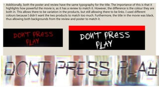
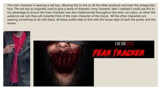
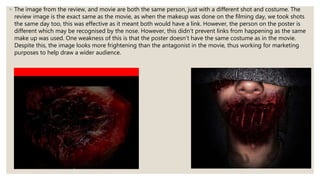
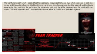
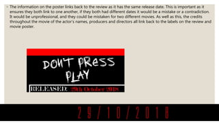
Lucknow 💋 Call Girls in Lucknow ₹7.5k Pick Up & Drop With Cash Payment 892311...
Eval 2
1. 2. HOW EFFECTIVE IS THE COMBINATION OF
YOUR MAIN PRODUCT AND ANCILLARY
TEXTS?
By Simran Kailey
2. ◦ The same house style has been used for all three products. This was done to ensure that all products had an element which connected them
together, the easiest and most noticeable aspect would be house style. This is because it also follows the conventions of horror too. For
example, white, black and red has been used consistently. The advantage of this is that it ensures when all three products are placed
together, they look as if they belong together. The positive of this is that there's a synergy between them all, for example in the movie when
the credits are placed out, white is used, which is then used for the colour of my title on the review page, and the colour of my main text, as
well as the typography for the credits on the poster. Although the fonts may be different, using white helped to allow for a simple link to be
placed, ensuring the products all link via some sort of typography due to the same colour being used. This is because, white wasn't used
much in the poster. Despite this, it still allows there to be links, as both the backgrounds of the review and the poster as the same, and both
use consistent colours of red to ensure they match. The use of black backgrounds in both ensures they are similar, even if they
content/layout may differ slightly. For example, the title and release date on the poster are red, but the title on the review is white, with links
to the release date of being red of both. In order to incorporate more red into the review, as it was a prominent colour on the poster, I made
the columns red and the two borders red. This allowed the review to be as vibrant as the poster. Furthermore, the idea of the black cloak also
matches the background ideas of the poster and review, as well as the cloak in the movie, and the makeup matches the red and white that
has been used in the poster and review. This is all effective as it ensures that all the products look as if they belong together and should
come together. If the makeup wasn't consistent throughout the movie, poster and review, it would look as if all the antagonists are all
different. Thus, this allows the audience to link all the pieces together.
3. ◦ Additionally, both the poster and review have the same typography for the title. The importance of this is that it
highlights how powerful the movie is, as it has a review to match it. However, the difference is the colour they are
both in. This allows there to be variation in the products, but still allowing there to be links. I used different
colours because I didn’t want the two products to match too much. Furthermore, the title in the movie was black,
thus allowing both backgrounds from the review and poster to match it.
4. ◦ The main character is wearing a red top- allowing this to link to all the other products and even the antagonists
face. The red top as originally used to give a sense of dramatic irony, however, later I realised I could use this to
my advantage to ensure the main character was also implemented throughout the texts, via colour, as when the
audience see red, they will instantly think of the main character of the movie. All the other characters are
wearing something to do with black, all these outfits help to link with the house style of each the poster and the
review.
5. ◦ The image from the review, and movie are both the same person, just with a different shot and costume. The
review image is the exact same as the movie, as when the makeup was done on the filming day, we took shots
the same day too, this was effective as it meant both would have a link. However, the person on the poster is
different which may be recognised by the nose. However, this didn’t prevent links from happening as the same
make up was used. One weakness of this is that the poster doesn’t have the same costume as in the movie.
Despite this, the image looks more frightening than the antagonist in the movie, thus working for marketing
purposes to help draw a wider audience.
6. ◦ The fear factor graph which I created has the exact same colours as the house style which was used in both the
review and the poster, allowing it to blend in more and have links. For example, the title was red, and the labels
were white, thus matching the red title of the poster and matching the white typography of the movie with the
credits. This was important as it’s subtle similarities that allow all products to be linked together.
7. ◦ The information on the poster links back to the review as it has the same release date. This is important as it
ensures they both link to one another, if they both had different dates it would be a mistake or a contradiction.
It would be unprofessional, and they could be mistaken for two different movies. As well as this, the credits
throughout the movie of the actor’s names, producers and directors all link back to the labels on the review and
movie poster.
8. ◦ The language throughout the film has swearing as the characters all have a stroppy attitude, which links to the
negative language used in the review. The language used in the verdict is also what one character says in the
movie about going home. Twisting the movies words against itself allows there to be an exact link to the review
and highlights what the verdict is.
◦ My poster helped with the premiere night as it was advertised all around school helping to bring in more
people, but it also gave out an idea of what the movie was about and what to fear during the movie, but the
positive was that it didn't give away how the antagonist got there in the first place, leaving the idea of not
pressing play for the audience to find out for when they watch the movie. Thus, this curiosity led to a much
bigger crowd and by the end of the movie the feedback made sure the poster did link to the movie. This is
because I gained feedback from teachers, friends and other year groups who I didn't know. This was significant
as it helped to highlight the weaknesses from those who have never seen the movie before. This meant that
missing links from the movie and poster were able to be changed to ensure they did link.