EVALUATION
QUESTIONTWO
Frank Hammond
Introduction
■ In this question I will be showing how the three marketing campaign products (teaser
trailer, film poster and film magazine cover), were all shown to be representing the
same product, using brand identity ideas.
■ I will be showing this using specific examples of what we did in relation to our
marketing research.
Importance of Marketing
■ When it comes to creating a film, as well as actually creating the film, having an
effective marketing campaign is vital.Without this, a film will not reach out and get an
audience.
■ Marketing is done by finding the target audience of the film and then marketing to
them, by using techniques that will appeal to the said target audience, such as
advertising on social media platforms for younger audiences, and onTV and the
newspapers for older audiences.
■ As well as this, it is important for a marketing campaign to establish a brand identity,
so that it is clear that the marketing campaign is showing the same film, same genre,
same narrative etc.
Importance of Brand Identity
■ During a film’s marketing campaign, forming a brand identity is very important.A brand
identity allows a film to form a consistent continuity for their brand and for their film, which is
done by using certain conventions throughout their campaign.
■ The effects of this is that causes is that when people see different elements of the marketing
campaign (film posters, trailers, social media posts etc) there is a definitive link between
them, so they can all be seen to be representing the same film.
■ It is important that not only do they just portray the film but also the genre of the film in the
brand identity, as it wouldn’t make sense the film poster portraying an action but the trailer
displaying themes of romance.
Our Brand Identity
■ One way that we formed a brand identity was by using the colour red throughout our
marketing campaign.On the magazine cover there is lots of red that is used around
the cover, mainly to highlight certain elements, but also to carry the brand identity.
The films poster is a lot darker than the magazine cover, but it still contains lots of red;
the transparent blood overlay, the title’s colour, the costume of the protagonist in the
key image, it is all red, and it stands out against the other colours used. Using the
colour red wasn’t simply because our pieces title was “The Girl in Red” but because the
colour red holds connotations of both violence and love, which are both heavily
featured in our films narrative.
■ As part of our marketing research we looked into the marketing campaign of the film
“Mr and Mrs Smith” which is a film that has the same genre as us. Mr and Mrs Smith
also used colours within their campaign, more specifically black and white’s to push
their “spy” theme that they also had in their film, which was also their USP.
Our Brand Identity
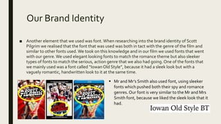
■ Another element that we used was font.When researching into the brand identity of Scott
Pilgrim we realised that the font that was used was both in tact with the genre of the film and
similar to other fonts used.We took on this knowledge and in our film we used fonts that went
with our genre.We used elegant looking fonts to match the romance theme but also sleeker
types of fonts to match the serious, action genre that we also had going. One of the fonts that
we mainly used was a font called “IowanOld Style”, because it had a sleek look but with a
vaguely romantic, handwritten look to it at the same time.
 Mr and Mr’s Smith also used font, using sleeker
fonts which pushed both their spy and romance
genres. Our font is very similar to the Mr and Mrs
Smith font, because we liked the sleek look that it
had.
Our Brand Identity
■ Something that was used a lot within other brand identities was the use of showing
key cast members. We used this element a lot, mostly recognisable on the film’s
magazine cover and the film poster.We found that this worked very well because the
title was positioned around the main cast member (The Girl in Red, showing who that
was), which helped people realised who the film was about.
■ This also worked in parallel with the fact that the colour red was worn a lot with cast
members and also elements within the marketing campaign.The usage of colour in
costume is something that was used a lot in the teaser trailer of Mr and Mrs Smith
which I researched. In their teaser trailer the cast members are seen predominately in
black and white clothes, which is used to push their genre, which is what we have also
tried to adopt into our marketing campaign.
Brand Identity Questions
When thinking about if the marketing campaign elements had successful Brand identity, I had to
ask myself a few questions;
■ Did each of our products suggest the same genre?
■ Did they suggest the same narrative aspects?
■ Did each of the products represent the characters in similar ways?
■ Did they each clearly “speak” and appeal to the same target audience?
Brand Identity Questions
I believe that all of our products did show the same genre.The film poster shows the elements of murder
and mystery with the blood, sinister looks given, as well as the darker colours.The romance is represented
and shown in the posters with the portrayal of the male and female characters on screen shown next to
each other.
The magazine cover mainly shows the romance themes, shown with the lighter white background, the
reds and the image of the female cast member show mainly a more romantic theme.
The trailer is the product in the campaign which definitely shows the most when it comes to genre.The
trailer throughout shows the scenes of romance between the characters, but then again shows many
violent and murderous themes within the trailer too.
When it comes to showing narrative too, the trailer reveals the most, with the portrayal of the three
characters (being showing the alter-ego character as well as the two main characters) and romance
between the two, as well as the disruptions in the plot.
This goes for the films poster too which shows the narrative elements of the three characters. But other
than that, the two other marketing products don’t have that much narrative to show other than the cast
members.
Brand Identity Questions
The products as well showing the genre show the characters of the film.The way that the
characters are portrayed need to be consistent through the marketing campaign, in each of the
elements.
In the trailer, Rose, the protagonist is displayed as a vulnerable, yet strong and headstrong girl,
who takes control and speaks her mind, which is also displayed in the film’s poster, as she is
positioned between the two male characters looking with a worried facial expression, however
she is seen front and centre, showing the headstrong nature of her character. In the magazine
cover she is shown as a romantic symbol mainly, with the dreamy pose she has, as well as the
lighter colours with the red, carrying the connotations of love.
Both Alec and Damian, the male character, Damian being the name of his evil alter-ego. In the
trailer, Alec is shown as a vulnerable, broken person shown in this facial expressions as well as
mannerisms on screen. Damian on the other hand is shown as a very evil character, in fact the
first time he is positioned, it is in front of a dead body.Throughout the trailer he is seen starting
menacingly, or performing violent actions. In the films poster, they are positioned looking away
from each other, as well as being on opposite sides of the poster. Alec having a light expression,
matching his character, whereas Damian is shown with a menacing look in a much darker
frame. Alec and Damian’s cast member isn’t shown on the film magazine cover.
Brand Identity Questions
When it comes to the question of target audience which in our case was around 15-25 year
olds, both male and female.The way this is successfully communicated to the audience is
through the way that both the romance themes are shown in the trailer, as well as the
thriller/action/murder themes. As shown by our research, the romance themes would be
more popular with the female part of our audience, however the way that we have
included our murder themes in the trailer too it will also attract the male side of the
audience, so that we aren’t limiting ourselves when it came to audience attraction.
This also followed for both the film’s poster and magazine cover. Both showed themes of
both romance and murder, the poster slightly more murder/sinister themes than
magazine and the magazine showing slightly more romance themes, but both being
balanced enough to attract both sides of the audience, both gender and the age group we
wanted.

Evaluation Question Two

  • 1.
  • 2.
    Introduction ■ In thisquestion I will be showing how the three marketing campaign products (teaser trailer, film poster and film magazine cover), were all shown to be representing the same product, using brand identity ideas. ■ I will be showing this using specific examples of what we did in relation to our marketing research.
  • 3.
    Importance of Marketing ■When it comes to creating a film, as well as actually creating the film, having an effective marketing campaign is vital.Without this, a film will not reach out and get an audience. ■ Marketing is done by finding the target audience of the film and then marketing to them, by using techniques that will appeal to the said target audience, such as advertising on social media platforms for younger audiences, and onTV and the newspapers for older audiences. ■ As well as this, it is important for a marketing campaign to establish a brand identity, so that it is clear that the marketing campaign is showing the same film, same genre, same narrative etc.
  • 4.
    Importance of BrandIdentity ■ During a film’s marketing campaign, forming a brand identity is very important.A brand identity allows a film to form a consistent continuity for their brand and for their film, which is done by using certain conventions throughout their campaign. ■ The effects of this is that causes is that when people see different elements of the marketing campaign (film posters, trailers, social media posts etc) there is a definitive link between them, so they can all be seen to be representing the same film. ■ It is important that not only do they just portray the film but also the genre of the film in the brand identity, as it wouldn’t make sense the film poster portraying an action but the trailer displaying themes of romance.
  • 5.
    Our Brand Identity ■One way that we formed a brand identity was by using the colour red throughout our marketing campaign.On the magazine cover there is lots of red that is used around the cover, mainly to highlight certain elements, but also to carry the brand identity. The films poster is a lot darker than the magazine cover, but it still contains lots of red; the transparent blood overlay, the title’s colour, the costume of the protagonist in the key image, it is all red, and it stands out against the other colours used. Using the colour red wasn’t simply because our pieces title was “The Girl in Red” but because the colour red holds connotations of both violence and love, which are both heavily featured in our films narrative. ■ As part of our marketing research we looked into the marketing campaign of the film “Mr and Mrs Smith” which is a film that has the same genre as us. Mr and Mrs Smith also used colours within their campaign, more specifically black and white’s to push their “spy” theme that they also had in their film, which was also their USP.
  • 6.
    Our Brand Identity ■Another element that we used was font.When researching into the brand identity of Scott Pilgrim we realised that the font that was used was both in tact with the genre of the film and similar to other fonts used.We took on this knowledge and in our film we used fonts that went with our genre.We used elegant looking fonts to match the romance theme but also sleeker types of fonts to match the serious, action genre that we also had going. One of the fonts that we mainly used was a font called “IowanOld Style”, because it had a sleek look but with a vaguely romantic, handwritten look to it at the same time.  Mr and Mr’s Smith also used font, using sleeker fonts which pushed both their spy and romance genres. Our font is very similar to the Mr and Mrs Smith font, because we liked the sleek look that it had.
  • 7.
    Our Brand Identity ■Something that was used a lot within other brand identities was the use of showing key cast members. We used this element a lot, mostly recognisable on the film’s magazine cover and the film poster.We found that this worked very well because the title was positioned around the main cast member (The Girl in Red, showing who that was), which helped people realised who the film was about. ■ This also worked in parallel with the fact that the colour red was worn a lot with cast members and also elements within the marketing campaign.The usage of colour in costume is something that was used a lot in the teaser trailer of Mr and Mrs Smith which I researched. In their teaser trailer the cast members are seen predominately in black and white clothes, which is used to push their genre, which is what we have also tried to adopt into our marketing campaign.
  • 8.
    Brand Identity Questions Whenthinking about if the marketing campaign elements had successful Brand identity, I had to ask myself a few questions; ■ Did each of our products suggest the same genre? ■ Did they suggest the same narrative aspects? ■ Did each of the products represent the characters in similar ways? ■ Did they each clearly “speak” and appeal to the same target audience?
  • 9.
    Brand Identity Questions Ibelieve that all of our products did show the same genre.The film poster shows the elements of murder and mystery with the blood, sinister looks given, as well as the darker colours.The romance is represented and shown in the posters with the portrayal of the male and female characters on screen shown next to each other. The magazine cover mainly shows the romance themes, shown with the lighter white background, the reds and the image of the female cast member show mainly a more romantic theme. The trailer is the product in the campaign which definitely shows the most when it comes to genre.The trailer throughout shows the scenes of romance between the characters, but then again shows many violent and murderous themes within the trailer too. When it comes to showing narrative too, the trailer reveals the most, with the portrayal of the three characters (being showing the alter-ego character as well as the two main characters) and romance between the two, as well as the disruptions in the plot. This goes for the films poster too which shows the narrative elements of the three characters. But other than that, the two other marketing products don’t have that much narrative to show other than the cast members.
  • 10.
    Brand Identity Questions Theproducts as well showing the genre show the characters of the film.The way that the characters are portrayed need to be consistent through the marketing campaign, in each of the elements. In the trailer, Rose, the protagonist is displayed as a vulnerable, yet strong and headstrong girl, who takes control and speaks her mind, which is also displayed in the film’s poster, as she is positioned between the two male characters looking with a worried facial expression, however she is seen front and centre, showing the headstrong nature of her character. In the magazine cover she is shown as a romantic symbol mainly, with the dreamy pose she has, as well as the lighter colours with the red, carrying the connotations of love. Both Alec and Damian, the male character, Damian being the name of his evil alter-ego. In the trailer, Alec is shown as a vulnerable, broken person shown in this facial expressions as well as mannerisms on screen. Damian on the other hand is shown as a very evil character, in fact the first time he is positioned, it is in front of a dead body.Throughout the trailer he is seen starting menacingly, or performing violent actions. In the films poster, they are positioned looking away from each other, as well as being on opposite sides of the poster. Alec having a light expression, matching his character, whereas Damian is shown with a menacing look in a much darker frame. Alec and Damian’s cast member isn’t shown on the film magazine cover.
  • 11.
    Brand Identity Questions Whenit comes to the question of target audience which in our case was around 15-25 year olds, both male and female.The way this is successfully communicated to the audience is through the way that both the romance themes are shown in the trailer, as well as the thriller/action/murder themes. As shown by our research, the romance themes would be more popular with the female part of our audience, however the way that we have included our murder themes in the trailer too it will also attract the male side of the audience, so that we aren’t limiting ourselves when it came to audience attraction. This also followed for both the film’s poster and magazine cover. Both showed themes of both romance and murder, the poster slightly more murder/sinister themes than magazine and the magazine showing slightly more romance themes, but both being balanced enough to attract both sides of the audience, both gender and the age group we wanted.