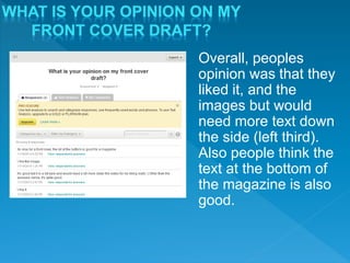
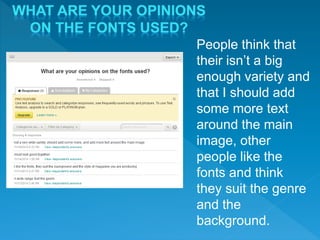
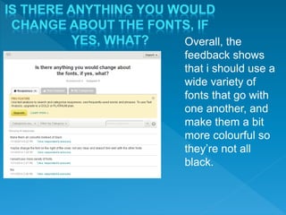
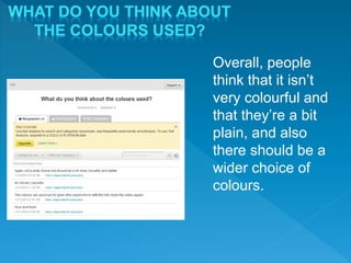
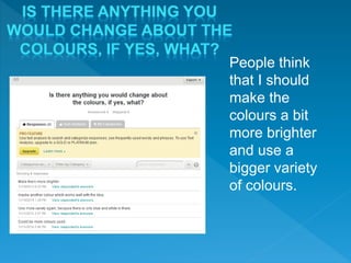
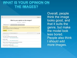
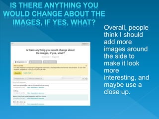
2. Overall, peoples
opinion was that they
liked it, and the
images but would
need more text down
the side (left third).
Also people think the
text at the bottom of
the magazine is also
good.
3. People think that
their isn’t a big
enough variety and
that I should add
some more text
around the main
image, other
people like the
fonts and think
they suit the genre
and the
background.
4. Overall, the
feedback shows
that i should use a
wide variety of
fonts that go with
one another, and
make them a bit
more colourful so
they’re not all
black.
5. Overall, people
think that it isn’t
very colourful and
that they’re a bit
plain, and also
there should be a
wider choice of
colours.
6. People think
that I should
make the
colours a bit
more brighter
and use a
bigger variety
of colours.
7. Overall, people
think the image
looks good, and
that it suits the
genre, but make
the model look
less bored.
People also think
I should add
more images.
8. Overall, people
think I should
add more
images around
the side to
make it look
more
interesting, and
maybe use a
close up.