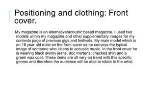
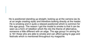
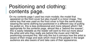
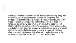
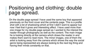
Question 2: how does your
media product represent
particular social groups?
Audience and
Representations.
Positioning and clothing: Front
cover.
My magazine is an alternative/acoustic based magazine. I used two
models within my magazine and other supplementary images for my
contents page of previous gigs and festivals. My main model which is
an 18 year old male on the front cover as he conveys the typical
image of someone who listens to acoustic music. In the front cover he
is wearing black skinny jeans, doc martens, checked shirt and a
green wax coat. These items are all very on trend with this specific
genres and therefore the audience will be able to relate to the artist.
He is positioned standing up straight, looking up at the camera (as its
at an angle creating style) and therefore looking directly at the reader.
He is smoking and in quite a relaxed positioned which is common for
this age group. The reason I got the model to smoke is that it can be
seen as a form of rebellion which fits into the theme of alternative,
someone a little different with an edge. The age group I’m aiming for
is 18+ those who are able to smoke and can afford going to gigs and
festivals which is mentioned throughout my magazine.
Positioning and clothing:
contents page.
On my contents page I used two main models; the model that
appeared on the front cover but also myself in a minor image. The
same boy that was used on the front cover is from the same shoot,
wearing the same clothing but positioned in a different way of putting
his jacket on, this is less professional and more relaxed which I felt
appropriate for the contents page, almost like a “behind the scenes”,
this is easily relatable as the reader will want to find out more about
the artist and who they really are behind the music and I felt the
positioning conveyed this. Not only this but it conveys how the artist is
aware of their image and style which most of the people in the target
audience are also aware of and take care of their appearance.
This image, different to the one on the front cover is looking away from
the camera, again less formal and relaxed but still giving off a
professional feel of being on a real photo-shoot. Secondly, I used an
image of myself, wearing a hat, a stripy top and lots of rings. My
hands are covering my face which is an alternative pose but I felt
fitted in with the alternative feel of the magazine. I felt it was important
to include this as it could be seen as an artists album cover and would
interest the reader. I also included a variety of images that I have
taken previously at gigs and festivals which I feel will appeal to the
audience as they themselves will go to gigs and festivals.
Positioning and clothing: double
page spread.
On the double page spread I have used the same boy that appeared
previously on the front cover and the contents page. This is a profile
shot with a lot of shadowing which at first I didn’t want to appear but
now I feel that it gives and interesting affect. I have used more than
one image for my double page spread as I wanted to the interest the
reader through photography as well as the content. The main image
he is looking directly at the camera which draws the reader in and
makes them want to read more. The minor images, one of them the
artist is looking away from the camera which shows the way the social
genre being represented are always looking to the next big thing and
having their minds constantly on that.
My product.
I feel that my magazine as a product involves and incorporates the
type of people that will be interested in the magazine and the genre of
music through the photography. It also uses subject tops that the
target audience will be interested in. the people that are featured in
the magazine also represent the target audience; alternative style of
dress and different positioning but those who are interested in
different type of deeper subjects such a politics and religion but light
hearted subjects such as music, appearances etc. my music
magazine focuses predominantly on music and appearances. Some
may see this as shallow however I think the simplicity works as its
target audiences are fairly young people who are interested in music
and fashion and want a light hearted read.
If they wanted to find out about hard subject matters they would
purchase a magazine that focuses and suited to that subject. I feel
that the representation my magazine offers support dominant ideas
about my social group as it clearly shows people of the certain social
group due to the way they dress and pose. Although these may seem
like small aspects of the photographs, the connotations they hold say
a lot. As the alternative music genre also has a particular style of
dress runs along with it is a huge component, I have tried to work
along with this fact by styling my models in a certain way.

QUESTION 2

  • 1.
    Question 2: howdoes your media product represent particular social groups? Audience and Representations.
  • 2.
    Positioning and clothing:Front cover. My magazine is an alternative/acoustic based magazine. I used two models within my magazine and other supplementary images for my contents page of previous gigs and festivals. My main model which is an 18 year old male on the front cover as he conveys the typical image of someone who listens to acoustic music. In the front cover he is wearing black skinny jeans, doc martens, checked shirt and a green wax coat. These items are all very on trend with this specific genres and therefore the audience will be able to relate to the artist.
  • 3.
    He is positionedstanding up straight, looking up at the camera (as its at an angle creating style) and therefore looking directly at the reader. He is smoking and in quite a relaxed positioned which is common for this age group. The reason I got the model to smoke is that it can be seen as a form of rebellion which fits into the theme of alternative, someone a little different with an edge. The age group I’m aiming for is 18+ those who are able to smoke and can afford going to gigs and festivals which is mentioned throughout my magazine.
  • 4.
    Positioning and clothing: contentspage. On my contents page I used two main models; the model that appeared on the front cover but also myself in a minor image. The same boy that was used on the front cover is from the same shoot, wearing the same clothing but positioned in a different way of putting his jacket on, this is less professional and more relaxed which I felt appropriate for the contents page, almost like a “behind the scenes”, this is easily relatable as the reader will want to find out more about the artist and who they really are behind the music and I felt the positioning conveyed this. Not only this but it conveys how the artist is aware of their image and style which most of the people in the target audience are also aware of and take care of their appearance.
  • 5.
    This image, differentto the one on the front cover is looking away from the camera, again less formal and relaxed but still giving off a professional feel of being on a real photo-shoot. Secondly, I used an image of myself, wearing a hat, a stripy top and lots of rings. My hands are covering my face which is an alternative pose but I felt fitted in with the alternative feel of the magazine. I felt it was important to include this as it could be seen as an artists album cover and would interest the reader. I also included a variety of images that I have taken previously at gigs and festivals which I feel will appeal to the audience as they themselves will go to gigs and festivals.
  • 6.
    Positioning and clothing:double page spread. On the double page spread I have used the same boy that appeared previously on the front cover and the contents page. This is a profile shot with a lot of shadowing which at first I didn’t want to appear but now I feel that it gives and interesting affect. I have used more than one image for my double page spread as I wanted to the interest the reader through photography as well as the content. The main image he is looking directly at the camera which draws the reader in and makes them want to read more. The minor images, one of them the artist is looking away from the camera which shows the way the social genre being represented are always looking to the next big thing and having their minds constantly on that.
  • 7.
    My product. I feelthat my magazine as a product involves and incorporates the type of people that will be interested in the magazine and the genre of music through the photography. It also uses subject tops that the target audience will be interested in. the people that are featured in the magazine also represent the target audience; alternative style of dress and different positioning but those who are interested in different type of deeper subjects such a politics and religion but light hearted subjects such as music, appearances etc. my music magazine focuses predominantly on music and appearances. Some may see this as shallow however I think the simplicity works as its target audiences are fairly young people who are interested in music and fashion and want a light hearted read.
  • 8.
    If they wantedto find out about hard subject matters they would purchase a magazine that focuses and suited to that subject. I feel that the representation my magazine offers support dominant ideas about my social group as it clearly shows people of the certain social group due to the way they dress and pose. Although these may seem like small aspects of the photographs, the connotations they hold say a lot. As the alternative music genre also has a particular style of dress runs along with it is a huge component, I have tried to work along with this fact by styling my models in a certain way.