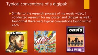
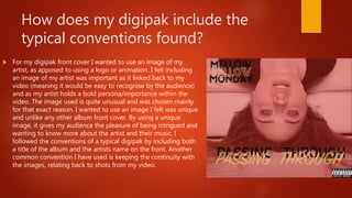
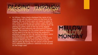
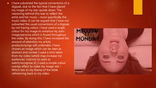
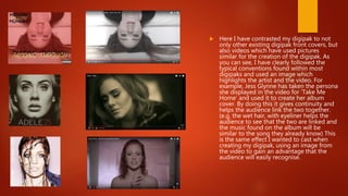
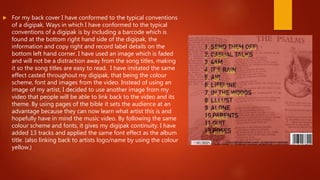
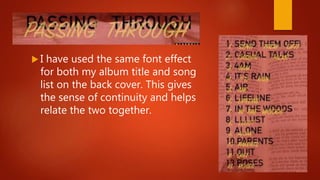
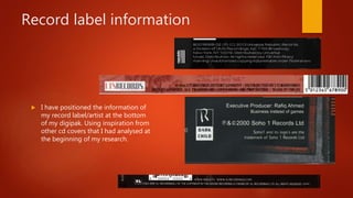
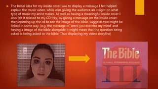
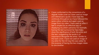
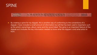
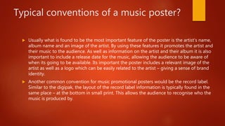
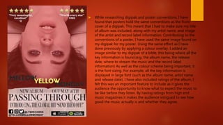
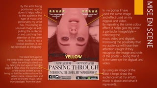
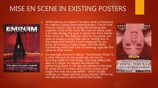
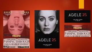
1. In what ways does your
media product use, develop
or challenge forms and
conventions of real media
products?
HELENA LATAMSING
2. Typical conventions of music videos
Camera shots: Music videos typically tend to include multiple long shots. This gives emphasis on
the artist, locations and emotions being displayed. Close up shots not only help display the
emotions reflected within the song but the lyrics – focusing on the movement of the lips.
Editing: The primary editing technique found within music videos is the use of jump cuts. This is a
popular technique to use as it allows sudden change from one scene to another. However, effects
such as transition and fade are very common in music videos as they create a different way of
cutting two scenes together.
Mise en scene: Mise en scene allows the importance of props, performers and scene of production
to be represented with a lot of importance. This can be done through the lighting, location or shot
type.
Props: In similarity to mise en scene, props included in music videos help show the significance to
the song and storyline of the video.
Lighting: some music videos are black and white or have emphasis on dark shots within the video.
This can help represent the mood of the artist or theme of the song.
3. Conventions I have used in my music
video
Camera shots: the camera shots I used within my music video were a mix of mid shots, close ups and a few
long shots. My choice of shots was chosen based off of the way I wanted to present my artist with their
music. For example the close up shots used while the artist was displaying particular emotions, enhanced
the emotions further as the audience could clearly see how they felt in that moment. Possibly having the
same affect on the audience.
Editing: The editing techniques I used throughout my video were fading, overlay and transitioning between
shots. Using these effects throughout my video helped add a variety of ways to cut between each shot. The
overlay was a good technique to display emotions felt within the video (whether that was by the artist or for
the audience to relate to). Using popular techniques typically found within most music videos meant that
my video would be seen as pleasing to watch and correspond well against other videos of the same genre.
Mise en scene: I concentrated on having a simple/everyday themed mise en scene throughout my video.
Using typical locations such as the living room, bedroom, bathroom and the woods. All locations which can
be found easily by the audience in their day-to-day lives. I felt by using these few locations it would make
the video easier to relate to by the audience. (e.g. by having props such as a vodka bottle, bible and filming
in typical locations, it helps relate back to the audience as these are things they can find in their everyday
lives – enhancing the idea that the storyline is a possible problem they could encounter)
4. Types of music videos
Performance based: performance based videos usually include the artist
performing live or clips from a previous performance of the song being
used for the video.
Narrative based: often the video tells a story either that features in the
lyrics or is suggested in the lyrics e.g. girl dumps boy. It can also promote a
film with clips from the film telling a story.
Concept based: concept videos are based around a single idea or concept
and are usually unusual or obscure, even surreal for an audience. The
unusual content is an attraction to people, which draws them in.
5. Which theme did I focus on for my
video?
The type of video I wanted to create was narrative based. I feel a video which holds a storyline
becomes some what more interesting than any others. By having a storyline to a song it gives the
audience a personal connection to the song and artist. (e.g. if there were a song which regarded the
topic of cheating, a young girl/boy who had recently experienced this might feel more connected to
the artist if they know they have been through the same thing.)
I wanted to choose a topic in which I felt would be something young people would be able to relate to
or take an interest in. Choosing a controversial topic such as religion did fall at a risk, I had to take on
board that a topic such as this can consequently lead to backlash. However, this did not effect my
choice with choosing to use it as my theme within my video.
I decided to use the concept of social realism within my video as I knew this would be another way of
drawing in my target audience. For example the use of underage drinking/drug use helps the audience
understand/relate to the artist and their feelings.
6. How researching into music videos helped
with my idea/editing process?
Researching into styles/themes of music videos enhanced my ideas and helped tremendously
with what shot types/editing techniques to consider when creating my own video. Researching
into my chosen genre was a good way of analysing how particular music is displayed/presented
to its chosen target audience and how the audience are given the opportunity to engage with
the music/video.
My initial idea was to base my video around the bible and its effects on individuals. Although, I
struggled with putting the idea into motion, how I should display the storyline and what
techniques I could use in order for the audience to understand the message behind the video.
However, it wasn’t until I begun to look into similar themed videos that I found a way of
presenting the theme to my audience. For example I found the use of close up shots to display
emotions, or mid shots to denote body language. I learned that the lighting used throughout the
video may influence the audiences mood. This enabled me to carry out the same conventions
when editing/filming as I now understood what was needed to make my idea come to life.
7. How researching into music videos helped
with my idea/editing process?
Once I learned how to display my chosen theme/storyline through the use of other videos, filming became
easy along with editing techniques. I knew that to have a successful and/or interesting video you needed
to have a variety of shot types and different ways of cutting between scenes.
For example I followed off from the idea of having my artist in the bath with a close up shot from Rhianna’s
music video for ‘stay’. I felt that by having the location of the bath it connotes the idea of the artist’s
emotions to be quite personal. Due to the idea of having alone time when in the bath; the sense of being
trapped with your thoughts. Having scenes such as this in my video also has the ability to inflict my
audiences mood. As it is something they can relate to and will understand as being a personal experience.
Ultimately giving the video’s message a deeper meaning.
8. Typical conventions of a digipak
Similar to the research process of my music video, I
conducted research for my poster and digipak as well. I
found that there were typical conventions found within
each.
9. Digipak
The front cover of a digipak typically displays a symbol which can be linked to
them in some way, an image of the artist or maybe an abstract piece of artwork
which doesn’t have a connection to them but is just used to display the album.
The text displayed on the front cover usually is the artist’s name/logo and the
name of the album.
The back cover of the digipak is usually quite simple in comparison to the front.
Being that usually only the song titles are displayed, as well as additional
information on the record label and a barcode for price scanning. Whereas the
front cover includes a statement image, title of the album, artist name and any
addition information.
Most commonly, digipaks keep to the same colour scheme on the front and back
(unless its intentional for there to be different colours) This helps keep continuity
within the product and denotes a consistent style.
10. How does my digipak include the
typical conventions found?
For my digipak front cover I wanted to use an image of my
artist, as apposed to using a logo or animation. I felt including
an image of my artist was important as it linked back to my
video (meaning it would be easy to recognise by the audience)
and as my artist holds a bold persona/importance within the
video. The image used is quite unusual and was chosen mainly
for that exact reason. I wanted to use an image I felt was unique
and unlike any other album front cover. By using a unique
image, it gives my audience the pleasure of being intrigued and
wanting to know more about the artist and their music. I
followed the conventions of a typical digipak by including both
a title of the album and the artists name on the front. Another
common convention I have used is keeping the continuity with
the images, relating back to shots from my video.
11. As follows, I have clearly displayed the name of my
artist along with the album name on the front of my
digipak. My use of fonts were not meant to relate to
each other in anyway but the colours used I felt were
more important to duplicate and be used for both. By
placing my artists name at the top of my digipak
meant that I was following the structure of a typical
digipak. The location for my artists name is important
as you want it to be the first thing the audience’s
attention is drawn to first. By having the album name
at the bottom of my digipak it helped create a
distance between the two, enabling the audience to
establish which was the artist and which was the
album name. By having the two pieces of text spread
out it allowed the audience’s attention to be focused
on the image used.
12. I have subverted the typical conventions of a
digipak, due to the fact that I have placed
my image of my star upside down. The
reasoning behind this was to reflect the
artist and her music – more specifically the
music video. It can be argued that I have not
subverted the usual conventions of a digipak
by not having colour. I have used a single
colour for my image to enhance my stars
image/persona which is found throughout
the video. By doing this, I have increased the
amount of attention my artists
products/songs will undertake. I have
chosen an image which can be seen as
abstract and surreal. I used a shot taken
from my video (which may increase my
audiences’ instincts to want to
watch/recognise it), I used a simple colour
overlay effect to make my image red –
Which ties to my theme of the bible,
referencing back to my video.
13. Here I have contrasted my digipak to not
only other existing digipak front covers, but
also videos which have used pictures
similar for the creation of the digipak. As
you can see, I have clearly followed the
typical conventions found within most
digipaks and used an image which
highlights the artist and the video. For
example, Jess Glynne has taken the persona
she displayed in the video for ‘Take Me
Home’ and used it to create her album
cover. By doing this it gives continuity and
helps the audience link the two together.
(e.g. the wet hair, with eyeliner helps the
audience to see that the two are linked and
the music found on the album will be
similar to the song they already know) This
is the same effect I wanted to cast when
creating my digipak, using an image from
the video to gain an advantage that the
audience will easily recognise.
14. For my back cover I have conformed to the typical conventions
of a digipak. Ways in which I have conformed to the typical
conventions of a digipak is by including a barcode which is
found at the bottom right hand side of the digipak, the
information and copy right and record label details on the
bottom left hand corner. I have used an image which is faded
and will not be a distraction away from the song titles, making
it so the song titles are easy to read. I have imitated the same
effect casted throughout my digipak, that being the colour
scheme, font and images from the video. Instead of using an
image of my artist, I decided to use another image from my
video that people will be able to link back to the video and its
theme. By using pages of the bible it sets the audience at an
advantage because they can now learn what artist this is and
hopefully have in mind the music video. By following the same
colour scheme and fonts, it gives my digipak continuity. I have
added 13 tracks and applied the same font effect as the album
title. (also linking back to artists logo/name by using the colour
yellow.)
15. I have used the same font effect
for both my album title and song
list on the back cover. This gives
the sense of continuity and helps
relate the two together.
16. Record label information
I have positioned the information of
my record label/artist at the bottom
of my digipak. Using inspiration from
other cd covers that I had analysed at
the beginning of my research.
17. I have included on my digipak my own
record label company and copy right
information, similar to existing digipaks. My
record label has been named ‘LTSRECORDS’.
I have conformed to the conventions by
including a feature which will make it stand
out – adding the colour red and using a
slogan. (producing since ‘09) I used this logo
throughout my digipak and included it on
my poster. By having this logo included on
my digipak, I feel I have successfully
conformed to the typical conventions found
on digipak while also giving it a sense of
continuity. Thus making my products look
professional and realistic.
18. The Initial idea for my inside cover was to display a message I felt helped
explain the music video, while also giving the audience an insight on what
type of music my artist makes. As well as having a meaningful inside cover I
also felt it related to my CD tray, by giving a message on the inside cover,
then opening up the cd to see the image of the bible, suggests two might be
linked in some way. (e.g. the message of ‘wont you exercise my mind’ and
having a image of the bible alongside it might mean that the question being
asked is being asked to the bible. Thus displaying my video storyline)
19. I have conformed to the conventions of a
digipak inside cover as I have used an image
and referenced a quote. I have kept the
continuity throughout as I have followed the
same colour scheme and again used an
image from my video. I have used an effect I
feel is simple but an effective way of
displaying my artist’s persona. For example,
having the text surround her face helps
show the significance of both the artist and
the text. (suggesting the quote is of
importance alongside the artist) Similar to
the back cover, I have not used an image of
my artist for the CD tray this was solely for
the purpose of having the two images relate
to one another.
20. SPINE
By creating a spine for my digipak, this is another way of conforming to the conventions of a
digipak. I have included a small amount of information but all that has been used is important, such
as the artist’s name/logo, album name and the record label. The spine is an important feature of the
digipak as it includes the key information needed to know what the digipak is and what artist its
from.
21. How have I conformed to the
conventions of a poster in my own
poster?
22. Typical conventions of a music poster?
Usually what is found to be the most important feature of the poster is the artist’s name,
album name and an image of the artist. By using these features it promotes the artist and
their music to the audience. As well as information on the artist and their album it is also
important to include a release date for the music, allowing the audience to be aware of
when its going to be available. Its important the poster includes a relevant image of the
artist as well as a logo which can be easily related to the artist – giving a sense of brand
identity.
Another common convention for music promotional posters would be the record label.
Similar to the digipak, the layout of the record label information is typically found in the
same place – at the bottom in small print. This allows the audience to recognise who the
music is produced by.
23.
24. While researching digipak and poster conventions, I have
found that posters hold the same conventions as the front
cover of a digipak. This meant that I had to make sure my title
of album was included, along with my artist name, and image
of the artist and record label information. Contributing to the
conventions of a poster, I have used the same image found on
my digipak for my poster. Using the same effect as I have
done previously by applying a colour overlay. I added an
image similar to my digipak of a bible, this being where all the
key information is found.(e.g. the album name, the release
date, where to stream the music and the record label
information) As well as the colour scheme being important, it
is the font sizing. For example, all the key information is
displayed in large font (such as the album name, artist name
and release date). I have also included ratings of the album, I
felt this was an important feature to include as it gives the
audience the opportunity to know what to expect the music to
be like before they listen. By having ratings from high end
music magazines it makes the audience intrigued to see how
good the music actually is and whether they agree.
25. MISEENSCENE
In my poster I have
used the same image
and effect used on my
digipak and video.
By repeating the same colour
effect, it helps give my artist
a particular image/style –
reflecting the
music video and digipak.
Increasing the possibility that
my audience will have their
attention caught if they
recognise the image and style
of the poster – being that it
is the same on the digipak and
video.
By using an image of the
Bible it helps show the
audience what my artist’s
music is about and what it
represents.
By the artist being
positioned upside
down it helps reflect
to the audience the
type of music and
personality my artist
has. Thus being an
unusual image as well,
pulling the audience
in and catching their
attention at the same
time. As this is not a
typical position, it can
be perceived as intriguing.
The black font against
the white faded image of the bible
helps the writing to stand out.
by fading the text against the bible
pages it helps show the significance
of the words written across it.
being so that the audience know the
album name, release date and
where to find the music rather
than passages from the bible.
26. MISE EN SCENE IN EXISTING POSTERS
While taking out research to learn what is important
for making a good promotional poster, I found that
mise en scene is key for tying the whole poster
together. A lot of the time, the mise en scene used
is to help display the type of genre the artist relates
their music to. The features used for my poster are
clear to display a pop/inide genre. Mainly due to
the image and persona I have displayed for my
artist, by having a unque image with the bible.
(something which has a lot of meaning, typically the
same as inide music)
For example, Eminem’s album ‘The Eminem Show’ it
is clear that just by the poster we can see its
focusing solely on one singer. This may reflect the
idea of a rapper as rappers are known for
performing alone. It can also be related to the idea
of some sort of contest (due to the curtains and
stage) this may be a rap battle – which usually
undergo on stages and are sung singular. Which we
can see Eminem is alone behind the curtain.
27.
28. After comparing my own poster to other existing music posters, I can clearly see
I have used the typical conventions which are found within promotional posters.
By having my artist present and the largest part of my poster, it makes it
possible for the audience to see what the artist looks like as well as recognising
similar features from the video. Including the text on a faded bible encourages
the audience to focus what's beneath the music, such as presenting them with
questions they can find the answers to after listening.(e.g. what's the relevance
of the bible? Why is the image red? Why is the artist upside down?) By
presenting this effect to my audience, it makes them more interested and
interests them to want to know more about the artist and their music.
By having a clear image of my artist, including the album name, artist name and
record label information it means I have successfully conformed to the typical
conventions of a digipak.