This document summarizes the effectiveness of combining the main product (music video) and ancillary texts (album artwork and poster).
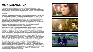
The music video, album, and poster all effectively incorporate elements of the alternative indie genre such as surrealism and developing narrative. They also diverge slightly from conventions to establish a unique brand identity. Key connections between the texts include similar color grading, motifs, themes of love/loss, and representations of the reserved artist and emotionally complex audience. While the lack of clear artist/album identification in some pieces could hinder recognition, pre-releasing the featured song may counteract this issue. Overall, the multi-text production cohesively presents and expands upon the artist's story and ideology