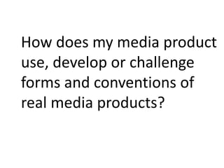
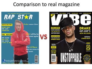
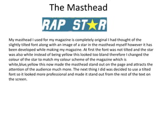
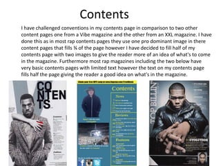
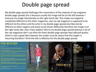
This document summarizes how the media product challenges conventions of real rap magazines. Key ways conventions are challenged include tilting the masthead font and using color to make it stand out more. The main image avoids being too dark or lit and has a plain background for easy editing. While the model's hood and clothing convey the rap genre, they also appeal to a wider audience. Contents include more images and text than typical rap magazines to give readers more information. The double page spread unconventionally places the image on the right side. Some basic conventions like the barcode are followed to maintain professionalism, but overall conventions are challenged to make the magazine stand out from others.
[Luis Sousa] Assédio no local de trabalho, um assunto escondidoBlog Safemed
Tema cada vez mais relevante na nossa sociedade, o assédio no local de trabalho tem sido objeto de preocupação das entidades europeias ligadas à prevenção de riscos laborais.
De acordo com dados publicados pela Fundação Europeia para a Melhoria das Condições de Vida e de Trabalho (EUROFOUND), 8 % do total de trabalhadores da União Europeia, ou seja, 12 milhões de pessoas, declaram ter sido vítimas de assédio moral no trabalho no decurso dos 12 meses anteriores.
http://blog.safemed.pt/assedio-no-local-de-trabalho-um-assunto-escondido/
A Strategic Approach: GenAI in EducationPeter Windle
Artificial Intelligence (AI) technologies such as Generative AI, Image Generators and Large Language Models have had a dramatic impact on teaching, learning and assessment over the past 18 months. The most immediate threat AI posed was to Academic Integrity with Higher Education Institutes (HEIs) focusing their efforts on combating the use of GenAI in assessment. Guidelines were developed for staff and students, policies put in place too. Innovative educators have forged paths in the use of Generative AI for teaching, learning and assessments leading to pockets of transformation springing up across HEIs, often with little or no top-down guidance, support or direction.
This Gasta posits a strategic approach to integrating AI into HEIs to prepare staff, students and the curriculum for an evolving world and workplace. We will highlight the advantages of working with these technologies beyond the realm of teaching, learning and assessment by considering prompt engineering skills, industry impact, curriculum changes, and the need for staff upskilling. In contrast, not engaging strategically with Generative AI poses risks, including falling behind peers, missed opportunities and failing to ensure our graduates remain employable. The rapid evolution of AI technologies necessitates a proactive and strategic approach if we are to remain relevant.
Operation “Blue Star” is the only event in the history of Independent India where the state went into war with its own people. Even after about 40 years it is not clear if it was culmination of states anger over people of the region, a political game of power or start of dictatorial chapter in the democratic setup.
The people of Punjab felt alienated from main stream due to denial of their just demands during a long democratic struggle since independence. As it happen all over the word, it led to militant struggle with great loss of lives of military, police and civilian personnel. Killing of Indira Gandhi and massacre of innocent Sikhs in Delhi and other India cities was also associated with this movement.
Macroeconomics- Movie Location
This will be used as part of your Personal Professional Portfolio once graded.
Objective:
Prepare a presentation or a paper using research, basic comparative analysis, data organization and application of economic information. You will make an informed assessment of an economic climate outside of the United States to accomplish an entertainment industry objective.
Introduction to AI for Nonprofits with Tapp NetworkTechSoup
Dive into the world of AI! Experts Jon Hill and Tareq Monaur will guide you through AI's role in enhancing nonprofit websites and basic marketing strategies, making it easy to understand and apply.
Biological screening of herbal drugs: Introduction and Need for
Phyto-Pharmacological Screening, New Strategies for evaluating
Natural Products, In vitro evaluation techniques for Antioxidants, Antimicrobial and Anticancer drugs. In vivo evaluation techniques
for Anti-inflammatory, Antiulcer, Anticancer, Wound healing, Antidiabetic, Hepatoprotective, Cardio protective, Diuretics and
Antifertility, Toxicity studies as per OECD guidelines
How to Make a Field invisible in Odoo 17Celine George
It is possible to hide or invisible some fields in odoo. Commonly using “invisible” attribute in the field definition to invisible the fields. This slide will show how to make a field invisible in odoo 17.
Francesca Gottschalk - How can education support child empowerment.pptxEduSkills OECD
Francesca Gottschalk from the OECD’s Centre for Educational Research and Innovation presents at the Ask an Expert Webinar: How can education support child empowerment?
3. The Masthead
My masthead I used for my magazine is completely original I had thought of the
slightly tilted font along with an image of a star in the masthead myself however it has
been developed while making my magazine. At first the font was not tilted and the star
was also white instead of being yellow this looked too bland therefore I changed the
colour of the star to match my colour scheme of the magazine which is
white,blue,yellow this now made the masthead stand out on the page and attracts the
attention of the audience much more. The next thing I did was decided to use a tilted
font so it looked more professional and made it stand out from the rest of the text on
the screen.
4. The Image
I ensured for my main Image that the place was not too lit up but also not too dark either
as this way the image wouldn't be clear as too much natural light would be on the model
or the model wouldn't be clear enough. Furthermore I had decided the image must have
been taken on a plain background preferably white as this would make it easier to crop the
image and remove the background and red and black would stand out well on a white
background therefore this was taken into consideration when taking the photo
5. Costume/Genre
My image is conventional as for the rap genre having the hood part way up
conveys that the genre is rap as typically rappers either wear caps or hoods
therefore choosing to have the hood part way up was good as you can still see
the models face however it gives of the rap feel to the image.
6. Audience
The pose my model is doing was an idea taking from the vibe magazine
in the right hand side of the screen the arms folded approach was good
as it shows the seriousness of the person conveying the seriousness of
this magazine. However my model appeals to a wider more diverse
audience as he has trendy clothing on appealing to a younger teenage
audience as well as adults. With the trendy clothing and the modern
hairstyle it will attract more teens with similar style with the model
being late teens and him being a successful rapper people may want to
be like him. In comparison to Eminem where he is wearing a basic black
tank top just conveys the seriousness and the stereotypical rapper.
7. People
In my magazine I have mentioned some of the most well known rappers in the world
with names ranging from up and coming rappers such as: Kendrick Lamar,Tyga and
Chris Brown to the icons of rap such as: Jay-Z, Snoop Dog and Dr.Dre, therefore I can
target a large, varied audience as the the icons of rap can appeal to a more mature
audience (20-30’s) as they were around when they were younger, and then the up
coming talent can appeal to a younger teen audience as the young rappers can
appeal to a younger audience. With such big names on the front cover of my
magazine this will attract big fans of rap, however since all rappers featured in my
magazine are male this will mean my audience will predominantly be male between
16-30.
8. Front Cover
As you can see I am comparing my magazine to one of the best most successful rap
magazines ‘Vibe’ I followed a few of the conventions from vibe magazine as firstly I used a
few of the colours used in a lot of rap magazines which is yellow and white. However I
decided to try a different background which has not been seen on a rap magazine before
it’s a navy blue background which make my magazine stand out from the other two which
are black and white. Also I have challenged conventions as in rap magazines you don’t
normally see shapes/images in the title however I have decided to use a star in yellow to
help the title stand out, in comparison to Vibe who have kept it plain and simple.
9. Contents
I have challenged conventions in my contents page in comparison to two other
content pages one from a Vibe magazine and the other from an XXL magazine. I have
done this as in most rap contents pages they use one pro dominant image in there
content pages that fills ¾ of the page however I have decided to fill half of my
contents page with two images to give the reader more of an idea of what's to come
in the magazine. Furthermore most rap magazines including the two below have
very basic contents pages with limited text however the text on my contents page
fills half the page giving the reader a good idea on what's in the magazine.
10. Double page spread
My double page spread challenges the conventions of the majority of rap magazine
double page spreads this is because usually the image will be on the left however I
have put my image intentionally on the right hand side. This makes my magazine
completely different to the other magazines, also my rap magazine is supposed to be
different to the others and the artist in my double page spread also likes too be
different to other rappers and wants to be shown differently therefore the image is on
the right hand side. Also I have added a title to my double page spread whereas a lot of
the rap magazines don’t use titles for there double page spreads they add pull quotes
which is also a good idea however the reader must be aware that this rapper is
returning therefore I think the title is effective for this double page spread.
11. Conclusion
In conclusion for some aspects of the magazine I followed conventions including
the basic conventions such as barcode, issue number and price this keeps the
magazine looking professional. But also certain colours such as yellow has been
used in a lot of magazines and I have used it following that convention. However I
have also challenged a lot of conventions such as the layout of the double page
spread, this gives the audience something different. Overall I think the conventions
I have followed and challenged ends up making my magazine very professional
looking and makes my magazine competitive against other magazines.