
Recommended
More Related Content
What's hot
What's hot (18)
Viewers also liked
Similar to Evaluation question 1
Similar to Evaluation question 1 (20)
More from s9037
More from s9037 (17)
Evaluation question 1
- 1. Evaluation Question 1. In what ways does your media product use, develop or challenge forms and conventions of real media products?
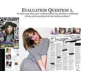
- 2. Front cover layout: I think I used the conventions of a real media product when doing my front cover because it looks quite similar. It uses the same types of stories and the general layout of one main image. However, the use of polaroid images challenges the conventions because it adds a unique part to the front cover. I really like the layout I’ve used because it is really realistic looking and follows the conventions.
- 3. Contents page layout: I didn’t really follow conventions for my contents page layout. I used a scattered feel, instead of structured. I also didn’t use boxes constricting the text. However, I did use the band index feature which is a common feature in magazines of this genre. I really like the overall feel because it is different.
- 4. Double page spread layout: I think my double page spread also follows conventions because it uses one main image, it also uses a larger initial to start off the article. I also has a large title and a logo and page number. However, I did use the polaroids again which isn’t typical in magazines.
- 5. Costumes & Props: The main prop I used was a pink acoustic guitar, this is because it backs up my indie target audience and helped create a girly artist. The costumes I used also backed up my genre because they are clothes from shops like Topshop, which aims at a ‘young, indie’ audience.
- 6. Location: For the location I used a studio.
- 7. Images: For the photoshoot I dressed my model in suitable clothing, for the proposed artist, an indie girl. She used suitable makeup that would be eye grabbing, such as blusher. I used artists such as Florence and the machine and Amy Winehouse for inspiration.
- 8. Contents page: The pictures and poses used in the contents match the genre of my magazine. It looks quite Indie rock.
- 9. Fonts: Most of my fonts keep with conventions of a magazine. This “calligraphy" font I have never seen in a magazine before. I think this could be because it is quite hard to read, this could be confusing, However I like this font. I made sure on Photoshop that the letters were spread from each other so it was legible. It keeps with my theme, of being quite girly.
- 10. Title: I used the ALT, which isn’t to typical of a magazine. It stands for Alternative music magazine, which is quite similar to NME which stands for New musical express.