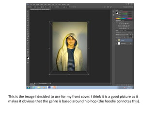
1. This is the image I decided to use for my front cover. I think it is a good picture as it
makes it obvious that the genre is based around hip hop (the hoodie connotes this).
2. Following the conventions of a lot of hip hop magazines that I have seen, I decided to
zoom closely into the image and use the rule of thirds to create a layout. The way it is
set up, I can add a masthead and a lot of cover lines on the left hand side of the
magazine and keep it looking neat.
3. After adding my masthead (which connotes how the hip hop industry is not ethnic based
anymore: people of many races are part of it), I removed the background and added a
gradient, gradually going from black to white.
4. I began to add my main cover line. This is where I began to clearly show my colour
scheme: red, black and white. I think that the masthead worked well because it
stands out very clearly amongst the more monochrome colours.