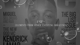
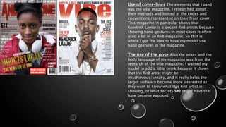
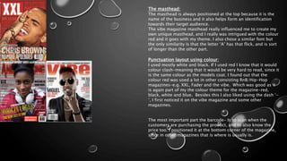
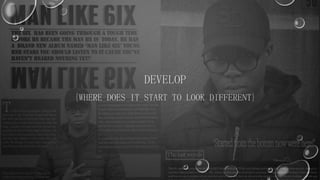
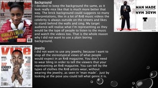
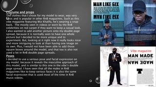
QUESTION 1
IN WHAT WAYS DOES YOUR
MAGAZINE USE, DEVELOP OR
CHALLENGE FORMS AND REAL MEDIA
PRODUCTS?
USE:
{ELEMENTS FROM OTHER EXISTING MAGAZINES}
Use of cover-lines The elements that I used
was the vibe magazine. I researched about
their methods and looked at the codes and
conventions represented on their front cover.
This magazine in particular shows that
Kendrick Lamar is a decent RnB artists because
showing hand gestures in most cases is often
used a lot in an RnB magazine. So that is
where I got the idea to have my model use
hand gestures in the magazine.
The use of the pose Also the poses and the
body language of my magazine was from the
research of the vibe magazine. I wanted my
model to add a little smirk because it shows
that the RnB artist might be
mischievous/sneaky, and it really helps the
target audience become more interested as
they want to know what this RnB artist is
showing, or what secrets she might have that
have become exposed.
The masthead:
The masthead is always positioned at the top because it is the
name of the business and it also helps form an identification
towards their target audience.
The vibe magazine masthead really influenced me to create my
own unique masthead, and I really was intrigued with the colour
red and it goes with my theme. I also chose a similar font but
the only similarity is that the letter ‘A’ has that flick, and is sort
of longer than the other part.
Punctuation layout using colour:
I used mostly white and black. If I used red I know that it would
colour clash-meaning that it would be very hard to read, since it
is the same colour as the models coat. I found out that the
colour red was used a lot in other consisting RnB/Hip-Hop
magazines-e.g. XXL, Fader and the vibe. Which was good as it
is again part of my the colour theme for the magazine-red,
black, white and blue. Besides this I also liked using the dash ‘-
’, I first noticed it on the vibe magazine and some other
magazines.
The most important part the barcode- Is to scan when the
customers are purchasing the product, and to also know the
price too. I positioned it at the bottom corner of the magazine,
since in other magazines that is where is usually is.
The name of the RnB artist
Having the names of RnB artist is as important as the
masthead, because it represents to the audience what the
magazine company wants to convey. Since it is big and bold
in other magazines, and it gets the attention from the
viewers/audience of the magazine. As it is the second point
that most people would look out for on a magazine.
Use of captions
In my magazine, I used captions as it helped me to create
and convey the meaning of the image on the front cover,
which makes it more motivated and would make the
magazine even more interested to my target audience. It will
motivate them as they will clearly know who that person is in
the magazine, by reading the name below. (it gives them an
interpretation)
Use of fonts
I used the same style of font in this ’Billboard’ magazine and
also on the vibe magazine in the previous slide. I used this
style of font because it is definitely suitable for an RnB
magazine, as it seems to appear on the vibe and billboard
magazine a lot.
The use of branding:
The use of branding in the vibe magazine is very efficient
because, they have a certain style of the way they present the
name ‘contents’ alone. I find the way of the design very
fascinating because it helps transfer to the audience what they
are and it represents the magazine company’s logo. I created my
own unique branding, as you can see in the top corner I added
the word ‘contents’, and put in a red circle over it to signify my
own brand and put the word exclusive next to it. The reason why
I did this was to make my magazine recognisable to my
audience. Since my content is mostly on gossip and other things,
that would be of interest to my target audience. I did the same
with the letter ‘A’, as seen on the vibes’ contents page.
The use of poses on the contents page:
I got the idea of using this certain type of pose on the vibe
magazine that is featuring Kendrick Lamar. The only difference
that I wanted to make was to have my model looking down,
because it helps make it look as if she is staring at the contents
page and is in deep thought. The effect of having the RnB artist
not looking at the camera it tells me that the person could not
be interested or bothered about their surroundings and probably
too focused on something else and it also tells me the type of
person they are. For in the vibe, Kendrick looks quite shy and
timid and so does my model as they are both looking
away/avoiding eye contact towards their audience.
Page numbering/ordering:
This is where I got the idea from which order I should
put the numbers in. I used this because the vibe
magazine uses it a lot, and is recommended. I also
underlined the important content, because I have
seen it being used on the vibe magazine, and it makes
it look nicer too.
The design template
The boxes that I created was my own unique idea, and
I wanted to make it look like steps (see 50, 74, and
82) just beneath the model’s eyes, so that it really
looks like she is reading it. I also really liked the idea
of having a short rectangle, it helps because it means
it is the end of the list, but the only difference that I
wanted to make was to have a picture underneath it.
Reason being is because it gives the readers the
impression that this particular person is going to be
shown on the double page spread.
DEVELOP
{WHERE DOES IT START TO LOOK DIFFERENT}
Heading/subheading
So, this is where I got the idea of having the title being called ‘Man like 6ix’, in
comparison to the version of the vibe’s double page spread man made. I
changed the subheading so that it could fit in with my story, and plus it is
mentioned on my contents page. I also placed the sub-heading on the left hand
side as it looked better that way. As you can see again the only difference that
has been made, would be having the boxes around the model. I done this
because I saw that it looked nice and was really effective.
Different colour
I decided to have my double page spread all in blue, as I knew that it would go
very well with the model’s out fit and also the background, which made it even
easier for me to get the colour right.
Vibe magazine
The columns
I used a full size image for my double page spread, as it is
seen a lot in the vibe magazine. I also used a quote, for it
helps signify what emotions are being brought out of the
picture, characteristics of this RnB artist.
The differentiation on the choice of clothing
My model is wearing glasses, this is very unique and stops all
stereotypical features of what other peoples’ expectations of
RnB magazine. Having my model wear glasses makes him
look intelligent but also cool at the same time; as he has his
glasses slightly titled, and is wearing his bubble jacket and
watch. I made my model wear a hat because in a lot of RnB
magazines the men tend to cover their hair a lot, one the
reasons is because the either have messy hair or a bad
hairline.
Vibe magazine
Name of celebrity:
As you can see that I had to use a larger
font, because it is seen in other consisting
RnB magazines. This helps indicate to the
target audience, the important aspects of
the magazine.
I decided to have the name of this RnB
artist, tilted to the corner because it looks
better than having it up straight, and it
draws attention to the audience. I also
decided to use a bold font, because that is
what I wanted and is preferably used more
in other RnB magazines- and is very visible
and easy to see rather than having a light
font.
CHALLENGE
{WHERE DOES IT LOOK COMPLETELY
DIFFERENT}
Vibe magazine
Background
I decided to keep the background the same, as it
look really nice like that is much more better that
way. The brick background could suggests so many
interpretations, like in a lot of RnB music videos the
celebrity is always outside on the streets and likes
to stand behind the walls and sing. My target
audience will realise what I’m representing as they
would be the type of people to listen to the music
and watch the videos too. That is the whole reason
why I did not want to use a plain boring
background.
Jewelry
I did not want to use any jewelry, because I want to
stop all the stereotypical views of what people
would expect in an RnB magazine. You don’t need
to wear bling in order to tell the viewers that your
representing an RnB magazine. You can tell by the
types of clothes the RnB artists wear, without
wearing the jewelry, as seen in ‘man made’. Just by
looking at the pose you could tell what genre it is.
Vibe magazine
Costume and props
The clothes that I chose for my model to wear, was very
basic and is popular in other RnB magazines. Such as this
vibe magazine featuring Wiz Khalifa, he’s wearing a snap
back. The mostly seen in videos or worn by the RnB
celebrities on red carpet if they want to keep a casual look.
I also wanted to add another picture onto my double page
spread, because it is normally seen to have one whole
picture but I decided to be more unique and to
experiment. But, looking at it right now it really looks nicer
and more intriguing to look at than having one image on
its own. Plus, I would not have been able to add those
square boxes around the model, and that too is also not
used a lot in RnB double page spreads.
Poses
I decided to use a serious pose and facial expression on
my model; because it reveals the masculine approach of
this model, and is similar to this one in the vibe’s double
page spread. I have seen that all the males in RnB
magazines like to keep serious faces it is also the same
facial expression that is used most of the time in RnB
music videos.

Evaluation Question 1-AS Media Studies

  • 1.
    QUESTION 1 IN WHATWAYS DOES YOUR MAGAZINE USE, DEVELOP OR CHALLENGE FORMS AND REAL MEDIA PRODUCTS?
  • 2.
    USE: {ELEMENTS FROM OTHEREXISTING MAGAZINES}
  • 3.
    Use of cover-linesThe elements that I used was the vibe magazine. I researched about their methods and looked at the codes and conventions represented on their front cover. This magazine in particular shows that Kendrick Lamar is a decent RnB artists because showing hand gestures in most cases is often used a lot in an RnB magazine. So that is where I got the idea to have my model use hand gestures in the magazine. The use of the pose Also the poses and the body language of my magazine was from the research of the vibe magazine. I wanted my model to add a little smirk because it shows that the RnB artist might be mischievous/sneaky, and it really helps the target audience become more interested as they want to know what this RnB artist is showing, or what secrets she might have that have become exposed.
  • 4.
    The masthead: The mastheadis always positioned at the top because it is the name of the business and it also helps form an identification towards their target audience. The vibe magazine masthead really influenced me to create my own unique masthead, and I really was intrigued with the colour red and it goes with my theme. I also chose a similar font but the only similarity is that the letter ‘A’ has that flick, and is sort of longer than the other part. Punctuation layout using colour: I used mostly white and black. If I used red I know that it would colour clash-meaning that it would be very hard to read, since it is the same colour as the models coat. I found out that the colour red was used a lot in other consisting RnB/Hip-Hop magazines-e.g. XXL, Fader and the vibe. Which was good as it is again part of my the colour theme for the magazine-red, black, white and blue. Besides this I also liked using the dash ‘- ’, I first noticed it on the vibe magazine and some other magazines. The most important part the barcode- Is to scan when the customers are purchasing the product, and to also know the price too. I positioned it at the bottom corner of the magazine, since in other magazines that is where is usually is.
  • 5.
    The name ofthe RnB artist Having the names of RnB artist is as important as the masthead, because it represents to the audience what the magazine company wants to convey. Since it is big and bold in other magazines, and it gets the attention from the viewers/audience of the magazine. As it is the second point that most people would look out for on a magazine. Use of captions In my magazine, I used captions as it helped me to create and convey the meaning of the image on the front cover, which makes it more motivated and would make the magazine even more interested to my target audience. It will motivate them as they will clearly know who that person is in the magazine, by reading the name below. (it gives them an interpretation) Use of fonts I used the same style of font in this ’Billboard’ magazine and also on the vibe magazine in the previous slide. I used this style of font because it is definitely suitable for an RnB magazine, as it seems to appear on the vibe and billboard magazine a lot.
  • 6.
    The use ofbranding: The use of branding in the vibe magazine is very efficient because, they have a certain style of the way they present the name ‘contents’ alone. I find the way of the design very fascinating because it helps transfer to the audience what they are and it represents the magazine company’s logo. I created my own unique branding, as you can see in the top corner I added the word ‘contents’, and put in a red circle over it to signify my own brand and put the word exclusive next to it. The reason why I did this was to make my magazine recognisable to my audience. Since my content is mostly on gossip and other things, that would be of interest to my target audience. I did the same with the letter ‘A’, as seen on the vibes’ contents page. The use of poses on the contents page: I got the idea of using this certain type of pose on the vibe magazine that is featuring Kendrick Lamar. The only difference that I wanted to make was to have my model looking down, because it helps make it look as if she is staring at the contents page and is in deep thought. The effect of having the RnB artist not looking at the camera it tells me that the person could not be interested or bothered about their surroundings and probably too focused on something else and it also tells me the type of person they are. For in the vibe, Kendrick looks quite shy and timid and so does my model as they are both looking away/avoiding eye contact towards their audience.
  • 7.
    Page numbering/ordering: This iswhere I got the idea from which order I should put the numbers in. I used this because the vibe magazine uses it a lot, and is recommended. I also underlined the important content, because I have seen it being used on the vibe magazine, and it makes it look nicer too. The design template The boxes that I created was my own unique idea, and I wanted to make it look like steps (see 50, 74, and 82) just beneath the model’s eyes, so that it really looks like she is reading it. I also really liked the idea of having a short rectangle, it helps because it means it is the end of the list, but the only difference that I wanted to make was to have a picture underneath it. Reason being is because it gives the readers the impression that this particular person is going to be shown on the double page spread.
  • 8.
    DEVELOP {WHERE DOES ITSTART TO LOOK DIFFERENT}
  • 9.
    Heading/subheading So, this iswhere I got the idea of having the title being called ‘Man like 6ix’, in comparison to the version of the vibe’s double page spread man made. I changed the subheading so that it could fit in with my story, and plus it is mentioned on my contents page. I also placed the sub-heading on the left hand side as it looked better that way. As you can see again the only difference that has been made, would be having the boxes around the model. I done this because I saw that it looked nice and was really effective. Different colour I decided to have my double page spread all in blue, as I knew that it would go very well with the model’s out fit and also the background, which made it even easier for me to get the colour right. Vibe magazine
  • 10.
    The columns I useda full size image for my double page spread, as it is seen a lot in the vibe magazine. I also used a quote, for it helps signify what emotions are being brought out of the picture, characteristics of this RnB artist. The differentiation on the choice of clothing My model is wearing glasses, this is very unique and stops all stereotypical features of what other peoples’ expectations of RnB magazine. Having my model wear glasses makes him look intelligent but also cool at the same time; as he has his glasses slightly titled, and is wearing his bubble jacket and watch. I made my model wear a hat because in a lot of RnB magazines the men tend to cover their hair a lot, one the reasons is because the either have messy hair or a bad hairline. Vibe magazine
  • 11.
    Name of celebrity: Asyou can see that I had to use a larger font, because it is seen in other consisting RnB magazines. This helps indicate to the target audience, the important aspects of the magazine. I decided to have the name of this RnB artist, tilted to the corner because it looks better than having it up straight, and it draws attention to the audience. I also decided to use a bold font, because that is what I wanted and is preferably used more in other RnB magazines- and is very visible and easy to see rather than having a light font.
  • 12.
    CHALLENGE {WHERE DOES ITLOOK COMPLETELY DIFFERENT}
  • 13.
    Vibe magazine Background I decidedto keep the background the same, as it look really nice like that is much more better that way. The brick background could suggests so many interpretations, like in a lot of RnB music videos the celebrity is always outside on the streets and likes to stand behind the walls and sing. My target audience will realise what I’m representing as they would be the type of people to listen to the music and watch the videos too. That is the whole reason why I did not want to use a plain boring background. Jewelry I did not want to use any jewelry, because I want to stop all the stereotypical views of what people would expect in an RnB magazine. You don’t need to wear bling in order to tell the viewers that your representing an RnB magazine. You can tell by the types of clothes the RnB artists wear, without wearing the jewelry, as seen in ‘man made’. Just by looking at the pose you could tell what genre it is.
  • 14.
    Vibe magazine Costume andprops The clothes that I chose for my model to wear, was very basic and is popular in other RnB magazines. Such as this vibe magazine featuring Wiz Khalifa, he’s wearing a snap back. The mostly seen in videos or worn by the RnB celebrities on red carpet if they want to keep a casual look. I also wanted to add another picture onto my double page spread, because it is normally seen to have one whole picture but I decided to be more unique and to experiment. But, looking at it right now it really looks nicer and more intriguing to look at than having one image on its own. Plus, I would not have been able to add those square boxes around the model, and that too is also not used a lot in RnB double page spreads. Poses I decided to use a serious pose and facial expression on my model; because it reveals the masculine approach of this model, and is similar to this one in the vibe’s double page spread. I have seen that all the males in RnB magazines like to keep serious faces it is also the same facial expression that is used most of the time in RnB music videos.