3. 1) In what ways does your media product use, develop
or challenge forms and conventions of real media
products?
My media product, a music magazine, quite closely adheres the stereotypical
conventions and codes of a real magazine. For example there is a front cover,
contents and double page spread which are use in all normal magazines. My
product is genre specific, house music, I have aimed to highlight this genre by the
use of colour scheme, title, images and text. My front cover has a bold masthead
‘RAVE’ which stands out on the cover and makes it recognisable. However my
front cover also slightly challenges the usual conventions with my unique cover
image. Rather than a clear/bold photo I chose to manipulate the image using
Photoshop to make it look more like a painting with a more ‘inky style.’ Usually
the image is quite drastically pushed in front of the masthead but I did not do
this as it’s the first copy and therefore not as recognisable. To become a
recognised magazine the title needs to be known first, it only slightly covers it at
the bottom of the ‘E’.
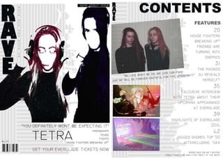
4. The front cover includes multiple story lines, usual to a magazine,
also including a strap line seen as an introductory headline below the
masthead describing the magazine. Also the puff about the main
artists Tetra. What’s also quite significant is I’ve included in house
trademarks for the magazine, for the example the headline ‘RAVE’ is
also used on the contents and the colour scheme throughout is
consistent. The black and white stripes on the back of each page.
My contents and double page spread also quite closely follow the
normal convention; the colour scheme and front throughout is
consistent to show professionalism, there are multiple clear cover
lines, the picture style is steady and my double page spread shows
the generic artist interview. On both the front cover and double page
spread I have used pull quotes which adhere to the stereotypical
music magazine.
5. Bold Masthead: both slightly covered by the main image, both use bold capitals and a thick font
Main image: Both bold and the main attention of front cover. However my main image is more of a inky style
rather than an actual photograph and therefore challenges the stereotypical front cover.
Issue number/price: Both include this however as mine is a new magazine it includes the tag ‘Debut’ issue
Main story line: Both include a bold main story line, mine is an interview with a leading music artist. Vibe’s is an
exclusive on set report, what’s different about the text of both is that mine is quite simplistic and only uses one
colour. Vibe uses blue and pink to make certain words/tags stand out.
My includes a
puff/strap line, Vibe
does not seem to
follow this typical
music magazine
convention. I did
this to make the
magazine more
recognisable and
memorable.
Both include multiple other cover lines, a typical magazine convention.
My front cover includes a barcode however vibe doesn’t.
My magazine
includes a pull
quote ‘you
definitely won’t
be expecting
it.’ Kanye also
has a quote ‘I
am Rap.”
6. Both include multiple other cover lines, a typical magazine convention. Also both include the tag ‘features’,
this shows that I have followed usual codes.
Both have the main tag line ‘contents’ in bold, following the same font of the front cover to adhere to the in house
trademarks. We also see this on my magazine with the similar background and ‘RAVE’ in the top left hand corner, Q
does this also.
Images: both use more than one image on the contents. Also what’s quite significant is that the cover lines/ story lines
are all up one side. Also my images there all up one side. Also I have used page numbers, a typical convention.
My contents
includes a pull
quote under the
image of Tetra to
make their
interview most
relevant.
7. Main image of the artist, typically on the left hand side. My image follows my in house trademark style of the
‘inky’ style image. However both are still bold and stand out amongst the double page spread. Also the image
with Tetra down the left hand side is Tetra’s in house logo and therefore it is representing them.
What I haven’t included that is quite significant is a drop cap, and therefore my magazine subverts from the
typical conventions. I didn’t do this as I did not think it was particularly important, instead I used another
drop quote. Also instead of a letter for the background to the text I used the in house trademark of the black
and white background.