Add more information to your upload Tip: Better titles and descriptions lead ...
Comparing media product to real magazines
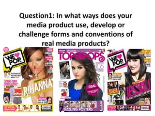
1. Question1: In what ways does your
media product use, develop or
challenge forms and conventions of
real media products?
2. Comparing my front cover
I am now going to compare my front cover to real music magazine front covers that are of a similar genre to mine to show how I have followed codes
and conventions. of a music magazine. I have chosen to use magazines such as Top of the pop and We love pop because their genre of music is Pop
which is the genre of music that my magazine is.
Both Mastheads are interesting and stand out, they
are also both at the top of the front cover in a bold
font. The real magazines masthead is in a shape
and has a heart in it, my magazines masthead is
effective as it has shapes e.g. white circles in it
making it stand out.
Both the main images on the front cover are a medium/
close up shot of the protagonist or celebrity endorsement.
The main image on the ‘we love pop’ magazine is of Tulisa
posing and smiling, similarly my main image is of my model
posing and smiling. Both of the main images having the
models looking directly at the audience.
I followed the conventions of a
music magazine by including
dateline, issue number and price.
Also both magazines
Include a barcode at the bottom
of the front cover
I have followed the conventions of a music magazine by
Including a puff. Both ‘we love pop’ and ‘impulse’
have a bold, bright puff to attract the audience.
I have challenged some of the codes and conventions of a front
cover for my magazine to make it stand out, as many pop
magazines are aged at young children I tried to make my
magazine less brightly coloured to help it target an older target
audience than other magazines such as ‘we love pop’.
I have followed the
conventions of an
archetype music magazine
by including cover lines on
the front cover to attract
the audience. My cover
lines
are mostly in a sans serif
font as it looks
professional and formal.
3. Comparing my contents page
I am going to compare my contents page to real existing magazine contents page that is of a similar genre to mine to show how I have followed the codes
and conventions of a contents page. I have chosen to use magazines such as Top of the pops and We love pop since these magazines have the same genre
as mine (pop).
The main image on both magazines is a medium long
shot, and both my magazine and the real magazine have
numbers next to the image so that audience know what
page that ‘celeb’ will be found and what the page will be
about.
Both magazines has a colour scheme that they
have stuck to in the contents page so they
don’t have too many colours, both magazines
have bright bold colours that stand out such as
pink. However I converted the convention of
pop magazines using girly colours as I didn’t
stick to pinks and reds as I include blue to make
it different.
Top of the Pops has a image of their front
cover featured inside their contents page as
this is a conventions therefore I followed this
convention and decide to also include an
image of my front cover on my contents
page.
I have followed the convention of including page
numbers at the bottom of the pages of the
magazine so its easy for the audience to navigate
around my magazine and find the pages easily.
The masthead and layout similar, as they both
have a coloured box behind the masthead to
make it stand out
with the text in a informal font to give it a sense
of warmth and a chatty tone. Both magazines
have the pages put into sections so its easy for
the audience to find the pages.
I followed the
convention of having
an editors note on the
contents page to give
a chatty and friendly
tone to the magazine
however the real
magazine I am
comparing too didn’t
include one of these,
but many magazines I
looked at did such as
(we love pop).
4. Comparing my double page spread
I am now going to compare my double page spread to a real
magazine double page spread is of a similar genre to mine to show
how I have followed conventions. I have chosen to use magazines
such as Top of the pops and We love pop this is because their genre
of music is pop which is the same as magazine genre.
Both magazines have images at the top of the
double page spread of the interviewee. Which
makes the double page spread look more
professional and interesting.
My target audience think my product looks like a real
magazine double page spread as it follows the codes
and conventions making it look similar to other
double page spreads.
Both magazines ( mine and we love pop ) have
text underneath the images that are a subtitle for
the double page spread, or a mini quote to inform
the readers what they will find on this page.
I have followed the codes and
conventions of a double page spread by
using a Drop Capital at the start of my
Interview. I have also used a different
colour for the questions in the interview
compared to the answer to make it stand
out.
I have followed the conventions of a double page spread by
keeping all of the text included on the page in columns so it
looks formal and the layout is neat.