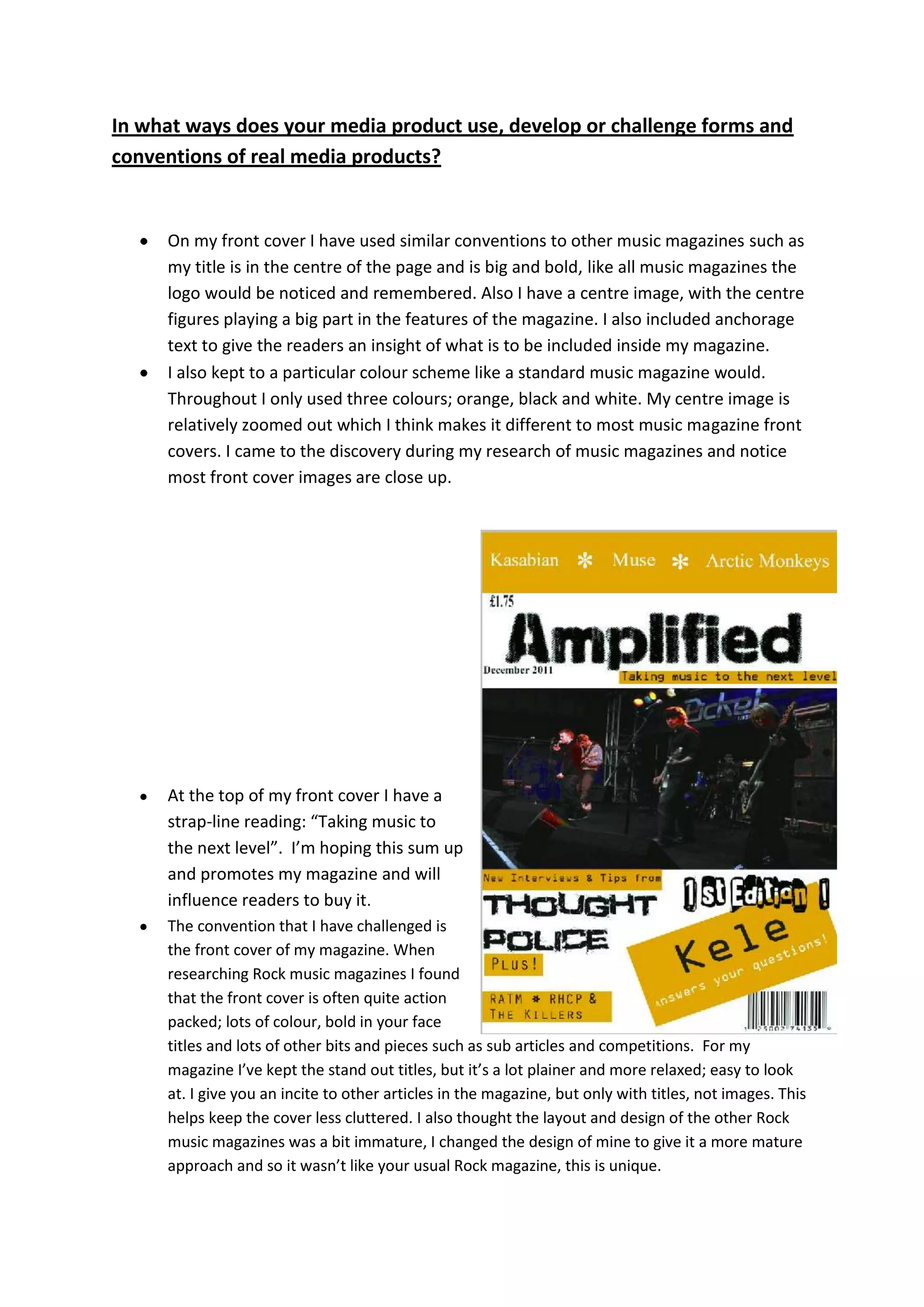
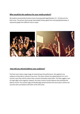
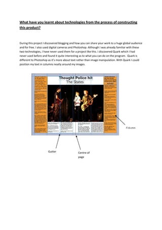
In what ways does your media product use, develop or challenge forms and
conventions of real media products?


     On my front cover I have used similar conventions to other music magazines such as
     my title is in the centre of the page and is big and bold, like all music magazines the
     logo would be noticed and remembered. Also I have a centre image, with the centre
     figures playing a big part in the features of the magazine. I also included anchorage
     text to give the readers an insight of what is to be included inside my magazine.
     I also kept to a particular colour scheme like a standard music magazine would.
     Throughout I only used three colours; orange, black and white. My centre image is
     relatively zoomed out which I think makes it different to most music magazine front
     covers. I came to the discovery during my research of music magazines and notice
     most front cover images are close up.


     At the top of my front cover I have a
     strap-line reading: “Taking music to
     the next level”. I’m hoping this sum up
     and promotes my magazine and will
     influence readers to buy it.
     The convention that I have challenged is
     the front cover of my magazine. When
     researching Rock music magazines I found
     that the front cover is often quite action
     packed; lots of colour, bold in your face
     titles and lots of other bits and pieces such as sub articles and competitions. For my
     magazine I’ve kept the stand out titles, but it’s a lot plainer and more relaxed; easy to look
     at. I give you an incite to other articles in the magazine, but only with titles, not images. This
     helps keep the cover less cluttered. I also thought the layout and design of the other Rock
     music magazines was a bit immature, I changed the design of mine to give it a more mature
     approach and so it wasn’t like your usual Rock magazine, this is unique.
Showing the date


                                                                     Title in big, bold letters


                                                                              Picture on one side


                                                                          Kept to a particular colour scheme


Text on one side   I also used similar conventions of the layout of music magazines contents pages. With a
                   column full of text and a column with a large image or images.
                   I think this idea has worked well, it looks effective, clear, simple and tidy. I have also
                   used the same colour scheme on my contents page that I used on my front cover. It
                   makes it look more professional.
Introduction                      Central title

                                                  Large, main image


                                                                      Quotes from
                                                                      the band


       Maintained colour scheme
How does your media product represent particular social groups?

My magazine targets and represents people who are into Rock music. As long as you like the genre
of music age shouldn’t be an issue, people of any age or gender can enjoy reading my magazine. My
magazine counters that general negative representation of young people in the media. My magazine
represents young people as fun, lively, outgoing people who like to enjoy themselves. The people in
my magazine are relatively young and would consider themselves to be middle class on a social
level. However, my magazine shows how young people can take a different route to the ordinary
jobs they’re expected to get in future, and can go on the to be famous and lead great lives. My
magazine includes both white & black people and represents them equally. The pictures mostly
show white musicians, but the reference to Kele shows there are black musicians in my magazine
aswell.


What kind of media institution might distribute your media product and
why?


I think Bauer Media Group would be interested in publishing my magazine, as it is a different type of
magazine as to which they’re already publishing. Bauer are also based in Germany, which means
they could potentially spread my magazine to a wider audience, including readers through out
Germany and other parts of Europe.
Who would be the audience for your media product?
My audience would predominately consist of young people (aged between 13 – 21) who are into
Rock music. The pictures show young, lively people having a good time and enjoying themselves. It
represents people from different races as equal.


How did you attract/address your audience?

The front cover shows a large image of a band during a live performance, this appeals to my
audience as they take an interest in live music. The colour scheme has a good balance to it, as it’s
not too in your face and the colours have a neutral connotation about them. The titles suggest a sort
of rough edge to the magazine; however, the colour scheme counter balances that and keeps the
balance neutral. The contents page and double page spread maintains the same colour scheme and
carry the same connotations with them as the front cover.
What have you learnt about technologies from the process of constructing
this product?


During this project I discovered blogging and how you can share your work to a huge global audience
and for free. I also used digital cameras and Photoshop. Although I was already familiar with these
two technologies, I have never used them for a project like this. I discovered Quark which I had
never used before and found it quite interesting as to what you can do on the program. Quark is
different to Photoshop as it’s more about text rather than image manipulation. With Quark I could
position my text in columns neatly around my images.


                                                                                     Column


                       Gutter                  Centre of
                                               page
Looking back at your preliminary task, what do you feel you have learnt in
the progression from it to the full product?


I think my music magazine is much improved from my college magazine, as there is much more
detail, I’ve taken thought and consideration into selecting the right fonts and titles and they layout is
much more professional. The image on the music magazine looks a lot more professional and
appropriate than the college magazine image. On my music magazine I have much more cover
stories and a proper tag line, which makes the magazine more professional. I also added a double
page spread to my music magazine, which involved putting two pages together which I hadn’t done
before.

Evaluation

  • 1.
    In what waysdoes your media product use, develop or challenge forms and conventions of real media products? On my front cover I have used similar conventions to other music magazines such as my title is in the centre of the page and is big and bold, like all music magazines the logo would be noticed and remembered. Also I have a centre image, with the centre figures playing a big part in the features of the magazine. I also included anchorage text to give the readers an insight of what is to be included inside my magazine. I also kept to a particular colour scheme like a standard music magazine would. Throughout I only used three colours; orange, black and white. My centre image is relatively zoomed out which I think makes it different to most music magazine front covers. I came to the discovery during my research of music magazines and notice most front cover images are close up. At the top of my front cover I have a strap-line reading: “Taking music to the next level”. I’m hoping this sum up and promotes my magazine and will influence readers to buy it. The convention that I have challenged is the front cover of my magazine. When researching Rock music magazines I found that the front cover is often quite action packed; lots of colour, bold in your face titles and lots of other bits and pieces such as sub articles and competitions. For my magazine I’ve kept the stand out titles, but it’s a lot plainer and more relaxed; easy to look at. I give you an incite to other articles in the magazine, but only with titles, not images. This helps keep the cover less cluttered. I also thought the layout and design of the other Rock music magazines was a bit immature, I changed the design of mine to give it a more mature approach and so it wasn’t like your usual Rock magazine, this is unique.
  • 2.
    Showing the date Title in big, bold letters Picture on one side Kept to a particular colour scheme Text on one side I also used similar conventions of the layout of music magazines contents pages. With a column full of text and a column with a large image or images. I think this idea has worked well, it looks effective, clear, simple and tidy. I have also used the same colour scheme on my contents page that I used on my front cover. It makes it look more professional.
  • 3.
    Introduction Central title Large, main image Quotes from the band Maintained colour scheme
  • 4.
    How does yourmedia product represent particular social groups? My magazine targets and represents people who are into Rock music. As long as you like the genre of music age shouldn’t be an issue, people of any age or gender can enjoy reading my magazine. My magazine counters that general negative representation of young people in the media. My magazine represents young people as fun, lively, outgoing people who like to enjoy themselves. The people in my magazine are relatively young and would consider themselves to be middle class on a social level. However, my magazine shows how young people can take a different route to the ordinary jobs they’re expected to get in future, and can go on the to be famous and lead great lives. My magazine includes both white & black people and represents them equally. The pictures mostly show white musicians, but the reference to Kele shows there are black musicians in my magazine aswell. What kind of media institution might distribute your media product and why? I think Bauer Media Group would be interested in publishing my magazine, as it is a different type of magazine as to which they’re already publishing. Bauer are also based in Germany, which means they could potentially spread my magazine to a wider audience, including readers through out Germany and other parts of Europe.
  • 5.
    Who would bethe audience for your media product? My audience would predominately consist of young people (aged between 13 – 21) who are into Rock music. The pictures show young, lively people having a good time and enjoying themselves. It represents people from different races as equal. How did you attract/address your audience? The front cover shows a large image of a band during a live performance, this appeals to my audience as they take an interest in live music. The colour scheme has a good balance to it, as it’s not too in your face and the colours have a neutral connotation about them. The titles suggest a sort of rough edge to the magazine; however, the colour scheme counter balances that and keeps the balance neutral. The contents page and double page spread maintains the same colour scheme and carry the same connotations with them as the front cover.
  • 6.
    What have youlearnt about technologies from the process of constructing this product? During this project I discovered blogging and how you can share your work to a huge global audience and for free. I also used digital cameras and Photoshop. Although I was already familiar with these two technologies, I have never used them for a project like this. I discovered Quark which I had never used before and found it quite interesting as to what you can do on the program. Quark is different to Photoshop as it’s more about text rather than image manipulation. With Quark I could position my text in columns neatly around my images. Column Gutter Centre of page
  • 7.
    Looking back atyour preliminary task, what do you feel you have learnt in the progression from it to the full product? I think my music magazine is much improved from my college magazine, as there is much more detail, I’ve taken thought and consideration into selecting the right fonts and titles and they layout is much more professional. The image on the music magazine looks a lot more professional and appropriate than the college magazine image. On my music magazine I have much more cover stories and a proper tag line, which makes the magazine more professional. I also added a double page spread to my music magazine, which involved putting two pages together which I hadn’t done before.