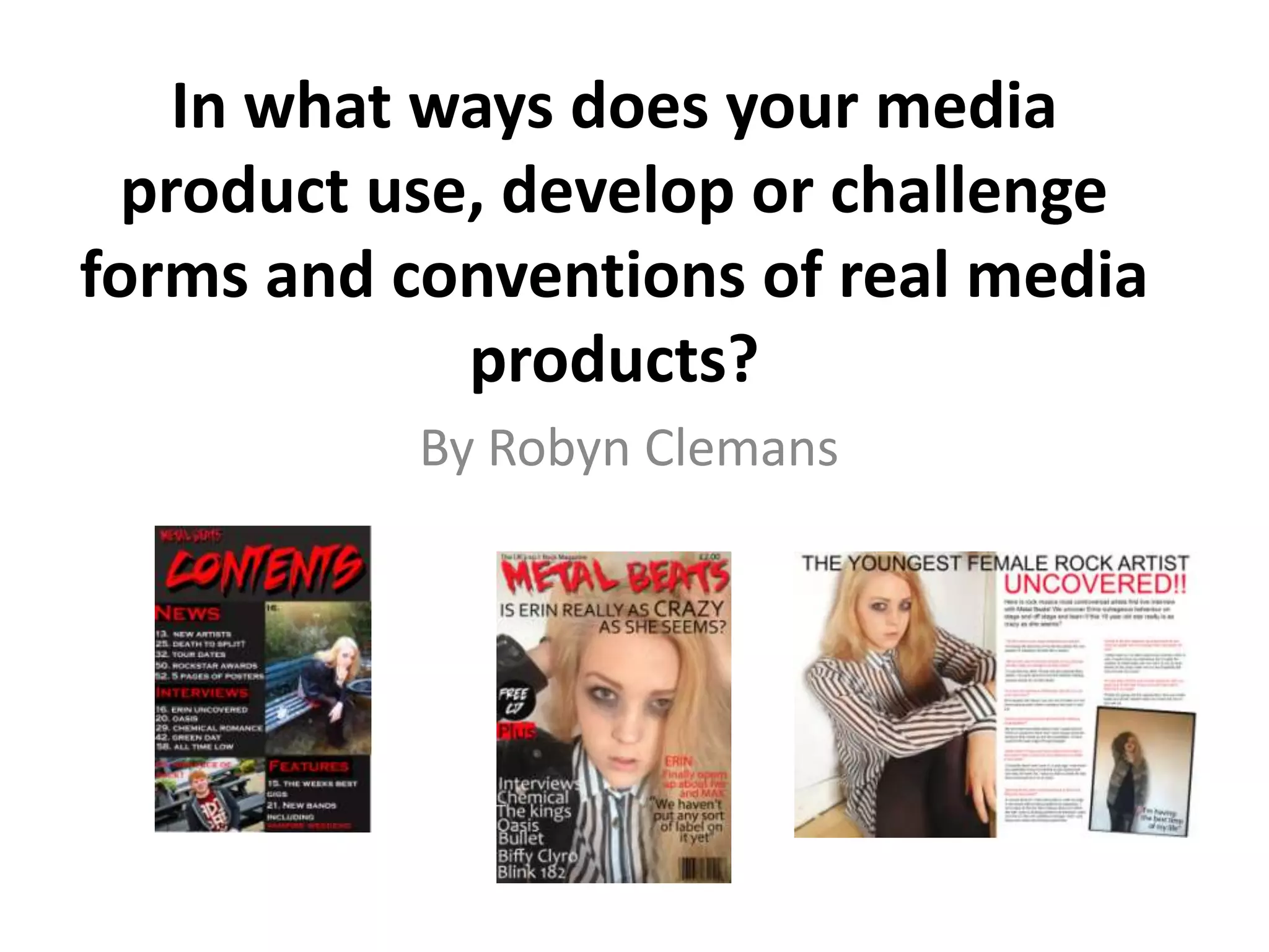
In what ways does your media
product use, develop or challenge
forms and conventions of real media
products?
By Robyn Clemans
My Front Cover
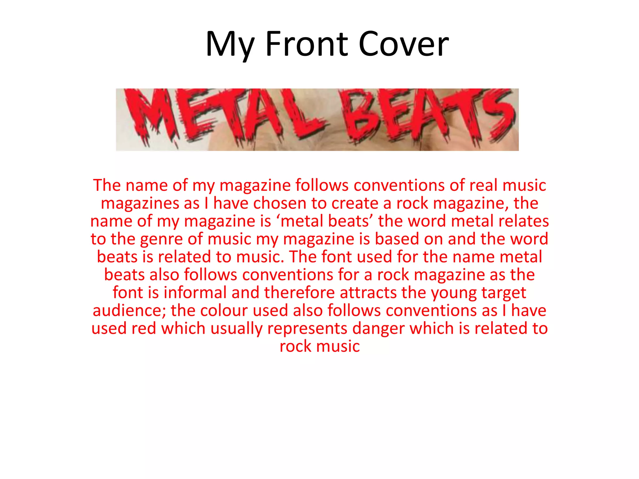
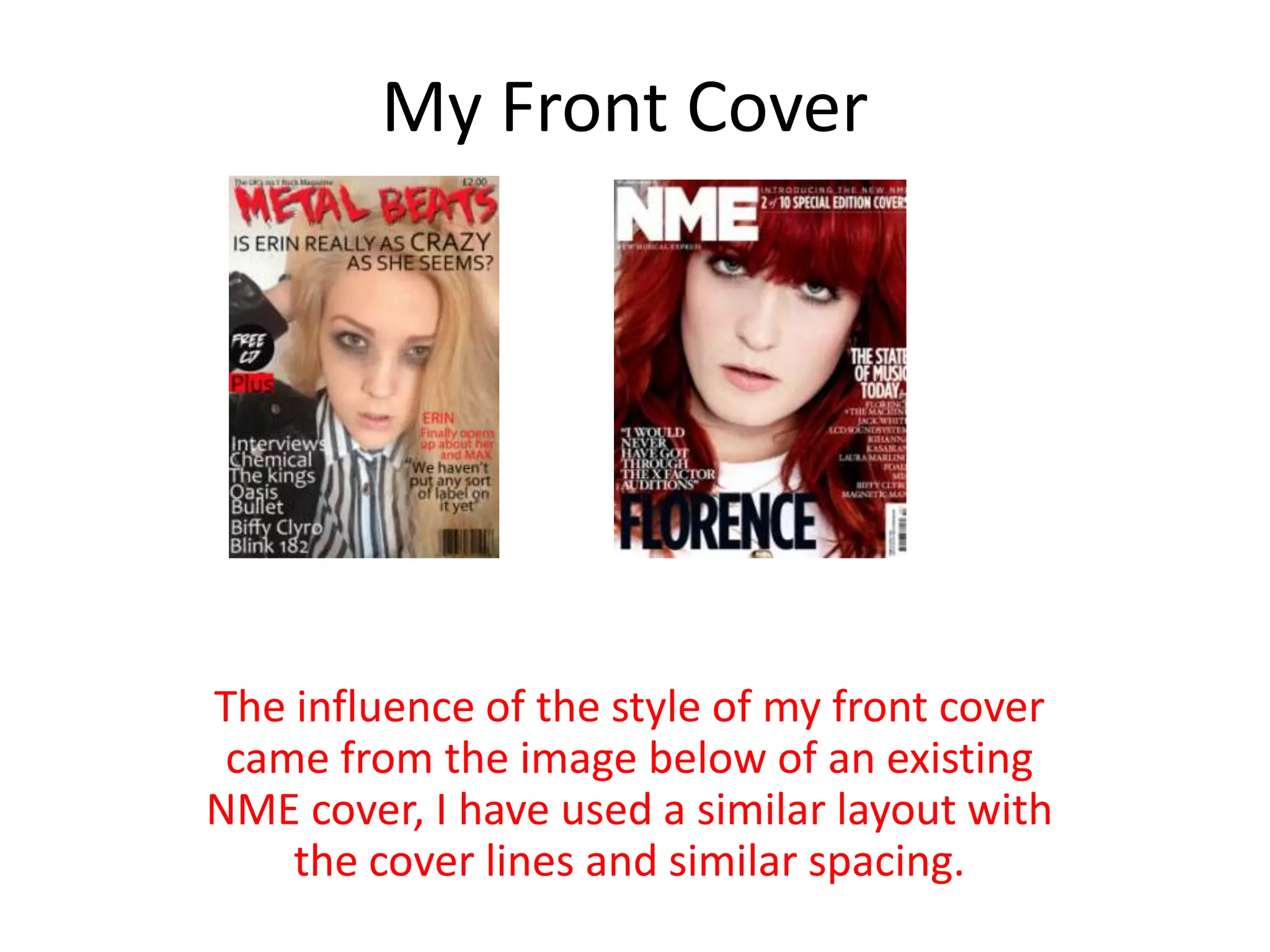
The name of my magazine follows conventions of real music
magazines as I have chosen to create a rock magazine, the
name of my magazine is ‘metal beats’ the word metal relates
to the genre of music my magazine is based on and the word
beats is related to music. The font used for the name metal
beats also follows conventions for a rock magazine as the
font is informal and therefore attracts the young target
audience; the colour used also follows conventions as I have
used red which usually represents danger which is related to
rock music
My Front Cover
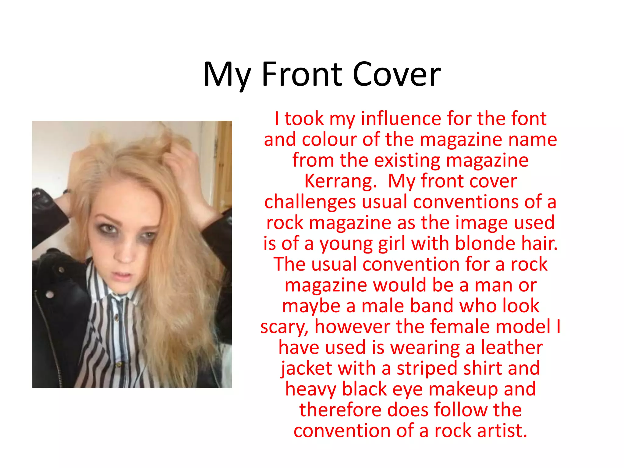
I took my influence for the font
and colour of the magazine name
from the existing magazine
Kerrang. My front cover
challenges usual conventions of a
rock magazine as the image used
is of a young girl with blonde hair.
The usual convention for a rock
magazine would be a man or
maybe a male band who look
scary, however the female model I
have used is wearing a leather
jacket with a striped shirt and
heavy black eye makeup and
therefore does follow the
convention of a rock artist.
My Front Cover
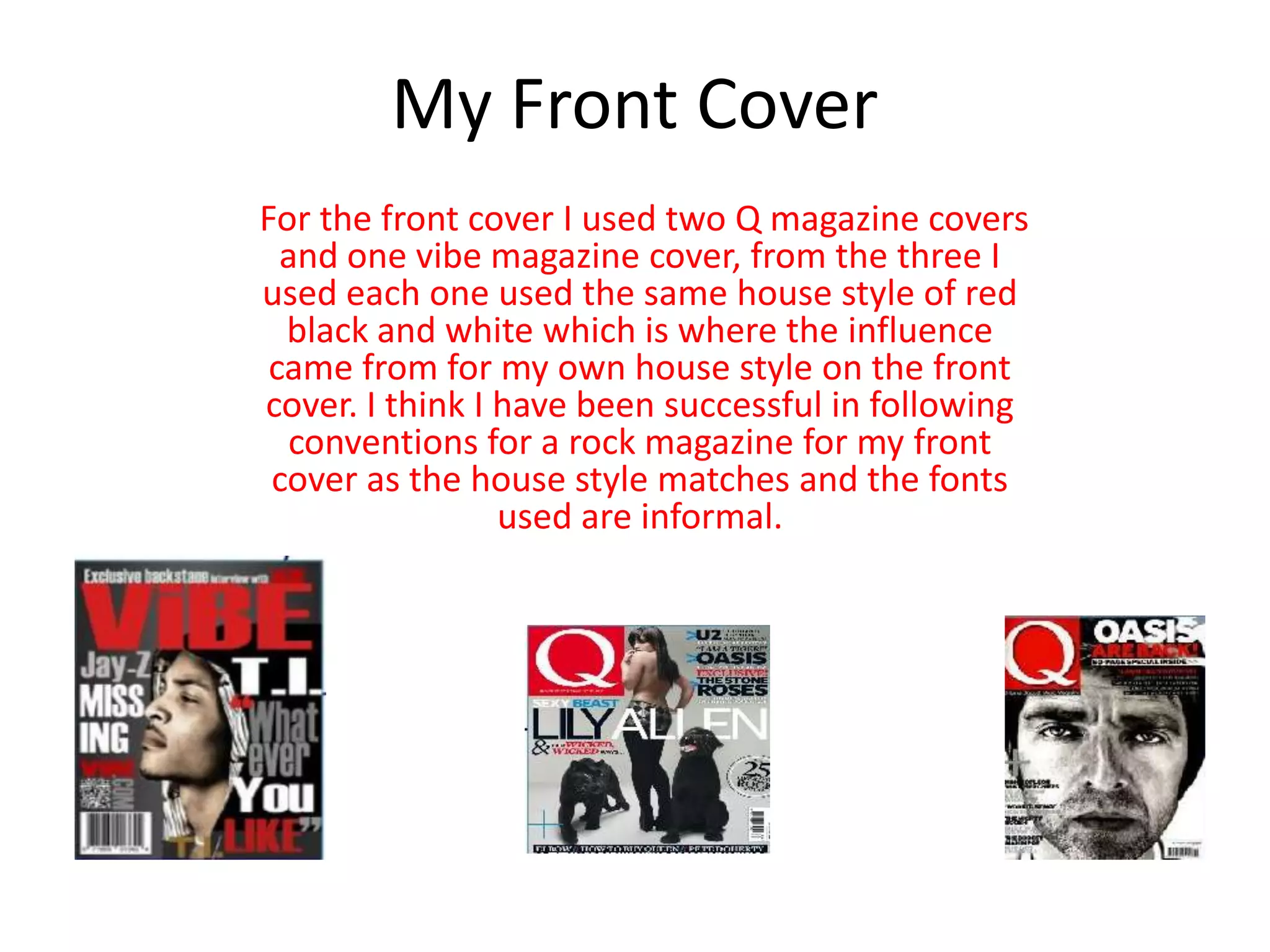
For the front cover I used two Q magazine covers
and one vibe magazine cover, from the three I
used each one used the same house style of red
black and white which is where the influence
came from for my own house style on the front
cover. I think I have been successful in following
conventions for a rock magazine for my front
cover as the house style matches and the fonts
used are informal.
My Front Cover
The influence of the style of my front cover
came from the image below of an existing
NME cover, I have used a similar layout with
the cover lines and similar spacing.
Contents Page
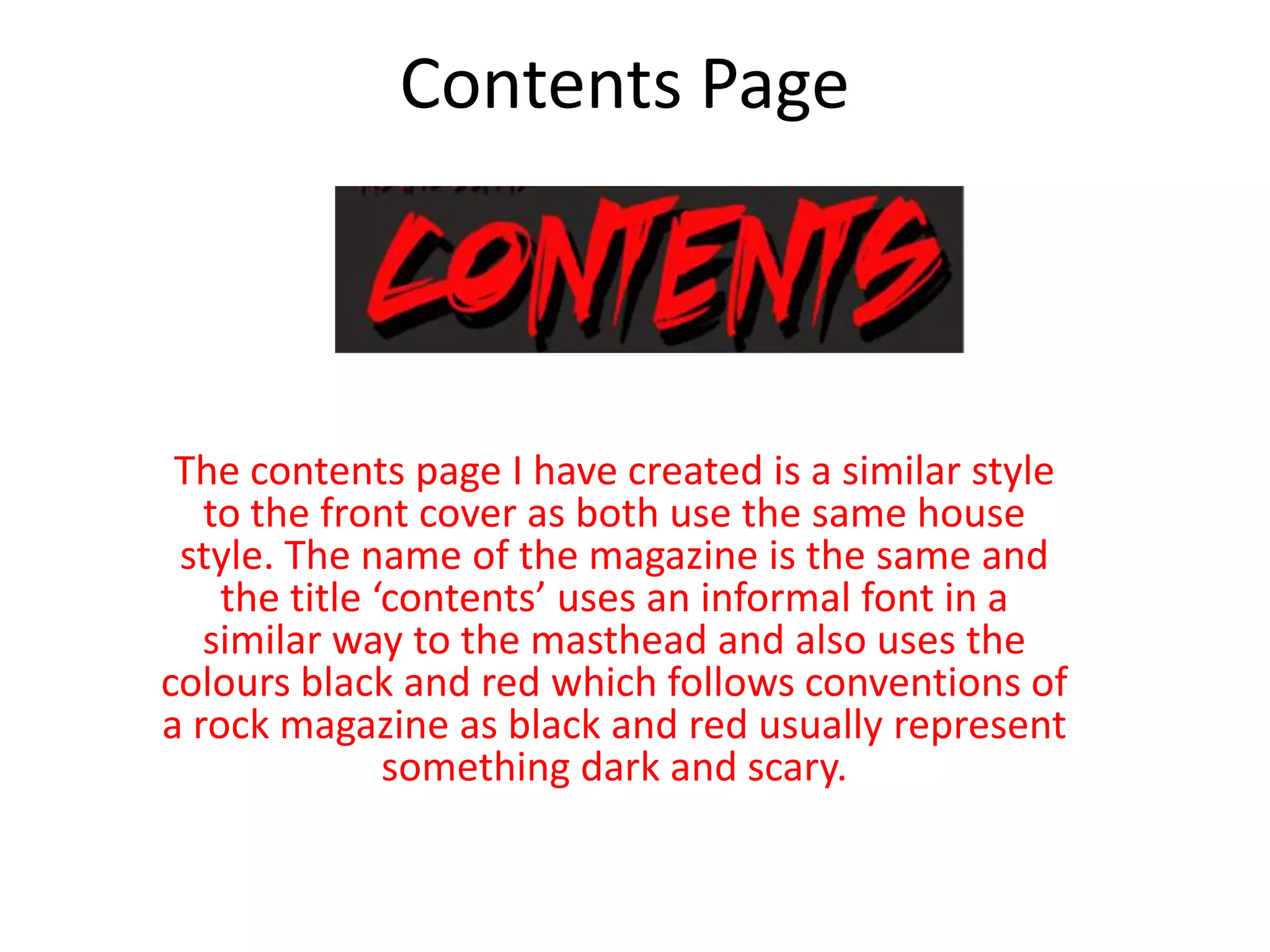
The contents page I have created is a similar style
to the front cover as both use the same house
style. The name of the magazine is the same and
the title ‘contents’ uses an informal font in a
similar way to the masthead and also uses the
colours black and red which follows conventions of
a rock magazine as black and red usually represent
something dark and scary.
Contents Page
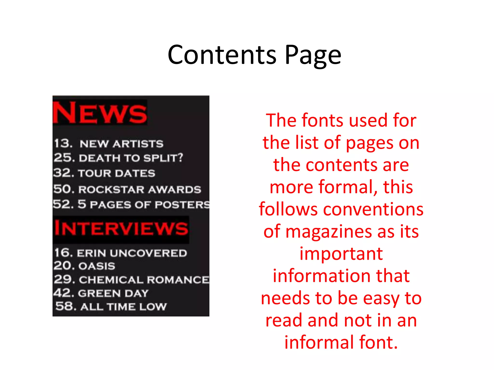
The fonts used for
the list of pages on
the contents are
more formal, this
follows conventions
of magazines as its
important
information that
needs to be easy to
read and not in an
informal font.
Contents Page
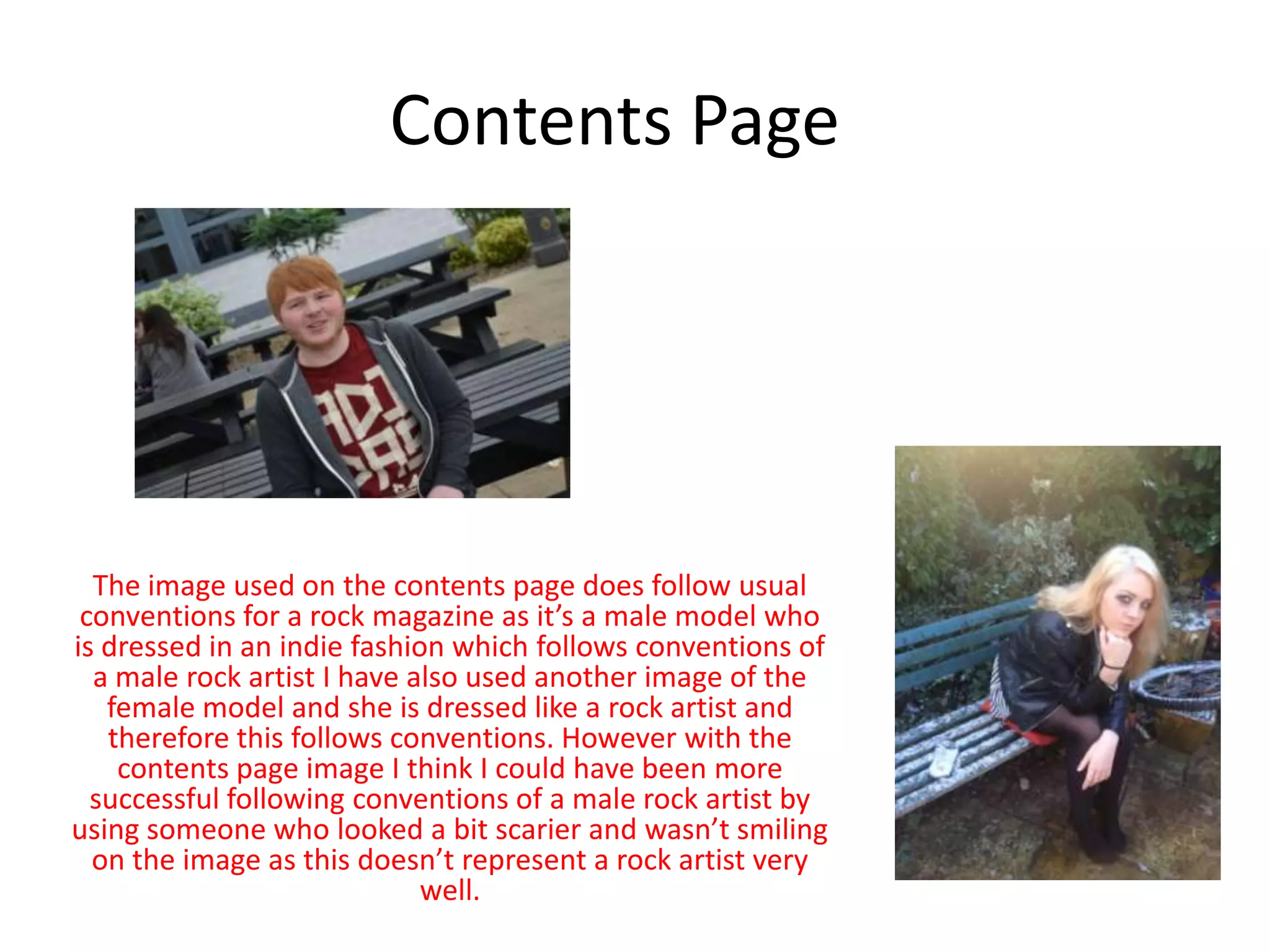
The image used on the contents page does follow usual
conventions for a rock magazine as it’s a male model who
is dressed in an indie fashion which follows conventions of
a male rock artist I have also used another image of the
female model and she is dressed like a rock artist and
therefore this follows conventions. However with the
contents page image I think I could have been more
successful following conventions of a male rock artist by
using someone who looked a bit scarier and wasn’t smiling
on the image as this doesn’t represent a rock artist very
well.
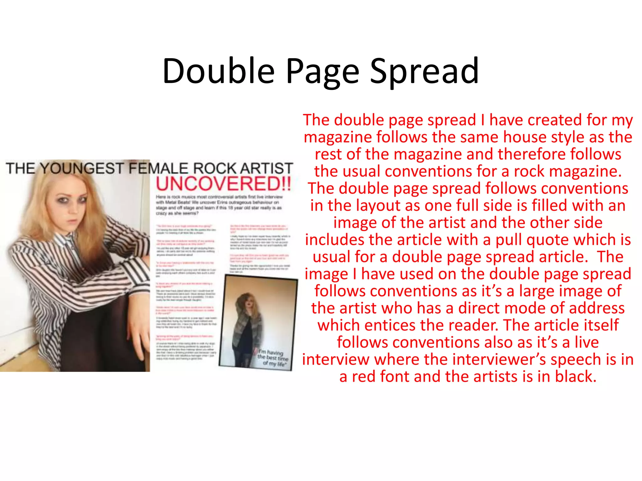
Double Page Spread
The double page spread I have created for my
magazine follows the same house style as the
rest of the magazine and therefore follows
the usual conventions for a rock magazine.
The double page spread follows conventions
in the layout as one full side is filled with an
image of the artist and the other side
includes the article with a pull quote which is
usual for a double page spread article. The
image I have used on the double page spread
follows conventions as it’s a large image of
the artist who has a direct mode of address
which entices the reader. The article itself
follows conventions also as it’s a live
interview where the interviewer’s speech is in
a red font and the artists is in black.

Question 1

  • 1.
    In what waysdoes your media product use, develop or challenge forms and conventions of real media products? By Robyn Clemans
  • 2.
    My Front Cover Thename of my magazine follows conventions of real music magazines as I have chosen to create a rock magazine, the name of my magazine is ‘metal beats’ the word metal relates to the genre of music my magazine is based on and the word beats is related to music. The font used for the name metal beats also follows conventions for a rock magazine as the font is informal and therefore attracts the young target audience; the colour used also follows conventions as I have used red which usually represents danger which is related to rock music
  • 3.
    My Front Cover Itook my influence for the font and colour of the magazine name from the existing magazine Kerrang. My front cover challenges usual conventions of a rock magazine as the image used is of a young girl with blonde hair. The usual convention for a rock magazine would be a man or maybe a male band who look scary, however the female model I have used is wearing a leather jacket with a striped shirt and heavy black eye makeup and therefore does follow the convention of a rock artist.
  • 4.
    My Front Cover Forthe front cover I used two Q magazine covers and one vibe magazine cover, from the three I used each one used the same house style of red black and white which is where the influence came from for my own house style on the front cover. I think I have been successful in following conventions for a rock magazine for my front cover as the house style matches and the fonts used are informal.
  • 5.
    My Front Cover Theinfluence of the style of my front cover came from the image below of an existing NME cover, I have used a similar layout with the cover lines and similar spacing.
  • 6.
    Contents Page The contentspage I have created is a similar style to the front cover as both use the same house style. The name of the magazine is the same and the title ‘contents’ uses an informal font in a similar way to the masthead and also uses the colours black and red which follows conventions of a rock magazine as black and red usually represent something dark and scary.
  • 7.
    Contents Page The fontsused for the list of pages on the contents are more formal, this follows conventions of magazines as its important information that needs to be easy to read and not in an informal font.
  • 8.
    Contents Page The imageused on the contents page does follow usual conventions for a rock magazine as it’s a male model who is dressed in an indie fashion which follows conventions of a male rock artist I have also used another image of the female model and she is dressed like a rock artist and therefore this follows conventions. However with the contents page image I think I could have been more successful following conventions of a male rock artist by using someone who looked a bit scarier and wasn’t smiling on the image as this doesn’t represent a rock artist very well.
  • 9.
    Double Page Spread Thedouble page spread I have created for my magazine follows the same house style as the rest of the magazine and therefore follows the usual conventions for a rock magazine. The double page spread follows conventions in the layout as one full side is filled with an image of the artist and the other side includes the article with a pull quote which is usual for a double page spread article. The image I have used on the double page spread follows conventions as it’s a large image of the artist who has a direct mode of address which entices the reader. The article itself follows conventions also as it’s a live interview where the interviewer’s speech is in a red font and the artists is in black.