![The images ,[object Object],-Altering the opacity was the first idea I wanted to incorporate to make the images more interesting, but I wanted to expand on it. -One of the ideas I had for my double page spread image was the same person with a guitar in different poses, with reduced opacity for each image. -For some reason a music video came to mind, the white stripes. The effects in the video are really interesting and I would like to commit them to my magazine.(Explained on the next slide).](data:image/gif;base64,R0lGODlhAQABAIAAAAAAAP///yH5BAEAAAAALAAAAAABAAEAAAIBRAA7)
Recommended
More Related Content
What's hot
What's hot (16)
Viewers also liked
Viewers also liked (20)
Similar to Step 30
Similar to Step 30 (20)
More from stevenpwells
More from stevenpwells (19)
Step 30
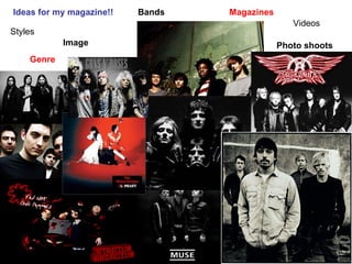
- 1. Ideas for my magazine!! Styles Genre Image Bands Magazines Videos Photo shoots
- 3. The main image My original idea for my main cover came from my research and planning. In particular this image. I wanted to use this kind of image but of a guy rock-star with his arms crossed and his hands covering his mouth, looking directly at the camera. This image would bring out my genre of a serious rock magazine, conceptualising what my magazine is all about, and my target audience I am trying to appeal to. These pictures are screen shots from the white stripes videos “seven nation army”. I want to incorporate the dark colours into my magazine because they work so well togeather and in terms of the way the rockstar is presented I want to use a smaller image of the star, covered by a bigger picture of the same star, standing over themselves. All together I think this will bring passion of the music to the magazine, using this interested visual technique.
- 4. http://www.whitestripes.com/video/video.html This is a shot taken from the website of white stripes, the style is exactly what I am looking for, it’s interesting, the colours are dark showing it is rock, but it is presented neatly, bringing seriousness to the band and the genre. Whereas other rock bands can show themselves to be rockers who just don’t care, through having a busy video, kind of all over the place, showing a different type of rock all together.
- 5. Fonts and lettering The san serif fonts used for the masthead VIBE are all consistent, it’s a simplistic font and one which stands out. The font here used is also very simplistic but underneath each band is a red line, this separates the writing and makes it easy to read, it looks good and could be easy incorporated to my music magazine. Using a colour scheme associated with my genre can help bring my music magazine across in an effective way to the reader. Red, black and white colours work together well for my genre.
- 6. Masthead & Fonts I really like the font on the right known as the “pac-man” font, I think this will bring an old-school feel to the magazine. Names for the magazine: -Bachelor -Condo magazine -Today magazine -Future -Tomorrow magazine
- 7. Genre My band/artist will be based around indie rock. There are bands and people in particular who I think I can relate and interperate into my magazine. Kings of Leon – This is the type of music I am talking about, they are serious rockers, they don’t walk on stage with the intention to break everything around them but they care about the music and their music in particular, when you listen to it, it’s a different sound which is near impossible to replicate. MGMT – Their music can’t really be classed as rock, but it’s the attitude the band gives off, a vibe embedded in their music which makes them individual/different. I think these examples of the two bands should be the range of music my magazine talks about. I also would like my magazine to incorporate a bit of an old school feel, to broaden the age range of young adults, to people around 30-40. I believe my magazine will be targeted more at a personality rather than an age group. Men who are interested in fashion, like a little bit of sport and have a relaxed attitude will favour my magazine.
- 8. Genre The killers are a modern band which concern their musical identity with an 80s vibe. My music magazine is about “ New music with an old school twist ”. This is what makes my magazine unique.