1. House style
Ancillary Research
Imagery
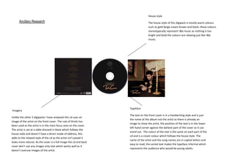
Unlike the other 2 digipacks I have analysed this cd uses an
image of the artist on the front cover. The rule of thirds has
been used as the artist is in the main focus area on the cover.
The artist is sat at a table dressed in black which follows the
house style and doesn’t have a direct mode of address, this
adds to the relaxed style of the cd as the artist isn’t posed it
looks more natural. As the cover is a full image the cd and back
cover don’t use any images only text which works well as it
doesn’t overuse images of the artist.
The house style of this digipack is mostly warm colours
such as gold beige cream brown and black, these colours
stereotypically represent r&b music as nothing is too
bright and bold the colours are relaxing just like r&b
music.
Typeface
The text on the front cover is in a handwriting style and is just
the name of the album not the artist as there is already an
image to show the artist, the position of the text is in the lower
left hand corner against the darkest part of the cover so it can
stand out. The colour of the text is the same on each part of the
cd and is a cream colour which follows the house style. The
name of the artist and the song names are in capital letters and
easy to read, the varied text makes the typeface informal which
represents the audience who would be young adults.