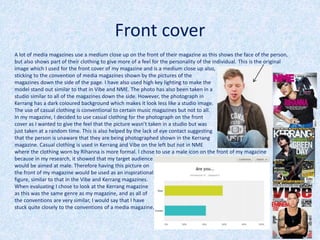
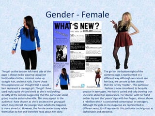
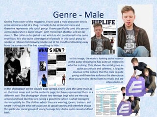
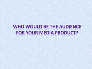
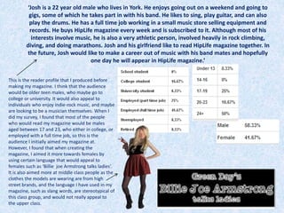
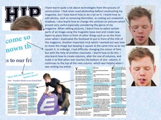
On the front cover of the magazine, the author uses a male model represented as a bit of a thug to appeal to the target male audience of late teens. Throughout the magazine, the author aims to represent the target audience of middle class teenagers through the casual clothing and appearances of the models. While trying to include diversity, the magazine unintentionally shows bias towards featuring only white British people due to limitations. The author considers publishers like IPC who distribute similar magazines as potential partners due to their large audience reach and expertise in marketing magazines across different platforms.
media school homework coursework questions one a levels sixth form media studies exams preparation powerpoint presentation music magazine front cover contents page double page spread article images editing text layers text masthead coverlines
Welcome to TechSoup New Member Orientation and Q&A (May 2024).pdfTechSoup
In this webinar you will learn how your organization can access TechSoup's wide variety of product discount and donation programs. From hardware to software, we'll give you a tour of the tools available to help your nonprofit with productivity, collaboration, financial management, donor tracking, security, and more.
How to Create Map Views in the Odoo 17 ERPCeline George
The map views are useful for providing a geographical representation of data. They allow users to visualize and analyze the data in a more intuitive manner.
Instructions for Submissions thorugh G- Classroom.pptxJheel Barad
This presentation provides a briefing on how to upload submissions and documents in Google Classroom. It was prepared as part of an orientation for new Sainik School in-service teacher trainees. As a training officer, my goal is to ensure that you are comfortable and proficient with this essential tool for managing assignments and fostering student engagement.
Students, digital devices and success - Andreas Schleicher - 27 May 2024..pptxEduSkills OECD
Andreas Schleicher presents at the OECD webinar ‘Digital devices in schools: detrimental distraction or secret to success?’ on 27 May 2024. The presentation was based on findings from PISA 2022 results and the webinar helped launch the PISA in Focus ‘Managing screen time: How to protect and equip students against distraction’ https://www.oecd-ilibrary.org/education/managing-screen-time_7c225af4-en and the OECD Education Policy Perspective ‘Students, digital devices and success’ can be found here - https://oe.cd/il/5yV
Operation “Blue Star” is the only event in the history of Independent India where the state went into war with its own people. Even after about 40 years it is not clear if it was culmination of states anger over people of the region, a political game of power or start of dictatorial chapter in the democratic setup.
The people of Punjab felt alienated from main stream due to denial of their just demands during a long democratic struggle since independence. As it happen all over the word, it led to militant struggle with great loss of lives of military, police and civilian personnel. Killing of Indira Gandhi and massacre of innocent Sikhs in Delhi and other India cities was also associated with this movement.
2024.06.01 Introducing a competency framework for languag learning materials ...Sandy Millin
http://sandymillin.wordpress.com/iateflwebinar2024
Published classroom materials form the basis of syllabuses, drive teacher professional development, and have a potentially huge influence on learners, teachers and education systems. All teachers also create their own materials, whether a few sentences on a blackboard, a highly-structured fully-realised online course, or anything in between. Despite this, the knowledge and skills needed to create effective language learning materials are rarely part of teacher training, and are mostly learnt by trial and error.
Knowledge and skills frameworks, generally called competency frameworks, for ELT teachers, trainers and managers have existed for a few years now. However, until I created one for my MA dissertation, there wasn’t one drawing together what we need to know and do to be able to effectively produce language learning materials.
This webinar will introduce you to my framework, highlighting the key competencies I identified from my research. It will also show how anybody involved in language teaching (any language, not just English!), teacher training, managing schools or developing language learning materials can benefit from using the framework.
The Roman Empire A Historical Colossus.pdfkaushalkr1407
The Roman Empire, a vast and enduring power, stands as one of history's most remarkable civilizations, leaving an indelible imprint on the world. It emerged from the Roman Republic, transitioning into an imperial powerhouse under the leadership of Augustus Caesar in 27 BCE. This transformation marked the beginning of an era defined by unprecedented territorial expansion, architectural marvels, and profound cultural influence.
The empire's roots lie in the city of Rome, founded, according to legend, by Romulus in 753 BCE. Over centuries, Rome evolved from a small settlement to a formidable republic, characterized by a complex political system with elected officials and checks on power. However, internal strife, class conflicts, and military ambitions paved the way for the end of the Republic. Julius Caesar’s dictatorship and subsequent assassination in 44 BCE created a power vacuum, leading to a civil war. Octavian, later Augustus, emerged victorious, heralding the Roman Empire’s birth.
Under Augustus, the empire experienced the Pax Romana, a 200-year period of relative peace and stability. Augustus reformed the military, established efficient administrative systems, and initiated grand construction projects. The empire's borders expanded, encompassing territories from Britain to Egypt and from Spain to the Euphrates. Roman legions, renowned for their discipline and engineering prowess, secured and maintained these vast territories, building roads, fortifications, and cities that facilitated control and integration.
The Roman Empire’s society was hierarchical, with a rigid class system. At the top were the patricians, wealthy elites who held significant political power. Below them were the plebeians, free citizens with limited political influence, and the vast numbers of slaves who formed the backbone of the economy. The family unit was central, governed by the paterfamilias, the male head who held absolute authority.
Culturally, the Romans were eclectic, absorbing and adapting elements from the civilizations they encountered, particularly the Greeks. Roman art, literature, and philosophy reflected this synthesis, creating a rich cultural tapestry. Latin, the Roman language, became the lingua franca of the Western world, influencing numerous modern languages.
Roman architecture and engineering achievements were monumental. They perfected the arch, vault, and dome, constructing enduring structures like the Colosseum, Pantheon, and aqueducts. These engineering marvels not only showcased Roman ingenuity but also served practical purposes, from public entertainment to water supply.
We all have good and bad thoughts from time to time and situation to situation. We are bombarded daily with spiraling thoughts(both negative and positive) creating all-consuming feel , making us difficult to manage with associated suffering. Good thoughts are like our Mob Signal (Positive thought) amidst noise(negative thought) in the atmosphere. Negative thoughts like noise outweigh positive thoughts. These thoughts often create unwanted confusion, trouble, stress and frustration in our mind as well as chaos in our physical world. Negative thoughts are also known as “distorted thinking”.
How to Split Bills in the Odoo 17 POS ModuleCeline George
Bills have a main role in point of sale procedure. It will help to track sales, handling payments and giving receipts to customers. Bill splitting also has an important role in POS. For example, If some friends come together for dinner and if they want to divide the bill then it is possible by POS bill splitting. This slide will show how to split bills in odoo 17 POS.
Palestine last event orientationfvgnh .pptxRaedMohamed3
An EFL lesson about the current events in Palestine. It is intended to be for intermediate students who wish to increase their listening skills through a short lesson in power point.
The Art Pastor's Guide to Sabbath | Steve ThomasonSteve Thomason
What is the purpose of the Sabbath Law in the Torah. It is interesting to compare how the context of the law shifts from Exodus to Deuteronomy. Who gets to rest, and why?
The Art Pastor's Guide to Sabbath | Steve Thomason
My evaluation
1.
2.
3. Front cover
A lot of media magazines use a medium close up on the front of their magazine as this shows the face of the person,
but also shows part of their clothing to give more of a feel for the personality of the individual. This is the original
image which I used for the front cover of my magazine and is a medium close up also,
sticking to the convention of media magazines shown by the pictures of the
magazines down the side of the page. I have also used high key lighting to make the
model stand out similar to that in Vibe and NME. The photo has also been taken in a
studio similar to all of the magazines down the side. However, the photograph in
Kerrang has a dark coloured background which makes it look less like a studio image.
The use of casual clothing is conventional to certain music magazines but not to all.
In my magazine, I decided to use casual clothing for the photograph on the front
cover as I wanted to give the feel that the picture wasn’t taken in a studio but was
just taken at a random time. This is also helped by the lack of eye contact suggesting
that the person is unaware that they are being photographed shown in the Kerrang
magazine. Casual clothing is used in Kerrang and Vibe on the left but not in NME
where the clothing worn by Rihanna is more formal. I chose to use a male icon on the front of my magazine
because in my research, it showed that my target audience
would be aimed at male. Therefore having this picture on
the front of my magazine would be used as an inspirational
figure, similar to that in the Vibe and Kerrang magazines.
When evaluating I chose to look at the Kerrang magazine
as this was the same genre as my magazine, and as all of
the conventions are very similar, I would say that I have
stuck quite closely to the conventions of a media magazine.
4. Front cover
On the front cover of my magazine, I used the idea from other magazines to put the model
in front of the title of the magazine. This seems to be done in all magazines and is an
accepted convention. It is also a convention to put the name of the magazine right at the
top of the page and have it in large bold font. I also have a barcode in the bottom life hand
corner and issue number in the top right which I have seen on every magazine that I have
analysed. The main headline I have done in different sized fonts which I haven’t seen on
many front covers, but I chose to go against this convention as I believed that it would
make the name of the person stand out from the rest of the headline and would draw
people to it. I put the main storylines down one side of the page which also seems to be
done in most magazines that I have looked at. The colour scheme which I chose to use does
not reflect the conventions used in media magazines. In my research, I chose a colour
scheme of black, white, green, and blue. However, when I started to
produce my magazine, I realized that these colours didn’t stand out as
much on the page as just black and white and therefore changed the
original colour scheme. Most magazines have a colour scheme of
yellow, red, black and white, or
something similar to this and I have
therefore challenged the media
conventions in this sense. Although
I haven’t included yellow and red, I
have used mainly white and black
for the cover lines, which shows that
to some extent I have followed
the conventions of music magazines.
5. Contents page
On my contents page, I have copied ideas
from other magazines by using an image of
a male with a guitar with what appeared to
be in concert. However, I have not followed
the convention of the magazine by editing
the image to make it black and white. I did
this as when I did my research into the
theme which I wanted to base my
magazine on, I found that there were quite
a lot of images which were in black and
white or had some sort of effect on them
and therefore put this theme into my
magazine.
With this image, I blurred out the face as it was for a
competition. I haven’t come across a magazine which
has a photograph like this on their contents page but I
decided to blur the image and make it unique to my
magazine. However, the costume that I used is very
conventional to the type of magazine which I produced:-
indie rock. It is quite unique to see an indie rock solo
artist which is a woman, but I included this image as I
wanted my magazine to go against certain stereotypes.
Although I have not followed conventions of a typical
magazine with this image, I included it as I thought this
type of image should be more common in indie rock
magazines such as Kerrang, NME, etc.
I decided to use casual clothes with this image as the girl is
quite young and not properly famous at the issue of this
magazine but is rising. I have seen many magazines which use
casual clothes and therefore have stuck to the conventions of
an indie rock magazine. The photograph is taken in a studio
and, on the contents page, has a white background. This makes
the picture look very bright which is quite conventional to
certain magazines.
6. Contents page
On my contents page, I have in some ways stuck to the conventions
of a typical media product. All magazine contents pages have some
sort of title at the top of the page, most of them just being ‘contents’, but
some magazines have their own unique title such as NME. Also, most
magazines have either the issue number or the date underneath the title
which I have also done. I have set out my page into 3 columns. All of the
magazine contents pages I looked at had some sort of column
arrangement, but none I saw had the whole page split into columns. I did
this because I thought that it would make the page look neat. When I was
analysing contents pages, I found that most of the pages had a larger
photograph that stood out on the page. However, I decided to make all of
my photographs of the same size as they were all as equally as important.
Originally I planned to have the bottom half of the page set into two
columns and the rest of the page filled with two
pictures. However, when I started to make the
contents page, I found that the images I was
using were didn’t look right in the places that I
originally planned to put them because they
were a bit of a funny shape. I have used the left
hand side of the page to advertise ‘feature’
articles. Although not always in the same place,
most magazines also have something like this
to separate the main
articles from the rest
of the articles.
7. Double page spread
With the image on the double page spread, I originally planned on using a serious image.
However, when I did the photoshoot and experimented with certain scenarios, this image
seemed to be the image which was most related to the content of my article. Most
magazines do have serious photos for their double page spreads but some articles
(particularly those about bands) will use images which aren’t serious. By using an image
like this then, in some ways I went against the conventions of a magazine but in other
ways I followed the conventions. Although most images don’t advertise channels or
festivals, I decided to go against this idea and use the prop of the E4 sign. This was used
to draw potential buyers in. By using the E4 sign, it intrigues the viewers as to what the
article is about which will then persuade them to buy the magazine to read the full
article. On my original image, it had shadows as a resultant of the lighting arrangement in
the photoshoot, I decided to edit the image so the shadows did not exist which made the
image look brighter. On most double page spreads which I viewed, the photographs on
these certain pages had high lighting and looked quite bright so by doing this, I followed
the conventions of the type of magazine which I produced. The image which I took was in
the studio which sticks to the convention of most magazine double page spreads.
8. Double page spreadIn my double page spread, I used a large ‘H’ standing for Hiplife magazine. I originally
got this idea from Q magazine when evaluating other magazines and decided that I
would like to use something like this as I thought that it drew attention to the page
whilst also advertising the magazine. Although it is used in Q magazine, it did not
follow the conventions of normal music magazines as I have only seen this used in one
other magazine. I have also used a large pull quote at the top of the page. This is used
in a lot in music magazines as it gives the reader some idea of what will be included in
the article. Although I did stick to the convention of the magazine in that sense, I used
different colours to make the quote stand out which I have not seen done in other
magazine developing the conventions of a music magazine. I put page numbers at the
bottom of the page which is used in every magazine, and also included the issue
number. I have also set out my text into 3 columns. Columns are used in every
magazine therefore following the conventions. The photograph takes up one side of
the double page spread and the other side is taking up by the actual article. This seems
to be the case in most magazines which I have researched. The
colour scheme that I used is very neutral with quite pale colours
which seems to be the case in most music magazines. However, I
chose to use a white background whereas most magazines don’t
use photographs
from a studio and
therefore have
their own
backgrounds.
9.
10. The girl on the bottom left hand side of the
page is shown to be wearing casual yet
fashionable clothes, minimal make up,
straight hair, and nice nails. I have chose
this appearance as I thought that it would
best represent a teenage girl. The girl I have
used looks quite shy and timid as she is not looking
directly at the camera suggesting that this particular social
group may be quite vulnerable. This may appeal to the
audience I have chosen as she is an attractive young girl
which may interest the younger men which my magazine
is more aimed at. However, the female readers may relate
themselves to her and therefore read about her story.
The girl on the bottom right of the
contents page is represented in a
different way. Although we cannot see
her face, we can see by her clothes
that she is very ‘hipster’. This particular
fashion is now considered to be quite
popular in teenagers. Her hair is curled and tidy showing that
she cares about her appearance. Her stance, with her hand
on her hip and the ‘peace’ sign with her fingers, almost shows
a rebellion which is considered stereotypical in teenagers.
Although the girls on my magazine are represented in
different ways, it still represents this particular social group as
fashionable and attractive.
Gender - Female
11. On the front cover of the magazine, I have used a male character who is
represented as a bit of a thug. He looks to be in his late teens and
therefore represents this social group. I have specifically used this person
as his appearance is quite ‘rough’, with messy hair, stubble, and an ear
stretch. The collar on his jacket is up which is also considered to be quite
rebellious. It is also quite stereotypical of people in this social group to
smoke so I shown him blowing smoke out of his mouth and looking away
from the camera as if he has something to hide.
In this image, the male is looking quite intently
at the guitar showing he has quite an interest in
what he is doing. This shows the social group as
quite passionate and talented. It is quite
obvious in the picture that the male is quite
young and therefore enforces the stereotype
that young males like to listen to music and are
interested in it.
Genre - Male
In the photograph on the double page spread, I have used the same male as
on the front cover and on the contents page, but have represented them in a
different way. The photograph shows two teenage boys who are messing
around and look like they are having a good time which is what teenagers
stereotypically do. The clothes which they are wearing, (jeans, trainers, and
smart t-shirts) are what we associate as casual clothes and therefore shows
this particular social group of young teenage boys to be quite casual and laid
back.
12. In my magazine, I have only
used one ethnicity, white
British. Although I wanted
to have different ethnicities
in my magazine, coming
from a predominantly white
British city, it is hard to find
people of different
ethnicities to participate.
Therefore the magazine
shows an unintentional bias
towards this ethnicity of
people, maybe showing
them to be more important
that other ethnicities which
is not how I planned my
magazine to be perceived.
Class/Ethnicity
I have included quite a lot of information about
festivals in my magazine which suggests that it is
predominantly aimed at middle class and above
people as lower class people are unlikely to be able
to afford a ticket to one of these festivals.
However, I have also included information about
competitions which could appeal to a lower class
background because they may be able to win free
tickets to festivals and money.
13.
14. I think that a publisher such as IPC would distribute my product.
This is because they publish NME magazine which is similar to mine
so they already have expertise in distributing this type of magazine.
However, because this is the only music magazine they distribute, it
means that there is room for another music magazine to be
published here. IPC are the UK’s leading consumer magazine which
means that they are very well known and have the ability to market
my magazine efficiently and help to boost sales. They also market
their products in lots of different ways for example across print,
mobile, tablets, and events. This therefore means there are lots of
different ways in which the product can be distributed which would
help to widen my audience base and sell more copies. It would also
mean that people will have different ways of accessing it. For
example, if one week a reader was unable to go the shop and buy a
copy, they may be able to buy it online and read it from their
computer so it therefore doesn’t give people an excuse not to read
the magazine. I would also consider Bauer media group to publish
my product because they are very well known and would be able to
distribute it very effectively.
Large audience
NME is the only other
music magazine
‘IPC media was founded in 1958 and sells over 350 million copies of
magazines each year. They are the UK’s leading consumer magazine
publisher and engage with almost two thirds of the women in the
UK and 42% of men. IPC is divided into six sections; newspapers,
magazines, trade and technical, books, printing, and new products.
It sells a few of the most recognised newspapers in the UK, the Sun
and the Daily Mirror. The magazines which they publish are made
to target the general population of male and woman in separate
magazines, and also upmarket women. Some of the magazines
which they publish are; Teen now, Marie Clare, Look, and Nuts.’
15.
16. ‘Josh is a 22 year old male who lives in York. He enjoys going out on a weekend and going to
gigs, some of which he takes part in with his band. He likes to sing, play guitar, and can also
play the drums. He has a full time job working in a small music store selling equipment and
records. He buys HipLife magazine every week and is subscribed to it. Although most of his
interests involve music, he is also a very athletic person, involved heavily in rock climbing,
diving, and doing marathons. Josh and his girlfriend like to read HipLife magazine together. In
the future, Josh would like to make a career out of music with his band mates and hopefully
one day he will appear in HipLife magazine.’
This is the reader profile that I produced before
making my magazine. I think that the audience
would be older teen males, who maybe go to
college or university. It would also appeal to
individuals who enjoy indie-rock music, and maybe
are looking to be a musician themselves. When I
did my survey, I found that most of the people
who would read my magazine would be males
aged between 17 and 23, who either in college, or
employed with a full time job, so this is the
audience I initially aimed my magazine at.
However, I found that when creating the
magazine, I aimed it more towards females by
using certain language that would appeal to
females such as ‘Billie joe Armstrong talks ladies’.
It is also aimed more at middle class people as the
clothes the models are wearing are from high
street brands, and the language I have used in my
magazine, such as slang words, are stereotypical of
this class group, and would not really appeal to
the upper class.
17.
18. To attract my audience, I used models who would be the same age as my readers to
either inspire them or attract them. Because the survey showed that there was a
higher proportion of males that would read my magazine, I decided to use a male on
the front cover of my magazine so readers would be able to relate to him. I also
decided to use a male which was in the age range of my expected readers. I dressed
him in casual clothes to further help to relate to the audience of my magazine, middle
class college students which would also stereotypically tend to dress this way.
I also attracted my audience by including information about
festivals in my magazine. It tends to be more teenagers that
attend festivals than other age groups. However, other
people that do attend festivals may also be interested in
reading my magazine because of the information inside it
and therefore expanding the audience.
I made the front cover quite plain and
easy to read trying not to overpower
the readers with information. I
thought that this would help to
attract my audience as
stereotypically, teenagers aren’t seen
to be big readers and therefore didn’t
put too much to read on the front
cover on the magazine which I
thought would help to attract them. I
also made sure that the text was bold
and stood out against the background
so that potential buyers wouldn’t
actually have to read anything before
they were attracted to the magazine.
To address my audience, I used a question to make the audience feel like they were
interacting with the magazine and maybe feel like they were part of something. It
therefore encourages them to buy the magazine as an ‘escape’ from the normal lives
which many teenagers like to do. The question itself ‘Who’s this weeks mystery guest?’
challenges the reader to see if they can figure out who the guest is. This may therefore
attract them as they feel proud of themselves if they manage to correctly identify the
mystery guest.
The found that I chose to use for the masthead would help to attract readers as it
is quite ‘indie’ and unique, which would be the same as the personality of most
of the people reading my magazine. It also helps to attract readers because of
the actual name of the magazine, ‘HipLife’. It makes the readers think that
somehow by read the magazine that their life will be better and more ‘hip’. This
therefore tricks them into buying the magazine.
19. On the contents page, I have used a gradient fill to attract the reader. This first of
all draws their eyes to the features of the magazine, and informs them of the
most important articles in the magazine. I have also used black boxes and white
boxes to separate the summaries, making it easier for readers to see which title
belongs to which page number. If it is easier for the reader to see this, then they
are more likely to purchase the magazine because it means that they won’t have
to put any effort into figuring out where to go for a specific article.
I have included information about how to follow on
social networking sites at the bottom of the page
because teenagers are stereotypically into social
networking sites. This will therefore attract readers
because if they know that they can interact with the
magazine on social networking sites then they may be
more likely to buy it.
Another way in which I have attracted readers is by
using the same font for the word ‘HipLife’ as I have on
the front cover. This will help to create an association
between this font and the magazine and therefore
when people see this font again, they will think of the
magazine.
I have addressed the readers on this page by including a
question at the top of the page in large letters so that it is
the first thing that they will see when opening the page.
This will make them feel like they are interacting with the
magazine, again. I have also used the third person quite a
lot e.g. ‘you’ to make people feel like the magazine is
speaking directly to them.
20.
21. Technologies I have used:
• Powerpoint
• Slideshare
• Blogger
• Survey monkey
• Camera
• Photoshop
• Indesign
22. I have used powerpoint quite a lot previously so I didn’t learn anything new from it in the process of constructing my
magazine. However, I had never used slideshare but managed to figure out how to use it. I learnt how to use the URL from
slideshare to embed into my blog so I could upload a powerpoint presentation. I had also never used blogger before, but
had used other blogging websites such as tumblr etc which it seemed to be similar to. I learnt how to change the layout of
my blog to make it unique to my interests and also how to add a background. I learnt how to change the colour sheme and
also how to upload presentations and word documents. With survey monkey, I had also used this website previously so I
knew how to use it. However, this time I did learn how to change the colour of the banner at the top of the survey.
I also learnt a lot of things about the camera which I used to take
photos on. Although I have used cameras before, I have never used
a professional camera. When I was taking pictures, many of them
came out blurry, but I learnt how to focus the image. I also learnt
how to zoom in and out on the camera, therefore I could take
different types of shots ranging from long shots to close ups. When
in the photography studio, I leant how to connect the camera up to
the light sources so when I took a photograph, the lights would
flash at the same time to make the background look brighter. I also
learnt that if I move the lights around and change the brightness of
them, I could alter the amount of shadow on the image.
23. I have learnt quite a lot about technologies from the process of
construction. I had never used photoshop before constructing my
magazine, but I have learnt how to do a lot on it. I learnt how to
edit photos, such as removing blemishes, or cutting out unwanted
shadows. I also learnt how to change the contrast on pictures which
proved very useful especially considering the genre of my
magazine. When ediitng pictures, I learnt how to select certain
parts of an image using the magnetic lasso tool and create new
layers to place them in front of other things such as on the front
cover when I duplicated the forehead to put in front of the title of
the magazine. Another important trick which I worked out was how
to resize the image but keeping it square at the same time as to not
squash it. In indesign, I had difficulty changing the colour of font,
but with the help of another classmate, I learnt how to do this. I
also learnt how to create columns, alter the size of columns, and
make it so that when text reaches the bottom of one column, it
continues to the top of the next column which was helpful when I
was writing my article.
24.
25. I feel like I have learnt a lot from my preliminary task to
my final product. I have learnt a lot about the conventions
of a music magazine and what should and shouldn’t be
included on the front cover. I have also learnt what
colours and what fonts should be used to make the
magazine look like a real magazine. On top of this, I have
learnt what size to make the writing to make it stand out
but also not to be overpowering and not too big. Another
thing I have learnt, is what type of people to use in the
magazine. For example, if the magazine is aimed at
teenagers, then not to use older people as this will not
attract the younger generation. I also learnt that when
arranging the text on the page, to make the more
important pieces of text larger than the rest so that this is
the first thing that the audience sees.
When making my contents page, I realised that in my
preliminary task, I hardly stuck to any conventions of a
contents page. In my preliminary task, I used 3 large
photographs whereas normal magazines use 1 large
image and a few small images. I also learnt that I
needed to use only certain articles instead of listing
them all in one place. Although I used columns in my
preliminary task, I learnt that this was an accepted way
of presenting as contents page whereas I did it on my
preliminary task to set it out neatly. Another thing
which I have learnt from the progression of my
preliminary task to full product is the right type of
colours to use on a magazine. When I created my
preliminary contents page, I used pink and brown
because I though that they went well together but by
analysing other magazines, I realised that they weren’t
used at all.