The digipack uses a colorful house style with all colors to represent the happy, upbeat pop music. Mika's name stands out in white text against this background. Imagery on the digipack includes colorful cartoon pictures of flowers, fitting the album title "Life in Cartoon Motion". The artist's name is prominently displayed in 3D white bold text against the colors, while song names are in black handwritten style text.
This is a research document on all the different kind of digipaks. I did this to give me a rough idea on what to do for my digipak when I was in the planning stage of making one. These different albums helped me out especially as they are under the same genre as the one I am producing so it was good for me to go off digipaks that are in the same genre.
This is a research document on all the different kind of digipaks. I did this to give me a rough idea on what to do for my digipak when I was in the planning stage of making one. These different albums helped me out especially as they are under the same genre as the one I am producing so it was good for me to go off digipaks that are in the same genre.
1. Ancillary Research
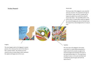
House style
The house style of this digipack is very colourful
and uses all colours, this represents the type of
music which is pop, and this is usually seen as
happy and upbeat music which the colourful
house style shows. The word Mika which is the
artists name is in white which stands out against
the colourful background, also on the back cover
the song list has a blue background so it’s easy to
read.
Imagery
Typeface
The only imagery used on this digipack is cartoon
pictures; this is because the name of the album is
life in cartoon motion. The cartoons are very
colourful and are mostly flowers which represent
the upbeat and happy tone of the music.
The main text on the digipack is the artists
name which is in white bold writing which is
made to look 3d, this stands out against the
colourful background and allows the buyer to
see clearly whose album It is. The song names
and album name is in the same text black and
a handwriting style this goes well with the
style of the cd.