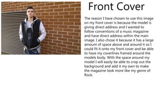
Final Images for Magazine
Front Cover
The reason I have chosen to use this image
on my front cover is because the model is
giving direct address and I wanted to
follow conventions of a music magazine
and have direct address within the main
image. I also chose it because it has a large
amount of space above and around it so I
could fit it onto my front cover and be able
to have my coverlines framed around the
models body. With the space around my
model I will easily be able to crop out the
background and add it my own to make
the magazine look more like my genre of
Rock.
I have chosen to use the first image because I can anchor it to the page number of the
double page spread. I have also decided that the because of how they are position in
the image it would fit in better with the contents page rather than the double page
spread. I have also decided to use my second image because it is a very natural looking
image and both models still look like they would fit into the genre of rock. My third
image an be linked in with my main coverline and main image from the front cover, it
also continues to create the Rock genre I am attempting to achieve. I have chosen my
fourth image because it clearly fit in with my genre and the direct address continues the
conventions of a music magazine that I want to follow.
Contents Page
Double page spread
I have chosen these images because one of them will be my main image and
then I will create a strip down the side or along the bottom using the other
three. The four mages I have chosen all show that the models are having a
good time and will link in with the topic of my article being that they are just
like regular people. Having them just messing/joking around reinforces this
idea that musicians are just like the general public, it subverts the stereotype
that musicians life the rock star lifestyle. Al the images reinforce my strong
genre of Rock and clearly shows that this is a Rock music magazine.

Final Images for Magazine

  • 1.
  • 2.
    Front Cover The reasonI have chosen to use this image on my front cover is because the model is giving direct address and I wanted to follow conventions of a music magazine and have direct address within the main image. I also chose it because it has a large amount of space above and around it so I could fit it onto my front cover and be able to have my coverlines framed around the models body. With the space around my model I will easily be able to crop out the background and add it my own to make the magazine look more like my genre of Rock.
  • 3.
    I have chosento use the first image because I can anchor it to the page number of the double page spread. I have also decided that the because of how they are position in the image it would fit in better with the contents page rather than the double page spread. I have also decided to use my second image because it is a very natural looking image and both models still look like they would fit into the genre of rock. My third image an be linked in with my main coverline and main image from the front cover, it also continues to create the Rock genre I am attempting to achieve. I have chosen my fourth image because it clearly fit in with my genre and the direct address continues the conventions of a music magazine that I want to follow. Contents Page
  • 4.
    Double page spread Ihave chosen these images because one of them will be my main image and then I will create a strip down the side or along the bottom using the other three. The four mages I have chosen all show that the models are having a good time and will link in with the topic of my article being that they are just like regular people. Having them just messing/joking around reinforces this idea that musicians are just like the general public, it subverts the stereotype that musicians life the rock star lifestyle. Al the images reinforce my strong genre of Rock and clearly shows that this is a Rock music magazine.