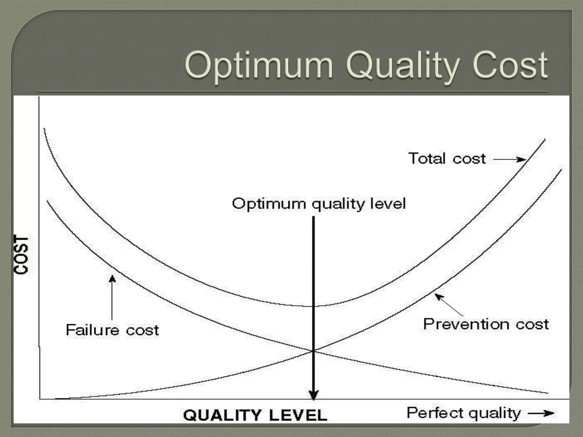
By:
Rahul khatri
Rohit Rupam
Yashwant Singh Rathore
 These are the costs associated with
resources and efforts used to provide quality
to a product.
 Quality costs do not involve simply upgrading
the perceived value of a product to a higher
standard.
 Instead, quality involves creating and
delivering a product that meets the
expectations of a customer.
Feigenbaum defined the following four
quality cost areas:
Prevention
Cost
Appraisal
Cost
Internal
Failure Cost
External
Failure Cost
Cost of control / Cost of
conformance
Cost of failure / Cost of non-
conformance
 Arise from efforts to prevent defects from
occurring at all
 Examples:
• Quality planning
• Statistical process control
• Investment in quality-related information systems
• Quality training and workforce development
• Product-design verification
• Systems development and management
 Arise from detecting defects via inspection, test,
audit
 Examples:
• Test and inspection of purchased materials
• Acceptance testing
• Inspection
• Testing
• Checking labor
• Setup for test or inspection
• Test and inspection equipment
• Quality audits
• Field testing
Arise from defects caught internally and
dealt with by discarding or repairing the
defective items
Examples:
• Scrap
• Rework
• Material procurement costs
Arise from defects that actually reach
customers
Examples:
• Complaints in warranty
• Complaints out of warranty
• Product service
• Product liability
• Product recall
• Loss of reputation
 Described by Joseph M. Juran
 Cost due to production of poor quality
products:
• Tangible costs—factory accounts
• Tangible costs—sales accounts
• Intangible costs
 Delays and stoppages caused by defectives
 Customer good will
 Loss in morale due to friction between departments
 First emphasized by Kaoru Ishikawa, Father
of Quality Circles.
1. Cause-and-effect diagram (also known as the
"fishbone" or Ishikawa diagram)
2. Check sheet
3. Control chart
4. Histogram
5. Pareto chart
6. Scatter diagram
7. Stratification (alternately, flow chart or run chart)
The most
commonly used
graph for
showing
frequency
distributions, or
how often each
different value
in a set of data
occurs.
• A Pareto chart is a bar
graph.
• The lengths of the
bars represent
frequency or cost (time
or money), and are
arranged with longest
bars on the left and the
shortest to the right.
• In this way the chart
visually depicts which
situations are more
significant.
The scatter diagram
graphs pairs of
numerical data, with one
variable on each axis, to
look for a relationship
between them.
If the variables are
correlated, the points will
fall along a line or curve.
The better the
correlation, the more the
points will be close to
the line.
Flow chart
Run chart
Flow line
Terminal
Decision
Input/
Output
Predefined
process
Quality cost and quality control tools

Quality cost and quality control tools

  • 1.
  • 2.
     These arethe costs associated with resources and efforts used to provide quality to a product.  Quality costs do not involve simply upgrading the perceived value of a product to a higher standard.  Instead, quality involves creating and delivering a product that meets the expectations of a customer.
  • 3.
    Feigenbaum defined thefollowing four quality cost areas: Prevention Cost Appraisal Cost Internal Failure Cost External Failure Cost Cost of control / Cost of conformance Cost of failure / Cost of non- conformance
  • 4.
     Arise fromefforts to prevent defects from occurring at all  Examples: • Quality planning • Statistical process control • Investment in quality-related information systems • Quality training and workforce development • Product-design verification • Systems development and management
  • 5.
     Arise fromdetecting defects via inspection, test, audit  Examples: • Test and inspection of purchased materials • Acceptance testing • Inspection • Testing • Checking labor • Setup for test or inspection • Test and inspection equipment • Quality audits • Field testing
  • 7.
    Arise from defectscaught internally and dealt with by discarding or repairing the defective items Examples: • Scrap • Rework • Material procurement costs
  • 8.
    Arise from defectsthat actually reach customers Examples: • Complaints in warranty • Complaints out of warranty • Product service • Product liability • Product recall • Loss of reputation
  • 10.
     Described byJoseph M. Juran  Cost due to production of poor quality products: • Tangible costs—factory accounts • Tangible costs—sales accounts • Intangible costs  Delays and stoppages caused by defectives  Customer good will  Loss in morale due to friction between departments
  • 11.
     First emphasizedby Kaoru Ishikawa, Father of Quality Circles. 1. Cause-and-effect diagram (also known as the "fishbone" or Ishikawa diagram) 2. Check sheet 3. Control chart 4. Histogram 5. Pareto chart 6. Scatter diagram 7. Stratification (alternately, flow chart or run chart)
  • 15.
    The most commonly used graphfor showing frequency distributions, or how often each different value in a set of data occurs.
  • 16.
    • A Paretochart is a bar graph. • The lengths of the bars represent frequency or cost (time or money), and are arranged with longest bars on the left and the shortest to the right. • In this way the chart visually depicts which situations are more significant.
  • 17.
    The scatter diagram graphspairs of numerical data, with one variable on each axis, to look for a relationship between them. If the variables are correlated, the points will fall along a line or curve. The better the correlation, the more the points will be close to the line.
  • 18.
  • 19.

Editor's Notes

  • #10 ISO 9000: The International Organization for Standardization (ISO) 9000 standards are a set of international quality management system standards and guidelines.
  • #11 Factory account: Materials scrapped or junked Labor and burden on product scrapped or junked Labor, materials, and burden necessary to effect repairs on salvageable product Extra operations added because of presence of defectives Burden arising from excess production capacity necessitated by defectives Excess inspection costs Investigation of causes of defects Sales account: Discount on seconds Customer complaints Charges to quality guarantee account
  • #13 Causes and effect, It is kind of reverse technique
  • #14 A structured, prepared form for collecting and analyzing data; a generic tool that can be adapted for a wide variety of purposes.
  • #15 The control chart is a graph used to study how a process changes over time. Data are plotted in time order. A control chart always has a central line for the average, an upper line for the upper control limit and a lower line for the lower control limit. These lines are determined from historical data. By comparing current data to these lines, you can draw conclusions about whether the process variation is consistent (in control) or is unpredictable (out of control, affected by special causes of variation).
  • #16 The most commonly used graph for showing frequency distributions, or how often each different value in a set of data occurs.
  • #21 A run chart is a series of recorded data over time that is graphically represented. This trend will help in understanding whether there is a problem or not.