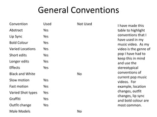
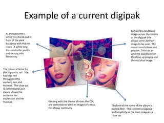
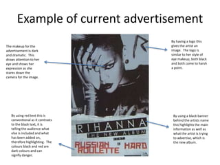
In What Ways Does Your Media
Product Use, Develop or Challenge
Forms and Conventions of Real
Media Products?
General Conventions
Convention Used Not Used
Abstract Yes
Lip Sync Yes
Bold Colour Yes
Varied Locations Yes
Short edits Yes
Longer edits Yes
Effects Yes
Black and White No
Slow motion Yes
Fast motion Yes
Varied Shot types Yes
Graffiti Yes
Outfit change Yes
Male Models No
I have made this
table to highlight
conventions that I
have used in my
music video. As my
video is the genre of
pop I have had to
keep this in mind
and use the
stereotypical
conventions of
current pop music
videos. For
example, location
changes, outfit
changes, lip sync
and bold colour are
most common.
Ancillary text conventions
When I was choosing the font for my
advertisement, as the genre is pop, I was
looking for something edgy but stylish. By
the font having a soft edge this still
stereotypically girly.
As the lyrics of the song are strong towards
women I decided to dress the girls for the
advertisement in black to convey dark rebellion,
as well as having the black lipstick. The contrast
of the pink still shows a feminine side to the
artists.
By using a white background to the main sell line,
this makes it sand out in contrast to the black
background to the bottom of the advertisement,
this separates up the different areas of the
advertisement.
By using neon green this makes this stand out the
most as it is the only predominant colour on the
advertisement. As they are number one singles,
they are already popular with the general public
this draws attention to the artist.
Having contact information icons breaks up the text
as the icons are commonly seen and the public
know the websites without having to write out the
names as text.
I chose neon green as my main colour within
my colour scheme, this means that I have
added the colour in to different parts to my CD
and CD casing.
By having relaxed body language within an image
this conveys likeability to the public. By the
artists being relaxed this also connotes a cool
atmosphere.
I have
continued
the same
font style as
this signifies
continuity
and
connotes a
personal
aspect. The
neon green
banner also
highlights
the name of
the album.
By having a barcode this makes the
album on the market to be bought
by the general public.
As I have a background image I have placed a
panel for the track list to be placed on, I have
changed the transparency so that the full
length image of the artists can still be seen. By
having a full length image it shows the outfit
change and the choice of outfit.
By having an
image with
no text over
it, it simply
shows the
audience the
artists
appearance
and what
vibe they are
wanting to
connote. For
example,
costume,
hair and
makeup can
all be clearly
seen by the
audience. By
having graffiti
as the
background
to the image
this matches
the genre of
pop and has
an edgy vibe
to the girly
costume of a
skirt and
crop top.
Example of a current digipak
The colour scheme for
this digipak is red. She
has kept red
throughout the
scenery, hair and
makeup. The close up
is conventional as it
clearly shows the
audience her
expression and her
makeup.
As the costume is
white this stands out in
front of the dark
backdrop with the red
roses. A white long
dress connotes purity
and beauty, also
femininity.
By having a landscape
image across the insides
of the digipak this
allows some abstract
image to lay over. The
roses connote love and
passion. This ties in
with the expression on
the close up images and
the mid shot image.
The font of the name of the album is
narrow text. This connotes elegance
and simplicity as the main images is a
close up.
Keeping with the theme of roses the CDs
are both covered with an images of a rose,
this shows continuity.
Example of current advertisement
By using a black banner
behind the artists name
this highlights the main
information as well as
what the artist is trying
to advertise, which is
the new album.
By using red text this is
conventional as it contrasts
to the black text, it is
telling the audience what
else is included and what
has been added on,
therefore highlighting. The
colours black and red are
dark colours and can
signify danger.
The makeup for the
advertisement is dark
and dramatic. This
draws attention to her
eye and shows her
expression as she
stares down the
camera for the image.
By having a logo this
gives the artist an
image. The logo is
similar to her style of
eye makeup, both black
and both come to harsh
a point.

Evaluation 1

  • 1.
    In What WaysDoes Your Media Product Use, Develop or Challenge Forms and Conventions of Real Media Products?
  • 2.
    General Conventions Convention UsedNot Used Abstract Yes Lip Sync Yes Bold Colour Yes Varied Locations Yes Short edits Yes Longer edits Yes Effects Yes Black and White No Slow motion Yes Fast motion Yes Varied Shot types Yes Graffiti Yes Outfit change Yes Male Models No I have made this table to highlight conventions that I have used in my music video. As my video is the genre of pop I have had to keep this in mind and use the stereotypical conventions of current pop music videos. For example, location changes, outfit changes, lip sync and bold colour are most common.
  • 3.
    Ancillary text conventions WhenI was choosing the font for my advertisement, as the genre is pop, I was looking for something edgy but stylish. By the font having a soft edge this still stereotypically girly. As the lyrics of the song are strong towards women I decided to dress the girls for the advertisement in black to convey dark rebellion, as well as having the black lipstick. The contrast of the pink still shows a feminine side to the artists. By using a white background to the main sell line, this makes it sand out in contrast to the black background to the bottom of the advertisement, this separates up the different areas of the advertisement. By using neon green this makes this stand out the most as it is the only predominant colour on the advertisement. As they are number one singles, they are already popular with the general public this draws attention to the artist. Having contact information icons breaks up the text as the icons are commonly seen and the public know the websites without having to write out the names as text.
  • 4.
    I chose neongreen as my main colour within my colour scheme, this means that I have added the colour in to different parts to my CD and CD casing. By having relaxed body language within an image this conveys likeability to the public. By the artists being relaxed this also connotes a cool atmosphere. I have continued the same font style as this signifies continuity and connotes a personal aspect. The neon green banner also highlights the name of the album. By having a barcode this makes the album on the market to be bought by the general public. As I have a background image I have placed a panel for the track list to be placed on, I have changed the transparency so that the full length image of the artists can still be seen. By having a full length image it shows the outfit change and the choice of outfit. By having an image with no text over it, it simply shows the audience the artists appearance and what vibe they are wanting to connote. For example, costume, hair and makeup can all be clearly seen by the audience. By having graffiti as the background to the image this matches the genre of pop and has an edgy vibe to the girly costume of a skirt and crop top.
  • 5.
    Example of acurrent digipak The colour scheme for this digipak is red. She has kept red throughout the scenery, hair and makeup. The close up is conventional as it clearly shows the audience her expression and her makeup. As the costume is white this stands out in front of the dark backdrop with the red roses. A white long dress connotes purity and beauty, also femininity. By having a landscape image across the insides of the digipak this allows some abstract image to lay over. The roses connote love and passion. This ties in with the expression on the close up images and the mid shot image. The font of the name of the album is narrow text. This connotes elegance and simplicity as the main images is a close up. Keeping with the theme of roses the CDs are both covered with an images of a rose, this shows continuity.
  • 6.
    Example of currentadvertisement By using a black banner behind the artists name this highlights the main information as well as what the artist is trying to advertise, which is the new album. By using red text this is conventional as it contrasts to the black text, it is telling the audience what else is included and what has been added on, therefore highlighting. The colours black and red are dark colours and can signify danger. The makeup for the advertisement is dark and dramatic. This draws attention to her eye and shows her expression as she stares down the camera for the image. By having a logo this gives the artist an image. The logo is similar to her style of eye makeup, both black and both come to harsh a point.