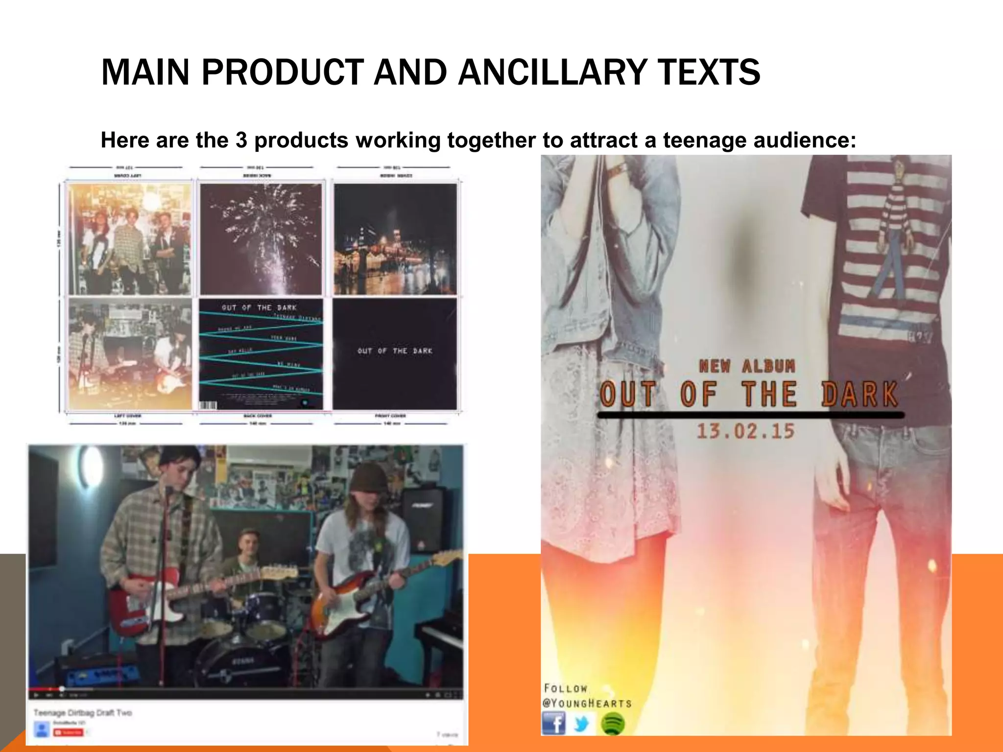
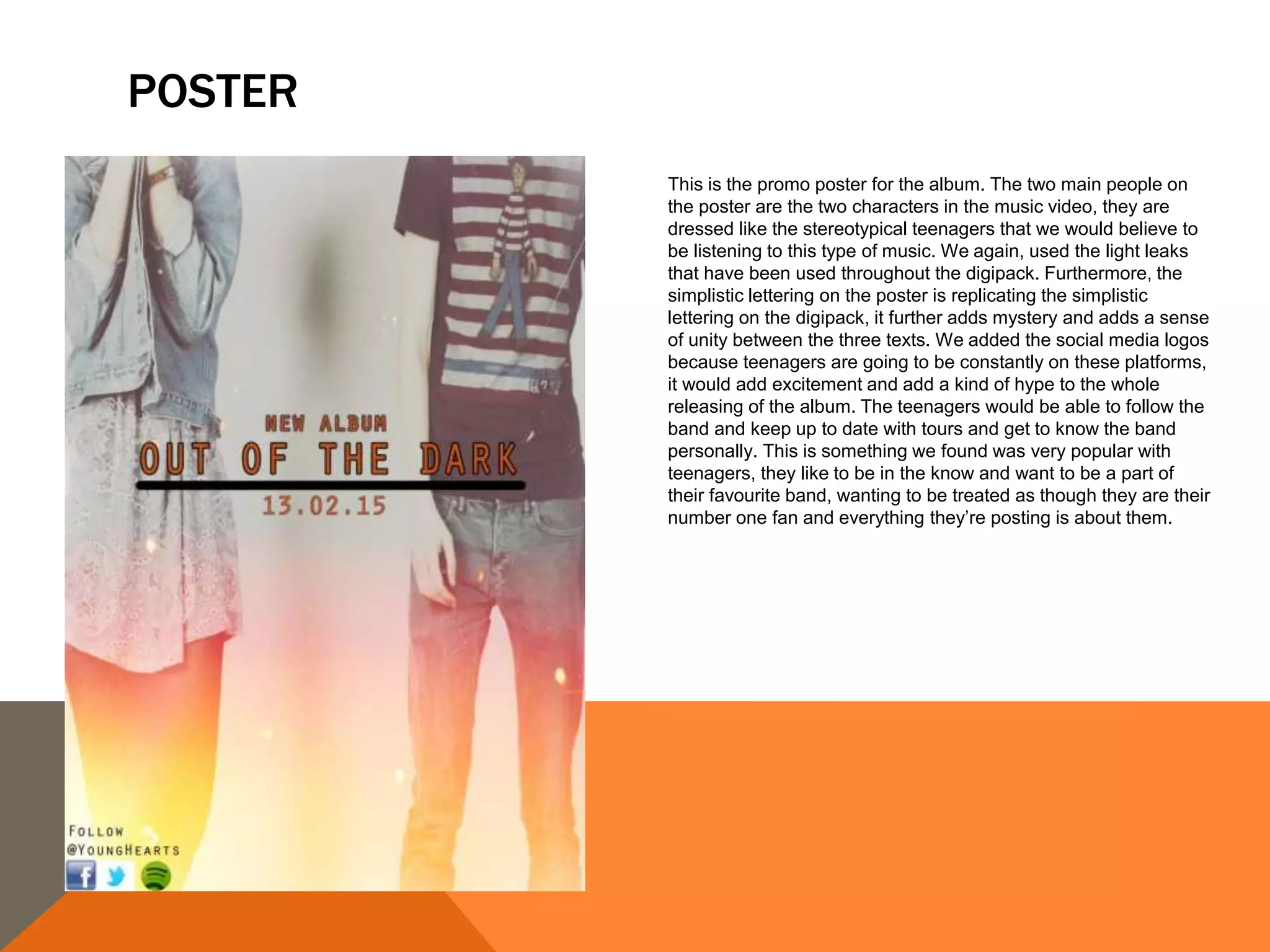
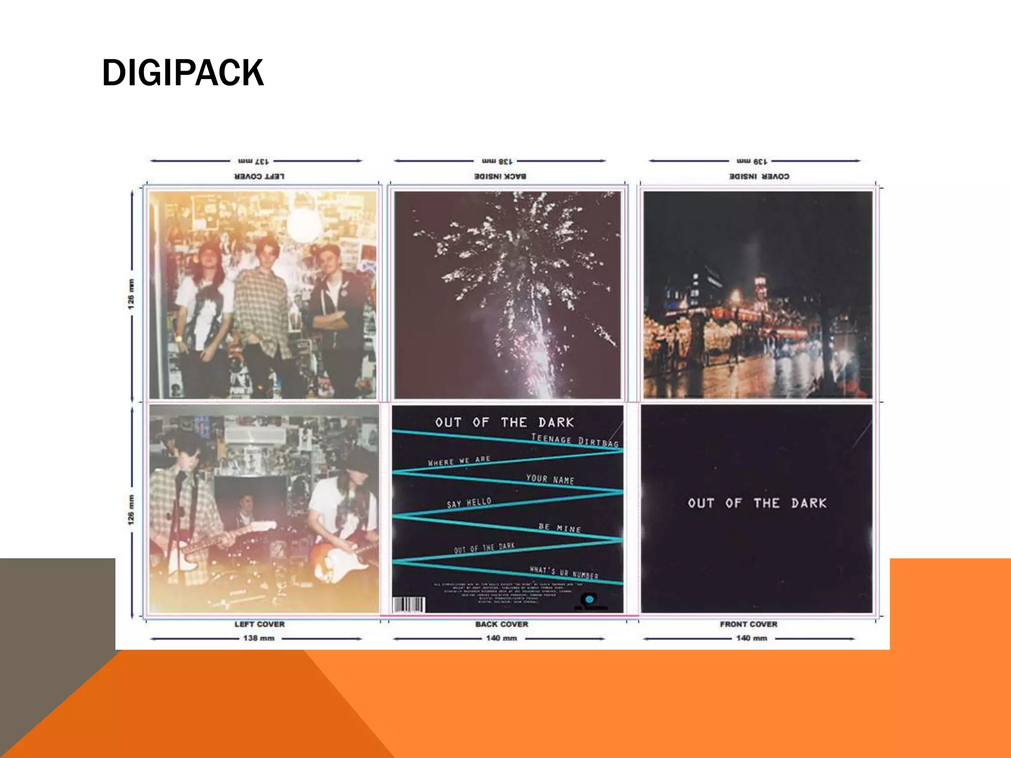
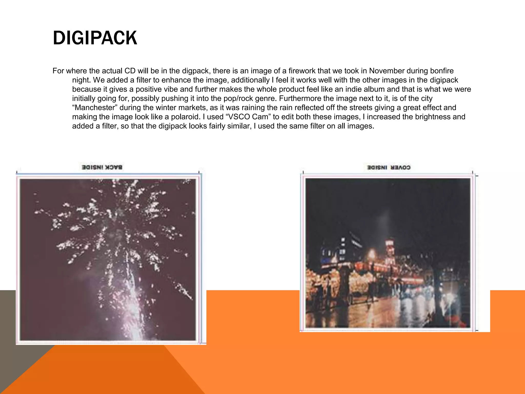
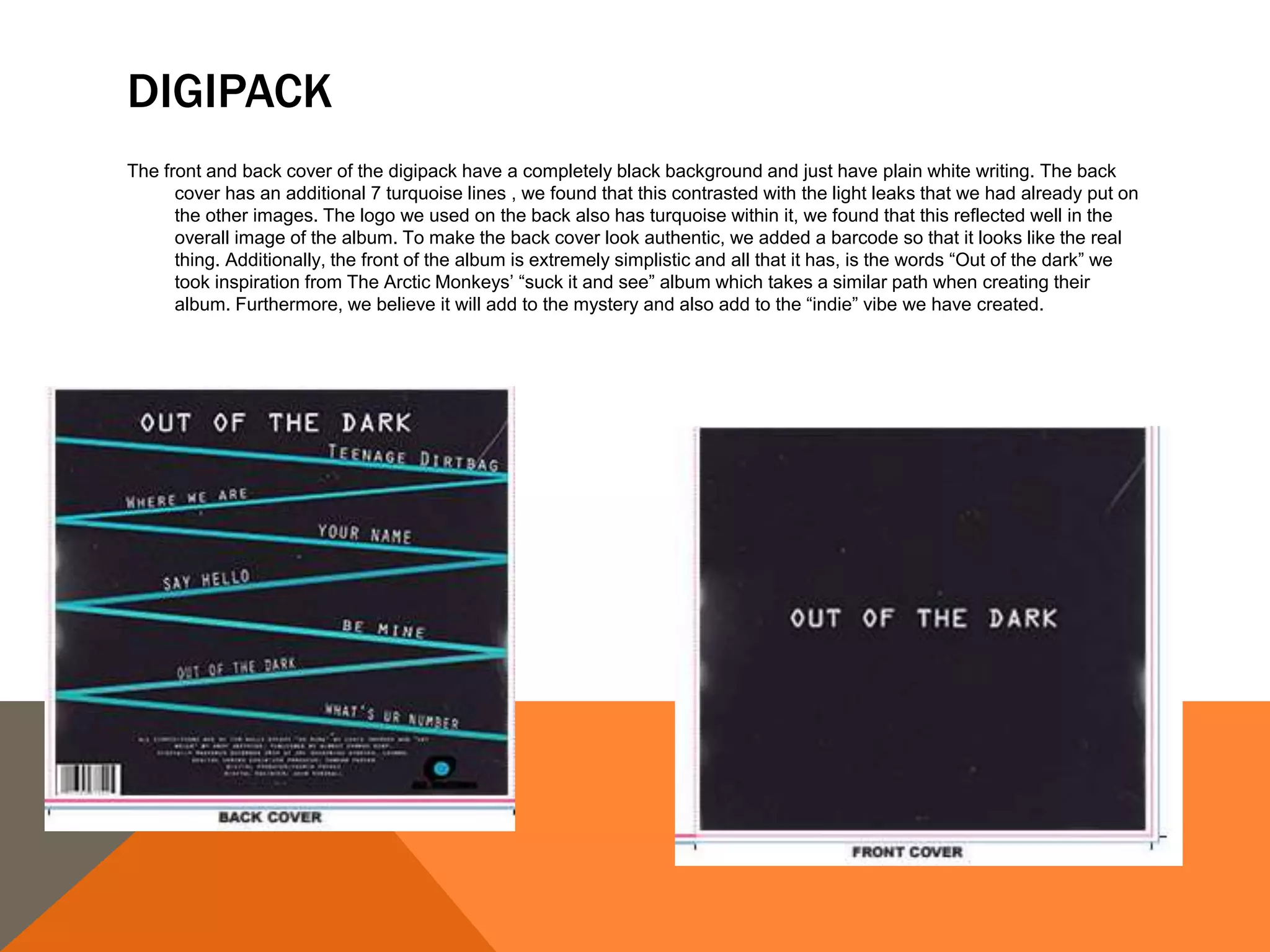
MAIN PRODUCT AND ANCILLARY TEXTS
Here are the 3 products working together to attract a teenage audience:
THE POP/ROCK GENRE
We focused out music video and ancillary texts to suit the pop/rock
subgenre. This both targeted at teens our age (17/18) and also appealed
to us both as we are fans of the genre. The ancillary texts had to suit the
genre and further match the vibe of the music video. We used a “house
style” meaning we focused on a set colour scheme for the ancillary
texts, therefore it would link them together and audiences would be able
to associate the products together when in stores.
POSTER
This is the promo poster for the album. The two main people on
the poster are the two characters in the music video, they are
dressed like the stereotypical teenagers that we would believe to
be listening to this type of music. We again, used the light leaks
that have been used throughout the digipack. Furthermore, the
simplistic lettering on the poster is replicating the simplistic
lettering on the digipack, it further adds mystery and adds a sense
of unity between the three texts. We added the social media logos
because teenagers are going to be constantly on these platforms,
it would add excitement and add a kind of hype to the whole
releasing of the album. The teenagers would be able to follow the
band and keep up to date with tours and get to know the band
personally. This is something we found was very popular with
teenagers, they like to be in the know and want to be a part of
their favourite band, wanting to be treated as though they are their
number one fan and everything they’re posting is about them.
DIGIPACK
DIGIPACK
The two images here placed on the left cover have similar styles and have an indie vibe to them. We used an app called
“Landcam” to get the polaroid picture effects and made the images look quite grainy to make the images look authentic and also
to imply that the people in the images look a bit grunge. The lead singer is wearing a flannel t-shirt and the guitarist has long
hair, I think that both of these qualities comply with the traditional indie stereotypes. The background is quite mis-matched and
also has a “grunge” appearance about it which relates to both the poster and the music video. The other two texts (music video
and poster) mix well with the digipack because the same effects have been used and the overall look is the same.
DIGIPACK
For where the actual CD will be in the digpack, there is an image of a firework that we took in November during bonfire
night. We added a filter to enhance the image, additionally I feel it works well with the other images in the digipack
because it gives a positive vibe and further makes the whole product feel like an indie album and that is what we were
initially going for, possibly pushing it into the pop/rock genre. Furthermore the image next to it, is of the city
“Manchester” during the winter markets, as it was raining the rain reflected off the streets giving a great effect and
making the image look like a polaroid. I used “VSCO Cam” to edit both these images, I increased the brightness and
added a filter, so that the digipack looks fairly similar, I used the same filter on all images.
DIGIPACK
The front and back cover of the digipack have a completely black background and just have plain white writing. The back
cover has an additional 7 turquoise lines , we found that this contrasted with the light leaks that we had already put on
the other images. The logo we used on the back also has turquoise within it, we found that this reflected well in the
overall image of the album. To make the back cover look authentic, we added a barcode so that it looks like the real
thing. Additionally, the front of the album is extremely simplistic and all that it has, is the words “Out of the dark” we
took inspiration from The Arctic Monkeys’ “suck it and see” album which takes a similar path when creating their
album. Furthermore, we believe it will add to the mystery and also add to the “indie” vibe we have created.
THE NARRATIVE OF THE MUSIC VIDEO
Our music video follows a simple narrative of boy meets girl, girl and boy
fall in love so she dumps her old boyfriend because he is a jerk in some
way or another so the good guy gets her in the end. We found the
sound “Teenage Dirtbag” suits this narrative structure and really
compliments the story etc. Even the song title shows that the music
video is going to have some kind of jerk within it. We got the good guy
to wear a combination of both red and white to symbolise love and
purity, this implies that he is the good guy as white normally suggests
this.

Q2

  • 2.
    MAIN PRODUCT ANDANCILLARY TEXTS Here are the 3 products working together to attract a teenage audience:
  • 3.
    THE POP/ROCK GENRE Wefocused out music video and ancillary texts to suit the pop/rock subgenre. This both targeted at teens our age (17/18) and also appealed to us both as we are fans of the genre. The ancillary texts had to suit the genre and further match the vibe of the music video. We used a “house style” meaning we focused on a set colour scheme for the ancillary texts, therefore it would link them together and audiences would be able to associate the products together when in stores.
  • 4.
    POSTER This is thepromo poster for the album. The two main people on the poster are the two characters in the music video, they are dressed like the stereotypical teenagers that we would believe to be listening to this type of music. We again, used the light leaks that have been used throughout the digipack. Furthermore, the simplistic lettering on the poster is replicating the simplistic lettering on the digipack, it further adds mystery and adds a sense of unity between the three texts. We added the social media logos because teenagers are going to be constantly on these platforms, it would add excitement and add a kind of hype to the whole releasing of the album. The teenagers would be able to follow the band and keep up to date with tours and get to know the band personally. This is something we found was very popular with teenagers, they like to be in the know and want to be a part of their favourite band, wanting to be treated as though they are their number one fan and everything they’re posting is about them.
  • 5.
  • 6.
    DIGIPACK The two imageshere placed on the left cover have similar styles and have an indie vibe to them. We used an app called “Landcam” to get the polaroid picture effects and made the images look quite grainy to make the images look authentic and also to imply that the people in the images look a bit grunge. The lead singer is wearing a flannel t-shirt and the guitarist has long hair, I think that both of these qualities comply with the traditional indie stereotypes. The background is quite mis-matched and also has a “grunge” appearance about it which relates to both the poster and the music video. The other two texts (music video and poster) mix well with the digipack because the same effects have been used and the overall look is the same.
  • 7.
    DIGIPACK For where theactual CD will be in the digpack, there is an image of a firework that we took in November during bonfire night. We added a filter to enhance the image, additionally I feel it works well with the other images in the digipack because it gives a positive vibe and further makes the whole product feel like an indie album and that is what we were initially going for, possibly pushing it into the pop/rock genre. Furthermore the image next to it, is of the city “Manchester” during the winter markets, as it was raining the rain reflected off the streets giving a great effect and making the image look like a polaroid. I used “VSCO Cam” to edit both these images, I increased the brightness and added a filter, so that the digipack looks fairly similar, I used the same filter on all images.
  • 8.
    DIGIPACK The front andback cover of the digipack have a completely black background and just have plain white writing. The back cover has an additional 7 turquoise lines , we found that this contrasted with the light leaks that we had already put on the other images. The logo we used on the back also has turquoise within it, we found that this reflected well in the overall image of the album. To make the back cover look authentic, we added a barcode so that it looks like the real thing. Additionally, the front of the album is extremely simplistic and all that it has, is the words “Out of the dark” we took inspiration from The Arctic Monkeys’ “suck it and see” album which takes a similar path when creating their album. Furthermore, we believe it will add to the mystery and also add to the “indie” vibe we have created.
  • 9.
    THE NARRATIVE OFTHE MUSIC VIDEO Our music video follows a simple narrative of boy meets girl, girl and boy fall in love so she dumps her old boyfriend because he is a jerk in some way or another so the good guy gets her in the end. We found the sound “Teenage Dirtbag” suits this narrative structure and really compliments the story etc. Even the song title shows that the music video is going to have some kind of jerk within it. We got the good guy to wear a combination of both red and white to symbolise love and purity, this implies that he is the good guy as white normally suggests this.