SlideShare a Scribd company logo
Analysing music magazine  cover, content, and double page spreads James Christmas
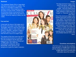
Images The large dominant image on the cover is the group, medium long shot of a girl group called “All Angels”. They are smiling at the camera and are dressed in formal white clothing to make them look “angelic” or “heavenly” to relate to their name. Part of the dominant image is also another group-shot of three young boys called “The Choirboys” who are dressed in black suits to look formal and are smiling and posing casually to show their adolescence and friendship to each other. The photo is smaller and positioned towards the corner to be more “out of the way” so the reader can instantly focus on “All Angels” who are probably featured more in the issue. Masthead The masthead Classic FM is in large black serif font to look formal to it’s readers. The letter F is in red italics to relate to the symbol in music;  Forte  (meaning to play the piece of music louder). Despite one of the dominant photos covering part of the masthead the reader still can see that it is  Classic FM  as the majority of letters are still visible. Text and font Underneath the faces of All Angles and in the centre of the page is their large name “All Angels” which is in serif font with bright gold lettering, again to make relate to their name as “heavenly”, perhaps to relate to the golden gates of heaven or a golden halo that sits on top of an angel’s head.  The majority of this front cover has text in serif font to look formal to it’s audience. The only exceptions are the sans serif plugs such as “New voices of Christmas!”, “2 FREE CDs!” and “THE UK’s FAVOURITE CLASSICAL MUSIC MAGAZINE” which all have a red background to grab the reader’s attention. Coverlines and straplines This front cover has very few coverlines. They are both in a smaller text in red font with the straplines underneath in an even smaller black font to provide extra information about the coverline.
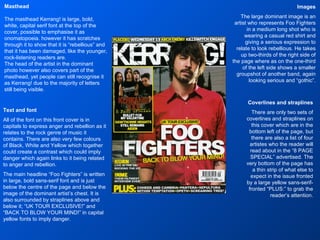
Images The large dominant image is an artist who represents Foo Fighters in a medium long shot who is wearing a casual red shirt and giving a serious expression to relate to look rebellious. He takes up two-thirds of the right side of the page where as on the one-third of the left side shows a smaller groupshot of another band, again looking serious and “gothic”. Masthead The masthead Kerrang! is large, bold, white, capital serif font at the top of the cover, possible to emphasise it as onomatopoeia. however it has scratches through it to show that it is “rebellious” and that it has been damaged, like the younger, rock-listening readers are. The head of the artist in the dominant photo however also covers part of the masthead, yet people can still recognise it as Kerrang! due to the majority of letters still being visible. Text and font All of the font on this front cover is in capitals to express anger and rebellion as it relates to the rock genre of music it contains. There are also very few colours of Black, White and Yellow which together could create a contrast which could imply danger which again links to it being related to anger and rebellion. The main headline “Foo Fighters” is written in large, bold sans-serif font and is just below the centre of the page and below the image of the dominant artist’s chest. It is also surrounded by straplines above and below it; “UK TOUR EXCLUSIVE!” and “BACK TO BLOW YOUR MIND!” in capital yellow fonts to imply danger. Coverlines and straplines There are only two sets of coverlines and straplines on this cover which are in the bottom left of the page, but there are also a list of four artistes who the reader will read about in the “8 PAGE SPECIAL” advertised. The very bottom of the page has a thin strip of what else to expect in the issue fronted by a large yellow sans-serif-fronted “PLUS:” to grab the reader’s attention.
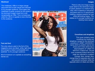
Images There is only one image on this cover which is the dominant image of Janet Jackson in a medium long shot, who is wearing a casual top and jeans and is in a casual pose holding a camera towards her eye while still looking happy. This relates to it’s younger audience as looking more casual.  Masthead The masthead, VIBe is in large orange sans-serif font to look casual and informal to it’s younger audience. Once again this masthead is partly covered by the artiste in the dominant image’s head but is still recognisable as VIBe. The e is lowercase while the VIB is in capitals to look informal to the audience. Text and font The only colours used in the font of this magazine cover are black, white, light blue and orange to make it contrastable and aesthetic  to it’s younger audience. All of it however is in capitals so everything stands out. Coverlines and straplines This cover contains many coverlines but hardly any straplines, except for the dominant coverline of “JANET JACKSON’s” name which is position next to her photo and in blue which has a short strapline of “LIKES TO WATCH” in black font. The list over coverlines bottom left of the page are coloured in a pattern (orange, blue, orange, blue, orange blue) to separate each one and prevent confusion while the opposite side is in black and white.
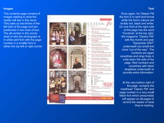
Text Once again, for Classic FM the font is in serif and formal while the font’s colours are mostly red, black and white. On one third at the right side of the page has the word “Contents” at the top right, the magazine “Classic FM” with the month and year “December 2007” underneath but small and more “out of the way”. The contents are again coverlines and strap lines in a list down the side of the page. Red numbers and coverlines with black straplines underneath to provide extra information. At the very bottom right of the page  contains the masthead “Classic FM” and page number in a very small black font which presumably will appear on all pages to remind the reader of what they’re reading. Images This contents page contains 8 images relating to what the reader will see in this issue. They take up two-thirds of the left side of the page and are positioned in two rows of four. The all contain in the corner what or who the photograph is in white serif font with the page number in a smaller font in either the top left or right corner.
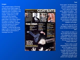
Text Once again, for Kerrang! the font is in capital sans-serif font and informal while the font’s colours are mostly white, black and yellow.  The headline “contents” at the top of the page and a sub-headline “This Week” just underneath the images and the contents is also capitals and scratchy to represent rebellion and anger. Also at the very top left of the page in small font is the issue number and publishing date. The contents are also in a list of white text and placed into categories with yellow capital font. These contents are positioned to stay out of the way of the man in the bottom half photo. There is also a small advertisement in the bototm left of the page to receive your copies of Kerrang! Through the post and at the bottom right of the page in extremely small font and positioned vertically is the picture and copyright credit. Images This contents page of Kerrang! contains three small images of the artists who will appear in the magazine with a coverline in the corner of them and the page number. These are in a row underneath the headline “Contents” at the top of the page while in the bottom half of the page is a large photo of someone on the floor, perhaps a drunken person at a gig to represent it’s audience’s “rebellion”. At the top left of the page is also a very small image of the editor to accompany a message from him.
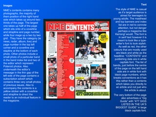
Text The style of NME is casual as it’s target audience is aimed for teenagers to young adults. The masthead and top banners and index list are in red to connote attention, but not danger perhaps a magazine like Kerrang! would. The font is in serif text however it is meant to look like a type-writer’s font to look stylish. As well as red, the other colours that are mostly used are black and white as the headline: “CONTENTS” and publishing date are in white capitals font. The list of bands, just before the centre of the page on the left hand side are in white font with black page numbers, which breaks conventions as it has this rather than a contents which takes you directly to an article and not just who the article is about. The very bottom of the page also advertises a “Gig Guide” with “477 GIGS LISTED IN THE UK’S BIGGEST GUIDE” in large black capitals font. Images NME’s contents contains many photographs, the majority of them position of the right hand side which takes up around two-thirds of the page. The largest one takes up half of the page which sits onto of a coverline and strapline and page number, while four mage up a two by two grid . They have the category (ie news, radar, album, live) and page number in the top left corner and a coverline and stapline at the bottom of each photo. Other photos include a small photo of a particular band in the band index list and two of the editor which represent Polaroid photos. Also underneath the editor’s message in the thin gap of the left side of the page contains a subscription advert which contains three very small photos of previous issues. Also to accompany the contents is a yellow sticker with a coverline and strapline to direct the reader to an individual feature in the magaizne.
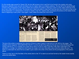
For this double page spread for Classic FM, the font still remains to be in serif font to be formal to the readers who enjoy listening to classical music and who are likely to be of a higher class or an elderly audience. The top half of the spread though contains many photographs of the various artists and orchestra the article is referring to which is quite neatly positioned at the top to look untidy and to be formal. The pictures are in black and white to make them look like they are in the past as they could be the preparation or a rehearsal for a concert or maybe a new CD. Captions also accompany the photos so the reader knows what is happening in each photo. Once again, it also makes the article look more formal. The text of the article is positioned into columns of three to make it easier to read and so it can all fit on the pages.  The headline of the magazine “DOCUMENTING RALPH” is at the top left of the space for the text as it is the first thing that the readers will look at. It is in capitals and a large text to stand out and to make it look like a title while underneath is the standfirst in a smaller non-capital font which gives the reader a bit more information about what the article will cover. The byline is underneath the stand first but smaller to give credit to the writer of the article and the photographer of the photos above. There is a drop cap on the first letter of the article which is the “G” to stand out and look formal so the reader knows exactly where the article starts.
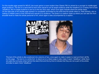
The text of the article is also positioned into columns of two, once again to make it easier to read and that it all fits on the page. . The text is in a white font  to stand out on a black page to also make it seem “rebellious” while there are pale blue and grey strips behind the stand first and the by line to indicate that they are not a part of the article and also to seem more “rebellious”. For this double page spread for MOJO, the music genre is more modern than Classic FM it is aimed for a younger to middle-aged target audience. The text is in sans-serif to look more casual to suit its target audience while the headline is in a messy font to look “rebellious” like it’s target audience is and so is the two drop caps, which once again indicate where the article starts. On the right side of the double page spread it is completely dominated by the artist that the article refers to, Pete Doherty, who is making a childish pose to look informal and casual to it’s audience. The photo is a medium close up where you can see him from shoulder level to make the article personal to him, which again is also accompanied by a caption.
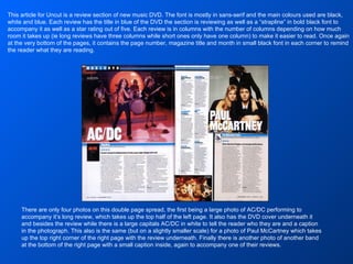
There are only four photos on this double page spread, the first being a large photo of AC/DC performing to accompany it’s long review, which takes up the top half of the left page. It also has the DVD cover underneath it and besides the review while there is a large capitals AC/DC in white to tell the reader who they are and a caption in the photograph. This also is the same (but on a slightly smaller scale) for a photo of Paul McCartney which takes up the top right corner of the right page with the review underneath. Finally there is another photo of another band at the bottom of the right page with a small caption inside, again to accompany one of their reviews. This article for Uncut is a review section of new music DVD. The font is mostly in sans-serif and the main colours used are black, white and blue. Each review has the title in blue of the DVD the section is reviewing as well as a “strapline” in bold black font to accompany it as well as a star rating out of five. Each review is in columns with the number of columns depending on how much room it takes up (ie long reviews have three columns while short ones only have one column) to make it easier to read. Once again at the very bottom of the pages, it contains the page number, magazine title and month in small black font in each corner to remind the reader what they are reading.

More Related Content

What's hot

NME Contents Page Analysis
NME Contents Page AnalysisNME Contents Page Analysis
NME Contents Page Analysis
meghanmooreg321
 
Analysis of existing products
Analysis of existing productsAnalysis of existing products
Analysis of existing products
Lee Popplewell
 
Q Contents Page Analysis
Q Contents Page AnalysisQ Contents Page Analysis
Q Contents Page Analysis
meghanmooreg321
 
Nme Front Page Analysis
Nme Front Page AnalysisNme Front Page Analysis
Nme Front Page Analysis
meghanmooreg321
 
Double page spread analysis
Double page spread analysisDouble page spread analysis
Double page spread analysis
Jack Allinson
 
Magazine advert analysis
Magazine advert analysisMagazine advert analysis
Magazine advert analysis
Olivia Mungham-Gray
 
Analysis of music magazines
Analysis of music magazinesAnalysis of music magazines
Analysis of music magazines
LauraASMagazine
 
Analysis of Names and Mastheads
Analysis of Names and MastheadsAnalysis of Names and Mastheads
Analysis of Names and Mastheads
meghanmooreg321
 
Question 1
Question 1Question 1
Question 1
chaggarg1
 
Kerrang Feature Analysis
Kerrang Feature AnalysisKerrang Feature Analysis
Kerrang Feature Analysis
meghanmooreg321
 
Research into kerrang magazine
Research into kerrang magazineResearch into kerrang magazine
Research into kerrang magazine
Johnny-Knoll
 
Q Front Page Analysis
Q Front Page AnalysisQ Front Page Analysis
Q Front Page Analysis
meghanmooreg321
 
Contents page analysis
Contents page analysisContents page analysis
Contents page analysis
Benjamin Irons
 
Analysing articles
Analysing articlesAnalysing articles
Analysing articles
Kyle150
 
Double page spread analysis
Double page spread analysisDouble page spread analysis
Double page spread analysis
Benjamin Irons
 
Q cover analysisisisi
Q cover analysisisisiQ cover analysisisisi
Q cover analysisisisi
beckybbb
 
Metal hammer
Metal hammerMetal hammer
Metal hammer
EllisHackett
 
Magazine Front Cover Analysis
Magazine Front Cover AnalysisMagazine Front Cover Analysis
Magazine Front Cover Analysis
BitUser Nguyễn
 
Music Magazine Research
Music Magazine ResearchMusic Magazine Research
Music Magazine Research
Adam Skinner
 
Detailed class analysis of music magazine on q
Detailed class analysis of music magazine on qDetailed class analysis of music magazine on q
Detailed class analysis of music magazine on q
AS Media Column E
 

What's hot (20)

NME Contents Page Analysis
NME Contents Page AnalysisNME Contents Page Analysis
NME Contents Page Analysis
 
Analysis of existing products
Analysis of existing productsAnalysis of existing products
Analysis of existing products
 
Q Contents Page Analysis
Q Contents Page AnalysisQ Contents Page Analysis
Q Contents Page Analysis
 
Nme Front Page Analysis
Nme Front Page AnalysisNme Front Page Analysis
Nme Front Page Analysis
 
Double page spread analysis
Double page spread analysisDouble page spread analysis
Double page spread analysis
 
Magazine advert analysis
Magazine advert analysisMagazine advert analysis
Magazine advert analysis
 
Analysis of music magazines
Analysis of music magazinesAnalysis of music magazines
Analysis of music magazines
 
Analysis of Names and Mastheads
Analysis of Names and MastheadsAnalysis of Names and Mastheads
Analysis of Names and Mastheads
 
Question 1
Question 1Question 1
Question 1
 
Kerrang Feature Analysis
Kerrang Feature AnalysisKerrang Feature Analysis
Kerrang Feature Analysis
 
Research into kerrang magazine
Research into kerrang magazineResearch into kerrang magazine
Research into kerrang magazine
 
Q Front Page Analysis
Q Front Page AnalysisQ Front Page Analysis
Q Front Page Analysis
 
Contents page analysis
Contents page analysisContents page analysis
Contents page analysis
 
Analysing articles
Analysing articlesAnalysing articles
Analysing articles
 
Double page spread analysis
Double page spread analysisDouble page spread analysis
Double page spread analysis
 
Q cover analysisisisi
Q cover analysisisisiQ cover analysisisisi
Q cover analysisisisi
 
Metal hammer
Metal hammerMetal hammer
Metal hammer
 
Magazine Front Cover Analysis
Magazine Front Cover AnalysisMagazine Front Cover Analysis
Magazine Front Cover Analysis
 
Music Magazine Research
Music Magazine ResearchMusic Magazine Research
Music Magazine Research
 
Detailed class analysis of music magazine on q
Detailed class analysis of music magazine on qDetailed class analysis of music magazine on q
Detailed class analysis of music magazine on q
 

Viewers also liked

Evaluation of music magazine coursework
Evaluation of music magazine courseworkEvaluation of music magazine coursework
Evaluation of music magazine coursework
ChristmasJ1
 
Task 8
Task 8Task 8
Task 8
ChristmasJ1
 
Task 10
Task 10Task 10
Task 10
ChristmasJ1
 
Task 5 and 6
Task 5 and 6Task 5 and 6
Task 5 and 6
ChristmasJ1
 
Task 5 and 6
Task 5 and 6Task 5 and 6
Task 5 and 6
ChristmasJ1
 
Task 4
Task 4Task 4
Task 4
ChristmasJ1
 
Evaluation powerpoint
Evaluation powerpointEvaluation powerpoint
Evaluation powerpoint
ChristmasJ1
 

Viewers also liked (7)

Evaluation of music magazine coursework
Evaluation of music magazine courseworkEvaluation of music magazine coursework
Evaluation of music magazine coursework
 
Task 8
Task 8Task 8
Task 8
 
Task 10
Task 10Task 10
Task 10
 
Task 5 and 6
Task 5 and 6Task 5 and 6
Task 5 and 6
 
Task 5 and 6
Task 5 and 6Task 5 and 6
Task 5 and 6
 
Task 4
Task 4Task 4
Task 4
 
Evaluation powerpoint
Evaluation powerpointEvaluation powerpoint
Evaluation powerpoint
 

Similar to Tasks 1 2 and 3

Analysis of a classical magazine
Analysis of a classical magazineAnalysis of a classical magazine
Analysis of a classical magazine
shahana18
 
Classical magazine analysis
Classical magazine analysisClassical magazine analysis
Classical magazine analysis
shahana18
 
Media foundation portfolio research
Media foundation portfolio  researchMedia foundation portfolio  research
Media foundation portfolio research
a_mcdermott
 
Magazine analysis
Magazine analysisMagazine analysis
Magazine analysis
pangk1
 
Radial analysis
Radial analysisRadial analysis
Radial analysis
ameliaelson
 
Magazine anaylisis
Magazine anaylisisMagazine anaylisis
Magazine anaylisis
sineadjen
 
Magazine anaylisis
Magazine anaylisisMagazine anaylisis
Magazine anaylisis
sineadjen
 
Presentgggation1
Presentgggation1Presentgggation1
Presentgggation1
tjjones2
 
As 21
As 21As 21
Music magazine reaserch and ideas annabel lucey
Music magazine reaserch and ideas annabel luceyMusic magazine reaserch and ideas annabel lucey
Music magazine reaserch and ideas annabel lucey
bell101
 
Music magazine reaserch and ideas annabel lucey
Music magazine reaserch and ideas annabel luceyMusic magazine reaserch and ideas annabel lucey
Music magazine reaserch and ideas annabel lucey
bell101
 
Media cw music magazine reaserch and ideas annabel lucey
Media cw music magazine reaserch and ideas annabel luceyMedia cw music magazine reaserch and ideas annabel lucey
Media cw music magazine reaserch and ideas annabel lucey
bell101
 
Media cw music magazine reaserch and ideas annabel lucey
Media cw music magazine reaserch and ideas annabel luceyMedia cw music magazine reaserch and ideas annabel lucey
Media cw music magazine reaserch and ideas annabel lucey
bell101
 
Final media music magazine annabel lucey
Final media music magazine annabel luceyFinal media music magazine annabel lucey
Final media music magazine annabel lucey
bell101
 
Music magazine annabel lucey
Music magazine annabel luceyMusic magazine annabel lucey
Music magazine annabel lucey
bell101
 
As 21
As 21As 21
As 21
07hhalim1
 
Final powerpiont
Final powerpiontFinal powerpiont
Final powerpiont
bell101
 
Music and school Magazine analysis
Music and school Magazine analysisMusic and school Magazine analysis
Music and school Magazine analysis
halimashalim
 
Contents pages
Contents pagesContents pages
Contents pages
sophiekilloran
 
Research task
Research taskResearch task
Research task
ollieweaver2404
 

Similar to Tasks 1 2 and 3 (20)

Analysis of a classical magazine
Analysis of a classical magazineAnalysis of a classical magazine
Analysis of a classical magazine
 
Classical magazine analysis
Classical magazine analysisClassical magazine analysis
Classical magazine analysis
 
Media foundation portfolio research
Media foundation portfolio  researchMedia foundation portfolio  research
Media foundation portfolio research
 
Magazine analysis
Magazine analysisMagazine analysis
Magazine analysis
 
Radial analysis
Radial analysisRadial analysis
Radial analysis
 
Magazine anaylisis
Magazine anaylisisMagazine anaylisis
Magazine anaylisis
 
Magazine anaylisis
Magazine anaylisisMagazine anaylisis
Magazine anaylisis
 
Presentgggation1
Presentgggation1Presentgggation1
Presentgggation1
 
As 21
As 21As 21
As 21
 
Music magazine reaserch and ideas annabel lucey
Music magazine reaserch and ideas annabel luceyMusic magazine reaserch and ideas annabel lucey
Music magazine reaserch and ideas annabel lucey
 
Music magazine reaserch and ideas annabel lucey
Music magazine reaserch and ideas annabel luceyMusic magazine reaserch and ideas annabel lucey
Music magazine reaserch and ideas annabel lucey
 
Media cw music magazine reaserch and ideas annabel lucey
Media cw music magazine reaserch and ideas annabel luceyMedia cw music magazine reaserch and ideas annabel lucey
Media cw music magazine reaserch and ideas annabel lucey
 
Media cw music magazine reaserch and ideas annabel lucey
Media cw music magazine reaserch and ideas annabel luceyMedia cw music magazine reaserch and ideas annabel lucey
Media cw music magazine reaserch and ideas annabel lucey
 
Final media music magazine annabel lucey
Final media music magazine annabel luceyFinal media music magazine annabel lucey
Final media music magazine annabel lucey
 
Music magazine annabel lucey
Music magazine annabel luceyMusic magazine annabel lucey
Music magazine annabel lucey
 
As 21
As 21As 21
As 21
 
Final powerpiont
Final powerpiontFinal powerpiont
Final powerpiont
 
Music and school Magazine analysis
Music and school Magazine analysisMusic and school Magazine analysis
Music and school Magazine analysis
 
Contents pages
Contents pagesContents pages
Contents pages
 
Research task
Research taskResearch task
Research task
 

More from ChristmasJ1

Task 9
Task 9Task 9
Task 9
ChristmasJ1
 
Task 8
Task 8Task 8
Task 8
ChristmasJ1
 
Task 7
Task 7Task 7
Task 7
ChristmasJ1
 
Task 10
Task 10Task 10
Task 10
ChristmasJ1
 
Task 9
Task 9Task 9
Task 9
ChristmasJ1
 
Task 7
Task 7Task 7
Task 7
ChristmasJ1
 
Task 4
Task 4Task 4
Task 4
ChristmasJ1
 

More from ChristmasJ1 (9)

Original photos
Original photosOriginal photos
Original photos
 
Task 9
Task 9Task 9
Task 9
 
Task 8
Task 8Task 8
Task 8
 
Task 7
Task 7Task 7
Task 7
 
Task 10
Task 10Task 10
Task 10
 
Task 9
Task 9Task 9
Task 9
 
Task 7
Task 7Task 7
Task 7
 
Task 4
Task 4Task 4
Task 4
 
Original photos
Original photosOriginal photos
Original photos
 

Recently uploaded

Oliver Asks for More by Charles Dickens (9)
Oliver Asks for More by Charles Dickens (9)Oliver Asks for More by Charles Dickens (9)
Oliver Asks for More by Charles Dickens (9)
nitinpv4ai
 
Pharmaceutics Pharmaceuticals best of brub
Pharmaceutics Pharmaceuticals best of brubPharmaceutics Pharmaceuticals best of brub
Pharmaceutics Pharmaceuticals best of brub
danielkiash986
 
spot a liar (Haiqa 146).pptx Technical writhing and presentation skills
spot a liar (Haiqa 146).pptx Technical writhing and presentation skillsspot a liar (Haiqa 146).pptx Technical writhing and presentation skills
spot a liar (Haiqa 146).pptx Technical writhing and presentation skills
haiqairshad
 
CHUYÊN ĐỀ ÔN TẬP VÀ PHÁT TRIỂN CÂU HỎI TRONG ĐỀ MINH HỌA THI TỐT NGHIỆP THPT ...
CHUYÊN ĐỀ ÔN TẬP VÀ PHÁT TRIỂN CÂU HỎI TRONG ĐỀ MINH HỌA THI TỐT NGHIỆP THPT ...CHUYÊN ĐỀ ÔN TẬP VÀ PHÁT TRIỂN CÂU HỎI TRONG ĐỀ MINH HỌA THI TỐT NGHIỆP THPT ...
CHUYÊN ĐỀ ÔN TẬP VÀ PHÁT TRIỂN CÂU HỎI TRONG ĐỀ MINH HỌA THI TỐT NGHIỆP THPT ...
Nguyen Thanh Tu Collection
 
Leveraging Generative AI to Drive Nonprofit Innovation
Leveraging Generative AI to Drive Nonprofit InnovationLeveraging Generative AI to Drive Nonprofit Innovation
Leveraging Generative AI to Drive Nonprofit Innovation
TechSoup
 
Data Structure using C by Dr. K Adisesha .ppsx
Data Structure using C by Dr. K Adisesha .ppsxData Structure using C by Dr. K Adisesha .ppsx
Data Structure using C by Dr. K Adisesha .ppsx
Prof. Dr. K. Adisesha
 
NEWSPAPERS - QUESTION 1 - REVISION POWERPOINT.pptx
NEWSPAPERS - QUESTION 1 - REVISION POWERPOINT.pptxNEWSPAPERS - QUESTION 1 - REVISION POWERPOINT.pptx
NEWSPAPERS - QUESTION 1 - REVISION POWERPOINT.pptx
iammrhaywood
 
Bossa N’ Roll Records by Ismael Vazquez.
Bossa N’ Roll Records by Ismael Vazquez.Bossa N’ Roll Records by Ismael Vazquez.
Bossa N’ Roll Records by Ismael Vazquez.
IsmaelVazquez38
 
Présentationvvvvvvvvvvvvvvvvvvvvvvvvvvvv2.pptx
Présentationvvvvvvvvvvvvvvvvvvvvvvvvvvvv2.pptxPrésentationvvvvvvvvvvvvvvvvvvvvvvvvvvvv2.pptx
Présentationvvvvvvvvvvvvvvvvvvvvvvvvvvvv2.pptx
siemaillard
 
Educational Technology in the Health Sciences
Educational Technology in the Health SciencesEducational Technology in the Health Sciences
Educational Technology in the Health Sciences
Iris Thiele Isip-Tan
 
Wound healing PPT
Wound healing PPTWound healing PPT
Wound healing PPT
Jyoti Chand
 
Bonku-Babus-Friend by Sathyajith Ray (9)
Bonku-Babus-Friend by Sathyajith Ray  (9)Bonku-Babus-Friend by Sathyajith Ray  (9)
Bonku-Babus-Friend by Sathyajith Ray (9)
nitinpv4ai
 
How to Manage Reception Report in Odoo 17
How to Manage Reception Report in Odoo 17How to Manage Reception Report in Odoo 17
How to Manage Reception Report in Odoo 17
Celine George
 
SWOT analysis in the project Keeping the Memory @live.pptx
SWOT analysis in the project Keeping the Memory @live.pptxSWOT analysis in the project Keeping the Memory @live.pptx
SWOT analysis in the project Keeping the Memory @live.pptx
zuzanka
 
Skimbleshanks-The-Railway-Cat by T S Eliot
Skimbleshanks-The-Railway-Cat by T S EliotSkimbleshanks-The-Railway-Cat by T S Eliot
Skimbleshanks-The-Railway-Cat by T S Eliot
nitinpv4ai
 
BIOLOGY NATIONAL EXAMINATION COUNCIL (NECO) 2024 PRACTICAL MANUAL.pptx
BIOLOGY NATIONAL EXAMINATION COUNCIL (NECO) 2024 PRACTICAL MANUAL.pptxBIOLOGY NATIONAL EXAMINATION COUNCIL (NECO) 2024 PRACTICAL MANUAL.pptx
BIOLOGY NATIONAL EXAMINATION COUNCIL (NECO) 2024 PRACTICAL MANUAL.pptx
RidwanHassanYusuf
 
Standardized tool for Intelligence test.
Standardized tool for Intelligence test.Standardized tool for Intelligence test.
Standardized tool for Intelligence test.
deepaannamalai16
 
Elevate Your Nonprofit's Online Presence_ A Guide to Effective SEO Strategies...
Elevate Your Nonprofit's Online Presence_ A Guide to Effective SEO Strategies...Elevate Your Nonprofit's Online Presence_ A Guide to Effective SEO Strategies...
Elevate Your Nonprofit's Online Presence_ A Guide to Effective SEO Strategies...
TechSoup
 
MDP on air pollution of class 8 year 2024-2025
MDP on air pollution of class 8 year 2024-2025MDP on air pollution of class 8 year 2024-2025
MDP on air pollution of class 8 year 2024-2025
khuleseema60
 
HYPERTENSION - SLIDE SHARE PRESENTATION.
HYPERTENSION - SLIDE SHARE PRESENTATION.HYPERTENSION - SLIDE SHARE PRESENTATION.
HYPERTENSION - SLIDE SHARE PRESENTATION.
deepaannamalai16
 

Recently uploaded (20)

Oliver Asks for More by Charles Dickens (9)
Oliver Asks for More by Charles Dickens (9)Oliver Asks for More by Charles Dickens (9)
Oliver Asks for More by Charles Dickens (9)
 
Pharmaceutics Pharmaceuticals best of brub
Pharmaceutics Pharmaceuticals best of brubPharmaceutics Pharmaceuticals best of brub
Pharmaceutics Pharmaceuticals best of brub
 
spot a liar (Haiqa 146).pptx Technical writhing and presentation skills
spot a liar (Haiqa 146).pptx Technical writhing and presentation skillsspot a liar (Haiqa 146).pptx Technical writhing and presentation skills
spot a liar (Haiqa 146).pptx Technical writhing and presentation skills
 
CHUYÊN ĐỀ ÔN TẬP VÀ PHÁT TRIỂN CÂU HỎI TRONG ĐỀ MINH HỌA THI TỐT NGHIỆP THPT ...
CHUYÊN ĐỀ ÔN TẬP VÀ PHÁT TRIỂN CÂU HỎI TRONG ĐỀ MINH HỌA THI TỐT NGHIỆP THPT ...CHUYÊN ĐỀ ÔN TẬP VÀ PHÁT TRIỂN CÂU HỎI TRONG ĐỀ MINH HỌA THI TỐT NGHIỆP THPT ...
CHUYÊN ĐỀ ÔN TẬP VÀ PHÁT TRIỂN CÂU HỎI TRONG ĐỀ MINH HỌA THI TỐT NGHIỆP THPT ...
 
Leveraging Generative AI to Drive Nonprofit Innovation
Leveraging Generative AI to Drive Nonprofit InnovationLeveraging Generative AI to Drive Nonprofit Innovation
Leveraging Generative AI to Drive Nonprofit Innovation
 
Data Structure using C by Dr. K Adisesha .ppsx
Data Structure using C by Dr. K Adisesha .ppsxData Structure using C by Dr. K Adisesha .ppsx
Data Structure using C by Dr. K Adisesha .ppsx
 
NEWSPAPERS - QUESTION 1 - REVISION POWERPOINT.pptx
NEWSPAPERS - QUESTION 1 - REVISION POWERPOINT.pptxNEWSPAPERS - QUESTION 1 - REVISION POWERPOINT.pptx
NEWSPAPERS - QUESTION 1 - REVISION POWERPOINT.pptx
 
Bossa N’ Roll Records by Ismael Vazquez.
Bossa N’ Roll Records by Ismael Vazquez.Bossa N’ Roll Records by Ismael Vazquez.
Bossa N’ Roll Records by Ismael Vazquez.
 
Présentationvvvvvvvvvvvvvvvvvvvvvvvvvvvv2.pptx
Présentationvvvvvvvvvvvvvvvvvvvvvvvvvvvv2.pptxPrésentationvvvvvvvvvvvvvvvvvvvvvvvvvvvv2.pptx
Présentationvvvvvvvvvvvvvvvvvvvvvvvvvvvv2.pptx
 
Educational Technology in the Health Sciences
Educational Technology in the Health SciencesEducational Technology in the Health Sciences
Educational Technology in the Health Sciences
 
Wound healing PPT
Wound healing PPTWound healing PPT
Wound healing PPT
 
Bonku-Babus-Friend by Sathyajith Ray (9)
Bonku-Babus-Friend by Sathyajith Ray  (9)Bonku-Babus-Friend by Sathyajith Ray  (9)
Bonku-Babus-Friend by Sathyajith Ray (9)
 
How to Manage Reception Report in Odoo 17
How to Manage Reception Report in Odoo 17How to Manage Reception Report in Odoo 17
How to Manage Reception Report in Odoo 17
 
SWOT analysis in the project Keeping the Memory @live.pptx
SWOT analysis in the project Keeping the Memory @live.pptxSWOT analysis in the project Keeping the Memory @live.pptx
SWOT analysis in the project Keeping the Memory @live.pptx
 
Skimbleshanks-The-Railway-Cat by T S Eliot
Skimbleshanks-The-Railway-Cat by T S EliotSkimbleshanks-The-Railway-Cat by T S Eliot
Skimbleshanks-The-Railway-Cat by T S Eliot
 
BIOLOGY NATIONAL EXAMINATION COUNCIL (NECO) 2024 PRACTICAL MANUAL.pptx
BIOLOGY NATIONAL EXAMINATION COUNCIL (NECO) 2024 PRACTICAL MANUAL.pptxBIOLOGY NATIONAL EXAMINATION COUNCIL (NECO) 2024 PRACTICAL MANUAL.pptx
BIOLOGY NATIONAL EXAMINATION COUNCIL (NECO) 2024 PRACTICAL MANUAL.pptx
 
Standardized tool for Intelligence test.
Standardized tool for Intelligence test.Standardized tool for Intelligence test.
Standardized tool for Intelligence test.
 
Elevate Your Nonprofit's Online Presence_ A Guide to Effective SEO Strategies...
Elevate Your Nonprofit's Online Presence_ A Guide to Effective SEO Strategies...Elevate Your Nonprofit's Online Presence_ A Guide to Effective SEO Strategies...
Elevate Your Nonprofit's Online Presence_ A Guide to Effective SEO Strategies...
 
MDP on air pollution of class 8 year 2024-2025
MDP on air pollution of class 8 year 2024-2025MDP on air pollution of class 8 year 2024-2025
MDP on air pollution of class 8 year 2024-2025
 
HYPERTENSION - SLIDE SHARE PRESENTATION.
HYPERTENSION - SLIDE SHARE PRESENTATION.HYPERTENSION - SLIDE SHARE PRESENTATION.
HYPERTENSION - SLIDE SHARE PRESENTATION.
 

Tasks 1 2 and 3

  • 1. Analysing music magazine cover, content, and double page spreads James Christmas
  • 2. Images The large dominant image on the cover is the group, medium long shot of a girl group called “All Angels”. They are smiling at the camera and are dressed in formal white clothing to make them look “angelic” or “heavenly” to relate to their name. Part of the dominant image is also another group-shot of three young boys called “The Choirboys” who are dressed in black suits to look formal and are smiling and posing casually to show their adolescence and friendship to each other. The photo is smaller and positioned towards the corner to be more “out of the way” so the reader can instantly focus on “All Angels” who are probably featured more in the issue. Masthead The masthead Classic FM is in large black serif font to look formal to it’s readers. The letter F is in red italics to relate to the symbol in music; Forte (meaning to play the piece of music louder). Despite one of the dominant photos covering part of the masthead the reader still can see that it is Classic FM as the majority of letters are still visible. Text and font Underneath the faces of All Angles and in the centre of the page is their large name “All Angels” which is in serif font with bright gold lettering, again to make relate to their name as “heavenly”, perhaps to relate to the golden gates of heaven or a golden halo that sits on top of an angel’s head. The majority of this front cover has text in serif font to look formal to it’s audience. The only exceptions are the sans serif plugs such as “New voices of Christmas!”, “2 FREE CDs!” and “THE UK’s FAVOURITE CLASSICAL MUSIC MAGAZINE” which all have a red background to grab the reader’s attention. Coverlines and straplines This front cover has very few coverlines. They are both in a smaller text in red font with the straplines underneath in an even smaller black font to provide extra information about the coverline.
  • 3. Images The large dominant image is an artist who represents Foo Fighters in a medium long shot who is wearing a casual red shirt and giving a serious expression to relate to look rebellious. He takes up two-thirds of the right side of the page where as on the one-third of the left side shows a smaller groupshot of another band, again looking serious and “gothic”. Masthead The masthead Kerrang! is large, bold, white, capital serif font at the top of the cover, possible to emphasise it as onomatopoeia. however it has scratches through it to show that it is “rebellious” and that it has been damaged, like the younger, rock-listening readers are. The head of the artist in the dominant photo however also covers part of the masthead, yet people can still recognise it as Kerrang! due to the majority of letters still being visible. Text and font All of the font on this front cover is in capitals to express anger and rebellion as it relates to the rock genre of music it contains. There are also very few colours of Black, White and Yellow which together could create a contrast which could imply danger which again links to it being related to anger and rebellion. The main headline “Foo Fighters” is written in large, bold sans-serif font and is just below the centre of the page and below the image of the dominant artist’s chest. It is also surrounded by straplines above and below it; “UK TOUR EXCLUSIVE!” and “BACK TO BLOW YOUR MIND!” in capital yellow fonts to imply danger. Coverlines and straplines There are only two sets of coverlines and straplines on this cover which are in the bottom left of the page, but there are also a list of four artistes who the reader will read about in the “8 PAGE SPECIAL” advertised. The very bottom of the page has a thin strip of what else to expect in the issue fronted by a large yellow sans-serif-fronted “PLUS:” to grab the reader’s attention.
  • 4. Images There is only one image on this cover which is the dominant image of Janet Jackson in a medium long shot, who is wearing a casual top and jeans and is in a casual pose holding a camera towards her eye while still looking happy. This relates to it’s younger audience as looking more casual. Masthead The masthead, VIBe is in large orange sans-serif font to look casual and informal to it’s younger audience. Once again this masthead is partly covered by the artiste in the dominant image’s head but is still recognisable as VIBe. The e is lowercase while the VIB is in capitals to look informal to the audience. Text and font The only colours used in the font of this magazine cover are black, white, light blue and orange to make it contrastable and aesthetic to it’s younger audience. All of it however is in capitals so everything stands out. Coverlines and straplines This cover contains many coverlines but hardly any straplines, except for the dominant coverline of “JANET JACKSON’s” name which is position next to her photo and in blue which has a short strapline of “LIKES TO WATCH” in black font. The list over coverlines bottom left of the page are coloured in a pattern (orange, blue, orange, blue, orange blue) to separate each one and prevent confusion while the opposite side is in black and white.
  • 5. Text Once again, for Classic FM the font is in serif and formal while the font’s colours are mostly red, black and white. On one third at the right side of the page has the word “Contents” at the top right, the magazine “Classic FM” with the month and year “December 2007” underneath but small and more “out of the way”. The contents are again coverlines and strap lines in a list down the side of the page. Red numbers and coverlines with black straplines underneath to provide extra information. At the very bottom right of the page contains the masthead “Classic FM” and page number in a very small black font which presumably will appear on all pages to remind the reader of what they’re reading. Images This contents page contains 8 images relating to what the reader will see in this issue. They take up two-thirds of the left side of the page and are positioned in two rows of four. The all contain in the corner what or who the photograph is in white serif font with the page number in a smaller font in either the top left or right corner.
  • 6. Text Once again, for Kerrang! the font is in capital sans-serif font and informal while the font’s colours are mostly white, black and yellow. The headline “contents” at the top of the page and a sub-headline “This Week” just underneath the images and the contents is also capitals and scratchy to represent rebellion and anger. Also at the very top left of the page in small font is the issue number and publishing date. The contents are also in a list of white text and placed into categories with yellow capital font. These contents are positioned to stay out of the way of the man in the bottom half photo. There is also a small advertisement in the bototm left of the page to receive your copies of Kerrang! Through the post and at the bottom right of the page in extremely small font and positioned vertically is the picture and copyright credit. Images This contents page of Kerrang! contains three small images of the artists who will appear in the magazine with a coverline in the corner of them and the page number. These are in a row underneath the headline “Contents” at the top of the page while in the bottom half of the page is a large photo of someone on the floor, perhaps a drunken person at a gig to represent it’s audience’s “rebellion”. At the top left of the page is also a very small image of the editor to accompany a message from him.
  • 7. Text The style of NME is casual as it’s target audience is aimed for teenagers to young adults. The masthead and top banners and index list are in red to connote attention, but not danger perhaps a magazine like Kerrang! would. The font is in serif text however it is meant to look like a type-writer’s font to look stylish. As well as red, the other colours that are mostly used are black and white as the headline: “CONTENTS” and publishing date are in white capitals font. The list of bands, just before the centre of the page on the left hand side are in white font with black page numbers, which breaks conventions as it has this rather than a contents which takes you directly to an article and not just who the article is about. The very bottom of the page also advertises a “Gig Guide” with “477 GIGS LISTED IN THE UK’S BIGGEST GUIDE” in large black capitals font. Images NME’s contents contains many photographs, the majority of them position of the right hand side which takes up around two-thirds of the page. The largest one takes up half of the page which sits onto of a coverline and strapline and page number, while four mage up a two by two grid . They have the category (ie news, radar, album, live) and page number in the top left corner and a coverline and stapline at the bottom of each photo. Other photos include a small photo of a particular band in the band index list and two of the editor which represent Polaroid photos. Also underneath the editor’s message in the thin gap of the left side of the page contains a subscription advert which contains three very small photos of previous issues. Also to accompany the contents is a yellow sticker with a coverline and strapline to direct the reader to an individual feature in the magaizne.
  • 8. For this double page spread for Classic FM, the font still remains to be in serif font to be formal to the readers who enjoy listening to classical music and who are likely to be of a higher class or an elderly audience. The top half of the spread though contains many photographs of the various artists and orchestra the article is referring to which is quite neatly positioned at the top to look untidy and to be formal. The pictures are in black and white to make them look like they are in the past as they could be the preparation or a rehearsal for a concert or maybe a new CD. Captions also accompany the photos so the reader knows what is happening in each photo. Once again, it also makes the article look more formal. The text of the article is positioned into columns of three to make it easier to read and so it can all fit on the pages. The headline of the magazine “DOCUMENTING RALPH” is at the top left of the space for the text as it is the first thing that the readers will look at. It is in capitals and a large text to stand out and to make it look like a title while underneath is the standfirst in a smaller non-capital font which gives the reader a bit more information about what the article will cover. The byline is underneath the stand first but smaller to give credit to the writer of the article and the photographer of the photos above. There is a drop cap on the first letter of the article which is the “G” to stand out and look formal so the reader knows exactly where the article starts.
  • 9. The text of the article is also positioned into columns of two, once again to make it easier to read and that it all fits on the page. . The text is in a white font to stand out on a black page to also make it seem “rebellious” while there are pale blue and grey strips behind the stand first and the by line to indicate that they are not a part of the article and also to seem more “rebellious”. For this double page spread for MOJO, the music genre is more modern than Classic FM it is aimed for a younger to middle-aged target audience. The text is in sans-serif to look more casual to suit its target audience while the headline is in a messy font to look “rebellious” like it’s target audience is and so is the two drop caps, which once again indicate where the article starts. On the right side of the double page spread it is completely dominated by the artist that the article refers to, Pete Doherty, who is making a childish pose to look informal and casual to it’s audience. The photo is a medium close up where you can see him from shoulder level to make the article personal to him, which again is also accompanied by a caption.
  • 10. There are only four photos on this double page spread, the first being a large photo of AC/DC performing to accompany it’s long review, which takes up the top half of the left page. It also has the DVD cover underneath it and besides the review while there is a large capitals AC/DC in white to tell the reader who they are and a caption in the photograph. This also is the same (but on a slightly smaller scale) for a photo of Paul McCartney which takes up the top right corner of the right page with the review underneath. Finally there is another photo of another band at the bottom of the right page with a small caption inside, again to accompany one of their reviews. This article for Uncut is a review section of new music DVD. The font is mostly in sans-serif and the main colours used are black, white and blue. Each review has the title in blue of the DVD the section is reviewing as well as a “strapline” in bold black font to accompany it as well as a star rating out of five. Each review is in columns with the number of columns depending on how much room it takes up (ie long reviews have three columns while short ones only have one column) to make it easier to read. Once again at the very bottom of the pages, it contains the page number, magazine title and month in small black font in each corner to remind the reader what they are reading.