SlideShare a Scribd company logo
1 of 7
Magazine analysis
Q magazine is aimed at a more sensible and mature rock enthusiast audience
The pull quote mentions two random things to
buy together which is supposed to entice you
into reading the magazine by making you
wonder why the artist has purchased these and
the fact that it is a wild and crazy thing to do
which makes them look at the artist as though
they don’t care what others think of them which
is a very ‘rock and roll’ thing to do
The masthead is red because it is showing the
rock image of the magazine and the fact it is
smashed by the guitar also aids the rock & roll
image of the magazine. The letter Q is a fairly
unused letter which emphasises the rock nature
of the magazine as it is a ‘mysterious’ and
different and the fact that it is just a singular
letter which makes it different and set apart from
the crowd which is how many rock type people
would like to be seen. And the fact it is one letter
makes it seem lazy as though the cant be
bothered to come up with a title which is very
rock and roll
The skyline is making a big claim about how Q
magazine is the biggest Magazine which is a big
thing to claim and a kind of ignorant thing to
declare which is a rock and roll thing to be as it
means again that you don’t care how people see
you
The left third refers to the other main articles they
are smaller as they are supposed to be less
appealing than the main article but they are still
appealing enough to feature on the front cover. The
language used is very rock and roll such as the use
of nut job which means that the artist doesn’t care
how others see them and that they are honest and
not pretending to be who they aren’t which appeals
to the rock audience as the commonly dislike fake
and dishonest people. Also it is written in capitals
as though somebody is shouting it and shouting is
associated with rock and roll and music
The main image is a very rocker style picture as
it features violence and he is dressed in dark
colours which demonstrates even more that he is
a rocker and he is holding a guitar which shows
he is obviously a musician and the fact that he is
smashing the masthead with it shows he doesn’t
care and he answers to nobody, that he is his
own man and also he is taking a risk by hitting
something with the guitar which further
demonstrates his ability not to care
The lead article is written in capitals and is
larger than everything else to help demonstrate
that it is a statement to show how big and
important they are and it sticks out from the
rest of the writing because of its size.
The contents are majority pictures as they are an intelligent magazine so
they know that nobody particularly wants to read a lot of information on the
contents page. The images aren’t really linked because they are all of
different scenes but they are still fairly bright and noticeable and appealing
such as the bottom image which makes you wonder what the article is.
There is a link between the title of the contents and the masthead as they are
both red background with a white Q which gives us a sense of house style.
The contents is a very clean and well organised and set out in a very
graphical fashion which isn’t very rock and roll but it just means the
contents is more understandable and easy to read.
The magazine features many of the stereotypical magazine layout features such as: drop cap, a pull quote, a by line, a
lead image and a stand first. All of these features help the article to look appealing and pull in the readers; the features
are used in a fashion that keeps the article looking busy and enjoyable to read.
The article is set out in three columns with something that stands out in each of the columns to keep the readers
attention (the bold cap in the first and last and the pull quote and an interesting image in the middle) this is done to
make the whole article look appealing so the reader doesn’t get disinterested and stops reading.
The lead image is set out in a not very interesting way at a quick glance but if you look at the image you notice the
subtle things, with the most obvious one being the fact there guitars are upside down which shows they aren’t planning
on playing the guitars just holding them. The way they are stood is the stereotypical band formation with the lead
guitarist and front man in front and the bass and drums behind which demonstrates that they are purposely placed there
(mise-en-scene). The image doesn’t link with the pull quote as the quote states ‘IT CAN’T BE COINCIDENCE WE’RE
A BAND OF MISFITS.” which would lead you to believe they would look quite different from each other and dress
differently but in the lead image they are all dressed in similar clothing. The writer portrays Matt Bellamy as a rough
and tough ‘killer’ as he discusses killing a chicken for Christmas he uses quite violent language when he describes him
“murder in his eyes” which portrays him as being quite a scary and intimidating man, this appeals to the rock audience
as they are normally quite a violent crowd and so talking about the artist like he isn’t violent helps to attract its target
audience.
The masthead is white because it is on a black
background and so it makes it stand out more than
any other colour and most other things on the front
of the front page as they are all darker and it also
looks like it is smashed which demonstrates
violence which emphasises the magazines rock
genre. It is in front of everything to show the
importance of it like it trumps all other information
on the page.
The pull quote sounds fairly violent which
would encourage the magazines main audience
(rockers) to read further as is its aim.
The lead article is larger than most writing on
the front page and it is white on a dark
background to attract your eyes towards it. It is
in capitals to give it the effect of someone
shouting it at you which is often associated
with rock.
The left third refers to the other main feature of
the magazine and makes you want to open up and
take a look and because it is pictures it is easier to
just have a quick look through and easily judged.
The fact that there are stickers and posters shows
how the target audience is younger than some other
music magazines audience and it shows the sort of
bands they expect there audience to want to have a
poster of.
The skyline is made a bit brighter than the rest
to make it stand out and it is also quite short so
it is easy to read as it is supposed to be there to
further encourage someone to read on.
The cover lines are short and simple and straight
to the point and they tell the audience directly who
is featured inside the magazine which would
probably appeal to an audience who didn’t want to
stare at the pictures working out who is inside.
The contents has a fairly equal amount of both pictures and writing so
whichever you prefer to find information from you can just use that or you can
also read both as it doesn’t feel like it is overloading you with either of them. As
the magazine is aimed at a youngish audience of about 14 – 19 it isn’t laid out
very graphically and is in a bit of a mess and a jumble which would be
associated with rock. Even with the writing it doesn’t seem as though there is
any which is a good feature as good literacy is also not always associated with
rock. There is a link to the cover as there are copies of the masthead dotted
around the contents and also is has the same colour yellow writing in the same
font as is on the front cover which gives us a sense of house style.
The main image is of an artist dressed in dark
colours which are leather which is associated
with rock and he also is wearing jewellery
which is again associated with rock and rock
stars as they don’t feel it is feminine to wear
jewellery and even if it was they wouldn’t care
as they are rockers
This DPS has many common features of a DPS such as: a pull quote, which is larger than the other text because it is used to
attract your attention and it sounds quite arrogant but very rock star which would appeal to the magazines target audience, a
drop cap, a lead image, which is the same image as used on the front cover page which would give us the link to the cover
giving us a sense of house style, 3 columns although this isn’t a house style feature as the other articles have a variety of
different columns.
There is an equal amount of copy and body copy in the article and the variety helps keep the reader enticed into reading it.
The Masthead is black as it is
on a white background as they
are two very contrasting colours
and this contrast emphasises the
masthead. The masthead is in
capitals to help emphasise it and
make it stand out also it gives
the impression of aggression as
capitals is normally a way of
putting across shouting. You
don’t get an overly clear image
of the target audience from the
masthead but the use of black
gives the impression of it being
aimed at a rock/indie/metal etc
type audience.
The left third is in capitals to
make it seem loud and
important and helps get its
point across although there isn’t
much said in this as it is written
about a very well known band
‘The Foo Fighters’ which is
enough to entice the reader into
reading further.
The cover lines are put simply and
straight to the point with the promise of
the posters being ‘classic’ which would
give the effect of the bands having been
around for quite a while and having been
quite liked and well known.
The lead article is different
from all of the other writing on
the front cover as it is larger
than all of the other writing and
also it is in a different font. The
font used links in with what is
being said as the both make
reference to paint and the fact
that it is red also links with war
as in the sense of blood although
it could just be to keep in with
the house style of the front cover
as there quite a bit of other red
writing on there. The simple fact
it is referring to war encourages
people to read on by giving the
lead article a menacing look and
also the use of ‘satanic’
emphasises this and
‘underground’ is associated with
partying and secrecy and
menacing behaviour.
The main image comes across
quite elegant whilst still
showing its rough side with all
of the artist’s hair being quite
messy and wild showing them
as ‘queens of the underground’.
The contents are very graphical and very different to
the front cover as it is a lot less lively seeming. It has
more text than images but its simple layout makes it
easy to understand. There isn’t a very clear sense of
house style as the only continuity is a small bit of
red and the black writing on a white background
This double page spread is very graphics based as it contains many images of quite festival and gig based
scenes except the largest image which seems very random as it doesn’t seem to fit but it is just simply
demonstrating who the band is as they are a fairly new and emerging band; the pictures are linked with the
article as the article is trying to portray them as a wild and loud band which is how the pictures show them.
The text is laid out in two columns to make it look less daunting as not many people want to read a large
block of text and the columns break it up. The pull quote is in capitals to make it sound loud and stand out
which links well with the article and the use of the word ‘fuck’ gives great emphasis also making it seem
wild and crazy as they article portrays the band. The stand first sets the article up well by introducing the
band as loud and mischievous which encourages you to read on as it makes you wonder why he makes this
‘warning’. The copy contains many quotes from the artist as the article is an interview with the majority of
what the journalist saying being about what the band have been up to and the use of quotes helps give you
an even interpretation of the band as they get to also have their say. The use of image over lapping and
adjusting the opacity gives a good effect.

More Related Content

What's hot (18)

Media
MediaMedia
Media
 
Analysing magazines
Analysing magazinesAnalysing magazines
Analysing magazines
 
Contents page analysis
Contents page analysisContents page analysis
Contents page analysis
 
Mastheads analysis
Mastheads analysisMastheads analysis
Mastheads analysis
 
Signs And Signifiers - Music Magazines
Signs And Signifiers - Music MagazinesSigns And Signifiers - Music Magazines
Signs And Signifiers - Music Magazines
 
Magazine analysis (1)
Magazine analysis (1)Magazine analysis (1)
Magazine analysis (1)
 
Music magazine analysis
Music magazine analysisMusic magazine analysis
Music magazine analysis
 
Feature Article Analysis
Feature Article AnalysisFeature Article Analysis
Feature Article Analysis
 
Q Magazine Analysis
Q Magazine AnalysisQ Magazine Analysis
Q Magazine Analysis
 
Media vibe1 2
Media vibe1 2Media vibe1 2
Media vibe1 2
 
Contents Page Analysis
Contents Page AnalysisContents Page Analysis
Contents Page Analysis
 
Magazine front cover analysis
Magazine front cover analysisMagazine front cover analysis
Magazine front cover analysis
 
Existing Mastheads Analysis
Existing Mastheads AnalysisExisting Mastheads Analysis
Existing Mastheads Analysis
 
Double page spread
Double page spreadDouble page spread
Double page spread
 
Music magazine contents analysis
Music magazine contents analysisMusic magazine contents analysis
Music magazine contents analysis
 
Magazine cover analysis
Magazine cover analysisMagazine cover analysis
Magazine cover analysis
 
Semiotic analysis of a magazine cover
Semiotic analysis of a magazine coverSemiotic analysis of a magazine cover
Semiotic analysis of a magazine cover
 
3. research(2) 2
3. research(2) 23. research(2) 2
3. research(2) 2
 

Similar to Magazine analysis

Detailed analysis of front
Detailed analysis of front Detailed analysis of front
Detailed analysis of front
djames127
 
Detailed analysis of front cover
Detailed analysis of front coverDetailed analysis of front cover
Detailed analysis of front cover
djames127
 
Magazine cover analysis
Magazine cover analysisMagazine cover analysis
Magazine cover analysis
ehallassmith
 
Music magazine front covers
Music magazine front coversMusic magazine front covers
Music magazine front covers
wilson101
 
magazine analysis
magazine analysismagazine analysis
magazine analysis
Katie Leese
 
music magazine anaylsis
music magazine anaylsismusic magazine anaylsis
music magazine anaylsis
alex
 
Magazine Cover Analysis
Magazine Cover AnalysisMagazine Cover Analysis
Magazine Cover Analysis
Fran Davies
 
Magazine article analysis
Magazine article analysisMagazine article analysis
Magazine article analysis
Browner97
 

Similar to Magazine analysis (20)

Analysing magazines
Analysing magazines Analysing magazines
Analysing magazines
 
Detailed analysis of front
Detailed analysis of front Detailed analysis of front
Detailed analysis of front
 
Detailed analysis of front cover
Detailed analysis of front coverDetailed analysis of front cover
Detailed analysis of front cover
 
Magazine cover analysis
Magazine cover analysisMagazine cover analysis
Magazine cover analysis
 
Analysing Music Magazines
Analysing Music MagazinesAnalysing Music Magazines
Analysing Music Magazines
 
Detailed analysis of front cover
Detailed analysis of front coverDetailed analysis of front cover
Detailed analysis of front cover
 
Work mag.
Work mag.Work mag.
Work mag.
 
Analysis of three magazines (3)
Analysis of three magazines (3)Analysis of three magazines (3)
Analysis of three magazines (3)
 
Music magazine front covers
Music magazine front coversMusic magazine front covers
Music magazine front covers
 
Magazine Analysis
Magazine AnalysisMagazine Analysis
Magazine Analysis
 
magazine analysis
magazine analysismagazine analysis
magazine analysis
 
Textual analysis
Textual analysis Textual analysis
Textual analysis
 
Magazine cover
Magazine coverMagazine cover
Magazine cover
 
music magazine anaylsis
music magazine anaylsismusic magazine anaylsis
music magazine anaylsis
 
Textual Analysis
Textual AnalysisTextual Analysis
Textual Analysis
 
Magazine Cover Analysis
Magazine Cover AnalysisMagazine Cover Analysis
Magazine Cover Analysis
 
Media contents and dps analysis
Media contents and dps analysis Media contents and dps analysis
Media contents and dps analysis
 
Analysing front covers, contents pages and double: Music Magazine
Analysing front covers, contents pages and double: Music MagazineAnalysing front covers, contents pages and double: Music Magazine
Analysing front covers, contents pages and double: Music Magazine
 
Music magazines
Music magazinesMusic magazines
Music magazines
 
Magazine article analysis
Magazine article analysisMagazine article analysis
Magazine article analysis
 

Recently uploaded

Spellings Wk 4 and Wk 5 for Grade 4 at CAPS
Spellings Wk 4 and Wk 5 for Grade 4 at CAPSSpellings Wk 4 and Wk 5 for Grade 4 at CAPS
Spellings Wk 4 and Wk 5 for Grade 4 at CAPS
AnaAcapella
 
The basics of sentences session 3pptx.pptx
The basics of sentences session 3pptx.pptxThe basics of sentences session 3pptx.pptx
The basics of sentences session 3pptx.pptx
heathfieldcps1
 

Recently uploaded (20)

Spellings Wk 4 and Wk 5 for Grade 4 at CAPS
Spellings Wk 4 and Wk 5 for Grade 4 at CAPSSpellings Wk 4 and Wk 5 for Grade 4 at CAPS
Spellings Wk 4 and Wk 5 for Grade 4 at CAPS
 
Tatlong Kwento ni Lola basyang-1.pdf arts
Tatlong Kwento ni Lola basyang-1.pdf artsTatlong Kwento ni Lola basyang-1.pdf arts
Tatlong Kwento ni Lola basyang-1.pdf arts
 
Exploring_the_Narrative_Style_of_Amitav_Ghoshs_Gun_Island.pptx
Exploring_the_Narrative_Style_of_Amitav_Ghoshs_Gun_Island.pptxExploring_the_Narrative_Style_of_Amitav_Ghoshs_Gun_Island.pptx
Exploring_the_Narrative_Style_of_Amitav_Ghoshs_Gun_Island.pptx
 
Towards a code of practice for AI in AT.pptx
Towards a code of practice for AI in AT.pptxTowards a code of practice for AI in AT.pptx
Towards a code of practice for AI in AT.pptx
 
The basics of sentences session 3pptx.pptx
The basics of sentences session 3pptx.pptxThe basics of sentences session 3pptx.pptx
The basics of sentences session 3pptx.pptx
 
Wellbeing inclusion and digital dystopias.pptx
Wellbeing inclusion and digital dystopias.pptxWellbeing inclusion and digital dystopias.pptx
Wellbeing inclusion and digital dystopias.pptx
 
Single or Multiple melodic lines structure
Single or Multiple melodic lines structureSingle or Multiple melodic lines structure
Single or Multiple melodic lines structure
 
NO1 Top Black Magic Specialist In Lahore Black magic In Pakistan Kala Ilam Ex...
NO1 Top Black Magic Specialist In Lahore Black magic In Pakistan Kala Ilam Ex...NO1 Top Black Magic Specialist In Lahore Black magic In Pakistan Kala Ilam Ex...
NO1 Top Black Magic Specialist In Lahore Black magic In Pakistan Kala Ilam Ex...
 
Python Notes for mca i year students osmania university.docx
Python Notes for mca i year students osmania university.docxPython Notes for mca i year students osmania university.docx
Python Notes for mca i year students osmania university.docx
 
Mehran University Newsletter Vol-X, Issue-I, 2024
Mehran University Newsletter Vol-X, Issue-I, 2024Mehran University Newsletter Vol-X, Issue-I, 2024
Mehran University Newsletter Vol-X, Issue-I, 2024
 
Details on CBSE Compartment Exam.pptx1111
Details on CBSE Compartment Exam.pptx1111Details on CBSE Compartment Exam.pptx1111
Details on CBSE Compartment Exam.pptx1111
 
21st_Century_Skills_Framework_Final_Presentation_2.pptx
21st_Century_Skills_Framework_Final_Presentation_2.pptx21st_Century_Skills_Framework_Final_Presentation_2.pptx
21st_Century_Skills_Framework_Final_Presentation_2.pptx
 
Unit 3 Emotional Intelligence and Spiritual Intelligence.pdf
Unit 3 Emotional Intelligence and Spiritual Intelligence.pdfUnit 3 Emotional Intelligence and Spiritual Intelligence.pdf
Unit 3 Emotional Intelligence and Spiritual Intelligence.pdf
 
OSCM Unit 2_Operations Processes & Systems
OSCM Unit 2_Operations Processes & SystemsOSCM Unit 2_Operations Processes & Systems
OSCM Unit 2_Operations Processes & Systems
 
FICTIONAL SALESMAN/SALESMAN SNSW 2024.pdf
FICTIONAL SALESMAN/SALESMAN SNSW 2024.pdfFICTIONAL SALESMAN/SALESMAN SNSW 2024.pdf
FICTIONAL SALESMAN/SALESMAN SNSW 2024.pdf
 
How to Add New Custom Addons Path in Odoo 17
How to Add New Custom Addons Path in Odoo 17How to Add New Custom Addons Path in Odoo 17
How to Add New Custom Addons Path in Odoo 17
 
Interdisciplinary_Insights_Data_Collection_Methods.pptx
Interdisciplinary_Insights_Data_Collection_Methods.pptxInterdisciplinary_Insights_Data_Collection_Methods.pptx
Interdisciplinary_Insights_Data_Collection_Methods.pptx
 
SOC 101 Demonstration of Learning Presentation
SOC 101 Demonstration of Learning PresentationSOC 101 Demonstration of Learning Presentation
SOC 101 Demonstration of Learning Presentation
 
Accessible Digital Futures project (20/03/2024)
Accessible Digital Futures project (20/03/2024)Accessible Digital Futures project (20/03/2024)
Accessible Digital Futures project (20/03/2024)
 
Google Gemini An AI Revolution in Education.pptx
Google Gemini An AI Revolution in Education.pptxGoogle Gemini An AI Revolution in Education.pptx
Google Gemini An AI Revolution in Education.pptx
 

Magazine analysis

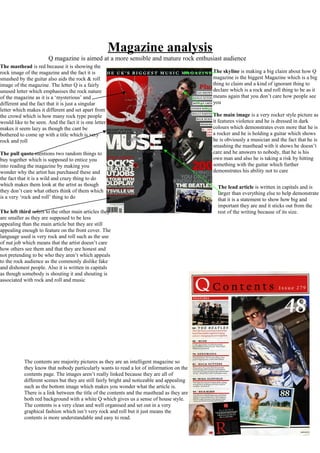
  • 1. Magazine analysis Q magazine is aimed at a more sensible and mature rock enthusiast audience The pull quote mentions two random things to buy together which is supposed to entice you into reading the magazine by making you wonder why the artist has purchased these and the fact that it is a wild and crazy thing to do which makes them look at the artist as though they don’t care what others think of them which is a very ‘rock and roll’ thing to do The masthead is red because it is showing the rock image of the magazine and the fact it is smashed by the guitar also aids the rock & roll image of the magazine. The letter Q is a fairly unused letter which emphasises the rock nature of the magazine as it is a ‘mysterious’ and different and the fact that it is just a singular letter which makes it different and set apart from the crowd which is how many rock type people would like to be seen. And the fact it is one letter makes it seem lazy as though the cant be bothered to come up with a title which is very rock and roll The skyline is making a big claim about how Q magazine is the biggest Magazine which is a big thing to claim and a kind of ignorant thing to declare which is a rock and roll thing to be as it means again that you don’t care how people see you The left third refers to the other main articles they are smaller as they are supposed to be less appealing than the main article but they are still appealing enough to feature on the front cover. The language used is very rock and roll such as the use of nut job which means that the artist doesn’t care how others see them and that they are honest and not pretending to be who they aren’t which appeals to the rock audience as the commonly dislike fake and dishonest people. Also it is written in capitals as though somebody is shouting it and shouting is associated with rock and roll and music The main image is a very rocker style picture as it features violence and he is dressed in dark colours which demonstrates even more that he is a rocker and he is holding a guitar which shows he is obviously a musician and the fact that he is smashing the masthead with it shows he doesn’t care and he answers to nobody, that he is his own man and also he is taking a risk by hitting something with the guitar which further demonstrates his ability not to care The lead article is written in capitals and is larger than everything else to help demonstrate that it is a statement to show how big and important they are and it sticks out from the rest of the writing because of its size. The contents are majority pictures as they are an intelligent magazine so they know that nobody particularly wants to read a lot of information on the contents page. The images aren’t really linked because they are all of different scenes but they are still fairly bright and noticeable and appealing such as the bottom image which makes you wonder what the article is. There is a link between the title of the contents and the masthead as they are both red background with a white Q which gives us a sense of house style. The contents is a very clean and well organised and set out in a very graphical fashion which isn’t very rock and roll but it just means the contents is more understandable and easy to read.
  • 2. The magazine features many of the stereotypical magazine layout features such as: drop cap, a pull quote, a by line, a lead image and a stand first. All of these features help the article to look appealing and pull in the readers; the features are used in a fashion that keeps the article looking busy and enjoyable to read. The article is set out in three columns with something that stands out in each of the columns to keep the readers attention (the bold cap in the first and last and the pull quote and an interesting image in the middle) this is done to make the whole article look appealing so the reader doesn’t get disinterested and stops reading. The lead image is set out in a not very interesting way at a quick glance but if you look at the image you notice the subtle things, with the most obvious one being the fact there guitars are upside down which shows they aren’t planning on playing the guitars just holding them. The way they are stood is the stereotypical band formation with the lead guitarist and front man in front and the bass and drums behind which demonstrates that they are purposely placed there (mise-en-scene). The image doesn’t link with the pull quote as the quote states ‘IT CAN’T BE COINCIDENCE WE’RE A BAND OF MISFITS.” which would lead you to believe they would look quite different from each other and dress differently but in the lead image they are all dressed in similar clothing. The writer portrays Matt Bellamy as a rough and tough ‘killer’ as he discusses killing a chicken for Christmas he uses quite violent language when he describes him “murder in his eyes” which portrays him as being quite a scary and intimidating man, this appeals to the rock audience as they are normally quite a violent crowd and so talking about the artist like he isn’t violent helps to attract its target audience.
  • 3. The masthead is white because it is on a black background and so it makes it stand out more than any other colour and most other things on the front of the front page as they are all darker and it also looks like it is smashed which demonstrates violence which emphasises the magazines rock genre. It is in front of everything to show the importance of it like it trumps all other information on the page. The pull quote sounds fairly violent which would encourage the magazines main audience (rockers) to read further as is its aim. The lead article is larger than most writing on the front page and it is white on a dark background to attract your eyes towards it. It is in capitals to give it the effect of someone shouting it at you which is often associated with rock. The left third refers to the other main feature of the magazine and makes you want to open up and take a look and because it is pictures it is easier to just have a quick look through and easily judged. The fact that there are stickers and posters shows how the target audience is younger than some other music magazines audience and it shows the sort of bands they expect there audience to want to have a poster of. The skyline is made a bit brighter than the rest to make it stand out and it is also quite short so it is easy to read as it is supposed to be there to further encourage someone to read on. The cover lines are short and simple and straight to the point and they tell the audience directly who is featured inside the magazine which would probably appeal to an audience who didn’t want to stare at the pictures working out who is inside. The contents has a fairly equal amount of both pictures and writing so whichever you prefer to find information from you can just use that or you can also read both as it doesn’t feel like it is overloading you with either of them. As the magazine is aimed at a youngish audience of about 14 – 19 it isn’t laid out very graphically and is in a bit of a mess and a jumble which would be associated with rock. Even with the writing it doesn’t seem as though there is any which is a good feature as good literacy is also not always associated with rock. There is a link to the cover as there are copies of the masthead dotted around the contents and also is has the same colour yellow writing in the same font as is on the front cover which gives us a sense of house style. The main image is of an artist dressed in dark colours which are leather which is associated with rock and he also is wearing jewellery which is again associated with rock and rock stars as they don’t feel it is feminine to wear jewellery and even if it was they wouldn’t care as they are rockers
  • 4. This DPS has many common features of a DPS such as: a pull quote, which is larger than the other text because it is used to attract your attention and it sounds quite arrogant but very rock star which would appeal to the magazines target audience, a drop cap, a lead image, which is the same image as used on the front cover page which would give us the link to the cover giving us a sense of house style, 3 columns although this isn’t a house style feature as the other articles have a variety of different columns. There is an equal amount of copy and body copy in the article and the variety helps keep the reader enticed into reading it.
  • 5. The Masthead is black as it is on a white background as they are two very contrasting colours and this contrast emphasises the masthead. The masthead is in capitals to help emphasise it and make it stand out also it gives the impression of aggression as capitals is normally a way of putting across shouting. You don’t get an overly clear image of the target audience from the masthead but the use of black gives the impression of it being aimed at a rock/indie/metal etc type audience. The left third is in capitals to make it seem loud and important and helps get its point across although there isn’t much said in this as it is written about a very well known band ‘The Foo Fighters’ which is enough to entice the reader into reading further. The cover lines are put simply and straight to the point with the promise of the posters being ‘classic’ which would give the effect of the bands having been around for quite a while and having been quite liked and well known. The lead article is different from all of the other writing on the front cover as it is larger than all of the other writing and also it is in a different font. The font used links in with what is being said as the both make reference to paint and the fact that it is red also links with war as in the sense of blood although it could just be to keep in with the house style of the front cover as there quite a bit of other red writing on there. The simple fact it is referring to war encourages people to read on by giving the lead article a menacing look and also the use of ‘satanic’ emphasises this and ‘underground’ is associated with partying and secrecy and menacing behaviour. The main image comes across quite elegant whilst still showing its rough side with all of the artist’s hair being quite messy and wild showing them as ‘queens of the underground’.
  • 6. The contents are very graphical and very different to the front cover as it is a lot less lively seeming. It has more text than images but its simple layout makes it easy to understand. There isn’t a very clear sense of house style as the only continuity is a small bit of red and the black writing on a white background This double page spread is very graphics based as it contains many images of quite festival and gig based scenes except the largest image which seems very random as it doesn’t seem to fit but it is just simply demonstrating who the band is as they are a fairly new and emerging band; the pictures are linked with the article as the article is trying to portray them as a wild and loud band which is how the pictures show them. The text is laid out in two columns to make it look less daunting as not many people want to read a large block of text and the columns break it up. The pull quote is in capitals to make it sound loud and stand out which links well with the article and the use of the word ‘fuck’ gives great emphasis also making it seem wild and crazy as they article portrays the band. The stand first sets the article up well by introducing the band as loud and mischievous which encourages you to read on as it makes you wonder why he makes this ‘warning’. The copy contains many quotes from the artist as the article is an interview with the majority of what the journalist saying being about what the band have been up to and the use of quotes helps give you an even interpretation of the band as they get to also have their say. The use of image over lapping and adjusting the opacity gives a good effect.
  • 7. The contents are very graphical and very different to the front cover as it is a lot less lively seeming. It has more text than images but its simple layout makes it easy to understand. There isn’t a very clear sense of house style as the only continuity is a small bit of red and the black writing on a white background This double page spread is very graphics based as it contains many images of quite festival and gig based scenes except the largest image which seems very random as it doesn’t seem to fit but it is just simply demonstrating who the band is as they are a fairly new and emerging band; the pictures are linked with the article as the article is trying to portray them as a wild and loud band which is how the pictures show them. The text is laid out in two columns to make it look less daunting as not many people want to read a large block of text and the columns break it up. The pull quote is in capitals to make it sound loud and stand out which links well with the article and the use of the word ‘fuck’ gives great emphasis also making it seem wild and crazy as they article portrays the band. The stand first sets the article up well by introducing the band as loud and mischievous which encourages you to read on as it makes you wonder why he makes this ‘warning’. The copy contains many quotes from the artist as the article is an interview with the majority of what the journalist saying being about what the band have been up to and the use of quotes helps give you an even interpretation of the band as they get to also have their say. The use of image over lapping and adjusting the opacity gives a good effect.