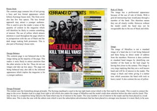
1. House Style Rule of Thirds
The contents page contains lots of text giving The image has a professional appearance
a busy and less formal appearance which because of the use of rule of thirds. With a
follows Kerrangs house style. The front cover grid all intersecting lines would pass through a
also has few free spaces. The less formal member of the band. This therefore means
approach may attract a younger audience. they are all clearly visible. However without
This is used to give the reader a sense of the the model credit the band may not be
quantity of content in the magazine which recognisable due to the use of black and white.
will therefore be likely to contain something
of interest. The use of yellow which attracts
attention is used throughout the page which is
in juxtaposition with the use of black and the
dark image making both prominent. This is
also part of Kerrang’s house style.
Image
The image of Metallica is not a standard
image of a band due to it not being balanced
Design Balance
and there being no direct mode of address
The contents page is not balanced due to the
from the members. However it does conform
image taking up the majority of the page. This
to standard band images by identifying one
makes it more likely to attract attention than
member of the band as the lead singer by
the other articles in the list. These do not use
having him closer to the camera. This image is
images and take up less space. The page not
very large implying that they are a well known
being balanced may also add to the informal
band and will be of interest to the reader. The
appearance which implies the magazine is for
image is black and white giving it a darker
a younger audience.
tone which associates the band with rock or
heavy metal. It also contrast the use of yellow.
Design Principal
The content uses the Guttenburg design principle. The Kerrang masthead is used in the top right hand corner which is the first read by the reader. This is used to connect the
page to the cover. Readers look at a page from right to left which also makes the image of Metallica and the model credit draw attention before the other articles listed. This
may be due to a competition being linked to the band which may be of interest to the reader. The issue number is not of interest to the reader and has been placed in a weak
fallow area. This is also the case with the editors note which is next the subscription advertisement that has been placed in a stronger area because it is more likely to be seen.
2. House Style Rule of Thirds
The contents page contains lots of text giving The image has a professional appearance
a busy and less formal appearance which because of the use of rule of thirds. With a
follows Kerrangs house style. The front cover grid all intersecting lines would pass through a
also has few free spaces. The less formal member of the band. This therefore means
approach may attract a younger audience. they are all clearly visible. However without
This is used to give the reader a sense of the the model credit the band may not be
quantity of content in the magazine which recognisable due to the use of black and white.
will therefore be likely to contain something
of interest. The use of yellow which attracts
attention is used throughout the page which is
in juxtaposition with the use of black and the
dark image making both prominent. This is
also part of Kerrang’s house style.
Image
The image of Metallica is not a standard
image of a band due to it not being balanced
Design Balance
and there being no direct mode of address
The contents page is not balanced due to the
from the members. However it does conform
image taking up the majority of the page. This
to standard band images by identifying one
makes it more likely to attract attention than
member of the band as the lead singer by
the other articles in the list. These do not use
having him closer to the camera. This image is
images and take up less space. The page not
very large implying that they are a well known
being balanced may also add to the informal
band and will be of interest to the reader. The
appearance which implies the magazine is for
image is black and white giving it a darker
a younger audience.
tone which associates the band with rock or
heavy metal. It also contrast the use of yellow.
Design Principal
The content uses the Guttenburg design principle. The Kerrang masthead is used in the top right hand corner which is the first read by the reader. This is used to connect the
page to the cover. Readers look at a page from right to left which also makes the image of Metallica and the model credit draw attention before the other articles listed. This
may be due to a competition being linked to the band which may be of interest to the reader. The issue number is not of interest to the reader and has been placed in a weak
fallow area. This is also the case with the editors note which is next the subscription advertisement that has been placed in a stronger area because it is more likely to be seen.
3. House Style Rule of Thirds
The contents page contains lots of text giving The image has a professional appearance
a busy and less formal appearance which because of the use of rule of thirds. With a
follows Kerrangs house style. The front cover grid all intersecting lines would pass through a
also has few free spaces. The less formal member of the band. This therefore means
approach may attract a younger audience. they are all clearly visible. However without
This is used to give the reader a sense of the the model credit the band may not be
quantity of content in the magazine which recognisable due to the use of black and white.
will therefore be likely to contain something
of interest. The use of yellow which attracts
attention is used throughout the page which is
in juxtaposition with the use of black and the
dark image making both prominent. This is
also part of Kerrang’s house style.
Image
The image of Metallica is not a standard
image of a band due to it not being balanced
Design Balance
and there being no direct mode of address
The contents page is not balanced due to the
from the members. However it does conform
image taking up the majority of the page. This
to standard band images by identifying one
makes it more likely to attract attention than
member of the band as the lead singer by
the other articles in the list. These do not use
having him closer to the camera. This image is
images and take up less space. The page not
very large implying that they are a well known
being balanced may also add to the informal
band and will be of interest to the reader. The
appearance which implies the magazine is for
image is black and white giving it a darker
a younger audience.
tone which associates the band with rock or
heavy metal. It also contrast the use of yellow.
Design Principal
The content uses the Guttenburg design principle. The Kerrang masthead is used in the top right hand corner which is the first read by the reader. This is used to connect the
page to the cover. Readers look at a page from right to left which also makes the image of Metallica and the model credit draw attention before the other articles listed. This
may be due to a competition being linked to the band which may be of interest to the reader. The issue number is not of interest to the reader and has been placed in a weak
fallow area. This is also the case with the editors note which is next the subscription advertisement that has been placed in a stronger area because it is more likely to be seen.
4. House Style Rule of Thirds
The contents page contains lots of text giving The image has a professional appearance
a busy and less formal appearance which because of the use of rule of thirds. With a
follows Kerrangs house style. The front cover grid all intersecting lines would pass through a
also has few free spaces. The less formal member of the band. This therefore means
approach may attract a younger audience. they are all clearly visible. However without
This is used to give the reader a sense of the the model credit the band may not be
quantity of content in the magazine which recognisable due to the use of black and white.
will therefore be likely to contain something
of interest. The use of yellow which attracts
attention is used throughout the page which is
in juxtaposition with the use of black and the
dark image making both prominent. This is
also part of Kerrang’s house style.
Image
The image of Metallica is not a standard
image of a band due to it not being balanced
Design Balance
and there being no direct mode of address
The contents page is not balanced due to the
from the members. However it does conform
image taking up the majority of the page. This
to standard band images by identifying one
makes it more likely to attract attention than
member of the band as the lead singer by
the other articles in the list. These do not use
having him closer to the camera. This image is
images and take up less space. The page not
very large implying that they are a well known
being balanced may also add to the informal
band and will be of interest to the reader. The
appearance which implies the magazine is for
image is black and white giving it a darker
a younger audience.
tone which associates the band with rock or
heavy metal. It also contrast the use of yellow.
Design Principal
The content uses the Guttenburg design principle. The Kerrang masthead is used in the top right hand corner which is the first read by the reader. This is used to connect the
page to the cover. Readers look at a page from right to left which also makes the image of Metallica and the model credit draw attention before the other articles listed. This
may be due to a competition being linked to the band which may be of interest to the reader. The issue number is not of interest to the reader and has been placed in a weak
fallow area. This is also the case with the editors note which is next the subscription advertisement that has been placed in a stronger area because it is more likely to be seen.