
Recommended
More Related Content
What's hot
Viewers also liked
Viewers also liked (14)
Similar to Double page spread analysis
Similar to Double page spread analysis (20)
More from Louis1995
More from Louis1995 (15)
Double page spread analysis
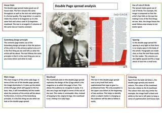
- 1. House Style Use of rule of thirds The double page spread makes good use of Double Page spread analysis The spread makes good use of house style. The font remains the same rule of thirds. For example, the throughout as well as the text size which gives image is composed so that the it a formal quality. The large letter L is used to artist’s face falls on the eye line relate the article to Q magazine as it is the making it one of the first things same font and colour used in Q magazines we see. Also, the image leaves the masthead. The text is arranged in 3 columns of weak fallow areas empty to not the same size so it seems constant. waste space. Gutenberg design principle Spacing The contents page makes use of the In this double page spread the Gutenberg design principle in that the picture spacing is very tight so that there of the artist is in the primary optical area so it is no empty space in the body of is the first thing we see and tells us what the the article. Paragraphs are made article will be about. The text follows the same clear so that the text flows easily principle in that it is the next thing you see so for the reader. The columns are you know where and what to read. also tightly spaced and fits a large about of text into a small area. Main image Masthead Text Colouring The main image is of the artist Lady Gaga. In The masthead used on this double page spread The text in this double page spread Apart from the bold red letter L, the terms of the rest of the double page spread, replicates the design of the Q logo which is the uses a very small font and a double page spread uses neutral the image dominates it. It takes up the whole magazine as to which this page is from. This sophisticated font type to give it a colours. The colour of the masthead of the left page which will appeal to the fan allows the audience to recognise it easily. It is professional look. The only exception is here also relates to the Q masthead. base. Also, it will immediately tell the reader also very large and bright in terms of the rest of the upper case letters at the beginning The colours here also stay similar for what the contents of the article will be about. the text. This makes it unmissable. Also, instead of two sections. This helps to identify example, the image itself is black and Furthermore, in terms of the Gutenberg of keeping to the original Q logo, the masthead when a subject matter is changing so white so the text is left plain to keep a principle, it is the first thing we see when we is an L linking it to Lady Gaga. the audience will be able to follow it sense of sophistication and house style. look at the double page spread. easily