
Recommended
More Related Content
What's hot
What's hot (17)
Similar to Q analysis
Similar to Q analysis (20)
More from Thomas Griffiths
More from Thomas Griffiths (20)
Recently uploaded
Recently uploaded (20)
Q analysis
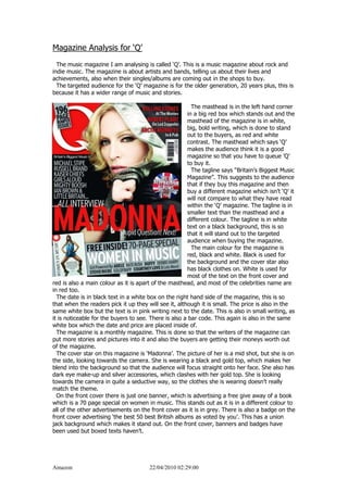
- 1. Magazine Analysis for ‘Q’<br /> The music magazine I am analysing is called ‘Q’. This is a music magazine about rock and indie music. The magazine is about artists and bands, telling us about their lives and achievements, also when their singles/albums are coming out in the shops to buy.<br /> The targeted audience for the ‘Q’ magazine is for the older generation, 20 years plus, this is because it has a wider range of music and stories.<br />-28575134620<br /> The masthead is in the left hand corner in a big red box which stands out and the masthead of the magazine is in white, big, bold writing, which is done to stand out to the buyers, as red and white contrast. The masthead which says ‘Q’ makes the audience think it is a good magazine so that you have to queue ’Q’ to buy it. <br /> The tagline says “Britain’s Biggest Music Magazine”. This suggests to the audience that if they buy this magazine and then buy a different magazine which isn’t ‘Q’ it will not compare to what they have read within the ‘Q’ magazine. The tagline is in smaller text than the masthead and a different colour. The tagline is in white text on a black background, this is so that it will stand out to the targeted audience when buying the magazine.<br /> The main colour for the magazine is red, black and white. Black is used for the background and the cover star also has black clothes on. White is used for most of the text on the front cover and red is also a main colour as it is apart of the masthead, and most of the celebrities name are in red too.<br /> The date is in black text in a white box on the right hand side of the magazine, this is so that when the readers pick it up they will see it, although it is small. The price is also in the same white box but the text is in pink writing next to the date. This is also in small writing, as it is noticeable for the buyers to see. There is also a bar code. This again is also in the same white box which the date and price are placed inside of. <br /> The magazine is a monthly magazine. This is done so that the writers of the magazine can put more stories and pictures into it and also the buyers are getting their moneys worth out of the magazine.<br /> The cover star on this magazine is ‘Madonna’. The picture of her is a mid shot, but she is on the side, looking towards the camera. She is wearing a black and gold top, which makes her blend into the background so that the audience will focus straight onto her face. She also has dark eye make-up and silver accessories, which clashes with her gold top. She is looking towards the camera in quite a seductive way, so the clothes she is wearing doesn’t really match the theme.<br /> On the front cover there is just one banner, which is advertising a free give away of a book which is a 70 page special on women in music. This stands out as it is in a different colour to all of the other advertisements on the front cover as it is in grey. There is also a badge on the front cover advertising ‘the best 50 best British albums as voted by you’. This has a union jack background which makes it stand out. On the front cover, banners and badges have been used but boxed texts haven’t.<br />