
More Related Content
What's hot
What's hot (18)
Similar to Music magazine anaylsis
Similar to Music magazine anaylsis (20)
More from lauryndainton
Recently uploaded
Recently uploaded (20)
Music magazine anaylsis
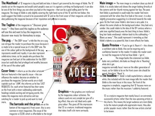
- 1. The Masthead of ‘Q’ magazine is big and bold and also, it doesn’t get covered by the image of Adele. The ‘Q’ stands out on the magazine and would catch people’s eyes as it is against a striking red background, it can also be one of the first things you see when you look at the magazine – that can be a good selling point for the magazine. The image of Adele is only slightly covering the right hand curve of the ‘Q’ and the text below, this could suggest that Adele is proud to be associated with ‘Q’ and on the front cover of their magazine, and she is also publicising the magazine because of her reputation and position in society. The Tagline of the magazine is “ Discover great music “ – they have used this tagline so the audience will see this and want to buy the magazine to discover new music for themselves to enjoy. The pug – “ The 300th issue “ a title like this on a pug can intrigue the reader to purchase this issue because it is made to be a special issue as it’s the 300th one. The use of the colour gold on the background of the pug represents wealth and royalty, it can also represent celebratory times, so for people who purchase this magazine can feel part of the celebration for the 300th issue but could also feel privileged and wealthy because of the use of the colour gold. The barcode and the price are at the bottom of the magazine’s front cover, this is very common in most magazines. This issue of the magazine is £3.99, which is affordable to the target Main image – The main image is a medium close up shot of Adele, it is studio taken and shows the singer looking directly at the camera with her thumb resting against her lips. The pose that Adele is positioned in could make the reader feel more connected with her when they first look at the cover, it is also slightly provocative suggesting it is directed towards the male gaze. On the front cover Adele’s skin tone is very pale; it is almost the same shade as the background colour, they look very similar, this could relate to the idea of the 19th century where a pale tone signified beauty was the best thing to have. Adele’s long hair looks windswept, relation back to the subheading – “ Blows us away “. This could represent it reminding us that Adele’s talents is so powerful, that it even effects her looks. Quote Preview – ‘If you’ve got it, flaunt it’ – this shows a confident side to Adele, this can be inspiring and a confidence booster to the reader. It makes the reader want to read the magazine to find out how Adele – ‘got it’. The image backs this statement as Adele looks very confident, she looks as though she is ‘flaunting’ what she’s got. ‘Q’ magazine normally focus’ more on the older generation of music, so for Adele to be on the front cover she should be proud, therefore ‘ flaunt’ it. Cover lines – inform us on the other artists that are featured in that specific issue – this can influence the readers decision on whether to purchase the magazine. Certain words are in bold capitals such as ‘ LIAM’, this informs us he has ‘LAST REQUESTS, Etc. each artist featured has their name on the front with a minor subheading underneath, headings include exciting and intriguing words, this makes the magazine more attractive and eye catching for a reader to pick up and want to read more. The headline – ‘Adele’ in bold capital letters, coloured white, this included with the main image tells the reader that Adele is the main focus in this issue. The front of the magazine is simplistic, suggesting that ‘Q’ focuses more on the music rather than the musician / celebrity featured. ‘Q’ is a mature magazine that mainly focus’s on extremely successful artists rather than the new upcoming artists in the charts. This means the target audience are more likely to be the mature people who appreciate music, they also prefer popular music rather than the new artists started to be known. Graphics – the graphics are reinforced by the magazines colour schemes. The colours used are very simple but give off a big effect, they are red, black and a pale grey colour. This gives off the impression that ‘Q’ is a mature, traditional magazine that takes itself a bit more seriously.
- 2. - Q’s audience is younger than any other monthly music magazine. The average age of a Q magazine reader is 29, Adele is 24, so she is kind of a similar age to the average reader, this could suggest that she could possibly read the magazine too. Having someone roughly the same age featured in the magazine to the readers age can help them to feel more connected to the featured artist. Adele is currently very successful singer of the 21st century, so she is likely to be more relevant to the readers lives; making them more likely to buy the magazine. - As 68% of Q’s readers are male, they are providing for the majority.. By using a slightly provocative image of Adele with her ‘ thumb pressed against a slightly open mouth’ pose. The 32% of females who read Q, can also be intrigued by this picture as it can inspire them to be like Adele, they could possibly see her as a role model. - Adele is a white British female, suggesting she is more likely to appeal to the white British population, as appose to the ethnic minority groups. 85% of Britain are white British, so again they are aiming to appeal to the majority. - On all front covers of Q’s magazines capital letters are used. The font used is clear, bold and informative but at the same time short. Q is a trusted, high quality magazine focused on the substance of music. The font appeals to this as it is simplistic and doesn’t draw any attention from the headlines, which are the key things to draw attention. The font also appeals more to the target audience as they’re young, and affluent, suggesting that they are of a higher class. As the magazine is neat and sophisticated it will appeal to
- 3. Heading – The ‘Q’ logo is in a relatively small box, and font, this suggests that the magazine is that well known that they don’t need to emphasis the logo in big bold fonts to get new attention. The logo is followed by the word ‘CONTENTS’ in bold capital letters, which is conventional, this lets the reader know exactly what that certain page is for, and what is included in that issue of the magazine. It shows the main articles included in the magazine, this intrigues the target audience making them want to buy it. The sub-heading – The “features” grab the audience’s attention to the kicker’s ( the issue of Q’s main articles.) They all sound intriguing, exciting and exclusive, e.g. “ Fight the Power “ and “ Pro Green’s exclusive track “ making the reader feel and believe that they are getting good information and gossip that they can’t get anywhere else. As the features are laid out in a list it give the reader the impression that the magazine has a large amount of context within it, this can also make the reader feel like they are getting good worth out of their money so could be more willing to pay. Pug – An eye catcher to get the attention of the buyers on the contents page is the pug that says “ 140 songs to download now “. It makes the reader want to flick to that certain page and download the songs available or find out some songs they haven’t heard of before. Form of address – the words used in the magazine are informal and sometimes they can be rude. As the magazine is aimed at an older target audience, it is seen to be appropriate. It is seen to make the reader feel more comfortable and enjoy the magazine more when this type of language is used. Tagline “ Discover great music “, this kind of tagline intrigues the reader as they want to read the magazine and find out about the great music that ‘Q’ magazine has to offer them. Issue number – at the top of the page there is an issue number, this specific issue number tells us that ‘Q’ magazine has produced 207 magazines so far. The amount of magazines published shows us that ‘Q’ magazine is an extremely popular magazine. Having the issue number located at the start of the magazine is also useful as it makes it easier to find online if you want to look at it on the internet. Main image – the main image is an extreme close up of Lana Del Ray’s face, it shows her looking directly into the camera, this is as if she is staring at the audience, this could indicate as a hint to make us buy the magazine. -She has blood dripping from her head, this could suggest that something violent has happened or could be associated with danger. It could also relate to her passion towards her music, seeing this image would make the reader want to buy it so they can find out what has happened. Page numbers – The page number 48 is in an enlarged red box in bold white numbers, the page number is located in the bottom left corner of the picture of Lana Del Ray… this allows the audience to notice that this is the main article, the page number also lets them flick to the main article in the magazine quickly. The colour scheme of the contents page is quite simplistic and uses the traditional ‘Q’ magazine colours; white, red and black. This suggests that ‘Q’ magazine is very basic focuses a lot more on the music rather than the complexity of the layout. The simplistic colours can also be seen to suit their target audience of young adults who are also more interested in the actual music. The layout of the magazine is set out very orderly and structured. As the magazine is structured it emphasises the idea that the magazine focuses more on the music content. The magazine is simple and clear to read, this can interest the reader as it would be a quick and easy way to flick through the magazine to see if the issue that has been produced is related to their music taste.
- 4. The main image on the DPS is a medium shot of the band ‘ THE VACCINES ‘, it shows the four men, again, looking directly at the camera, this suggests the magazine trying to make the reader feel more connected to the people that they are reading the article about. Two of the four men are holding guitars, this shows us that they are musical and have talent. On most magazine covers for genre’s that aren’t pop, some of the images normally show the artists showing off their talent in the images, the image of the vaccines is an example of this. The four men in this image are all looking towards the camera but aren’t posing, this could suggest that the four musicians are dedicated to their music, and don’t see the need to pose and flaunt themselves to show they have talent or to show their passion for music. The man in the centre at the front of the image appears to be the leader of the band, possibly the main singer. The man is holding a guitar in his arms, the use of this can represent his role within the bad and as the colour of the guitar is red it represents the theme of passion, this can symbolise the mans passion for the music and the making of his music. The main focusof this article would be the image of the artists that are ‘ THE VACCINES ‘, the photo is much larger compared the to the actually article, on the right, where the text is rather small. The could suggest that the image is there to catch the readers eye as ‘ THE VACCINES ‘ are very popular and successful so a larger image would catch the readers eye and make them want to read the article about the band, the image is the main attraction of the double page spread. Having ‘ THE VACCINES ‘ as the main focus will get readers attention that have possibly not heard of ‘ THE VACCINES ‘ before, so therefore this can increase ‘ THE VACCINES ‘ popularity which could further increase their success. The heading – ‘ THE VACCINES ‘ is in black, bold, capital letters. The use of this indicates that the magazine wants to advertise that the band is ‘up and coming’. The way the magazine has designed this article is that we firstly notice the large image, we then notice the bands name. This is good as it informs the reader who the image is of and what the article is about, this will help interest the audience to read it. A quote used in the article is “ We are a pop band “, this quote is coloured blue and is enlarged from the rest of the text. As it is a quote from the band it tells us that the band want to be a pop band rather than an indie band, etc. However the layout of the double page spread contradicts this. The article’s content, in this article it includes an interview with each individual member of the band. This gives the reader a chance to get more involved and know more about the individual band members and the band as a whole. This helps the reader to understand and know the band a lot better too. Graphics – The colour scheme of this article is again very basic. There is a use of a sepia tone, this gives it an almost vintage feel which is similar to the genre of ‘ THE VACCINES ‘ and their sound, but this is where it contradicts to the band wanting to be a pop band. Within the article there are splashes of the colour blue, the colour on the dull background gives the article a kind of modern feel to the vintage look / feel, this agrees with the point that ‘ THE VACCINES’ have something new to offer to older bands, which could be the change from an Indie band to a pop band. There are little squares and lines of blue spread all over the page, this could represent the attitude the band have to neatness and tidiness, it could indicate that they arent bothered if the page is tidy because they care more about the simplicity of the music.