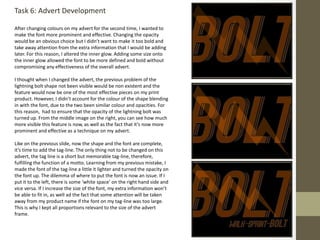
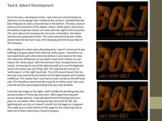
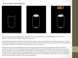
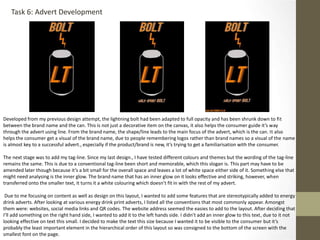
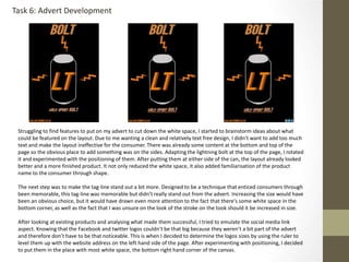
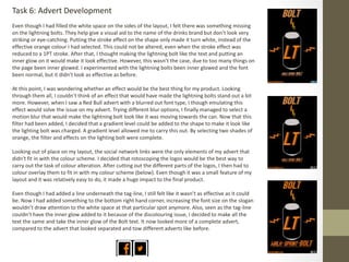
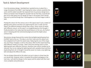
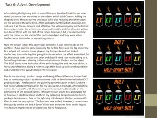
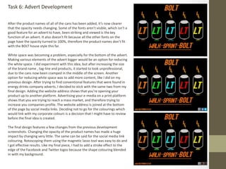
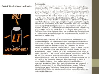
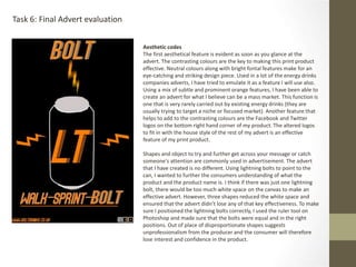
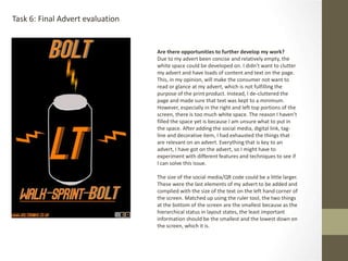
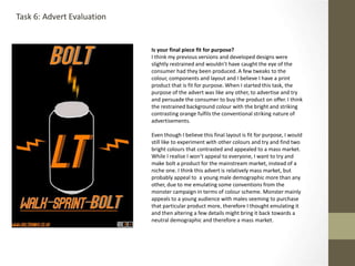
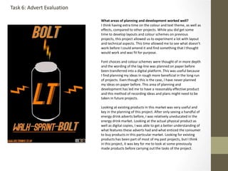
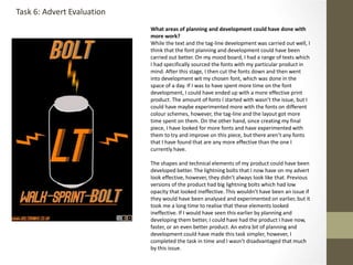
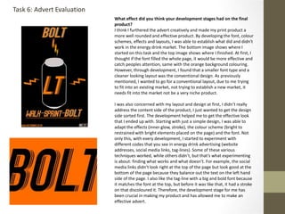
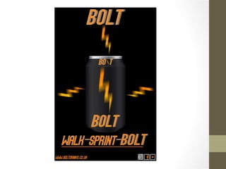
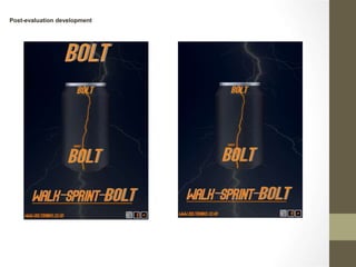
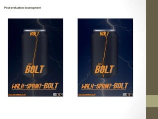
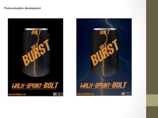
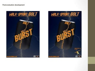
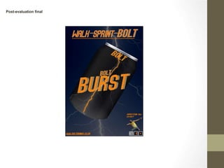
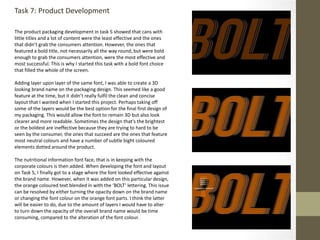
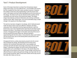
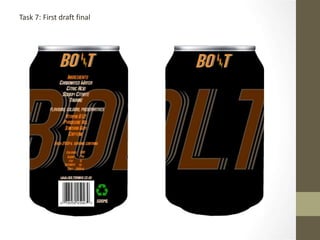
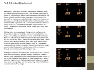
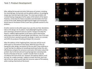
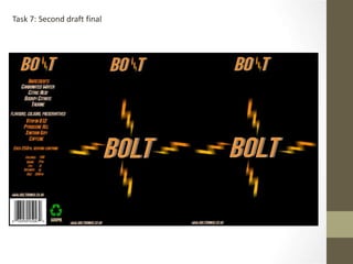
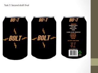
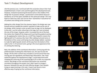
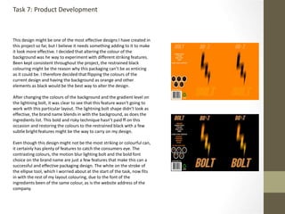
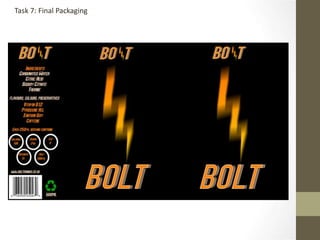
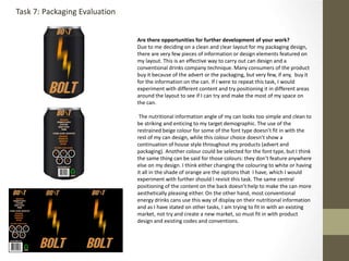
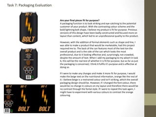
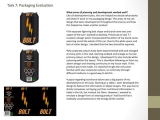
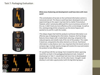
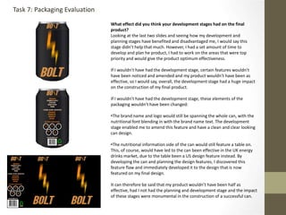
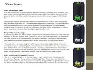
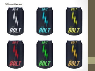
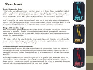
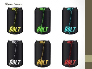
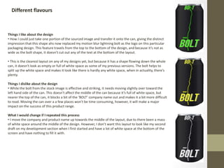
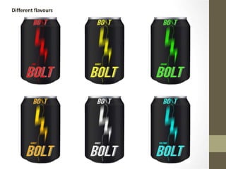
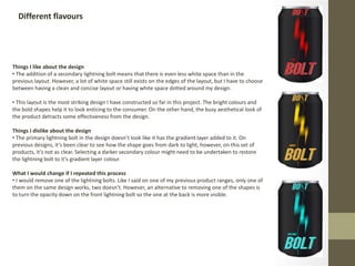
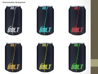
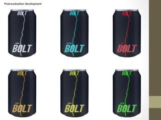
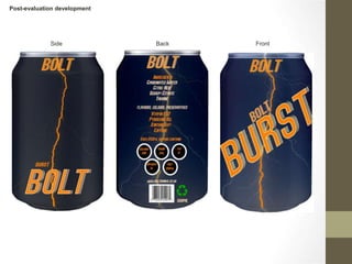
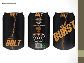
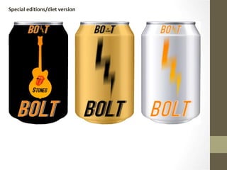
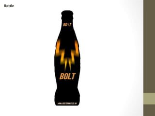
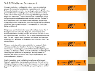
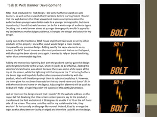
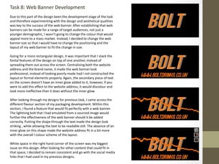
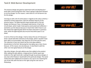
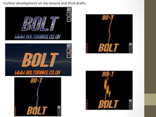
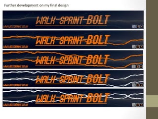
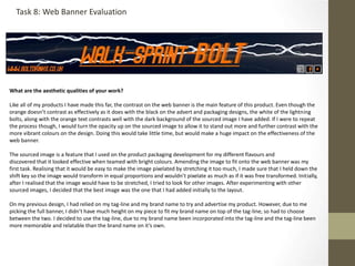
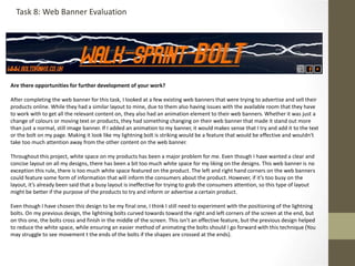
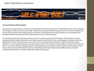
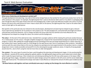
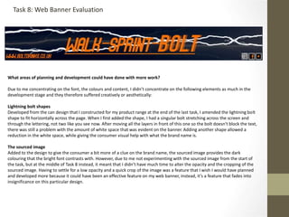
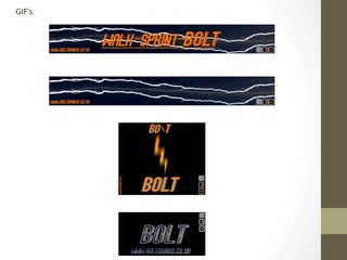
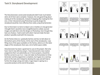
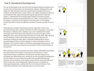
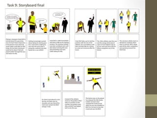
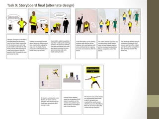
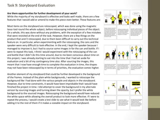
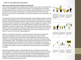
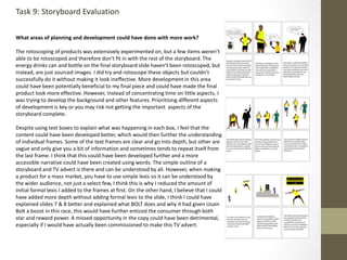
This document summarizes the development process of an advertisement for an energy drink called BOLT. The author experimented with different background colors, fonts, shapes, and elements to refine the design. Key elements included a lightning bolt shape to represent the product name, changing the background from orange to black to fit industry conventions, and adding the product can, tagline, and social media links. The author aimed to reduce white space, make elements more prominent, and create an advertisement that would appeal to mass consumers while fitting expected norms for the energy drink market.


![Photography%20book%20pro%20forma[1]](https://cdn.slidesharecdn.com/ss_thumbnails/photography20book20pro20forma1-140113034800-phpapp02-thumbnail.jpg?width=640&height=640&fit=bounds)


