SlideShare a Scribd company logo
What initial researchdidyoudo on the company?
I started by gathering a history of the company. I looked for how the company
was founded as well as the existing products, the prices and the general feel of
the company. OnceI had done this I created 20 paper questionnaires about
the currentRoyal Canin logo. The questions were a mix of qualitative and
quantitative which gave me an accurate responseand opinions which people
had on the brand. After this I held as focus group with 20 people to ask their
opinions on the look of the currentlogo and whatthey would change aboutit.
I then took this feedback and implemented it into my re-branded logo. They
said that the old logo was “bland” and was confused aboutwhat the brand
sold as their product. The main issuewith the logo was that they could not
identify what the Royal Canin brand was about justfrom looking at the logo.
Some of the people I asked within the focus group new whatthis brand did but
only knew this due to them buying the company’s products for their own pet.
How successful was this?
I felt that the initial research went well. I felt that knowing the company’s
beginnings really helped me to changethe logo. This is because of some of the
information I found out about the history of the brand Royal Canin. I found out
that it was founded in Franceby a passionatevet who only wanted the best for
the pets. However, I also found out that Royal Canin is owned by a company
called MARS. The company, who arebased in America, also own brands such
as pedigree and Banfield Pet Hospital. Due to MARS owning the Royal Canin
brand it has led the brand to become a much more global brand. This benefits
the company finically.
What data did you gather from this and how did it help you plan the rebrand
designs?
Frommy paper questionnaires, I found that 90% of the people I asked like the
colour of the logo. This was reflected in
the focus group as everyonedid not
have an issuewith the colour red. The
facts I found about the history of Royal
Canin helped me shapehow I need the
logo to look. I now know that I must
keep the colour red within my new logo
and havean older look to represent the
humble beginning of the company. I also needed to make the brand look crisp
and clean as well as stand out. I needed to listen to what my feedback was
fromboth the paper questionnaires and the focus group. I needed to add the
connotations of the pet industry that my focus group wanted.
How effective was your pre-production?
Overallmy pre-production was a success but it was not without its issues. I feel
that I was not able to use the Photoshop tools at firstbut the further on in the
design process this got easier. This was becauseI had
previous experience with Photoshop but not all the
tools I used to create the new logo. Before starting
this project, I had no knowledge of the pen tool. I did
not know whatit was or how to use it. My firstever
attempt using this tool was of a basic outline of a
sitting cat. This went ok. Itwas not as neat as the final
logo was becauseI did not know how bestto usethis
tool. I discovered that
by adding in less points
you could make curves
that are not as steep therefore creating more
natural, smooth lines which I needed within my
final logo. Another tool I did not have knowledge
of was the various brush tool. This tool could be
used like a paint brush, stroking them across the
page, or a stamp. I started by using the brush
tool to add differentpatterns and animals into
my logo designs. I did this because I wanted to
see whether this would work or not as well as
see how effective they would be. Some worked
well, like the giant paw print or the fox. Others
brushes like the spotlight and the dots did not
work as well. I also wanted to usethe brush
tool like a paint brush and add colour onto a
shape. Itwas at this stage I discovered how to
best use the pen tool. I added grey for the dog’s
body and red for the collar. This worked well however, it was very hard to keep
in the lines even though the size of the brush could be altered.
How did you respondtofeedback givenfrom peers and tutors and how did
this developyour work?
Half way through creating my designs I struggled to think of any ideas on how
to change the logo. This was frustrating becauseat this stage I was nowhere
near to a finished logo design. So, I decided to listened back to my focus group
and took notes on points that I had not taking in the firsttime as well as points
I had remembered frombefore. I choseto do this at that stage because all my
design did not look how I wanted them to and I felt that if I reminded myself of
what people wanted the logo to be I would be able to focus my mind on
coming up with ideas relating to the peer feedback. This helped a lot as I found
the creative direction I needed to go. Some of the feedback given was about
the colour scheme. They really liked the shade of red used within the old logo
and wished me to keep this in the new logo. Another piece of feedback I
received frommy focus group was regarding the poor attempt at a crown. My
focus group pointed out that unless they weretold it was a crown they would
have not known this justfrom the shape. They really wanted a crown to
feature within the final logo as they felt it had connotations with the word
Royal in “Royal Canin”. I agreed with them on both these issues so tried to
rectify them in my next lot of designs. I also had an image of the existing logo
for Royal Canin as a reference point. I made a rule that if the current logo
looked better than the design I worked on I would not us it as my final logo.
However, if certain elements of the logo, like the fontor arrangement, was
better than the current RoyalCanin logo I would keep these elements and
apply this to the next designs. The thoughts and feedback of the focus group
was that they said that the old logo was “bland” and was confused about what
the brand sold as their product. The main issuewith the logo was that they
could not identify what the Royal Canin brand was about justfrom looking at
the logo. Some of the people I asked within the focus group new what this
brand did but only knew this due to them buying the company’s products for
their own pet.
What skills have you developedthroughout this unit?
I started off by only having a basic knowledge of Photoshop. I found that as I
use Photoshop moreand moreI used the software, the easier I found it to
work. The bestexample of
this was using the pen tool.
When I firstuse this tool I
really struggled to curve the
line to fit the outline of the
shape. This changed as I
found out that I did not need
to add so many points to it
and that I could move the
points if needed as well as
add new points in. I also
learned that the bigger the distancebetween each point the wider the curve
will be. The quality of my work got better as I used Photoshop more. This is
down to the practice I got fromrepeating the same steps to add text in and
change the text’s colour as well as inserting new layers and images. Due to my
limited knowledge of Photoshop I struggled at times however, I overcomethis
by keeping to techniques and methods I can do and not to aim for unrealistic
goals I still struggleto usePhotoshop and I am far from an expert but I feel the
skills I have learned will help me if I need to use Photoshop again.
What does your final design“communicate”?
When re-branding RoyalCanin I needed to consider how to put the
connotations and element associated with the pet target market. For example,
I considered adding paw prints as well as a dog or cat to the logo. I kept the
crown idea fromthe main logo as this is what feedback I got from the focus
group and someof my questionnaires. When I asked what impression people
got about the company fromthe new logo design they said it was “not an
upper class brand anymore” and found it to be “down to earth” and “ pet
friendly“. They also felt that it looks “professional” and “appealing” than the
old logo.
Does your designfit or meet the original intentions?
The logo I created does meet the intentions I wanted it to. I wanted the logo to
be more associated with the pet food marketwhich Royal Canin is aimed at. I
wanted to do this by adding in these features which would help the logo to
become instantly associated with the pet products. This was done by adding
paw prints as well a cat and dog outline. Both pets are the top two most
popular pets in the UK and havestrong connection with the brand as well as
the company’s targetmarket. By adding a new design of the crown to the logo
it makes the Royalpart of the brand morerecognised than beforeas people
did not see the crown until it was pointed out to them. I also wanted the text
to stay the same shadeof red as the old logo because mostof the people I
asked agreed that this colours works welland they also liked the shade. The
main element as well as the strong connotations I wanted to add to the new
logo was that I wanted the logo to stand out and catch the attention of the
target audience.
How appropriate is it to the target audience?
The logo is more appropriatenow than before. The old logo had no clear
indication on what the brand was. The new logo on the other hand, has been
created to be appropriateto its target audience (cat and dog owners). This has
been done by using cat and dog images as well as the crown placed on top of
the dog’s head. The logo I created fits into the target marketof pet products
due to these added elements. Also, the colour was kept the samebecause the
focus group I asked said they like the colour. I felt that the new logo would
appeal to the audience moreif elements of the old logo like the colour of the
font and the idea of a crown werekept in. The thoughts and feedback of the
focus group was that they felt that the new logo had connotations and
elements which made the brand’s targetaudience moreclear and opened the
brand up to a wider audience. They also thoughtthat the new logo makes the
“brand feel friendly and welcoming”.
How effective is your final design?
I personally feel that this logo looks more professionaland has the
connotations that was desperately needed. I was not the only one with these
feeling towards the finished logo re-design. The participants in my second
focus group agreed that the logo was better than the original with one person
commenting that the old logo looked like a “cruiseship logo” whilst another
stated that it looked
“upper class” and this
would put them off or
even considering the
Royal Canin brand in
greater detail. The
second focus group and I
agreed that the issues
whererectified in the
new logo. However,
some people criticised the letter head design I created to go with the
company’s re-brand. I decided to take the image of my final logo and create a
water mark with it due to many companies using the water marked logo
concept within all their letter heads. One person commented that the image
part of the logo, the line drawn cat and dog, should have not been included as
the watermark becauseit had the image of the ca and dog already in it. I
pointed out to this person that I had chosen the water mark idea since many
companies use a water marked logo within their documentation. Some people
felt that other aspects of my final logo could havebeen changed. For example,
one element was that the packaging of the new dog food design could have
been changed more. I then pointed out to these people that I took the ideas
they had and usethem. The focus group agreed that the packaging should stay
the samebecause they liked how “visual” it was they felt it was “easier” to
“find the food you need especially if you are in a hurry”. Dueto this I change
the design little only adding in the new logo and leaving only the English parts
in. Overall, I felt my final logo design was effective and did meet the brief and
exceeded the expectation I had for it.
As well as conducting another focus group I created a Survey Monkey which
was sent out to at least 10 people. I got 7 responses back then gathered the
results up and analysed the responses. 100% agreed thatmy new logo for
Royal Canin was better than the old logo. Some of the reasons given for this
are “quite fun, morelegible text”, “I love the animal illustrations. Very
professional” and “I understand
that the productis aimed for
animals”. The last comment was
very good to hear as I wanted my
new logo to make the brand look
more suitable for its target market
of the pet industry. The feedback
for the business card design was
not as positivehowever. Only 71%
of the results liked the business
card design. I had a mix of both positiveand negative comments on the design
of my business cards. Comments alone the lines of “Too plain as the logo has a
very thin design a background colour or elements in the background may make
it more exciting” were said. This contrasted the thoughts of the majority. They
gave me feedback such as “It’s simpleand goes well with the logo and isn't too
busy which could get confusing for clients” and “Itkeeps the same layout as
the original logo which is good since it helps to keep up the same familiarity
and the text beneath it helps make it seem more professional”. Dueto the
majority of my results liking the design of the business cards, I willsay it has
been successfulafter all you cannot please everybody. Mostcompanies would
count productrebrand as a success if more than 50% liked it. As for the last
question the results are slip with the majority (71%) liking the design of the
letter head I created. Some of the
positive comments I received back
from my Survey Monkey were
“Again the simple design adds a nice
detail making the letter head more
interesting and shows which brand
the letter is from” and “The design
seems very friendly for people who
may not haveheard of the brand
before and also looks very fitting for
what the name of the brand is”.
Other comments I received were
“honestly I couldn't write over
something, it would drive me
insane” and “I like it, but the text
may get lost on the illustrated
background, I would consider
reducing the opacity of the
illustration”. Looking back at the design of letter head I can see that maybe I
could make the water make more faded by increasing the transparency of the
image. I asked people whether they preferred the old packaging or the new
one I created. The results were near enough a 50% - 50% split over which one
people preferred. I believe this was becauseof how little I changed about the
design of the original packaging design. Within the Survey Monkey I sentout I
included an image of the old logo, the re-branded logo, business card design,
letter head design, the old packaging and my redesigned packaging. I asked
them to rank all the images from 1 – 6 with 1 being the best and 6 being the
worst. The majority of the results agreed that image 2 was the best and image
1 was the worse. I think this could be because both of these images are the
logos and you can see a vastdifference between them more than the
differences between images 5 and 6 (packaging).
What do you like about your final design?
My favouritepart of my final design is the dog and cat line drawing becauseit
is so simple yet highly effective. I got the idea from images of line drawings I
found on Google images. They used as fewer simple lines as possibleto create
the outlines of the subjects. I liked how this looked because it was simple,
clean and crisp looking yet slightly traditional which is what I needed the logo
to look like. I used this idea to draw the image of my logo and when I was
happy I emailed myself a photograph of this line drawing. I used this as my
image. I also feel the colour of the font worked well as it was the same shade
of red as the original logo. The contrastbetween the red fontand the black
and white image is effective and grabs the correcttarget audience’s attention.
The old logo did not do this due to it being flat and 2D in comparison.
I believe there is nothing I could change myself due to my re-brand hitting all
the point my focus group and paper questionnaires told me to.
How does your designcompare to past or current practice?
The original logo incorporated an unusualfont style which does not appeal to
the people I asked
through my paper
questionnaires and
focus group. The font
has the letter “a”
slanted twice which
the focus group and I could not understand the purpose of. It also has a poor
attempt at a crown which is
meant to look like a paw print. I
did not realise myself that this
was a paw print until it was
pointed out to me by one person
in my focus group. As well as this,
the layoutwas bland and
lacklustrewhich added nothing
to the logo. The royalshade of red featured throughoutthe
logo was its only redeeming feature which my focus group and I
agree on. The overall look of the logo left a lot to be desired
and one person from my focus group commented on the Royal
Canin logo looking like a “logo for a cruiseship company”. Due
to this no one within my focus group would pay attention to
the pet food brand if they saw this logo and would not explore
the brand further. Now though the logo looks refreshed and
revived due to the clean, crisp, professionalfinish to it. The font
is simple yet effective and is helped by the red colour featured within the
centre of each letter. The tittle located abovethe letter “i” is in the shapeof a
paw print giving the brand the much-needed connotations of its target market.
The crown is now clearly visible and sits regally upon a dog’s head. Both dog
and cat are created in the style of line draws using as fewer lines as possibleto
create a bold, dramatic image which creates further connotations which are
found within the brand’s targetmarket.
Is there anything youwantedto do, but couldn’t?
I felt like I achieved all I wanted to do with the logo re-brand. I followed the
feedback I reserved frommy paper Questionnaires and my focus group as well
as my own check list
of elements I feel it
needed. I kept the
colour the same as
most of the people I
asked wanted me to, I
added a better
designed crown to the
logo as the focus
group asked me to
and I added a cat and dog to the logo as well as a paw print in place of the tittle
(a dot above a letter) of the letter “i” as my focus group and I wanted the logo
to have stronger connotations of its target market. I also struggled with one of
my elements of pre-production. I wanted to add fur onto the lettering to link
the logo design into the pet target market. This did not work becauseI did and
still do not haveenough experience using Photoshop to know how to do this. I
was shown butstruggled to follow the instructions due to me not
remembering whereall the tools are in Photoshop. When I did attempt this, it
turned partof my letters a sparkly silver which is not what I wantas this makes
the design look like it has been sprinkled with glitter. I did get a fur effect in the
end but it was using a brush tool to strokedifferent shades of colour to blend
them together and give it a rough texture.

More Related Content

What's hot

Lo4 evaluation
Lo4 evaluationLo4 evaluation
Lo4 evaluation
arranspencer
 
Client Evaluation
Client EvaluationClient Evaluation
Client Evaluation
Harry Taylor
 
Task 9!
Task 9!Task 9!
Task 9!
AlanSmith96
 
LO4 evaluation
LO4 evaluationLO4 evaluation
LO4 evaluation
arranspencer
 
Design pro forma
Design pro formaDesign pro forma
Design pro forma
harisshaikhPBM
 
7. Evaluation
7. Evaluation7. Evaluation
7. Evaluation
stefan hughes
 
7. Evaluation
7. Evaluation7. Evaluation
7. Evaluation
stefan hughes
 
Development diary
Development diaryDevelopment diary
Development diary
Harry Taylor
 
Graphic design
Graphic designGraphic design
Graphic designEllen M
 
Evaluation
Evaluation Evaluation
Evaluation
Emily Shaw
 
Graphic Design Portfolio Fall 2010
Graphic Design Portfolio Fall 2010Graphic Design Portfolio Fall 2010
Graphic Design Portfolio Fall 2010
abankow1
 
Task six products & evaluations print
Task six products & evaluations printTask six products & evaluations print
Task six products & evaluations print
RichardBurnn
 
Task 9! Evaluation
Task 9! Evaluation Task 9! Evaluation
Task 9! Evaluation
AlanSmith96
 
Presentation 02
Presentation 02Presentation 02
Presentation 02
nataschayolanda
 
Parminder Chand - Digital Resume
Parminder Chand - Digital ResumeParminder Chand - Digital Resume
Parminder Chand - Digital ResumeParminder Chand
 
Logo
LogoLogo
Idea development pro forma
Idea development pro formaIdea development pro forma
Idea development pro forma
Alisha Marie Harrison
 

What's hot (20)

Lo4 evaluation
Lo4 evaluationLo4 evaluation
Lo4 evaluation
 
Client Evaluation
Client EvaluationClient Evaluation
Client Evaluation
 
Task 9!
Task 9!Task 9!
Task 9!
 
LO4 evaluation
LO4 evaluationLO4 evaluation
LO4 evaluation
 
For tumblr
For tumblrFor tumblr
For tumblr
 
Design pro forma
Design pro formaDesign pro forma
Design pro forma
 
7. Evaluation
7. Evaluation7. Evaluation
7. Evaluation
 
7. Evaluation
7. Evaluation7. Evaluation
7. Evaluation
 
Goji evaluation
Goji evaluation Goji evaluation
Goji evaluation
 
Development diary
Development diaryDevelopment diary
Development diary
 
Graphic design
Graphic designGraphic design
Graphic design
 
Evaluation
Evaluation Evaluation
Evaluation
 
Graphic Design Portfolio Fall 2010
Graphic Design Portfolio Fall 2010Graphic Design Portfolio Fall 2010
Graphic Design Portfolio Fall 2010
 
Task six products & evaluations print
Task six products & evaluations printTask six products & evaluations print
Task six products & evaluations print
 
Task 9! Evaluation
Task 9! Evaluation Task 9! Evaluation
Task 9! Evaluation
 
Presentation 02
Presentation 02Presentation 02
Presentation 02
 
FMP Evaluation
FMP EvaluationFMP Evaluation
FMP Evaluation
 
Parminder Chand - Digital Resume
Parminder Chand - Digital ResumeParminder Chand - Digital Resume
Parminder Chand - Digital Resume
 
Logo
LogoLogo
Logo
 
Idea development pro forma
Idea development pro formaIdea development pro forma
Idea development pro forma
 

Similar to Evaluation

Evaluation
EvaluationEvaluation
7. fmp evaluation
7. fmp evaluation7. fmp evaluation
7. fmp evaluation
joshpalmmer
 
A LOGO IS NOT A BRAND
A LOGO IS NOT A BRANDA LOGO IS NOT A BRAND
A LOGO IS NOT A BRAND
Paul Hebron
 
7. fmp evaluation done
7. fmp evaluation done7. fmp evaluation done
7. fmp evaluation done
BenjaminLawrenson
 
7. fmp evaluation done
7. fmp evaluation done7. fmp evaluation done
7. fmp evaluation done
BenjaminLawrenson
 
Evaluation (task 9)
Evaluation (task 9)Evaluation (task 9)
Evaluation (task 9)
PJG123
 
Evaluation (task 9)
Evaluation (task 9)Evaluation (task 9)
Evaluation (task 9)
PJG123
 
7. fmp evaluation 2
7. fmp evaluation 27. fmp evaluation 2
7. fmp evaluation 2
jackedwardsz
 
7. fmp evaluation
7. fmp evaluation7. fmp evaluation
7. fmp evaluation
kallum-sykes
 
7. evaluation
7. evaluation7. evaluation
7. evaluation
louis harman
 
Pro forma for all work
Pro forma for all workPro forma for all work
Pro forma for all work
Jonah Adshead
 
7. evaluation
7. evaluation7. evaluation
7. evaluation
Daniel Thompson
 
Evaluation fmp (1)
Evaluation fmp  (1)Evaluation fmp  (1)
Evaluation fmp (1)
Daniel Thompson
 
Evaluation FMP
Evaluation FMPEvaluation FMP
Evaluation FMP
Daniel Thompson
 
Evaluation – jacob hargrave (jacob hargrave) (1)
Evaluation – jacob hargrave (jacob hargrave) (1)Evaluation – jacob hargrave (jacob hargrave) (1)
Evaluation – jacob hargrave (jacob hargrave) (1)
jake hargrave
 
Designing a logo.pptx
Designing a logo.pptxDesigning a logo.pptx
Designing a logo.pptx
SebCook3
 
Unit 30 LO5
Unit 30 LO5Unit 30 LO5
Unit 30 LO5
Kdavison17
 
Comparing my finished product to my design
Comparing my finished product to my designComparing my finished product to my design
Comparing my finished product to my designalpermertekci
 
Evaluation
Evaluation Evaluation
Evaluation
VickyPatchett
 
7. fmp evaluation(1)(1)
7. fmp evaluation(1)(1)7. fmp evaluation(1)(1)
7. fmp evaluation(1)(1)
Sam Fulton
 

Similar to Evaluation (20)

Evaluation
EvaluationEvaluation
Evaluation
 
7. fmp evaluation
7. fmp evaluation7. fmp evaluation
7. fmp evaluation
 
A LOGO IS NOT A BRAND
A LOGO IS NOT A BRANDA LOGO IS NOT A BRAND
A LOGO IS NOT A BRAND
 
7. fmp evaluation done
7. fmp evaluation done7. fmp evaluation done
7. fmp evaluation done
 
7. fmp evaluation done
7. fmp evaluation done7. fmp evaluation done
7. fmp evaluation done
 
Evaluation (task 9)
Evaluation (task 9)Evaluation (task 9)
Evaluation (task 9)
 
Evaluation (task 9)
Evaluation (task 9)Evaluation (task 9)
Evaluation (task 9)
 
7. fmp evaluation 2
7. fmp evaluation 27. fmp evaluation 2
7. fmp evaluation 2
 
7. fmp evaluation
7. fmp evaluation7. fmp evaluation
7. fmp evaluation
 
7. evaluation
7. evaluation7. evaluation
7. evaluation
 
Pro forma for all work
Pro forma for all workPro forma for all work
Pro forma for all work
 
7. evaluation
7. evaluation7. evaluation
7. evaluation
 
Evaluation fmp (1)
Evaluation fmp  (1)Evaluation fmp  (1)
Evaluation fmp (1)
 
Evaluation FMP
Evaluation FMPEvaluation FMP
Evaluation FMP
 
Evaluation – jacob hargrave (jacob hargrave) (1)
Evaluation – jacob hargrave (jacob hargrave) (1)Evaluation – jacob hargrave (jacob hargrave) (1)
Evaluation – jacob hargrave (jacob hargrave) (1)
 
Designing a logo.pptx
Designing a logo.pptxDesigning a logo.pptx
Designing a logo.pptx
 
Unit 30 LO5
Unit 30 LO5Unit 30 LO5
Unit 30 LO5
 
Comparing my finished product to my design
Comparing my finished product to my designComparing my finished product to my design
Comparing my finished product to my design
 
Evaluation
Evaluation Evaluation
Evaluation
 
7. fmp evaluation(1)(1)
7. fmp evaluation(1)(1)7. fmp evaluation(1)(1)
7. fmp evaluation(1)(1)
 

More from SamuelFranklinCollege (10)

Research
ResearchResearch
Research
 
Research
ResearchResearch
Research
 
Written Draft Copy
Written Draft CopyWritten Draft Copy
Written Draft Copy
 
Ideas
IdeasIdeas
Ideas
 
Proposal
ProposalProposal
Proposal
 
Focus group 2
Focus group 2Focus group 2
Focus group 2
 
1st focus group
1st focus group1st focus group
1st focus group
 
Focus group 2
Focus group 2Focus group 2
Focus group 2
 
Research Summary
Research SummaryResearch Summary
Research Summary
 
File formats (re sub)
File formats (re sub)File formats (re sub)
File formats (re sub)
 

Recently uploaded

Francesca Gottschalk - How can education support child empowerment.pptx
Francesca Gottschalk - How can education support child empowerment.pptxFrancesca Gottschalk - How can education support child empowerment.pptx
Francesca Gottschalk - How can education support child empowerment.pptx
EduSkills OECD
 
1.4 modern child centered education - mahatma gandhi-2.pptx
1.4 modern child centered education - mahatma gandhi-2.pptx1.4 modern child centered education - mahatma gandhi-2.pptx
1.4 modern child centered education - mahatma gandhi-2.pptx
JosvitaDsouza2
 
2024.06.01 Introducing a competency framework for languag learning materials ...
2024.06.01 Introducing a competency framework for languag learning materials ...2024.06.01 Introducing a competency framework for languag learning materials ...
2024.06.01 Introducing a competency framework for languag learning materials ...
Sandy Millin
 
CLASS 11 CBSE B.St Project AIDS TO TRADE - INSURANCE
CLASS 11 CBSE B.St Project AIDS TO TRADE - INSURANCECLASS 11 CBSE B.St Project AIDS TO TRADE - INSURANCE
CLASS 11 CBSE B.St Project AIDS TO TRADE - INSURANCE
BhavyaRajput3
 
Palestine last event orientationfvgnh .pptx
Palestine last event orientationfvgnh .pptxPalestine last event orientationfvgnh .pptx
Palestine last event orientationfvgnh .pptx
RaedMohamed3
 
Chapter 3 - Islamic Banking Products and Services.pptx
Chapter 3 - Islamic Banking Products and Services.pptxChapter 3 - Islamic Banking Products and Services.pptx
Chapter 3 - Islamic Banking Products and Services.pptx
Mohd Adib Abd Muin, Senior Lecturer at Universiti Utara Malaysia
 
The approach at University of Liverpool.pptx
The approach at University of Liverpool.pptxThe approach at University of Liverpool.pptx
The approach at University of Liverpool.pptx
Jisc
 
The geography of Taylor Swift - some ideas
The geography of Taylor Swift - some ideasThe geography of Taylor Swift - some ideas
The geography of Taylor Swift - some ideas
GeoBlogs
 
The French Revolution Class 9 Study Material pdf free download
The French Revolution Class 9 Study Material pdf free downloadThe French Revolution Class 9 Study Material pdf free download
The French Revolution Class 9 Study Material pdf free download
Vivekanand Anglo Vedic Academy
 
Lapbook sobre os Regimes Totalitários.pdf
Lapbook sobre os Regimes Totalitários.pdfLapbook sobre os Regimes Totalitários.pdf
Lapbook sobre os Regimes Totalitários.pdf
Jean Carlos Nunes Paixão
 
Unit 8 - Information and Communication Technology (Paper I).pdf
Unit 8 - Information and Communication Technology (Paper I).pdfUnit 8 - Information and Communication Technology (Paper I).pdf
Unit 8 - Information and Communication Technology (Paper I).pdf
Thiyagu K
 
Home assignment II on Spectroscopy 2024 Answers.pdf
Home assignment II on Spectroscopy 2024 Answers.pdfHome assignment II on Spectroscopy 2024 Answers.pdf
Home assignment II on Spectroscopy 2024 Answers.pdf
Tamralipta Mahavidyalaya
 
Welcome to TechSoup New Member Orientation and Q&A (May 2024).pdf
Welcome to TechSoup   New Member Orientation and Q&A (May 2024).pdfWelcome to TechSoup   New Member Orientation and Q&A (May 2024).pdf
Welcome to TechSoup New Member Orientation and Q&A (May 2024).pdf
TechSoup
 
Guidance_and_Counselling.pdf B.Ed. 4th Semester
Guidance_and_Counselling.pdf B.Ed. 4th SemesterGuidance_and_Counselling.pdf B.Ed. 4th Semester
Guidance_and_Counselling.pdf B.Ed. 4th Semester
Atul Kumar Singh
 
Operation Blue Star - Saka Neela Tara
Operation Blue Star   -  Saka Neela TaraOperation Blue Star   -  Saka Neela Tara
Operation Blue Star - Saka Neela Tara
Balvir Singh
 
Embracing GenAI - A Strategic Imperative
Embracing GenAI - A Strategic ImperativeEmbracing GenAI - A Strategic Imperative
Embracing GenAI - A Strategic Imperative
Peter Windle
 
The Accursed House by Émile Gaboriau.pptx
The Accursed House by Émile Gaboriau.pptxThe Accursed House by Émile Gaboriau.pptx
The Accursed House by Émile Gaboriau.pptx
DhatriParmar
 
Honest Reviews of Tim Han LMA Course Program.pptx
Honest Reviews of Tim Han LMA Course Program.pptxHonest Reviews of Tim Han LMA Course Program.pptx
Honest Reviews of Tim Han LMA Course Program.pptx
timhan337
 
aaaaaaaaaaaaaaaaaaaaaaaaaaaaaaaaaaaaaaaaa
aaaaaaaaaaaaaaaaaaaaaaaaaaaaaaaaaaaaaaaaaaaaaaaaaaaaaaaaaaaaaaaaaaaaaaaaaaaaaaaaaa
aaaaaaaaaaaaaaaaaaaaaaaaaaaaaaaaaaaaaaaaa
siemaillard
 
Unit 2- Research Aptitude (UGC NET Paper I).pdf
Unit 2- Research Aptitude (UGC NET Paper I).pdfUnit 2- Research Aptitude (UGC NET Paper I).pdf
Unit 2- Research Aptitude (UGC NET Paper I).pdf
Thiyagu K
 

Recently uploaded (20)

Francesca Gottschalk - How can education support child empowerment.pptx
Francesca Gottschalk - How can education support child empowerment.pptxFrancesca Gottschalk - How can education support child empowerment.pptx
Francesca Gottschalk - How can education support child empowerment.pptx
 
1.4 modern child centered education - mahatma gandhi-2.pptx
1.4 modern child centered education - mahatma gandhi-2.pptx1.4 modern child centered education - mahatma gandhi-2.pptx
1.4 modern child centered education - mahatma gandhi-2.pptx
 
2024.06.01 Introducing a competency framework for languag learning materials ...
2024.06.01 Introducing a competency framework for languag learning materials ...2024.06.01 Introducing a competency framework for languag learning materials ...
2024.06.01 Introducing a competency framework for languag learning materials ...
 
CLASS 11 CBSE B.St Project AIDS TO TRADE - INSURANCE
CLASS 11 CBSE B.St Project AIDS TO TRADE - INSURANCECLASS 11 CBSE B.St Project AIDS TO TRADE - INSURANCE
CLASS 11 CBSE B.St Project AIDS TO TRADE - INSURANCE
 
Palestine last event orientationfvgnh .pptx
Palestine last event orientationfvgnh .pptxPalestine last event orientationfvgnh .pptx
Palestine last event orientationfvgnh .pptx
 
Chapter 3 - Islamic Banking Products and Services.pptx
Chapter 3 - Islamic Banking Products and Services.pptxChapter 3 - Islamic Banking Products and Services.pptx
Chapter 3 - Islamic Banking Products and Services.pptx
 
The approach at University of Liverpool.pptx
The approach at University of Liverpool.pptxThe approach at University of Liverpool.pptx
The approach at University of Liverpool.pptx
 
The geography of Taylor Swift - some ideas
The geography of Taylor Swift - some ideasThe geography of Taylor Swift - some ideas
The geography of Taylor Swift - some ideas
 
The French Revolution Class 9 Study Material pdf free download
The French Revolution Class 9 Study Material pdf free downloadThe French Revolution Class 9 Study Material pdf free download
The French Revolution Class 9 Study Material pdf free download
 
Lapbook sobre os Regimes Totalitários.pdf
Lapbook sobre os Regimes Totalitários.pdfLapbook sobre os Regimes Totalitários.pdf
Lapbook sobre os Regimes Totalitários.pdf
 
Unit 8 - Information and Communication Technology (Paper I).pdf
Unit 8 - Information and Communication Technology (Paper I).pdfUnit 8 - Information and Communication Technology (Paper I).pdf
Unit 8 - Information and Communication Technology (Paper I).pdf
 
Home assignment II on Spectroscopy 2024 Answers.pdf
Home assignment II on Spectroscopy 2024 Answers.pdfHome assignment II on Spectroscopy 2024 Answers.pdf
Home assignment II on Spectroscopy 2024 Answers.pdf
 
Welcome to TechSoup New Member Orientation and Q&A (May 2024).pdf
Welcome to TechSoup   New Member Orientation and Q&A (May 2024).pdfWelcome to TechSoup   New Member Orientation and Q&A (May 2024).pdf
Welcome to TechSoup New Member Orientation and Q&A (May 2024).pdf
 
Guidance_and_Counselling.pdf B.Ed. 4th Semester
Guidance_and_Counselling.pdf B.Ed. 4th SemesterGuidance_and_Counselling.pdf B.Ed. 4th Semester
Guidance_and_Counselling.pdf B.Ed. 4th Semester
 
Operation Blue Star - Saka Neela Tara
Operation Blue Star   -  Saka Neela TaraOperation Blue Star   -  Saka Neela Tara
Operation Blue Star - Saka Neela Tara
 
Embracing GenAI - A Strategic Imperative
Embracing GenAI - A Strategic ImperativeEmbracing GenAI - A Strategic Imperative
Embracing GenAI - A Strategic Imperative
 
The Accursed House by Émile Gaboriau.pptx
The Accursed House by Émile Gaboriau.pptxThe Accursed House by Émile Gaboriau.pptx
The Accursed House by Émile Gaboriau.pptx
 
Honest Reviews of Tim Han LMA Course Program.pptx
Honest Reviews of Tim Han LMA Course Program.pptxHonest Reviews of Tim Han LMA Course Program.pptx
Honest Reviews of Tim Han LMA Course Program.pptx
 
aaaaaaaaaaaaaaaaaaaaaaaaaaaaaaaaaaaaaaaaa
aaaaaaaaaaaaaaaaaaaaaaaaaaaaaaaaaaaaaaaaaaaaaaaaaaaaaaaaaaaaaaaaaaaaaaaaaaaaaaaaaa
aaaaaaaaaaaaaaaaaaaaaaaaaaaaaaaaaaaaaaaaa
 
Unit 2- Research Aptitude (UGC NET Paper I).pdf
Unit 2- Research Aptitude (UGC NET Paper I).pdfUnit 2- Research Aptitude (UGC NET Paper I).pdf
Unit 2- Research Aptitude (UGC NET Paper I).pdf
 

Evaluation

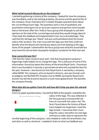
  • 1. What initial researchdidyoudo on the company? I started by gathering a history of the company. I looked for how the company was founded as well as the existing products, the prices and the general feel of the company. OnceI had done this I created 20 paper questionnaires about the currentRoyal Canin logo. The questions were a mix of qualitative and quantitative which gave me an accurate responseand opinions which people had on the brand. After this I held as focus group with 20 people to ask their opinions on the look of the currentlogo and whatthey would change aboutit. I then took this feedback and implemented it into my re-branded logo. They said that the old logo was “bland” and was confused aboutwhat the brand sold as their product. The main issuewith the logo was that they could not identify what the Royal Canin brand was about justfrom looking at the logo. Some of the people I asked within the focus group new whatthis brand did but only knew this due to them buying the company’s products for their own pet. How successful was this? I felt that the initial research went well. I felt that knowing the company’s beginnings really helped me to changethe logo. This is because of some of the information I found out about the history of the brand Royal Canin. I found out that it was founded in Franceby a passionatevet who only wanted the best for the pets. However, I also found out that Royal Canin is owned by a company called MARS. The company, who arebased in America, also own brands such as pedigree and Banfield Pet Hospital. Due to MARS owning the Royal Canin brand it has led the brand to become a much more global brand. This benefits the company finically. What data did you gather from this and how did it help you plan the rebrand designs? Frommy paper questionnaires, I found that 90% of the people I asked like the colour of the logo. This was reflected in the focus group as everyonedid not have an issuewith the colour red. The facts I found about the history of Royal Canin helped me shapehow I need the logo to look. I now know that I must keep the colour red within my new logo and havean older look to represent the humble beginning of the company. I also needed to make the brand look crisp and clean as well as stand out. I needed to listen to what my feedback was
  • 2. fromboth the paper questionnaires and the focus group. I needed to add the connotations of the pet industry that my focus group wanted. How effective was your pre-production? Overallmy pre-production was a success but it was not without its issues. I feel that I was not able to use the Photoshop tools at firstbut the further on in the design process this got easier. This was becauseI had previous experience with Photoshop but not all the tools I used to create the new logo. Before starting this project, I had no knowledge of the pen tool. I did not know whatit was or how to use it. My firstever attempt using this tool was of a basic outline of a sitting cat. This went ok. Itwas not as neat as the final logo was becauseI did not know how bestto usethis tool. I discovered that by adding in less points you could make curves that are not as steep therefore creating more natural, smooth lines which I needed within my final logo. Another tool I did not have knowledge of was the various brush tool. This tool could be used like a paint brush, stroking them across the page, or a stamp. I started by using the brush tool to add differentpatterns and animals into my logo designs. I did this because I wanted to see whether this would work or not as well as see how effective they would be. Some worked well, like the giant paw print or the fox. Others brushes like the spotlight and the dots did not work as well. I also wanted to usethe brush tool like a paint brush and add colour onto a shape. Itwas at this stage I discovered how to best use the pen tool. I added grey for the dog’s body and red for the collar. This worked well however, it was very hard to keep in the lines even though the size of the brush could be altered.
  • 3. How did you respondtofeedback givenfrom peers and tutors and how did this developyour work? Half way through creating my designs I struggled to think of any ideas on how to change the logo. This was frustrating becauseat this stage I was nowhere near to a finished logo design. So, I decided to listened back to my focus group and took notes on points that I had not taking in the firsttime as well as points I had remembered frombefore. I choseto do this at that stage because all my design did not look how I wanted them to and I felt that if I reminded myself of what people wanted the logo to be I would be able to focus my mind on coming up with ideas relating to the peer feedback. This helped a lot as I found the creative direction I needed to go. Some of the feedback given was about the colour scheme. They really liked the shade of red used within the old logo and wished me to keep this in the new logo. Another piece of feedback I received frommy focus group was regarding the poor attempt at a crown. My focus group pointed out that unless they weretold it was a crown they would have not known this justfrom the shape. They really wanted a crown to feature within the final logo as they felt it had connotations with the word Royal in “Royal Canin”. I agreed with them on both these issues so tried to rectify them in my next lot of designs. I also had an image of the existing logo for Royal Canin as a reference point. I made a rule that if the current logo looked better than the design I worked on I would not us it as my final logo. However, if certain elements of the logo, like the fontor arrangement, was better than the current RoyalCanin logo I would keep these elements and apply this to the next designs. The thoughts and feedback of the focus group was that they said that the old logo was “bland” and was confused about what the brand sold as their product. The main issuewith the logo was that they could not identify what the Royal Canin brand was about justfrom looking at the logo. Some of the people I asked within the focus group new what this brand did but only knew this due to them buying the company’s products for their own pet. What skills have you developedthroughout this unit?
  • 4. I started off by only having a basic knowledge of Photoshop. I found that as I use Photoshop moreand moreI used the software, the easier I found it to work. The bestexample of this was using the pen tool. When I firstuse this tool I really struggled to curve the line to fit the outline of the shape. This changed as I found out that I did not need to add so many points to it and that I could move the points if needed as well as add new points in. I also learned that the bigger the distancebetween each point the wider the curve will be. The quality of my work got better as I used Photoshop more. This is down to the practice I got fromrepeating the same steps to add text in and change the text’s colour as well as inserting new layers and images. Due to my limited knowledge of Photoshop I struggled at times however, I overcomethis by keeping to techniques and methods I can do and not to aim for unrealistic goals I still struggleto usePhotoshop and I am far from an expert but I feel the skills I have learned will help me if I need to use Photoshop again. What does your final design“communicate”? When re-branding RoyalCanin I needed to consider how to put the connotations and element associated with the pet target market. For example, I considered adding paw prints as well as a dog or cat to the logo. I kept the crown idea fromthe main logo as this is what feedback I got from the focus group and someof my questionnaires. When I asked what impression people got about the company fromthe new logo design they said it was “not an upper class brand anymore” and found it to be “down to earth” and “ pet friendly“. They also felt that it looks “professional” and “appealing” than the old logo. Does your designfit or meet the original intentions? The logo I created does meet the intentions I wanted it to. I wanted the logo to be more associated with the pet food marketwhich Royal Canin is aimed at. I wanted to do this by adding in these features which would help the logo to become instantly associated with the pet products. This was done by adding paw prints as well a cat and dog outline. Both pets are the top two most popular pets in the UK and havestrong connection with the brand as well as
  • 5. the company’s targetmarket. By adding a new design of the crown to the logo it makes the Royalpart of the brand morerecognised than beforeas people did not see the crown until it was pointed out to them. I also wanted the text to stay the same shadeof red as the old logo because mostof the people I asked agreed that this colours works welland they also liked the shade. The main element as well as the strong connotations I wanted to add to the new logo was that I wanted the logo to stand out and catch the attention of the target audience. How appropriate is it to the target audience? The logo is more appropriatenow than before. The old logo had no clear indication on what the brand was. The new logo on the other hand, has been created to be appropriateto its target audience (cat and dog owners). This has been done by using cat and dog images as well as the crown placed on top of the dog’s head. The logo I created fits into the target marketof pet products due to these added elements. Also, the colour was kept the samebecause the focus group I asked said they like the colour. I felt that the new logo would appeal to the audience moreif elements of the old logo like the colour of the font and the idea of a crown werekept in. The thoughts and feedback of the focus group was that they felt that the new logo had connotations and elements which made the brand’s targetaudience moreclear and opened the brand up to a wider audience. They also thoughtthat the new logo makes the “brand feel friendly and welcoming”. How effective is your final design? I personally feel that this logo looks more professionaland has the connotations that was desperately needed. I was not the only one with these feeling towards the finished logo re-design. The participants in my second focus group agreed that the logo was better than the original with one person commenting that the old logo looked like a “cruiseship logo” whilst another stated that it looked “upper class” and this would put them off or even considering the Royal Canin brand in greater detail. The second focus group and I agreed that the issues whererectified in the new logo. However,
  • 6. some people criticised the letter head design I created to go with the company’s re-brand. I decided to take the image of my final logo and create a water mark with it due to many companies using the water marked logo concept within all their letter heads. One person commented that the image part of the logo, the line drawn cat and dog, should have not been included as the watermark becauseit had the image of the ca and dog already in it. I pointed out to this person that I had chosen the water mark idea since many companies use a water marked logo within their documentation. Some people felt that other aspects of my final logo could havebeen changed. For example, one element was that the packaging of the new dog food design could have been changed more. I then pointed out to these people that I took the ideas they had and usethem. The focus group agreed that the packaging should stay the samebecause they liked how “visual” it was they felt it was “easier” to “find the food you need especially if you are in a hurry”. Dueto this I change the design little only adding in the new logo and leaving only the English parts in. Overall, I felt my final logo design was effective and did meet the brief and exceeded the expectation I had for it. As well as conducting another focus group I created a Survey Monkey which was sent out to at least 10 people. I got 7 responses back then gathered the results up and analysed the responses. 100% agreed thatmy new logo for Royal Canin was better than the old logo. Some of the reasons given for this are “quite fun, morelegible text”, “I love the animal illustrations. Very professional” and “I understand that the productis aimed for animals”. The last comment was very good to hear as I wanted my new logo to make the brand look more suitable for its target market of the pet industry. The feedback for the business card design was not as positivehowever. Only 71% of the results liked the business card design. I had a mix of both positiveand negative comments on the design of my business cards. Comments alone the lines of “Too plain as the logo has a very thin design a background colour or elements in the background may make it more exciting” were said. This contrasted the thoughts of the majority. They gave me feedback such as “It’s simpleand goes well with the logo and isn't too busy which could get confusing for clients” and “Itkeeps the same layout as the original logo which is good since it helps to keep up the same familiarity
  • 7. and the text beneath it helps make it seem more professional”. Dueto the majority of my results liking the design of the business cards, I willsay it has been successfulafter all you cannot please everybody. Mostcompanies would count productrebrand as a success if more than 50% liked it. As for the last question the results are slip with the majority (71%) liking the design of the letter head I created. Some of the positive comments I received back from my Survey Monkey were “Again the simple design adds a nice detail making the letter head more interesting and shows which brand the letter is from” and “The design seems very friendly for people who may not haveheard of the brand before and also looks very fitting for what the name of the brand is”. Other comments I received were “honestly I couldn't write over something, it would drive me insane” and “I like it, but the text may get lost on the illustrated background, I would consider reducing the opacity of the illustration”. Looking back at the design of letter head I can see that maybe I could make the water make more faded by increasing the transparency of the image. I asked people whether they preferred the old packaging or the new one I created. The results were near enough a 50% - 50% split over which one people preferred. I believe this was becauseof how little I changed about the design of the original packaging design. Within the Survey Monkey I sentout I included an image of the old logo, the re-branded logo, business card design, letter head design, the old packaging and my redesigned packaging. I asked them to rank all the images from 1 – 6 with 1 being the best and 6 being the worst. The majority of the results agreed that image 2 was the best and image 1 was the worse. I think this could be because both of these images are the logos and you can see a vastdifference between them more than the differences between images 5 and 6 (packaging). What do you like about your final design?
  • 8. My favouritepart of my final design is the dog and cat line drawing becauseit is so simple yet highly effective. I got the idea from images of line drawings I found on Google images. They used as fewer simple lines as possibleto create the outlines of the subjects. I liked how this looked because it was simple, clean and crisp looking yet slightly traditional which is what I needed the logo to look like. I used this idea to draw the image of my logo and when I was happy I emailed myself a photograph of this line drawing. I used this as my image. I also feel the colour of the font worked well as it was the same shade of red as the original logo. The contrastbetween the red fontand the black and white image is effective and grabs the correcttarget audience’s attention. The old logo did not do this due to it being flat and 2D in comparison. I believe there is nothing I could change myself due to my re-brand hitting all the point my focus group and paper questionnaires told me to. How does your designcompare to past or current practice? The original logo incorporated an unusualfont style which does not appeal to the people I asked through my paper questionnaires and focus group. The font has the letter “a” slanted twice which the focus group and I could not understand the purpose of. It also has a poor attempt at a crown which is meant to look like a paw print. I did not realise myself that this was a paw print until it was pointed out to me by one person in my focus group. As well as this, the layoutwas bland and lacklustrewhich added nothing to the logo. The royalshade of red featured throughoutthe logo was its only redeeming feature which my focus group and I agree on. The overall look of the logo left a lot to be desired and one person from my focus group commented on the Royal Canin logo looking like a “logo for a cruiseship company”. Due to this no one within my focus group would pay attention to the pet food brand if they saw this logo and would not explore the brand further. Now though the logo looks refreshed and revived due to the clean, crisp, professionalfinish to it. The font
  • 9. is simple yet effective and is helped by the red colour featured within the centre of each letter. The tittle located abovethe letter “i” is in the shapeof a paw print giving the brand the much-needed connotations of its target market. The crown is now clearly visible and sits regally upon a dog’s head. Both dog and cat are created in the style of line draws using as fewer lines as possibleto create a bold, dramatic image which creates further connotations which are found within the brand’s targetmarket. Is there anything youwantedto do, but couldn’t? I felt like I achieved all I wanted to do with the logo re-brand. I followed the feedback I reserved frommy paper Questionnaires and my focus group as well as my own check list of elements I feel it needed. I kept the colour the same as most of the people I asked wanted me to, I added a better designed crown to the logo as the focus group asked me to and I added a cat and dog to the logo as well as a paw print in place of the tittle (a dot above a letter) of the letter “i” as my focus group and I wanted the logo to have stronger connotations of its target market. I also struggled with one of my elements of pre-production. I wanted to add fur onto the lettering to link the logo design into the pet target market. This did not work becauseI did and still do not haveenough experience using Photoshop to know how to do this. I was shown butstruggled to follow the instructions due to me not remembering whereall the tools are in Photoshop. When I did attempt this, it turned partof my letters a sparkly silver which is not what I wantas this makes the design look like it has been sprinkled with glitter. I did get a fur effect in the end but it was using a brush tool to strokedifferent shades of colour to blend them together and give it a rough texture.