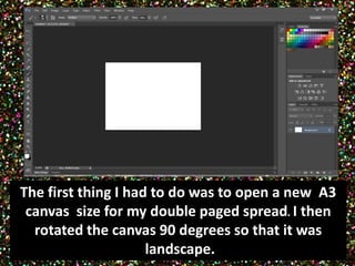
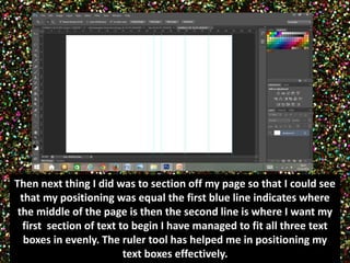
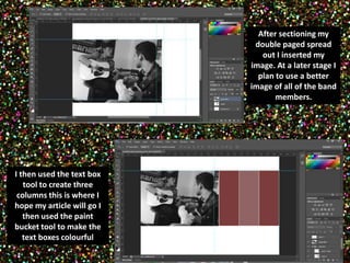
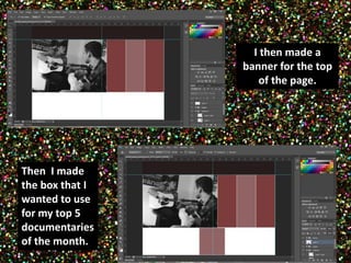
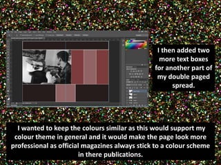
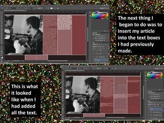
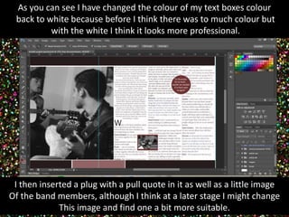
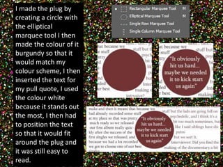
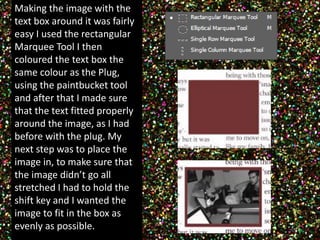
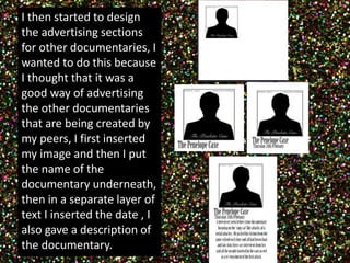
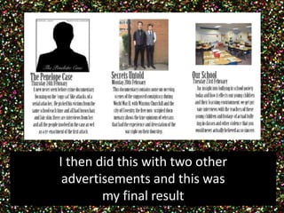
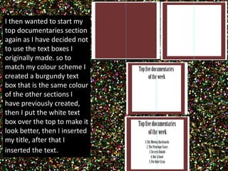
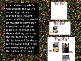
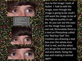
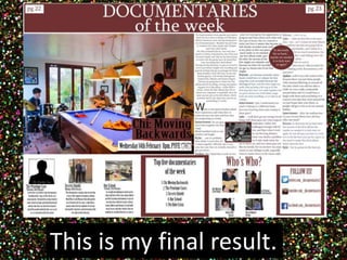
Double Paged 
Spread Progress 
By Eleanor Birtles
The first thing I had to do was to open a new A3 
canvas size for my double paged spread. I then 
rotated the canvas 90 degrees so that it was 
landscape.
Then next thing I did was to section off my page so that I could see 
that my positioning was equal the first blue line indicates where 
the middle of the page is then the second line is where I want my 
first section of text to begin I have managed to fit all three text 
boxes in evenly. The ruler tool has helped me in positioning my 
text boxes effectively.
After sectioning my 
double paged spread 
out I inserted my 
image. At a later stage I 
plan to use a better 
image of all of the band 
members. 
I then used the text box 
tool to create three 
columns this is where I 
hope my article will go I 
then used the paint 
bucket tool to make the 
text boxes colourful
I then made a 
banner for the top 
of the page. 
Then I made 
the box that I 
wanted to use 
for my top 5 
documentaries 
of the month.
I then added two 
more text boxes 
for another part of 
my double paged 
spread. 
II wanted to keep the colours similar as this would support my 
colour theme in general and it would make the page look more 
professional as official magazines always stick to a colour scheme 
in there publications.
This 
The next thing I 
began to do was to 
Insert my article 
into the text boxes 
I had previously 
made. 
This is what 
it looked 
like when I 
had added 
all the text.
As you can see I have changed the colour of my text boxes colour 
back to white because before I think there was to much colour but 
with the white I think it looks more professional. 
I then inserted a plug with a pull quote in it as well as a little image 
Of the band members, although I think at a later stage I might change 
This image and find one a bit more suitable.
I made the plug by 
creating a circle with 
the elliptical 
marquee tool I then 
made the colour of it 
burgundy so that it 
would match my 
colour scheme, I then 
inserted the text for 
my pull quote, I used 
the colour white 
because it stands out 
the most, I then had 
to position the text 
so that it would fit 
around the plug and 
it was still easy to 
read.
Making the image with the 
text box around it was fairly 
easy I used the rectangular 
Marquee Tool I then 
coloured the text box the 
same colour as the Plug, 
using the paintbucket tool 
and after that I made sure 
that the text fitted properly 
around the image, as I had 
before with the plug. My 
next step was to place the 
image in, to make sure that 
the image didn’t go all 
stretched I had to hold the 
shift key and I wanted the 
image to fit in the box as 
evenly as possible.
I then started to design 
the advertising sections 
for other documentaries, I 
wanted to do this because 
I thought that it was a 
good way of advertising 
the other documentaries 
that are being created by 
my peers, I first inserted 
my image and then I put 
the name of the 
documentary underneath, 
then in a separate layer of 
text I inserted the date , I 
also gave a description of 
the documentary.
I then did this with two other 
advertisements and this was 
my final result
I then wanted to start my 
top documentaries section 
again as I have decided not 
to use the text boxes I 
originally made. so to 
match my colour scheme I 
created a burgundy text 
box that is the same colour 
of the other sections I 
have previously created, 
then I put the white text 
box over the top to make it 
look better, then I inserted 
my title, after that I 
inserted the text.
I then started my who’s 
who section, this wasn’t 
something I initially 
planned but I thought it 
was something that would 
be realistic as I have seen 
it in other publications. I 
placed in the image and 
then added my text using 
the text tool, I then did 
this for Lyle and for Kieran 
but for Aydan I had to add 
some extra steps due to 
the quality of his image.
Due to the image I took of 
Aydan I had to edit the 
image, even though the 
image is going to be small I 
still want the image to be of 
the highest quality it can 
be. As you can see the eyes 
on the image have come 
out red, fortunately there is 
a tool on Photoshop called 
the ‘Red Eye Tool’ this 
involves you drawing a text 
box over the whole area 
that is red, and the when 
you let go the tool turns the 
red area black, fixing the 
eye and making it normal 
again.
I then inserted Aydan’s section into the who’s who 
component of my page completing the piece.
I then wanted to include a ‘Follow 
Us’ section as this is something that 
shows how current the magazine 
page would be as, technology is a 
big part of other people’s lives, so by 
having a twitter and facebook page 
as well as a YouTube channel, 
demonstrates that the magazine 
again is realistic. Firstly I did the 
same as what I did when I started to 
create the top documentaries 
section. I then inserted my text. The 
next thing I did was to add in my 
little icons, which in my opinion 
makes the whole box more 
interesting than if there was just 
text, I then inserted my text
I then made my title for my page I also 
inserted some page numbers to again make 
it more realistic
As I said earlier I wanted to change 
my image at a later stage after taking 
another photo shoot I chose this 
image to feature on my double paged 
spread. 
From looking at the first 
image you can see that it 
looks quite dull , and 
because I want my double 
page spread to be eye 
catching I thought that it 
would be wise to edit my 
image. So I opened my 
chosen image in camera 
raw and changed some of 
the colour settings. 
The first thing I did was to change the 
exposure and this automatically made the 
colours in the image brighter. I then 
increased the vibrance and the saturation of 
the image. To the right you can see my final 
result.
This is my final result.

Screenshots dps

  • 1.
    Double Paged SpreadProgress By Eleanor Birtles
  • 2.
    The first thingI had to do was to open a new A3 canvas size for my double paged spread. I then rotated the canvas 90 degrees so that it was landscape.
  • 3.
    Then next thingI did was to section off my page so that I could see that my positioning was equal the first blue line indicates where the middle of the page is then the second line is where I want my first section of text to begin I have managed to fit all three text boxes in evenly. The ruler tool has helped me in positioning my text boxes effectively.
  • 4.
    After sectioning my double paged spread out I inserted my image. At a later stage I plan to use a better image of all of the band members. I then used the text box tool to create three columns this is where I hope my article will go I then used the paint bucket tool to make the text boxes colourful
  • 5.
    I then madea banner for the top of the page. Then I made the box that I wanted to use for my top 5 documentaries of the month.
  • 6.
    I then addedtwo more text boxes for another part of my double paged spread. II wanted to keep the colours similar as this would support my colour theme in general and it would make the page look more professional as official magazines always stick to a colour scheme in there publications.
  • 7.
    This The nextthing I began to do was to Insert my article into the text boxes I had previously made. This is what it looked like when I had added all the text.
  • 8.
    As you cansee I have changed the colour of my text boxes colour back to white because before I think there was to much colour but with the white I think it looks more professional. I then inserted a plug with a pull quote in it as well as a little image Of the band members, although I think at a later stage I might change This image and find one a bit more suitable.
  • 9.
    I made theplug by creating a circle with the elliptical marquee tool I then made the colour of it burgundy so that it would match my colour scheme, I then inserted the text for my pull quote, I used the colour white because it stands out the most, I then had to position the text so that it would fit around the plug and it was still easy to read.
  • 10.
    Making the imagewith the text box around it was fairly easy I used the rectangular Marquee Tool I then coloured the text box the same colour as the Plug, using the paintbucket tool and after that I made sure that the text fitted properly around the image, as I had before with the plug. My next step was to place the image in, to make sure that the image didn’t go all stretched I had to hold the shift key and I wanted the image to fit in the box as evenly as possible.
  • 11.
    I then startedto design the advertising sections for other documentaries, I wanted to do this because I thought that it was a good way of advertising the other documentaries that are being created by my peers, I first inserted my image and then I put the name of the documentary underneath, then in a separate layer of text I inserted the date , I also gave a description of the documentary.
  • 12.
    I then didthis with two other advertisements and this was my final result
  • 13.
    I then wantedto start my top documentaries section again as I have decided not to use the text boxes I originally made. so to match my colour scheme I created a burgundy text box that is the same colour of the other sections I have previously created, then I put the white text box over the top to make it look better, then I inserted my title, after that I inserted the text.
  • 14.
    I then startedmy who’s who section, this wasn’t something I initially planned but I thought it was something that would be realistic as I have seen it in other publications. I placed in the image and then added my text using the text tool, I then did this for Lyle and for Kieran but for Aydan I had to add some extra steps due to the quality of his image.
  • 15.
    Due to theimage I took of Aydan I had to edit the image, even though the image is going to be small I still want the image to be of the highest quality it can be. As you can see the eyes on the image have come out red, fortunately there is a tool on Photoshop called the ‘Red Eye Tool’ this involves you drawing a text box over the whole area that is red, and the when you let go the tool turns the red area black, fixing the eye and making it normal again.
  • 16.
    I then insertedAydan’s section into the who’s who component of my page completing the piece.
  • 17.
    I then wantedto include a ‘Follow Us’ section as this is something that shows how current the magazine page would be as, technology is a big part of other people’s lives, so by having a twitter and facebook page as well as a YouTube channel, demonstrates that the magazine again is realistic. Firstly I did the same as what I did when I started to create the top documentaries section. I then inserted my text. The next thing I did was to add in my little icons, which in my opinion makes the whole box more interesting than if there was just text, I then inserted my text
  • 18.
    I then mademy title for my page I also inserted some page numbers to again make it more realistic
  • 19.
    As I saidearlier I wanted to change my image at a later stage after taking another photo shoot I chose this image to feature on my double paged spread. From looking at the first image you can see that it looks quite dull , and because I want my double page spread to be eye catching I thought that it would be wise to edit my image. So I opened my chosen image in camera raw and changed some of the colour settings. The first thing I did was to change the exposure and this automatically made the colours in the image brighter. I then increased the vibrance and the saturation of the image. To the right you can see my final result.
  • 20.
    This is myfinal result.