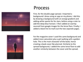
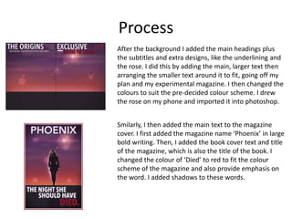
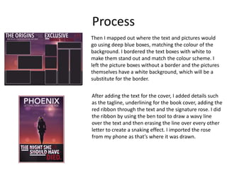
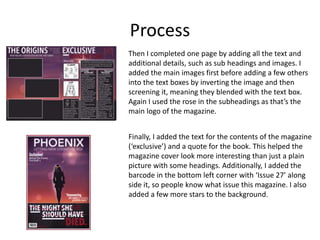
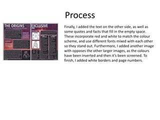
Production Reflection
Georgina Whiteley
Process
First, for the double page spread, I imported a
background I drew using an app on my phone. I did this
by drawing a background with an orange gradient and
adding white specks for for stars, before using a ruler to
add the deep blue horizon. I then added an overlay
sourced from google images for the lense flare. Finally, I
added a black line to mark out the two separate pages.
For the magazine cover I used the same background and
added more saturation plus a girl walking with a golden
halo. This is the main character of the book, hence
creating a book cover like planned. Similarly to the
spread background, I added the same lense flare to add
another similarity between the cover and the spread.
Process
After the background I added the main headings plus
the subtitles and extra designs, like the underlining and
the rose. I did this by adding the main, larger text then
arranging the smaller text around it to fit, going off my
plan and my experimental magazine. I then changed the
colours to suit the pre-decided colour scheme. I drew
the rose on my phone and imported it into photoshop.
Smilarly, I then added the main text to the magazine
cover. I first added the magazine name ‘Phoenix’ in large
bold writing. Then, I added the book cover text and title
of the magazine, which is also the title of the book. I
changed the colour of ‘Died’ to red to fit the colour
scheme of the magazine and also provide emphasis on
the word. I added shadows to these words.
Process
Then I mapped out where the text and pictures would
go using deep blue boxes, matching the colour of the
background. I bordered the text boxes with white to
make them stand out and match the colour scheme. I
left the picture boxes without a border and the pictures
themselves have a white background, which will be a
substitute for the border.
After adding the text for the cover, I added details such
as the tagline, underlining for the book cover, adding the
red ribbon through the text and the signature rose. I did
the ribbon by using the ben tool to draw a wavy line
over the text and then erasing the line over every other
letter to create a snaking effect. I imported the rose
from my phone as that’s where it was drawn.
Process
Then I completed one page by adding all the text and
additional details, such as sub headings and images. I
added the main images first before adding a few others
into the text boxes by inverting the image and then
screening it, meaning they blended with the text box.
Again I used the rose in the subheadings as that’s the
main logo of the magazine.
Finally, I added the text for the contents of the magazine
(‘exclusive’) and a quote for the book. This helped the
magazine cover look more interesting than just a plain
picture with some headings. Additionally, I added the
barcode in the bottom left corner with ‘Issue 27’ along
side it, so people know what issue this magazine. I also
added a few more stars to the background.
Process
Finally, I added the text on the other side, as well as
some quotes and facts that fill in the empty space.
These incorporate red and white to match the colour
scheme, and use different fonts mixed with each other
so they stand out. Furthermore, I added another image
with opposes the other larger images, as the colours
have been inverted and then it’s been screened. To
finish, I added white borders and page numbers.

Production Reflection

  • 1.
  • 2.
    Process First, for thedouble page spread, I imported a background I drew using an app on my phone. I did this by drawing a background with an orange gradient and adding white specks for for stars, before using a ruler to add the deep blue horizon. I then added an overlay sourced from google images for the lense flare. Finally, I added a black line to mark out the two separate pages. For the magazine cover I used the same background and added more saturation plus a girl walking with a golden halo. This is the main character of the book, hence creating a book cover like planned. Similarly to the spread background, I added the same lense flare to add another similarity between the cover and the spread.
  • 3.
    Process After the backgroundI added the main headings plus the subtitles and extra designs, like the underlining and the rose. I did this by adding the main, larger text then arranging the smaller text around it to fit, going off my plan and my experimental magazine. I then changed the colours to suit the pre-decided colour scheme. I drew the rose on my phone and imported it into photoshop. Smilarly, I then added the main text to the magazine cover. I first added the magazine name ‘Phoenix’ in large bold writing. Then, I added the book cover text and title of the magazine, which is also the title of the book. I changed the colour of ‘Died’ to red to fit the colour scheme of the magazine and also provide emphasis on the word. I added shadows to these words.
  • 4.
    Process Then I mappedout where the text and pictures would go using deep blue boxes, matching the colour of the background. I bordered the text boxes with white to make them stand out and match the colour scheme. I left the picture boxes without a border and the pictures themselves have a white background, which will be a substitute for the border. After adding the text for the cover, I added details such as the tagline, underlining for the book cover, adding the red ribbon through the text and the signature rose. I did the ribbon by using the ben tool to draw a wavy line over the text and then erasing the line over every other letter to create a snaking effect. I imported the rose from my phone as that’s where it was drawn.
  • 5.
    Process Then I completedone page by adding all the text and additional details, such as sub headings and images. I added the main images first before adding a few others into the text boxes by inverting the image and then screening it, meaning they blended with the text box. Again I used the rose in the subheadings as that’s the main logo of the magazine. Finally, I added the text for the contents of the magazine (‘exclusive’) and a quote for the book. This helped the magazine cover look more interesting than just a plain picture with some headings. Additionally, I added the barcode in the bottom left corner with ‘Issue 27’ along side it, so people know what issue this magazine. I also added a few more stars to the background.
  • 6.
    Process Finally, I addedthe text on the other side, as well as some quotes and facts that fill in the empty space. These incorporate red and white to match the colour scheme, and use different fonts mixed with each other so they stand out. Furthermore, I added another image with opposes the other larger images, as the colours have been inverted and then it’s been screened. To finish, I added white borders and page numbers.

Editor's Notes

  • #3 Discuss the tools and processes used in your production. Log your thoughts and feelings about your work.
  • #4 Discuss the tools and processes used in your production. Log your thoughts and feelings about your work.
  • #5 Discuss the tools and processes used in your production. Log your thoughts and feelings about your work.
  • #6 Discuss the tools and processes used in your production. Log your thoughts and feelings about your work.
  • #7 Discuss the tools and processes used in your production. Log your thoughts and feelings about your work.