Unit 14
Learning Aim B
Name ideas
• Cinematic
• Popcorn
• Reel View
• Keepin’ It Reel
• It’s A Rap!
• Premiere
Film Magazine Covers
Cover inspiration
I have used this cover as inspiration as I believe it is the most appealing and I think, for a film magazine, it
looks great. I have chosen a magazine which has followed codes and conventions as I believe following
the codes and conventions is important when creating a magazine cover as each convention server their
own purpose in helping to sell the magazine.
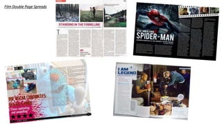
Film Double Page Spreads
Content
Location/Setting
Mise-en-scene
Lighting
Main Sell Lines for my magazine
Star Wars: Rise of Skywalker
IT chapter 2
Zombie land
John Wick
Hobbs and Shore
Jumanji: The Next Level
The Joker
Masthead
Dominant Image
Main Sell Line
Tagline
Plug
Barcode
Essential Information
Dominant ImageMasthead
Article, Article, Article
Pull Quote
Sub Image
with
Caption
Sub Image
with
Caption
Sub Image
with
Caption
Sub Image
with
Caption
Digital Magazine
I have decided to make my magazine a digital magazine because they are easier to distribute to my target demographic, as
many, if not most, of the audience will possess a mobile phone. As well as this, I believe distributing digitally is the better
option overall because digital magazines are rapidly becoming more popular and therefore evidence would suggest that my
magazine would be more successful if it was a digital magazine. I believe the choice of creating a digital magazine rather than
print is effective because it will be seen by more people and therefore will rapidly become more popular.
Production
Log
Front Cover I have chosen the font Cowboys for the masthead on my front cover
because I think that it looks perfect for a film magazine. I think this as
it looks in place and looks like the sort of font you would see in the
film world in the credits of a film or what not.
I chose the title, Keepin’ It Reel as I think the clever play on words
would grab the attention of a film demographic and immediately
they would be drawn to want to know more therefore they will
purchase the online magazine in order to read it and find out more.
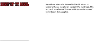
Here I have inserted a film reel inside the letters to
further enhance the play on words in the masthead. This
is a small but effective feature and Is sure to be noticed
by my target demographic.
Here I have inserted a background image which I found on Picuki.com, the
website would be credited on the contents page of the magazine. I edited the
colour of this picture to make it slightly darker using the brightness and
contrast tool under the adjustments heading.
Credit www.nicepng.com
Here I have inserted an image of Pennywise which I found on NICEPNG
who I would also credit in the contents page. I also adjusted the
brightness and contrast using the tool found under adjustments. This
was to further add to the theme of horror portrayed on my magazine.
Credit www.nicepng.com
Next I inserted the main sell line for my magazine, “you’ll float too.” I
used the font “Cowboys” which I found on dafont.com and I inserted a
small white glow around the side using the stroke tool found within
blending options.
Following adding the main sell line, I then added more less significant sell lines
to attract a secondary audience of the films advertised. I again used the
cowboys font so that the sell lines looked in place on the cover. I also added a
small white glow around the outside again using the stroke tool found under
blending options. I think having more than just one sell line is effective as it
attracts more audience to purchase the magazine and therefore the magazine
will rapidly become more popular due to the vast amount of content which will
be inside as well as advertised on the cover.
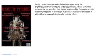
Finally I made the cover even darker once again using the
brightness/contrast tool found under adjustments. This is to further
enhance the horror effect that should be given of by Pennywise in order
to sell my magazine to the Target Audience. I also added a barcode in
which I found on google to give of a realistic effect.
Credit www.britannica.com for the barcode.
DPS production log
Firstly, I added a picture I took of Mayank Kumar in the studio
onto the Photoshop document and removed the background
using the magic wand tool. When taking the picture, I used red
and blue foil over the lights in order to give of the effect shown in
the picture.
Next added 3 more pictures of Mayank Kumar as well as Layton
Mensforth which I also took in the studio. I asked the subjects to
talk to each other so that for 2 of the images it looked like they
were discussing the film, Joker. Finally I asked them to look at
the camera for the 3rd shot. I did this to give off a realistic effect.
I then re-coloured the background to black using the paint-bucket
tool. I did this to show of the dark message shown in Joker, the
film which this double page spread is about.
Next I added a small image of Joker himself which I found
online to show that the article will be about Joker. I credited
the image in the bottom right (will be shown at the end.)
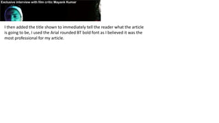
I then added the title shown to immediately tell the reader what the article
is going to be, I used the Arial rounded BT bold font as I believed it was the
most professional for my article.
Next I drafted up an interview to be the main article. I used pull
quotes as headers and I used a drop cap at the beginning of each
column, I did all this just by inserting a text box, and using the ruler
tool to measure the distance between columns.
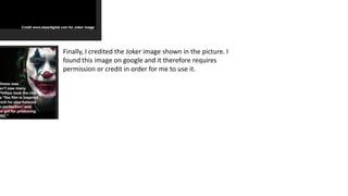
Finally, I credited the Joker image shown in the picture. I
found this image on google and it therefore requires
permission or credit in order for me to use it.

Production log and planning

  • 1.
  • 2.
    Name ideas • Cinematic •Popcorn • Reel View • Keepin’ It Reel • It’s A Rap! • Premiere
  • 3.
  • 4.
    Cover inspiration I haveused this cover as inspiration as I believe it is the most appealing and I think, for a film magazine, it looks great. I have chosen a magazine which has followed codes and conventions as I believe following the codes and conventions is important when creating a magazine cover as each convention server their own purpose in helping to sell the magazine.
  • 5.
  • 6.
  • 7.
    Main Sell Linesfor my magazine Star Wars: Rise of Skywalker IT chapter 2 Zombie land John Wick Hobbs and Shore Jumanji: The Next Level The Joker
  • 8.
    Masthead Dominant Image Main SellLine Tagline Plug Barcode Essential Information Dominant ImageMasthead Article, Article, Article Article, Article, Article Article, Article, Article Article, Article, Article Article, Article, Article Article, Article, Article Article, Article, Article Article, Article, Article Article, Article, Article Article, Article, Article Article, Article, Article Article, Article, Article Article, Article, Article Article, Article, Article Article, Article, Article Article, Article, Article Article, Article, Article Article, Article, Article Article, Article, Article Article, Article, Article Article, Article, Article Article, Article, Article Article, Article, Article Article, Article, Article Article, Article, Article Article, Article, Article Article, Article, Article Article, Article, Article Article, Article, Article Article, Article, Article Article, Article, Article Article, Article, Article Article, Article, Article Article, Article, Article Article, Article, Article Article, Article, Article Article, Article, Article Article, Article, Article Article, Article, Article Article, Article, Article Article, Article, Article Article, Article, Article Article, Article, Article Article, Article, Article Article, Article, Article Article, Article, Article Pull Quote Sub Image with Caption Sub Image with Caption Sub Image with Caption Sub Image with Caption
  • 9.
    Digital Magazine I havedecided to make my magazine a digital magazine because they are easier to distribute to my target demographic, as many, if not most, of the audience will possess a mobile phone. As well as this, I believe distributing digitally is the better option overall because digital magazines are rapidly becoming more popular and therefore evidence would suggest that my magazine would be more successful if it was a digital magazine. I believe the choice of creating a digital magazine rather than print is effective because it will be seen by more people and therefore will rapidly become more popular.
  • 10.
    Production Log Front Cover Ihave chosen the font Cowboys for the masthead on my front cover because I think that it looks perfect for a film magazine. I think this as it looks in place and looks like the sort of font you would see in the film world in the credits of a film or what not. I chose the title, Keepin’ It Reel as I think the clever play on words would grab the attention of a film demographic and immediately they would be drawn to want to know more therefore they will purchase the online magazine in order to read it and find out more.
  • 11.
    Here I haveinserted a film reel inside the letters to further enhance the play on words in the masthead. This is a small but effective feature and Is sure to be noticed by my target demographic.
  • 12.
    Here I haveinserted a background image which I found on Picuki.com, the website would be credited on the contents page of the magazine. I edited the colour of this picture to make it slightly darker using the brightness and contrast tool under the adjustments heading. Credit www.nicepng.com
  • 13.
    Here I haveinserted an image of Pennywise which I found on NICEPNG who I would also credit in the contents page. I also adjusted the brightness and contrast using the tool found under adjustments. This was to further add to the theme of horror portrayed on my magazine. Credit www.nicepng.com
  • 14.
    Next I insertedthe main sell line for my magazine, “you’ll float too.” I used the font “Cowboys” which I found on dafont.com and I inserted a small white glow around the side using the stroke tool found within blending options.
  • 15.
    Following adding themain sell line, I then added more less significant sell lines to attract a secondary audience of the films advertised. I again used the cowboys font so that the sell lines looked in place on the cover. I also added a small white glow around the outside again using the stroke tool found under blending options. I think having more than just one sell line is effective as it attracts more audience to purchase the magazine and therefore the magazine will rapidly become more popular due to the vast amount of content which will be inside as well as advertised on the cover.
  • 16.
    Finally I madethe cover even darker once again using the brightness/contrast tool found under adjustments. This is to further enhance the horror effect that should be given of by Pennywise in order to sell my magazine to the Target Audience. I also added a barcode in which I found on google to give of a realistic effect. Credit www.britannica.com for the barcode.
  • 17.
    DPS production log Firstly,I added a picture I took of Mayank Kumar in the studio onto the Photoshop document and removed the background using the magic wand tool. When taking the picture, I used red and blue foil over the lights in order to give of the effect shown in the picture.
  • 18.
    Next added 3more pictures of Mayank Kumar as well as Layton Mensforth which I also took in the studio. I asked the subjects to talk to each other so that for 2 of the images it looked like they were discussing the film, Joker. Finally I asked them to look at the camera for the 3rd shot. I did this to give off a realistic effect.
  • 19.
    I then re-colouredthe background to black using the paint-bucket tool. I did this to show of the dark message shown in Joker, the film which this double page spread is about.
  • 20.
    Next I addeda small image of Joker himself which I found online to show that the article will be about Joker. I credited the image in the bottom right (will be shown at the end.)
  • 21.
    I then addedthe title shown to immediately tell the reader what the article is going to be, I used the Arial rounded BT bold font as I believed it was the most professional for my article.
  • 22.
    Next I draftedup an interview to be the main article. I used pull quotes as headers and I used a drop cap at the beginning of each column, I did all this just by inserting a text box, and using the ruler tool to measure the distance between columns.
  • 23.
    Finally, I creditedthe Joker image shown in the picture. I found this image on google and it therefore requires permission or credit in order for me to use it.