Toby Jackson (Director/Actor)
Karl Shepherd (Actor 1)
Sam Smith (Actor 2)
Harry Smith (Actor 3)
Location: Orchard Fields Forest
Date: Sunday 25th April 2021
Time: 1pm
Pre-production
• What areyou making? I am making a film magazine, with a film trailer to go with one of my own ideas. This film
magazine includes a front cover, contents page, 6 pages of writing (including film trailer), and a back cover. It will be
based around films to be released in the future (this year), especially action or adventure films as they're the most
requested from my responses, and a section where I write about and recommend some of the responses from my
market research (their favourite films). My film idea and film trailer will be action, adventure, with elements of the
horror genre too, it is called Escape. It is set and filmed in the forest in Malton, about a group of friends out one
day and having to run away and escape from a mysterious person in the forest. The trailer will show parts of their
journey escaping and who they're running from.
• Why? This is because I enjoy doing graphic design and film editing, they're my two favourite aspects of creative
media and I have experience in both from previous projects. I am doing a film magazine because I enjoy watching
films and have knowledge on them. I've also watched a lot of action and adventure films, and their trailers, they're
my favourite film genre, so I have knowledge on how I should do my trailer
• Who is it for? It is for my primary target audience (teenagers), my film trailer is based off the most popular genres
from my market research responses, action and adventure, therefore they're more likely to click on it and be
interested in it. Also, in my film magazine I will include mainly those genres of films because from my market
research, the majority of my audience would want to read about action and adventure films, that’s why I have also
catered to my target audience from my market research responses by adding in a favourite films section which goes
over all the responses of people's favourite films, this adds a sense of an interactive part of the magazine, how it is
about some people's favourite films from my market research
• Where will it appear/on what? I will make it on Photoshop, and my film trailer will also be imported onto
photoshop on my 6th page so people can view it
Reflection:
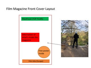
Film Magazine FrontCover Layout
Film title (Escape)
Masthead (TOP FILMS)
Information of
what's inside the
magazine
Free poster
inside
5.
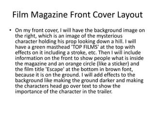
Film Magazine FrontCover Layout
• On my front cover, I will have the background image on
the right, which is an image of the mysterious
character holding his prop looking down a hill. I will
have a green masthead 'TOP FILMS' at the top with
effects on it including a stroke, etc. Then I will include
information on the front to show people what is inside
the magazine and an orange circle (like a sticker) and
the film title 'Escape' at the bottom in brown font,
because it is on the ground. I will add effects to the
background like making the ground darker and making
the characters head go over text to show the
importance of the character in the trailer.
6.
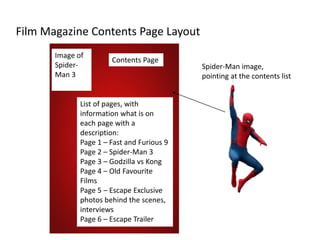
Film Magazine ContentsPage Layout
Image of
Spider-
Man 3
Contents Page
List of pages, with
information what is on
each page with a
description:
Page 1 – Fast and Furious 9
Page 2 – Spider-Man 3
Page 3 – Godzilla vs Kong
Page 4 – Old Favourite
Films
Page 5 – Escape Exclusive
photos behind the scenes,
interviews
Page 6 – Escape Trailer
Spider-Man image,
pointing at the contents list
7.
Film Magazine ContentsPage Layout
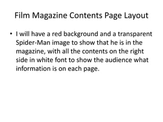
• I will have a red background and a transparent
Spider-Man image to show that he is in the
magazine, with all the contents on the right
side in white font to show the audience what
information is on each page.
8.
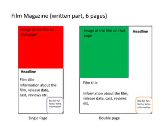
Film Magazine (writtenpart, 6 pages)
Single Page Double page
Image of the film on
that page
Film title
Information about the
film, release date,
cast, reviews etc.
Film title
Information about the film,
release date, cast, reviews
etc,
Image of the film on that
page
Headline
Headline
Box for fun
facts / extra
information
Box for fun
facts / extra
information
9.
Film Magazine WrittenPart
• I am going to be doing double page spreads
and a single page for my film magazine. I will
include images of the film, titles, headlines to
keep the audience interested and an extra box
with fun facts to add to it, this could make the
audience interested in the film more.
10.
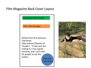
Film Magazine BackCover Layout
Masthead (TOP FILMS)
Exclusive
Interviews
Quotes from the exclusive
interviews:
Toby Jackson (Director of
'Escape') - "It was very fun
making it, it has a good
storyline, and I can't wait
for people to see the
trailer)
Film Title (Escape)
11.
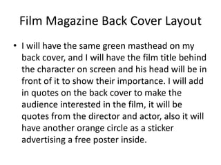
Film Magazine BackCover Layout
• I will have the same green masthead on my
back cover, and I will have the film title behind
the character on screen and his head will be in
front of it to show their importance. I will add
in quotes on the back cover to make the
audience interested in the film, it will be
quotes from the director and actor, also it will
have another orange circle as a sticker
advertising a free poster inside.
12.
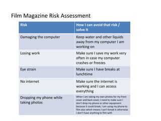
Film Magazine RiskAssessment
Risk How I can avoid that risk /
solve it
Damaging the computer Keep water and other liquids
away from my computer I am
working on
Losing work Make sure I save my work very
often in case my computer
crashes or freezes
Eye strain Make sure I have breaks at
lunchtime
No internet Make sure the internet is
working and I can access
everything
Dropping my phone while
taking photos
When I am taking my own photos for my front
cover and back cover, I need to make sure I
don't drop my phone or other equipment
because it could break, I am using my phone to
film also which means I can't break it otherwise
I don’t have anything to film with
13.
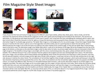
Film Magazine StyleSheet Images
I have chosen the first Fast and Furious 9 image because the different colour layers (white, yellow, blue, black, green, red) as smoke, and all the
characters fits exactly the theme of what all film magazines are like, with a good colourful background including all the characters. The second is an
alternative, it is the good size and shape (vertical) for a front cover or poster, and I could have the chain overlapping the masthead, which is what I also
plan to do to Dom's head (the character on the far right) as it shows the dominance and how powerful these characters are in the films. I could use this
alternative image for my double page spread too. The Spider-Man image on a red background is for my contents page, I chose that image of Spider-Man
because it matches the text colours I plan to use on that page (blue and white stroke), also he is pointing down to where the text will be, which is
effective because the image is one of the first parts my audience sees when looking at this contents page, so they will see Spider-Man's hand pointing
down to the text to read. The alternative image is also Spider-Man which I could use at the bottom of the page, like he has dropped from the top of the
page to the bottom, as that pose on the alternative image is what he does when he lands, my primary target audience who are interested in these films
might recognize it. The Godzilla vs Kong image is very bright, with the colours mainly being purple, blue, green, yellow and black with the character
Godzilla. This is effective because it has a main character that the audience will recognize and very eye-catching bright neon colours. The alternative
back cover image is the one below, which shows Godzilla and Kong fighting, which shows the dominance and importance in both characters, also how
the left side with Godzilla is red and orange and the right side of Kong is blue and green, I could have red text on the left side and blue text on the right
side, because it matches the colour theme. The connotations of red and blue together show strength and power, which works well because it shows the
two characters importance and how powerful they can be. Also, some of connotations are that red and blue together are two very popular and different
colours, so it shows two different sides, like there is in this battle between both monsters. I will use this alternative image for my written pages in my
magazine most likely. The other two images are for my written pages, the first image is of Dom and Letty in the trailer, which shows the characters being
careful with their arms out, and looking down onto something, thisis effective because I will have this image in my writing pages about the film, so it is
like the characters are looking down onto the headline and the text. Additionally, the image of the 3 Spider-Men is a concept and rumour that all three
characters will be in the new Spider-Man film, as many fans will be aware of this, so I will write about it in my magazine based off this image. I will also
use exclusive behind the scenes images for my film idea 'Escape' and use these in my written pages too.
14.
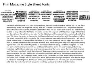
Film Magazine StyleSheet Fonts
I've downloaded all these fonts from DaFont website, then onto the FontBook on my Mac so I can use them
in Photoshop for my film magazine. Starting from left, that one is Evander which is a very simple but bold
font that I will use for headlines, then the Godzilla font that I will use on the back cover at the bottom for my
Godzilla vs Kong title, it fits the theme of Godzilla and the film very well with the unique shape of the letters
and the marks on them, this is to show they're like old statues with how some letters, including G are falling
over. This shows the power of the monster that has maybe been bruised or hurt with the marks on the font.
The next is Lemon Milk, which is used for the Empire magazine masthead on their front covers, I will use this
similar font because it is very good for mastheads or titles, and I can make the font bigger and space it out
more to stand out and catch the audience's attention. Also, if they enjoy film magazines they will most likely
enjoy or have seen the Empire Magazines, so it will appeal to them seeing a font they recognize. The next
one is an Adventure font, which I will use for titles and headlines on my film idea 'Escape', and with my
trailer too, my film idea is action and adventure with aspects of the horror genre, therefore this font suits it
well. The letters are slightly tilted, like italics, as if they're running which could connote how the characters
are running away, this suits my film well because the main plot is a group of friends running away from a
dangerous person. The Changa One font is similar to the Fast and Furious font, which is why I will use this
font on my front cover for the Fast and Furious 9 title, if the audience recognize the font from the film they'll
be interested in reading more. The Hauser font is good for headlies and film titles, as it is quite bold and
solid. Also, the Coolvetica font will be used in headlines, quotes or extra facts and information.
15.
Film Magazine EquipmentList
For my film magazine I will be making it in college on the Mac, therefore I will
need my bus tickets to get to college. I will need my Mac, keyboard and mouse so I
can work on it, including Photoshop because this is what I am making the
magazine on, and Google so I can download more fonts if needed, or get more
images if needed too. Also, internet acess and connection will be needed to make
sure I can go on Google and use this Mac. Also, I am taking photos for my film
magazine front cover, back cover and inside. I am taking photos with my phone as
a camera therefore that is another piece of equipment I need, and I need to make
sure it is fully charged on battery and have a lot of storage left to store my photos,
so I can put it on my OneDrive to edit in Photoshop.
16.
Film Magazine Budget
Formy magazine, I won't need much of a budget, this is because I am making it on
the Mac in college. I will need a budget of over £12 a week for my bus tickets and
journey into college. Therefore, I won't need to purchase anything else in college,
unless if anything goes wrong and I need to work from home, I will need to pay £10
per month for Adobe Creative Cloud, which includes Photoshop, PremierPro etc.
17.
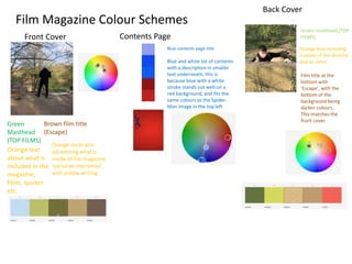
Film Magazine ColourSchemes
Front Cover Contents Page
Back Cover
Green
Masthead
(TOP FILMS)
Brown film title
(Escape)
Orange text
about what is
included in the
magazine,
films, quotes
etc.
Orange circle also
advertising what is
inside of the magazine
'exclusive interviews',
with yellow writing
Blue contents page title
Blue and white list of contents
with a description in smaller
text underneath, this is
because blue with a white
stroke stands out well on a
red background, and fits the
same colours as the Spider-
Man image in the top left
Green masthead (TOP
FILMS)
Orange text including
a quote of the director
and an actor
Film title at the
bottom with
'Escape', with the
bottom of the
background being
darker colours.
This matches the
front cover
18.
Film Magazine ColourSchemes
• For my colour schemes, I know that each part
usually sticks to 4 colours, therefore my front
cover and back cover mainly use the colours
green, brown, orange and yellow. The green and
brown links to the trees and branches you can
see on the background images, and orange works
well with those colours, and yellow suits it well.
The photoshop editing and the fonts and colours I
plan on using will help with the images being
more eye catching and suiting the colours to the
story, e.g. effects on
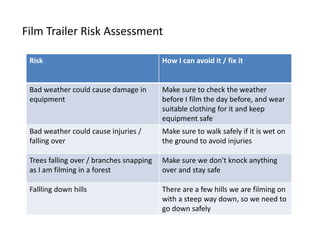
Film Trailer RiskAssessment
Risk How I can avoid it / fix it
Bad weather could cause damage in
equipment
Make sure to check the weather
before I film the day before, and wear
suitable clothing for it and keep
equipment safe
Bad weather could cause injuries /
falling over
Make sure to walk safely if it is wet on
the ground to avoid injuries
Trees falling over / branches snapping
as I am filming in a forest
Make sure we don't knock anything
over and stay safe
Fallling down hills There are a few hills we are filming on
with a steep way down, so we need to
go down safely
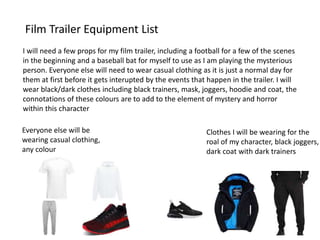
Film Trailer EquipmentList
I will need a few props for my film trailer, including a football for a few of the scenes
in the beginning and a baseball bat for myself to use as I am playing the mysterious
person. Everyone else will need to wear casual clothing as it is just a normal day for
them at first before it gets interupted by the events that happen in the trailer. I will
wear black/dark clothes including black trainers, mask, joggers, hoodie and coat, the
connotations of these colours are to add to the element of mystery and horror
within this character
Clothes I will be wearing for the
roal of my character, black joggers,
dark coat with dark trainers
Everyone else will be
wearing casual clothing,
any colour
24.
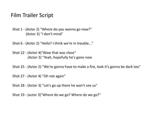
Film Trailer Script
Shot1 - (Actor 2) "Where do you wanna go now?"
(Actor 3) "I don’t mind"
Shot 6 - (Actor 2) "Hello? I think we're in trouble..."
Shot 22 - (Actor 4)"Wow that was close"
(Actor 3) "Yeah, hopefully he's gone now
Shot 25 - (Actor 2) "We're gonna have to make a fire, look it's gonna be dark too"
Shot 27 - (Actor 4) "Oh not again"
Shot 28 - (Actor 3) "Let's go up there he won't see us"
Shot 33 - (actor 3)"Where do we go? Where do we go?"
25.
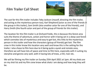
Film Trailer CallSheet
The cast for this film trailer includes Toby Jackson (myself, directing the film trailer,
and acting as the mysterious person too), Karl Shepherd (actor as one of the friends in
the group in this trailer), Sam Smith (also another actor for one of the friends), and
Harry Smith (the fourth actor and part of the group of friends for this trailer).
The location for this film trailer is at Orchard Fields, this is because this forest area
suits the theme of adventure, action and horror with it being set in a deep vast forest
which connotes lots of mysterious and easy to get lost, this links to the mysterious
person in this trailer and how the characters (group of friends) get lost. The film
crew in this trailer know this location very well and know this is the setting for the
trailer. I also chose to film here due to it being quite a quiet and remote area,
therefore we will have lots of space and time to film here, especially with it suiting my
storyline and genres very well, with it having lots of trees, a hill, river etc.
We will be filming my film trailer on Sunday 25th April 2021 at 1pm. All my shots are
on my shot list and my film crew know what shots I am doing and how long they will
be.
26.
Film Trailer Budget
Mybudget for my film trailer isn't big because I am using my own equipment and
filming on a weekend. I will need over £12 a week for my bus tickets to get into
college to complete the post-production and pre-production, as I am doing the
filming outside of college on a weekend. I will be using my own clothes, equipment
therefore I won't need to pay for anything else
27.
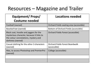
Resources – Magazineand Trailer
Equipment/ Props/
Costume needed
Locations needed
Football (owned) Orchard Fields seating area (accessible)
Baseball bat (owned) Bottom of Orchard Fields (accessible)
Black coat, hoodie and joggers for the
mysterious character, because it links to
the colour connotations, mystery and
darkness (owned)
Orchard Fields Forest (accessible)
Casual clothing for the other 3 characters
(owned)
Orchard Fields Forest Boardwalk
(accessible)
Mac, to access Photoshop and PremierPro
(owned)
College (accessible)
28.
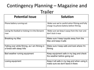
Contingency Planning –Magazine and
Trailer
Potential Issue Solution
Phone battery running out Make sure we're careful when filming and fully
charge my phone battery before filming
Losing the football or kicking it in the Derwent
river
Make sure we keep it away from the river and
don't kick it near
Breaking my Mac Make sure I keep luquids away from the
Mac and keep it safe
Falling over while filming, as I am filming in
a forest with steep hills
Make sure I keep safe and look where I'm
filming
Bad weather ruining equipment Keep equipment safe in my bag and check
the weather before going out
Losing equipment Keep it all safe in my bag and when using it,
make sure we don't leave it there
29.
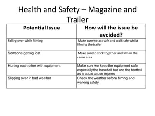
Health and Safety– Magazine and
Trailer
Potential Issue How will the issue be
avoided?
Falling over while filming Make sure we act safe and walk safe whilst
filming the trailer
Someone getting lost Make sure to stick together and film in the
same area
Hurting each other with equipment Make sure we keep the equipment safe
especially the baseball bat and the football
as it could cause injuries
Slipping over in bad weather Check the weather before filming and
walking safely
30.
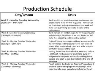
Production Schedule
Day/Lesson Tasks
Week1 – Monday, Tuesday, Wednesday
(12th April – 14th April)
I will need to get started on my production and use
photoshop to make my film magazine. I will work on
my front cover and my contents page this week and
make sure everything is done by the end of the
college week
Week 2 - Monday, Tuesday, Wednesday
(19th April – 21st April)
I will start on my written pages for my magazine, and
include images, headlines, titles, text, boxes etc and
make it as appealing and interesting as I can
Week 3 – Monday, Tuesday, Wednesday
(26th April – 28th April)
Finish off the written pages and keep a spare page for
my film trailer, and make sure I know how to insert
videos. Also, start my back cover and make progress
on that by the end of the week
Week 4 – Monday, Tuesday, Wednesday
(3rd May – 5th May)
Having filmed the film trailer the weekend before,
I will finish my back cover and make sure my
magazine is complete (except for adding in the
trailer), and start to edit the trailer by the end of
the week
Week 5 – Monday, Tuesday, Wednesday
(10th May – 12th May)
Finish editing the trailer on PremierPro and put it
onto the 6th written page on Photoshop. Also, I
need to make sure everything is finished how I
Editor's Notes
#5 Use this space to document whatever pre-production work you did for your project. It will vary from person to person and project to project.
#7 Use this space to document whatever pre-production work you did for your project. It will vary from person to person and project to project.
#9 Use this space to document whatever pre-production work you did for your project. It will vary from person to person and project to project.
#11 Use this space to document whatever pre-production work you did for your project. It will vary from person to person and project to project.
#13 Use this space to document whatever pre-production work you did for your project. It will vary from person to person and project to project.
#14 Use this space to document whatever pre-production work you did for your project. It will vary from person to person and project to project.
#15 Use this space to document whatever pre-production work you did for your project. It will vary from person to person and project to project.
#16 Use this space to document whatever pre-production work you did for your project. It will vary from person to person and project to project.
#17 Use this space to document whatever pre-production work you did for your project. It will vary from person to person and project to project.
#18 Use this space to document whatever pre-production work you did for your project. It will vary from person to person and project to project.
#21 Use this space to document whatever pre-production work you did for your project. It will vary from person to person and project to project.
#22 Use this space to document whatever pre-production work you did for your project. It will vary from person to person and project to project.
#23 Use this space to document whatever pre-production work you did for your project. It will vary from person to person and project to project.
#24 Use this space to document whatever pre-production work you did for your project. It will vary from person to person and project to project.
#25 Use this space to document whatever pre-production work you did for your project. It will vary from person to person and project to project.
#26 Use this space to document whatever pre-production work you did for your project. It will vary from person to person and project to project.
#27 Use this space to document whatever pre-production work you did for your project. It will vary from person to person and project to project.