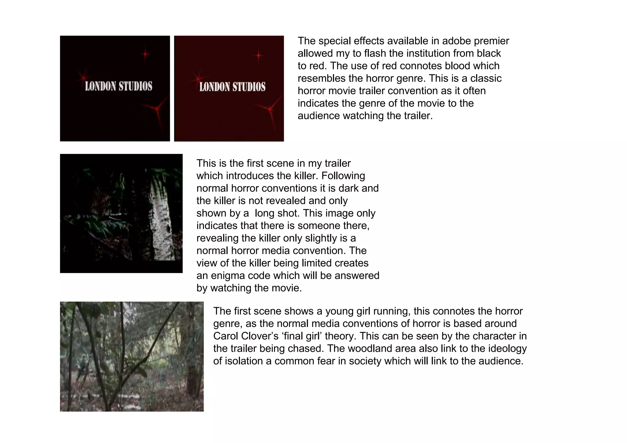
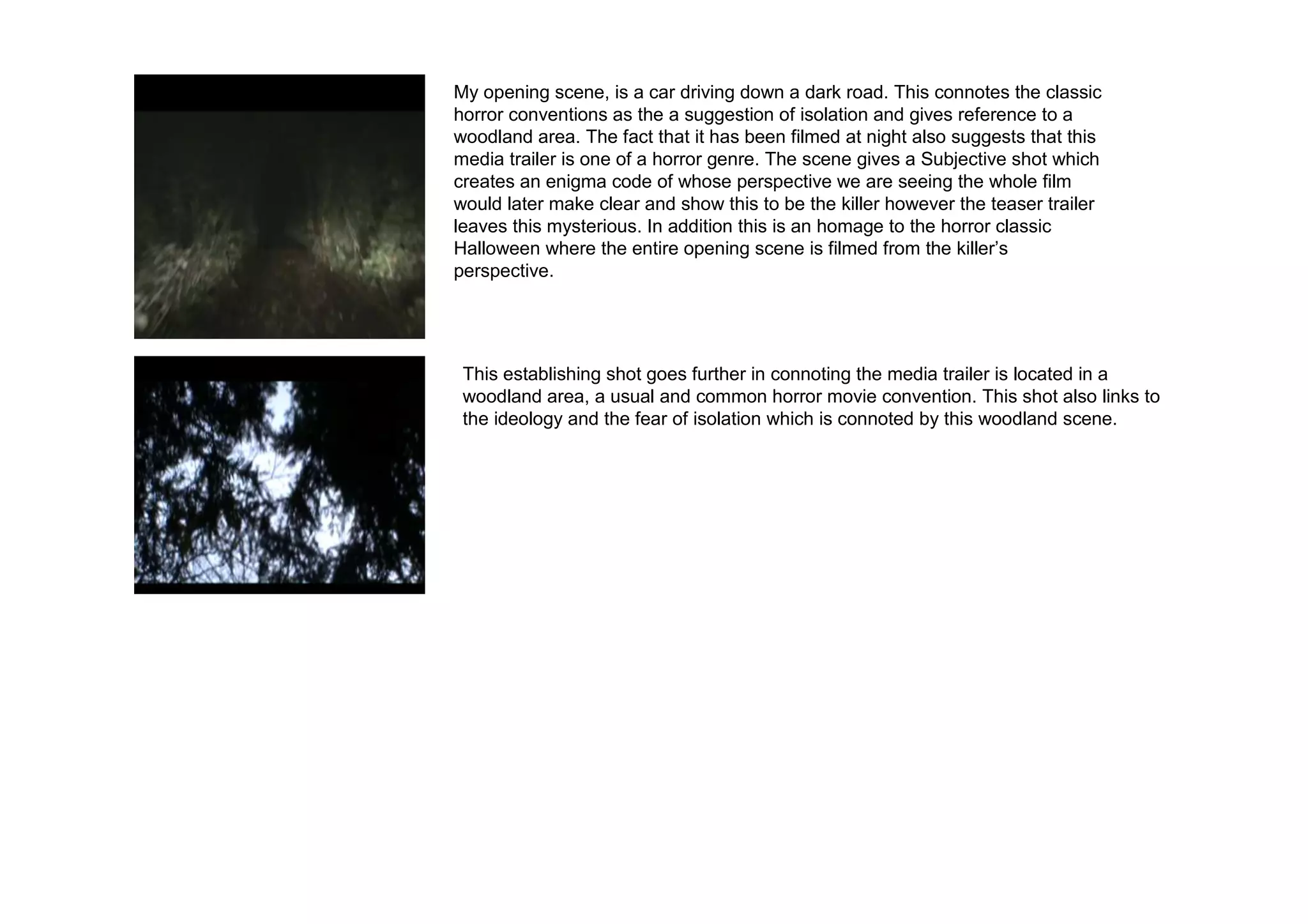
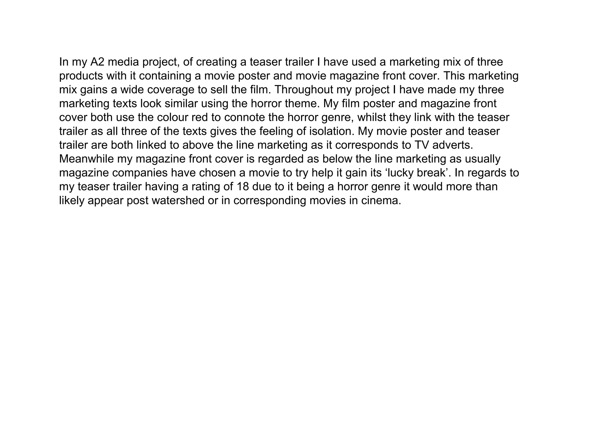
A2 product analysis

     Yr 13: G325
The Brief
• I have chosen to do a promotion package for
  a new film, to include a teaser trailer.

 I have chosen to do a film magazine front
 cover featuring the film, along with a poster
 for the film along with the teaser trailer for
 my film.
In what ways does your media product use, develop or challenge forms and
                             conventions of real media products?
                                          Due to Empire being a well established magazine
                                         company, my magazine front cover does not have the
                                         same luxury in being able to have the movie magazine
                                         title being covered by an image.
                                          Transformers fall under the action Sci-Fi genre. This
                                         can be seen by the use of colour which connotes an
    •                                    explosion. The use of weapons attached to the
                                         ‘Transformers’ is also used to connote the sci-fi genre.
                                         On my magazine front cover I have also used the same
                                         layout to resemble the horror genre. The use of red is
                                         used to resemble blood whilst ‘All Hallows Eve’
                                         connotes a supernatural reference.
                                          Due to Empire being a well established magazine
                                         company they are able to make little reference to their
                                         institution. However in the case of my magazine front
                                         cover institution reference is crucial I have made this
                                         reference by containing the ‘pure movies’ website.
                                          Empire magazine has used the use of exclamatives to
                                         highlight importance, which I have mirrored in my
                                         magazine front cover. ‘New heroes!’ New ‘villains!’
                                         ‘new rules!’
                                          ‘The blockbuster issue' adds critical acclaim to the
                                         magazine which I have also mirrored in my magazine
In regards to my magazine layout I                                                                  In regards to my magazine front
                                         front cover.
have used the usual key conventions                                                                 cover I have learnt to structure a
such as having the magazine title at      Empire magazine has focused its magazine front cover
                                         around the Transformers' movie, this is connoted by
                                                                                                    magazine front cover to the best
the top of the magazine front cover. I                                                              effect, in regards to the majority of a
have also made use of extras to the      the ‘Transformers’ being the main image and is the
                                         most focused point of the magazine front cover. This       magazine needs to be based around
magazine and have focused them in                                                                   the movie. In the case of my
                                         has been mirrored in my pure movies magazine with a
the lower third of the page a usual                                                                 magazine front cover this is ‘all
                                         scene of my movie trailer ‘all hallows eve’ being the
magazine front cover convention.                                                                    hallows eve’.
                                         main image for magazine front cover.
Title of my movie shows the usual conventions with it
being plain and simple and shown towards the end of
the trailer to conclude the analysis.


 My trailer’s opening scene sets the location. My
 trailer follows normal horror conventions with it
 being located in a woodland area at night.


  In regards to the killer I have followed normal horror
  trailer conventions in my trailer with the killer wearing
  all black and the iconic bad image of a ‘hoodie’. As this
  scene contains the killer in my horror movie trailer it
  was essential to not reveal the killer’s face.


 I used the editing available in adobe
 premier to distort the image of my movie
 trailers institution commonly found in
 horror movie trailers.
The special effects available in adobe premier
                      allowed my to flash the institution from black
                      to red. The use of red connotes blood which
                      resembles the horror genre. This is a classic
                      horror movie trailer convention as it often
                      indicates the genre of the movie to the
                      audience watching the trailer.


This is the first scene in my trailer
which introduces the killer. Following
normal horror conventions it is dark and
the killer is not revealed and only
shown by a long shot. This image only
indicates that there is someone there,
revealing the killer only slightly is a
normal horror media convention. The
view of the killer being limited creates
an enigma code which will be answered
by watching the movie.

   The first scene shows a young girl running, this connotes the horror
   genre, as the normal media conventions of horror is based around
   Carol Clover’s ‘final girl’ theory. This can be seen by the character in
   the trailer being chased. The woodland area also link to the ideology
   of isolation a common fear in society which will link to the audience.
My opening scene, is a car driving down a dark road. This connotes the classic
horror conventions as the a suggestion of isolation and gives reference to a
woodland area. The fact that it has been filmed at night also suggests that this
media trailer is one of a horror genre. The scene gives a Subjective shot which
creates an enigma code of whose perspective we are seeing the whole film
would later make clear and show this to be the killer however the teaser trailer
leaves this mysterious. In addition this is an homage to the horror classic
Halloween where the entire opening scene is filmed from the killer’s
perspective.


 This establishing shot goes further in connoting the media trailer is located in a
 woodland area, a usual and common horror movie convention. This shot also links to
 the ideology and the fear of isolation which is connoted by this woodland scene.
In my A2 media project, of creating a teaser trailer I have used a marketing mix of three
products with it containing a movie poster and movie magazine front cover. This marketing
mix gains a wide coverage to sell the film. Throughout my project I have made my three
marketing texts look similar using the horror theme. My film poster and magazine front
cover both use the colour red to connote the horror genre, whilst they link with the teaser
trailer as all three of the texts gives the feeling of isolation. My movie poster and teaser
trailer are both linked to above the line marketing as it corresponds to TV adverts.
Meanwhile my magazine front cover is regarded as below the line marketing as usually
magazine companies have chosen a movie to try help it gain its ‘lucky break’. In regards to
my teaser trailer having a rating of 18 due to it being a horror genre it would more than
likely appear post watershed or in corresponding movies in cinema.
How did you use media technologies in the
       construction and research, planning and
                  evaluation stages?
Adobe Photoshop Elements 5.0 - This software allowed me to create both my magazine front cover and magazine poster.
Photoshop allows me to insert text, edit and cut existing images and move them all into one document, this was essential
in my magazine front cover when I was fulfilling the usual magazine front cover conventions of using the rule of three, in
the case of magazine front cover I used three images. In terms of my poster Photoshop allowed me to edit and enhance
pictures this was achieved by the use of the lasso tool and clone stamp tool. Photoshop also allowed me to import certain
images such as a barcode of the internet.

 Piknik- This editing site found on the internet was very useful when creating my magazine front cover. This site
 allowed me to add special effects to the images used when forming my magazine front cover. This website allowed
 me to boost images to give a very bold effect, a neon tool allowed me to outline certain parts of the image I used in
 red which was very helpful in connoting the horror genre and the fact that it’s a special edition horror magazine
 made by ‘Pure Movies’. Piknik also had a wide range of fonts available which was very useful in making the title of
 my magazine front cover bold and professional.

  Adobe Elements 3.0 – Using this software I was able to create my horror movie teaser trailer ‘all hallows eve’ this
  software was able to make standard video clips into horror genre clips. The ability to change the contrast and
  brightness was very useful in darkening video clip which were to bright. Adobe elements also allowed me to
  import sound effects and a soundtrack which added to the tension the video clips created. Adobe elements also
  contains many effects which help to connote the horror genre the ability to fade video clips in and out helped to
  link all the clips together.

Mike Brown's A2 Media Studies evaluation

  • 1.
  • 2.
    The Brief • Ihave chosen to do a promotion package for a new film, to include a teaser trailer. I have chosen to do a film magazine front cover featuring the film, along with a poster for the film along with the teaser trailer for my film.
  • 3.
    In what waysdoes your media product use, develop or challenge forms and conventions of real media products? Due to Empire being a well established magazine company, my magazine front cover does not have the same luxury in being able to have the movie magazine title being covered by an image. Transformers fall under the action Sci-Fi genre. This can be seen by the use of colour which connotes an • explosion. The use of weapons attached to the ‘Transformers’ is also used to connote the sci-fi genre. On my magazine front cover I have also used the same layout to resemble the horror genre. The use of red is used to resemble blood whilst ‘All Hallows Eve’ connotes a supernatural reference. Due to Empire being a well established magazine company they are able to make little reference to their institution. However in the case of my magazine front cover institution reference is crucial I have made this reference by containing the ‘pure movies’ website. Empire magazine has used the use of exclamatives to highlight importance, which I have mirrored in my magazine front cover. ‘New heroes!’ New ‘villains!’ ‘new rules!’ ‘The blockbuster issue' adds critical acclaim to the magazine which I have also mirrored in my magazine In regards to my magazine layout I In regards to my magazine front front cover. have used the usual key conventions cover I have learnt to structure a such as having the magazine title at Empire magazine has focused its magazine front cover around the Transformers' movie, this is connoted by magazine front cover to the best the top of the magazine front cover. I effect, in regards to the majority of a have also made use of extras to the the ‘Transformers’ being the main image and is the most focused point of the magazine front cover. This magazine needs to be based around magazine and have focused them in the movie. In the case of my has been mirrored in my pure movies magazine with a the lower third of the page a usual magazine front cover this is ‘all scene of my movie trailer ‘all hallows eve’ being the magazine front cover convention. hallows eve’. main image for magazine front cover.
  • 4.
    Title of mymovie shows the usual conventions with it being plain and simple and shown towards the end of the trailer to conclude the analysis. My trailer’s opening scene sets the location. My trailer follows normal horror conventions with it being located in a woodland area at night. In regards to the killer I have followed normal horror trailer conventions in my trailer with the killer wearing all black and the iconic bad image of a ‘hoodie’. As this scene contains the killer in my horror movie trailer it was essential to not reveal the killer’s face. I used the editing available in adobe premier to distort the image of my movie trailers institution commonly found in horror movie trailers.
  • 5.
    The special effectsavailable in adobe premier allowed my to flash the institution from black to red. The use of red connotes blood which resembles the horror genre. This is a classic horror movie trailer convention as it often indicates the genre of the movie to the audience watching the trailer. This is the first scene in my trailer which introduces the killer. Following normal horror conventions it is dark and the killer is not revealed and only shown by a long shot. This image only indicates that there is someone there, revealing the killer only slightly is a normal horror media convention. The view of the killer being limited creates an enigma code which will be answered by watching the movie. The first scene shows a young girl running, this connotes the horror genre, as the normal media conventions of horror is based around Carol Clover’s ‘final girl’ theory. This can be seen by the character in the trailer being chased. The woodland area also link to the ideology of isolation a common fear in society which will link to the audience.
  • 6.
    My opening scene,is a car driving down a dark road. This connotes the classic horror conventions as the a suggestion of isolation and gives reference to a woodland area. The fact that it has been filmed at night also suggests that this media trailer is one of a horror genre. The scene gives a Subjective shot which creates an enigma code of whose perspective we are seeing the whole film would later make clear and show this to be the killer however the teaser trailer leaves this mysterious. In addition this is an homage to the horror classic Halloween where the entire opening scene is filmed from the killer’s perspective. This establishing shot goes further in connoting the media trailer is located in a woodland area, a usual and common horror movie convention. This shot also links to the ideology and the fear of isolation which is connoted by this woodland scene.
  • 7.
    In my A2media project, of creating a teaser trailer I have used a marketing mix of three products with it containing a movie poster and movie magazine front cover. This marketing mix gains a wide coverage to sell the film. Throughout my project I have made my three marketing texts look similar using the horror theme. My film poster and magazine front cover both use the colour red to connote the horror genre, whilst they link with the teaser trailer as all three of the texts gives the feeling of isolation. My movie poster and teaser trailer are both linked to above the line marketing as it corresponds to TV adverts. Meanwhile my magazine front cover is regarded as below the line marketing as usually magazine companies have chosen a movie to try help it gain its ‘lucky break’. In regards to my teaser trailer having a rating of 18 due to it being a horror genre it would more than likely appear post watershed or in corresponding movies in cinema.
  • 8.
    How did youuse media technologies in the construction and research, planning and evaluation stages? Adobe Photoshop Elements 5.0 - This software allowed me to create both my magazine front cover and magazine poster. Photoshop allows me to insert text, edit and cut existing images and move them all into one document, this was essential in my magazine front cover when I was fulfilling the usual magazine front cover conventions of using the rule of three, in the case of magazine front cover I used three images. In terms of my poster Photoshop allowed me to edit and enhance pictures this was achieved by the use of the lasso tool and clone stamp tool. Photoshop also allowed me to import certain images such as a barcode of the internet. Piknik- This editing site found on the internet was very useful when creating my magazine front cover. This site allowed me to add special effects to the images used when forming my magazine front cover. This website allowed me to boost images to give a very bold effect, a neon tool allowed me to outline certain parts of the image I used in red which was very helpful in connoting the horror genre and the fact that it’s a special edition horror magazine made by ‘Pure Movies’. Piknik also had a wide range of fonts available which was very useful in making the title of my magazine front cover bold and professional. Adobe Elements 3.0 – Using this software I was able to create my horror movie teaser trailer ‘all hallows eve’ this software was able to make standard video clips into horror genre clips. The ability to change the contrast and brightness was very useful in darkening video clip which were to bright. Adobe elements also allowed me to import sound effects and a soundtrack which added to the tension the video clips created. Adobe elements also contains many effects which help to connote the horror genre the ability to fade video clips in and out helped to link all the clips together.