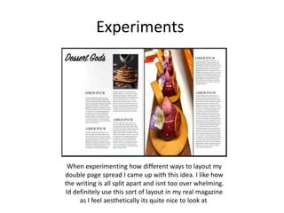
Experiments
Liv Crossley
Experiments
I like the colour scheme as the black and white makes it quite timeless, and also makes the green really
pop. However, I feel like its missing colour and isn't as aesthetically pleasing I would want it to be. Another
thing that I will do when I create my magazine is mess around with the fonts a bit more, for example where
I've done the competion on the side of the page I would enlarge the word WIN to make it stand out more.
Experiments
For this contents page I have gone for quite a
plain but aesthetically pleasing look. I
wouldn’t use this in my actual magazine as it
doesn’t fit in with my theme of magazine. For
my contents page in my magazine I want it to
look urban but this looks far too girly.
I used the app krita to create the contents
page. One feature krita has is a large
amount of different brush tools. It enabled
me to create the cool paint splat effect like
at the top of the page
To Stick to the colour scheme I have
used the same pink and blue for
the paint splats, writing and page
divider
Experiments
When taking photos in the studio its hard to get a
good angle where the shadow isn't in the picture.
To workout which is the best angle to take photos
from I have used a mannequin and a torch. After
trying holding the torch at different angles, by far
the best angle was straight forward. It blocks out
most shadows showing and gives it more of
a professional finish.
Side angle Straight forward Slightly high up angle Shone straight down
Experiments
When experimenting how different ways to layout my
double page spread I came up with this idea. I like how
the writing is all split apart and isnt too over whelming.
Id definitely use this sort of layout in my real magazine
as I feel aesthetically its quite nice to look at

Production experiments

  • 1.
  • 2.
    Experiments I like thecolour scheme as the black and white makes it quite timeless, and also makes the green really pop. However, I feel like its missing colour and isn't as aesthetically pleasing I would want it to be. Another thing that I will do when I create my magazine is mess around with the fonts a bit more, for example where I've done the competion on the side of the page I would enlarge the word WIN to make it stand out more.
  • 3.
    Experiments For this contentspage I have gone for quite a plain but aesthetically pleasing look. I wouldn’t use this in my actual magazine as it doesn’t fit in with my theme of magazine. For my contents page in my magazine I want it to look urban but this looks far too girly. I used the app krita to create the contents page. One feature krita has is a large amount of different brush tools. It enabled me to create the cool paint splat effect like at the top of the page To Stick to the colour scheme I have used the same pink and blue for the paint splats, writing and page divider
  • 4.
    Experiments When taking photosin the studio its hard to get a good angle where the shadow isn't in the picture. To workout which is the best angle to take photos from I have used a mannequin and a torch. After trying holding the torch at different angles, by far the best angle was straight forward. It blocks out most shadows showing and gives it more of a professional finish. Side angle Straight forward Slightly high up angle Shone straight down
  • 5.
    Experiments When experimenting howdifferent ways to layout my double page spread I came up with this idea. I like how the writing is all split apart and isnt too over whelming. Id definitely use this sort of layout in my real magazine as I feel aesthetically its quite nice to look at

Editor's Notes

  • #3 Discuss the tools and processes used in your experiments