This document summarizes the author's analysis of three travel websites:
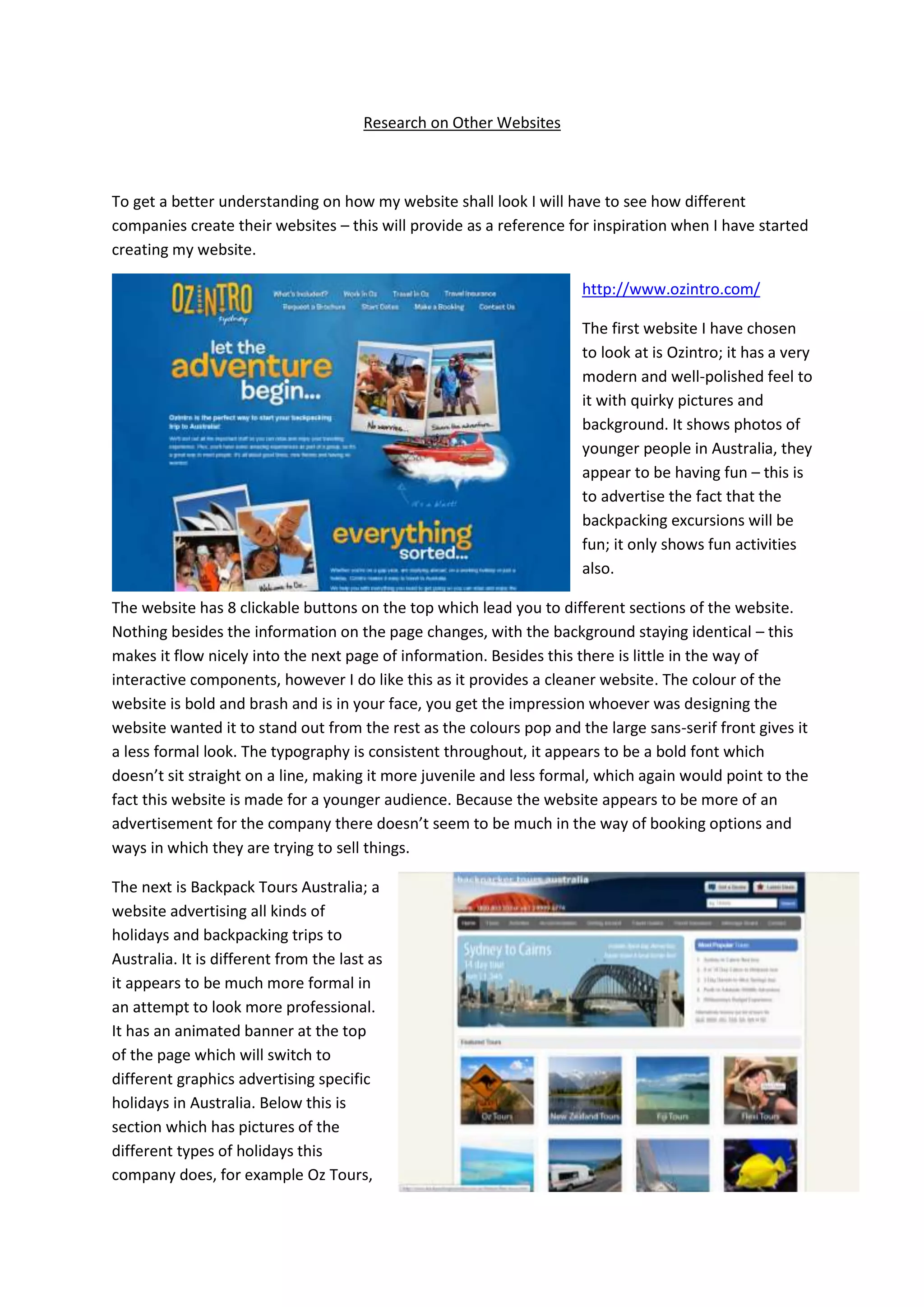
1) Ozintro - A bright, bold website targeting younger travelers. Features fun photos but lacks booking options.
2) Backpack Tours Australia - More formal with organized sections and clear descriptions of tour packages and prices. Focuses on practicality over aesthetics.
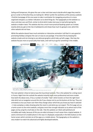
3) Courchevel - The most polished website with subtle graphics and tabs that change color on hover. Reminiscent of a mobile app. Uses advanced animations that make it feel professional and easy to navigate.