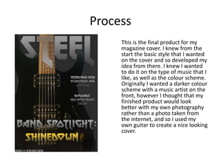
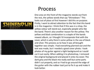
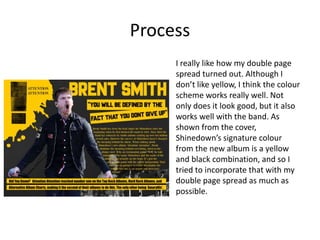
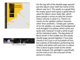
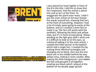
This document summarizes the process of creating a magazine cover and double page spread focused on the band Shinedown. The creator wanted to incorporate the band's signature yellow and black color scheme. For the cover, they used a photo of their own guitar against a dark background. For the double page spread, they included the album cover, a photo of the band's lead singer Brent Smith in color on a black and white background, and used splattered ink patterns in yellow. They experimented with different fonts and layouts to draw attention to the band and make the pieces cohesive.
2. Process
This is the final product for my
magazine cover. I knew from the
start the basic style that I wanted
on the cover and so developed my
idea from there. I knew I wanted
to do it on the type of music that I
like, as well as the colour scheme.
Originally I wanted a darker colour
scheme with a music artist on the
front, however I thought that my
finished product would look
better with my own photography
rather than a photo taken from
the internet, and so I used my
own guitar to create a nice looking
cover.
3. Process
One area on the front of the magazine stands out from
the rest, the yellow words that say “Shinedown.” This
looks out of place at first however I did this on purpose.
Firstly, I want to attract attention to the fact that this band
is in the magazine. I think that if this was in a shop, the
yellow colour will stand out, especially people who like
the band. There’s also another reason for the yellow. The
yellow and black combination is a staple of the bands
newest album, so I thought I’d incorporate that with the
cover, which is why there’s some yellow in the sea of black
and silver. This process as to how it was all brought
together was simple. I had everything planned out and the
text was made, but I needed a good cover photo. I took
photos of my guitar against a light background so I could
cut it out easily. When adding it to photoshop, I removed
the original background and placed it onto my cover. The
dark grey and the black mix really well but some parts
didn’t cut properly, and so I had to go around the edge of
the guitar with the rubber tool just to fix it up and make it
look better.
4. However one thing I would improve is my
photography. I was limited by the photos I
could take due to lack of time, and the fact that
I’m not very good at photography but I think
the cover was the best I could do with my
photography. This process as to how it was all
brought together was simple. The font I chose
was also important. It shows the genre I’m
working with very well as it is a classic rock
style font. It’s important to get the font right as
that’s one of the first things people see on a
cover. They spot the guitar and the title and
that’s mainly what would draw them in.
However I wasn’t too happy with the font, I felt
that it was missing something, so I tried a few
different styles and ended up adding a
gradient. This really blended the words into the
background and guitar which made the cover
look like it was all one rather than lots of little
pieces put together Also, I didn’t want the title
to be fully visible, I thought putting something
in front of it and so the top of the guitar body
covers the bottom of the title. I think that this
gives the cover a more professional look.
5. Process
I really like how my double page
spread turned out. Although I
don’t like yellow, I think the colour
scheme works really well. Not
only does it look good, but it also
works well with the band. As
shown from the cover,
Shinedown’s signature colour
from the new album is a yellow
and black combination, and so I
tried to incorporate that with my
double page spread as much as
possible.
6. On the top left of the double page spread I
put the album cover with the name of the
album next to it. This works as a good filler
for empty space and it gives a good idea of
what the album cover looks like, which
gives people a sense on why the chosen
colour scheme is what it is. There’s no
reason to the splatter pattern however
other than aesthetic. I simply got a photo
of an ink splatter, cut away the background
and changed it to yellow, which came out
quite well, however it took a while to get
all the individual splats. The big photo of
Brent Smith in the middle ties the whole
double page spread together. If you look
closely it isn’t just a cut out photo of him,
but a photo of Shinedown performing live
in black and white with only him in colour.
This is done to give credit to the whole
band, however the spotlight is specifically
on him and so he’s the only part of the
picture in colour.
Colour to Black and White
7. I also placed his head slightly in front of
the B in the title. I did this to show that
he’s important, that the article is about
him and so he’s at the front. To
exaggerate this point even more, I didn’t
put the main article on him but moved
the words around him, showing that he’s
at the front of everything. However I had
a lot of empty space going to waste at the
bottom, and so I created a short fact to
make it up. The fact still works with the
aesthetic, following the black and yellow
style, but it’s in front of everything. Yellow
wording on the light grey didn’t work and
it is difficult to look at on the eyes, so
instead of adding it to the main article, I
created this little banner at the bottom
which told a single fact. I created this by
making three identical rectangles and
changing one to black, then put the one
black one in the middle behind the two
yellow ones, making it seem smaller. After
making this little background, I just added
the fact and grouped it all together,
creating one block which I placed at the
bottom of my double page spread.
8. The fonts chosen here were very
important. I needed something bold for
the title to draw the reader in, and so I
chose the font headline, which is a font in
all caps which really brings attention to it.
This font mixed with the bright yellow
colour really makes my double page
spread stand out. Finally, I added a quote
at the top. The way I put this in was
interesting, as I didn’t want just a boring
set of words that were a bit bigger than
the rest. Instead I made a banner. Not
only does this quote say what type of
person Brent is, it also looks good, which
is equally important. It was simple to do
yet adds a different style to the double
page spread which I very much like.
Editor's Notes
Discuss the tools and processes used in your production. Log your thoughts and feelings about your work.